Friday, June 30, 2006

The nature of serial process

I published my blog post about Maggie and went off to read my e-mail and found and opened my latest Robert Genn letter. My mouth dropped when I realised he's done it again and written about something I've just been discussing!

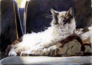
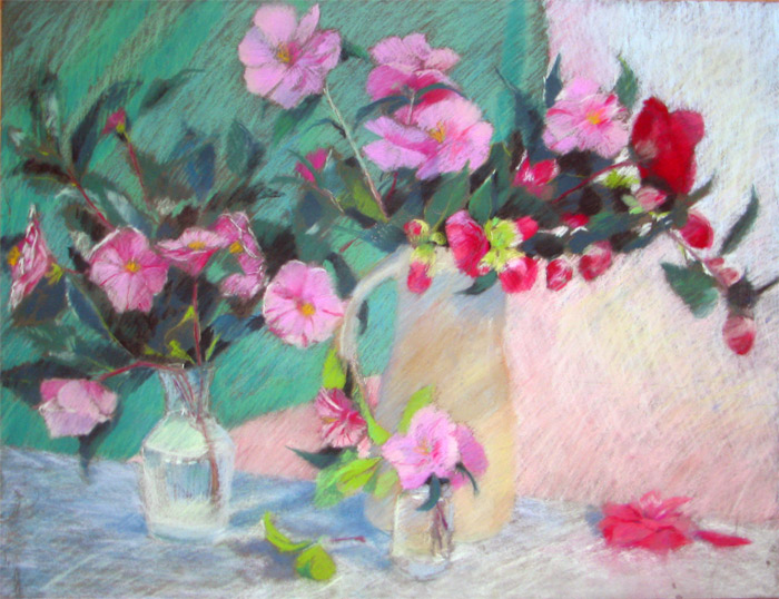
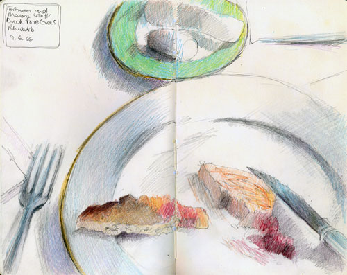
Maggie and I have talked quite a bit in the past and during her interview about how she settles on a theme and then develops it. It works for her because she becomes more confident in what's she's doing and feels she can then take risks, push a few 'boundaries, and try things which are a bit more unusual - it's a combination of steady application with a bit of excitement thrown in. It works for her customers who collect her work because they can build a set of paintings which have a continuity about them.

So what does Robert Genn write about in his twice-weekly letter to artists? Only "the nature of the serial process"! I'm going to quote a brief extract from the letter - but seriously urge you to go and read it in its entirety when it's published on the Painter's Keys website shortly (e-nmail subscribers always get it first).

Robert talks about
"The steady worker who applies his craft daily is more likely to make creative gains than an intermittent one. Even when tired, or even because of it, the rolling creator can generally squeeze further."
In addition - he highlights the stages in the creative process
  • Initial attraction and recognition of potential.
  • Commitment to virgin understanding and first rendition.
  • Secondary attraction to nuance and sleeper elements.
  • Further "aha" recognition that the thing has legs.
  • Re-dedication to specific exploration and variation.
  • Development of personal touches and sensitivities.
  • Progression through excited highs to creative climax.
Drawings and sketches work in the same way. I can see the progress made every time somebody selects a theme and develops it - with a good example being the monthly sketchbook themes of Laura's Laurelines blog (watch out for the mid-year assessment of the 2006 art plan review due to be posted today!). I know I go to my weekly drawing class for the discipline of drawing a live model. However I now also push my weekly study to include composition and the 'making of a picture' - even if it doesn't always work out - like last night! But when it works, I know it, get quietly excited about it and the drawing just flows out of my fingers.

I can highly recommend Robert's newsletter, it always gives me something stimulating to think about each time it lands in my in-box. The "clickback" (containing the letter and readers' response to it is also very well worth reading - and features readers' work!) This is the current clickback.

Relevant Links:
Technorati tags: , , , ,

Maggie Stiefvater - two of everything

Maggie Stiefvater is an up and coming artist who has developed a significant following on e-bay over the last year.

I've come to know Maggie very well and admire her hugely. She has done what a lot of people only dream about doing – handed in her notice at the day job, started a career as a full-time artist and become a collected artist. However, Maggie did all this while producing and raising two babies under the age of two. Maybe they provide the extra incentive to do well? She's certainly off to a flying start with her work now selling before it's even completed. Here’s what Maggie told me.
When I was small, I drew horses all the time but never ever thought that one day I would be an artist. It wasn't until I joined “Wet Canvas” that it occurred to me that people might want to hang my art on their wall.

I’m now am independent, self-taught, self-representing artist. I'm making progress because I'm always willing to learn from the experience and knowledge of others but also enjoy trying things out for myself. In everything I do, I learn by researching what works and how it works and then experiment by doing it my way. Inevitably this means I sometimes fail but I never let that discourage me and I try new things all the time – in terms of both my art and the way I do business. I always get really excited with every new piece of art because of an element of uncertainty as to whether or not I'll be able to pull it off. That excitement is only matched by trying out the latest idea I’ve had for marketing my work!

My artwork is divided into two. It began with realistic colored pencil portraits, mostly of my first love - horses. My aim when creating portraits is always to show character. I prefer a sketchy finish to the very precise realism which is very common in the coloured pencil world. While I enjoy doing larger portraits, I’ve also found a lucrative niche market in tiny art cards.


The other half of my art personality produces bright, bold streetscapes in acrylic which address a major fascination of mine: the juxtaposition of old and new. I love cars and they nearly always represent the modern element in my paintings. These have been doing incredibly well since I introduced them. I now have collectors who really love my work! In order to stay in close touch with them I've begun a new blog greywarenart.blogspot.com where I post my art as I complete it so that people can see and comment on it before it’s listed in my e-bay store. My website also displays my work but in a more traditional format and is now also set-up so that it works closely with my eBay store.

My two toddlers help me to be very organised and focused. Planning my art and my business activities has to be all about planning my time. My husband told me that I needed to take all of my spare moments during the day, clump them together and then put that time to good use. Very wise advice! I mark off blocks of time in the week for art and allot myself "weekends" for ‘time-off. And most importantly, I paint or draw whether or not I feel like it. When art is your living, the freedom of "not feeling like it" is taken away from you. That's my main suggestion for anybody who wants to become a professional artist: start treating it like a job.

Anybody who wants to meet me in person can find me throughout the summer at horse shows and exhibitions in Virginia – they’re all listed on my website.
Maggie is also a budding author with a book which is currently being considered for publication………..but that’s another story!

Artwork: click on either image to see a larger image
"Persephone" 11" x 14" (coloured pencil)
"The Hot Seat" 2.5" x 3.5" (coloured pencil art card )

Technorati tags: , , , ,
, , ,

Thursday, June 29, 2006

Unison Pastels: Red, Red Earth and Brown Earth

Some technical information today in the sixth of this series of posts about Unison Pastels.

John Hersey, an artist used to working with charcoal, created the pastels as a result of his enquiry into the nature and properties of colour.

The pastels appeal to colourists as they provide strong pigment colour with a soft pastel performance. The pastels are pigment rich, have very little binder and are developed as a series of hues. Many of the pastels are pure and single pigments which are then blended with a little white (chalk) to create the tints.
"The pigments used are the traditional ones: Cadmium (with a limit of 0.01% or 100ppm soluble Cadmium), Cobalt, Oxide of Chromium, Viridian, the Ultramarines, Cobalt Chromes, the natural and synthetic Iron Oxides, Titanium Dioxide and China Clay. These colours have stood the test of time and are very durable and lightfast."
The sets are based on Hersey's theory about colour integration hence the title - Unison. The cycles of hues and tint variations were influenced by the light in Northumberland which show the colours of nature very clearly. For me, this approach also explains why - in my experience - all the colours work so well with one another - as demonstrated by my plein air painting of the lake temple, Pura Ulun Danu Bratan, near Bedugal in Bali (below) which mixes shades from the the red earth and red sets with blues, blue greens and yellow greens.


Unison pastels are hand-made in Northumberland. The process used to produce them means they are considerably softer than many of those made in factories. Rather than being compressed and extruded from a pastel mixing machine and chopped into uniform lengths by another machine, each stick is hand-rolled and air-dried. Consequently they're not a uniform shape although each stick measures approximately 2-1/8" long × 5/8" diameter (54 mm × 16 mm). Pastel colour sets are then packaged in a robust black cardboard box with good quality foam insert which provides a protected home for 18 pastels.

My sixth post in this series combines the Red, Red earth and Brown Earth pastels. I have to confess I was a bit worried about how to cover the brown ones as I don't use them a lot. But they seem to fit in happily next to the Red Earth set. One of the worries of many people, on the other hand, is how some pigments cope with light over time. I have Devon Camellias #1 under glass on the wall of my sitting room for about 12 years with no obervable deterioration. The reality is that pastels are lightfast rather than fugitive if pigments are well chosen.

Artwork: click on the small images to see a larger painting
Pura Ulun Dana Bratan 19.5" x 25.5"
Devon Camellias #2 19.5 x 25.5"

Technorati tags: , , , , , , ,

Wednesday, June 28, 2006

Unison Pastels: Blues and Greys

Today is the turn of the Blues and the Greys. I don't really do a lot of 'blue' paintings but I so seem to use some of the blue pastels quite a bit for both highlights and darks. Over the years, I 've also grown to appreciate coloured greys more and more.

There is a good range of hues in the blues box. From ones which are very useful in more subtle pictures and within a more traditional palette (for example in "Dunwich Single" or "Violets in a jam jar" below) to ones which command attention in brighter more contemporary pieces (see "The Fish Bowl" below). I used BV12 and some touches of BV11 in the latter piece and the pigment strength and cover is simply astounding.

"The Fish Bowl" is an interesting example of what happens when you have a go at using some of the colours you don't normally use! I had tremendous fun doing it although I'm not sure whether it's ever going to find a place on the walls of my home!

The second box is a personal selection I made from the Greys series 1-36. The top two rows are #1-6 and 8-12 plus A49 which is the very dark indigo blue shade on the middle left. The bottom row from left to right is 22, 24, 26, 28-30. I didn't buy the greys without colour as I reckoned I'd never ever use them but I think I could maybe do with a few more of the yellow/brown greys. Numbers 30-36 which are various tints of a green grey looked to me to be pretty close to some of the pastels I already had in other boxes.

There are also another set of 36 greys called the Assheton Stones (named - I think - after the late Christopher Assheton Stones - a pastel artist and member of the Pastel Society). These shades can be seen on the Heaton Cooper site. These are very similar to the grey set of 36 pastels.

To see what the pastels look like when used in my artwork I've included three pastel paintings. Click on them to see a larger size
  • "Dunwich Shingle" (Pastel 19.5" x 25.5") (see Waterscapes Gallery on my website for more art involving water)
  • "Violets in a jam jar" (Pastl 19.5" x 25.5")
  • "The Fish Bowl" (Pastel 19.5" x 25.5") (the Flowers Gallery on my website has more pastel paintings of flowers


Technorati tags: , , , , ,

Self Portrait Marathon #3 - The mouth is wrong!

"A portrait is a painting with something wrong with the mouth." John Singer Sargent

This also applies to self-portraits - and here's #3 in my contribution to the self-portrait-marathon.

I think I've given up on the jigsaw idea as it's just so difficult actually finding an angle at which to draw that has decent light.

I again took off my glasses and I cannot tell you how grateful I am for having learned that this can be a good thing to do. As before I lost detail on the face and couldn't see what I was doing at all on the paper and just had to work on the basis of tonal shapes as I couldn't see individual lines. I'm really quite pleased with this in terms of the use of hatching and the relative accuracy while being very loosely done.

There is, of course something wrong with the mouth - and in the end I decided that I could live with that being on view to however many of you there are today (it was over 200 the other day!!!). Readers - you need to understand that in real life I don't really look mealy mouthed and very glum - except when I'm drawing myself! I can however rustle up a very steely glare on occasion as I discovered at an early age that I have the ability to stare without blinking! My cat Polly finds it very disconcerting when we're having a tustle over what she is and is not allowed to do.

The Self Portrait Marathon juggernaut continues to rumble on - felling trees in its path to cater for all the paper being used. It's passed the 250 portraits mark and goodness knows what the final number is going to be as there is definitely something about it getting easier the more you do - so you do more..........

The marathon was featured yesterday in an item on About.com Painting and Sparkling Walt (that's him in the picture) provided some very interesting comments about the process so far. He's also now set up a gallery on Flickr which shows all the SPs (as we "marathon artists" ;) call them) produced to date.

Reference Links:
Self Portrait Marathon - June 8 - July 8: The Rules
About.com painting: Self Portrait Marathon
Self Portrait Marathon gallery on Crackskull Bob

Technorati tags: , , , , ,

Tuesday, June 27, 2006

Unison Pastels: Blue Greens and Blue Green Earth

I'm very attached to my blue green and blue green earth sets. It might be something to do with my favourite colour being duck egg blue or it might be because they are just so useful when doing skies, water, trees etc. I know that it was these two sets which first got my plastic twitching!

And then there's the fact that the first time I ever tried to work by focusing on just one set (blue green earth) I promptly sold it!

That painting of a courtyard and archway in the Palacio de Mondragon in Ronda was also very special because it was the first painting that I sold (a) in the USA and (b) for more than $1,000. Unfortunately I can't show you that one as I've not yet made a digital copy of that particular transparency.

What Unison Pastels are great for is doing great big expanses of sea and sky so that you get great pigment coverage but haven't lost half your pastel in the process if working on abrasive support as I always do. At the same time, although they don't have a sharp edge, they can be used to get fine details if used carefully.

With these two sets, I find that the lighter shades (B4-B6, B10-B12, B16-B18 and BGE1) tend to get used more than the darker shades - with the exception of BGE18. However, you do need to bear in mind through that I will work blue green into anything and everything if relevant and possible! The blue greens also work extremely well with the blues, greens and yellow green earth sets - see the paintings at the end of this item.

To be honest I found it completely impossible to choose which painting to show you for these two sets - so you're getting small versions of a few! If you click on them they should come up larger. So in order they are:
  • "Evening in Chios" (NFS - a studio work which has hung next to my bed for the last decade and more!) See the House and Garden Gallery on my website for art involving structures and gardens.
  • "Tanah Lot" - a view of the famous temple on the southern coast of Bali (see Waterscapes Gallery on my website for more art involving water)
  • "Jilly's view" - of the River Dart in Devon - I well remember that it drizzled on and off when I did the original colour sketch. The Vistas and Views Gallery on my websites has more examples of artwork with a view!


Technorati tags: , , ,

Children's Art Day - 29th June 2006

Thursday 29th of June is Children's Art Day. It's a day of events to celebrate art in schools and galleries, museums, art centres and science and discovery centres, as well as in unusual places all over the country.

Activities are also taking place this weekend 1-2 July.
For example on Sunday 3 July, children and their families will be taking over Trafalgar Square to join in a giant open-air art workshop. The Trafalgar Square celebrations will be based on the theme of Friendship and will include special outdoor activities all over the Square as well as invitations to workshops and activities indoors at the National Gallery and the National Portrait Gallery. All the events are free.

On Children's Art Day in 2005, an event at the Tate Modern launched a national debate addressing issues surrounding the status of children's art - how it is taught, how it is influenced by artists and galleries, how it has influenced artists, and why it is so rarely displayed outside of schools. Findings are available in pdf form here "How old do you have to be to be an artist?"

You can find a list of all registered events both in schools and for families at the Engage website. Engage promotes greater access to and enjoyment of the visual arts and is managing the Children's Art Day activities on behalf of Artworks.

I was alerted to Children's Art Day by a 3 minute item on Channel 4 last night which showed the 2002 Turner Prize winner Kevin Tyson returning to his old school in Cumbria to open a new computer centre. His old art teacher had a collection of his schoolday works lovingly stored in a planchest His fame has clearly inspired a new generation of artists, with his ex-teacher telling him how current students had clearly recognised the drawings as being like those Tyson has produced as an adult - it makes one wonder how early individual style begins to emerge. There are series of short items running all week. Tonight, Peter Blake, the creator of the cover for the Beatles album Sergeant Pepper's Lonely Hearts Club Band, goes back to the school he left 70 years ago to find out things have changed.

The Clore Duffield Foundation launched the Artworks: Young Artists of the Year Awards in 1999, as part of a wide-ranging programme to support the visual arts in schools. The aim of the programme comprising a number of initiatives including the Awards themselves, together with Research, Publications, and Children'’s Art Day has been to inspire and support teachers; to enable and provide funding for art in schools; and to create exciting new opportunities for children to work closely with galleries, museums and practising artists. To date, more than 1,800 schools and 200,000 children and young people have participated in Artworks, making it the biggest and most influential scheme of its kind in the UK.


Technorati tags: , , ,

Monday, June 26, 2006

Catnapping 9

This is the ninth in Cosmo's catnapping series.

It took about 2 minutes and is unfinished. He woke up, rolled on his back, looked at me with big eyes and waited for his tummy to be tickled! ;) It's not quite one line but it's very nearly. I've hesitated to post it - but I like it (a lot! ) and so here it is.

Technical details are that it's black ink (Pilot G-Tec-C4) in an A6 Winsor and Newton Heavy Weight wire bound sketchbook with removable sheets (80lb paper)

Technorati tags: , , , , , ,

Unison Pastels: The Greens 1-36

This is the third in the series of posts about my Unison Colour Value sets. The Greens come in two boxes 1-18 and 19-36.

When I first saw them I couldn't believe how much yellow green and pale blue green colours there were. Subsequently, as I really got into painting trees, I couldn't believe how wonderful it was to have a set of greens which actually gave the range of colours experienced in real life!

On a trip to Australia and Bali in 1997 I really began to understand for the first time the way greens can change quite radically in different countries and that you can't always paint overseas with the same colour palette that you use at home. On the other hand with a good set of pastels you can find the new shades which need more emphasis and then make adjustments to your natural 'colour signature'. And that's where the Unison pastels have been so good. The addition of the new dark greens has only enhanced what was already a good set. It's also great to have the different tint strengths in one box - it really helps with the colour continuity in developing a pastel painting.

There are a few greens out of these two sets I've used an awful lot - these are 1,8,14 and 32. Darks in the painting below were however achieved using a very dark green A43 which is an "Additional Colour".

This pastel painting is of the back garden of the house in Sydney Australia that my sister and her family used to live in Sydney. Their back garden was huge and a series of terraces up the side of a hill - however most of it was natural 'bush' and was absolutely stunning.

Most of this painting was done from life one morning in late March 1997. I was positioned in the shade which meant I didn't get too hot and I could see all my colours clearly. Drawing looking up the whole time was an interesting experience as was the selection of colours for the eucalyptus trees, the tree ferns and all the rest of the vegetation. I got about two thirds of the way through and then finished it when I got back home. It felt very weird doing Sydney colours in London but it was great to have so much of the colours done as the photos looked quite insipid in comparison.

You can see more of my paintings featuring trees in the Trees Gallery on my website (yes - I really like them that much!)

(Note: The blue sky was done using a blue Schminke pastel which I found in an art shop in Sydney and colour matched to the sky!)

Linked posts:
Unison Pastels: the Darks and the Lights,
Unison Pastels: Yellow and Yellow Green Earth

Technorati tags: , , , , ,

Saturday, June 24, 2006

International Sketch Crawl - Saturday 1st July

I'm still catching up on my blog reading after last week's computer hiatus and very nearly missed the call from the Sketchcrawl Blog for participants in the 10th International Sketchcrawl next Saturday. That's right folks - people all over the world will be going out to sketch next Saturday - 1st July - as part of a worldwide sketch crawl.

This is the entry on the Sketchcrawl Blog - posted on June 20th - the day before my computer died before later being revived after transplant surgery!

What is a Sketchcrawl?

A sketchcrawl is a drawing marathon - lots and lots of sketching! It was invented by Enrico Casarosa, a storyboard artist living in San Francisco and working in animation.

The explanation of how it all came about can be found in SketchaWhat?. These are the sketches Enrico did on his sketchcrawl experiment on August 14th 2004. The first International Sketchcrawl was in November 2004 - and you can find a record of it here in the Sketccrawl Forum, plus records of all the other sketchcrawls.

A Sketchcrawl happens on a specific date when:
  • (group) you turn up at a pre-arranged meeting place at an agreed time and sketch the local area - lots of different sketches! You may move about together or on your own within the specific area. Then get together again towards the end and look at each other's sketchbooks! Then afterwards post on your blog or normal place where you post your work and reference in the Sketchcrawl Forum if you want to
  • (individual) turn up wherever you fancy on the agreed date and sketch as above. Post in the forum or provide a link to your blog or wherever you normally post your work. Plus reference in the forum
Enrico's suggestions for materials for a sketchcrawl can be found here - love those sketches!

Anybody can start a sketchcrawl group. The only suggestion is that people post what they're doing to the Sketchcrawl Forum so that others can join in.

Sketchcrawl Forum:
This is the Sketchcrawl Forum. Yesterday people were trying to get groups together in:Bear in mind the lack of notice(!) means some of these are still at a very sketchy stage. There's also probably even more venues since yesterday.

For those based in and around London the London SketchCrawl Itinerary is:
  • Southwark Cathedral
  • Borough Market
  • The George (a historic pub!)
  • South Thames riverside walk
  • The Golden Hinde
  • Shakespeare's Globe
  • Tate Modern
  • Hayward Gallery
I know the area well and there should be lots to sketch all afternoon. I'm looking forward to hearing over the next week about who else is getting involved either in London or elsewhere.

Are you going on a sketchcrawl?

Relevant Links:
The Sketchcrawl Blog (where announcements about all new sketchcrawls are posted)
The Sketchcrawl Forum (where details about all local sketchcrawl activities are posted + photos and sketches after the event)
SketchaWhat? (concept creation and development)
Sketchcrawl Materials (suggested materials for a sketchcrawl)

Tecnorati tags: , , , ,

"Life Plein Air" and Ovanes Berberian

Although I work in pastels, I find that looking at the work of oil painters who focus on colour relationships is always very helpful to developing my own techniques for optical mixing with different coloured pastels. Plus, I'm working towards oil painting plein air very slowly..........I'm at the reading stage! ;)

Anybody interested in colour relationships and/or painting still life or plein air in oils and/or Ovanes Berberian will probably find it rewarding to pay a visit to recent posts in Ed Terpening's blog "Life Plein Air". Ed is an established plein air oil painter who works and paints in California.

He's just done a week long workshop with Ovanes Berbarian in Idaho. His blog records the process and has photos of the work Ed produced. These are the links:
The overall principles around colour relationships and harmonies and colour mixing and the process of building a painting are all ones which apply to a lot of artists working in a variety of media. I hope you enjoy reading Ed's posts - I know I did.

Related links:
Links to examples of the work of Ovanes Berbarian: Gallery 1 Gallery 2 Gallery 3
Ed Terpening's blog "Life Plein Air"

Technorati tags: , , , , , , ,

The Self-Portrait Marathon #2 - Without Glasses

I started to do my next self-portrait feeling very pleased with myself as I'd worked out a grand strategy to cope with four weeks of self portraiture. I'm going to adopt a jigsaw approach and do different sections of my face in different weeks. They may fit together, they may not.

And then.........the problems started.

First off, I had a wholly unscheduled stop in the self-portrait marathon at a refreshment station to get my computer's power unit replaced. And I'm now back in business and steaming along........well, that was until I realised last night that I haven't got anywhere comfortable to sit where the lighting is good.

And then.........the whole self-portrait rigmarole came back to me in a flash.

Question: What's the longest part of doing any self-portrait.

Answer: getting the lighting and the mirror set up so you can sit comfortably and be relaxed for however long it takes to do.

And then...........I discovered that it's so long since I've done a self-portrait that I am now wearing vari-focals rather than just reading glasses and I had a whole new complication to cope with.

Well I decided I wouldn't let a small thing like eyesight and glasses get in the way. So I took my glasses off - and everything blurred nicely - just like it does when I'm screwing up my eyes and trying to see the values clearly. Which seemed like a bit of a bonus. I no longer need to get wrinkles while drawing my self-portrait if I take my glasses off - and that means I don't have to draw them either. Only thing is it also means I can't see what I'm drawing on the paper, either........

So this is:
  • a portrait of a middle-aged woman who's had a bad week with her computer and
  • who can't cope with lighting/mirror and the the additional complication of glasses on a Friday night and
  • who can't see herself properly and can't see the paper either.
Guess what? I'm calling it "Without Glasses"!

Technorati tags: , , , , ,

Friday, June 23, 2006

Unison Pastels - Yellow and Yellow Green Earth

These two Unison pastel sets are Yellow and Yellow Green Earth. The Yellow set is the one set where I've lost a pastel. It's somewhere in Italy on the border between Tuscany and Umbria!

None of the Unison pastels have names. They all have code names based on the set they belong to eg Y = Yellow and YGE = Yellow Green Earth.

Most sets have 18 different hues and tints of that hue - and the pastels are then numbered 1-18. I find this makes it very simple to keep your pastels organised in their related colours if kept in their original boxes - which is what I do.

On the whole, I've not come across many pastel brands sold in the UK that have a good strong pigment rich sunshine yellow - Unison is one of the few that provides such a shade with Y10. It was used along with other pastels from this set in "Spring Flowers and Pomegranate" which you can see at the end of this post.

Yellow Green earth is a really interesting set of quite muted colours which I like very much and find very useful in quite different settings - both in the UK and overseas.

I've yet to complete a painting using just this set but it's one of my ambitions to do so as the different hues work so well together.

The final image is Spring Flowers and Pomegranate which is 25.5" x 19.5". This was completed using Unison Pastels on Rembrandt Pastel card.

You can see this work and more flower paintings done using Unison Pastels in the Flowers Gallery on my website.

I've included below the websites of Heaton Cooper (based in the Lake District) where I've got most of my Unison Pastel sets and the distributor in the USA. To give you an idea of how much they cost, Heaton Cooper's on-line prices for a set of 18 Unison pastels is £27.50. Richeson, the USA distributor is pricing most individual sticks at $5.25. And yes, pastels are expensive, but these ones produce excellent results and will last you a very long time.

[NOTE: Apologies to those getting this sent to them twice. The pictures disappeared on Firefox and I needed to republish]

Related websites:
Pastels and Pencils - Flowers Gallery
Heaton Cooper
Jack Richeson & Co Inc (USA distributors)

Technorati tags: , , , , ,

Thursday, June 22, 2006

Unison Pastels: the Darks and the Lights

I'm back from the repair shop with a new power unit and am back in business!

I'm going to have a pastel theme for the Resources section which will comprise a number of posts. This post is the first in a series which will feature my Unison pastel set - which is my main "workhorse" set of pastels. I have an awful lot of boxes of 18 Unison pastels - which I started acquiring in the early/mid 1990s. All mine are in the colour sets and these don't often seem to feature on many suppliers pages so I thought I'd post them all.

These two are my most recent acquisition - the Darks and the Lights. They've not been used a lot as yet - but they are very well liked my me already - some of the shades are what I missed from the original range. The nice thing is that the darks are not at all scratchy - which often seems to happen with dark colours in some brands of pastel.

I'm going to post the rest of the sets but as we have quite a lot to get through I'll be doing two boxes a day - and I'm open to persuasion as to which ones you want to see next!

These are the sets I have:
  • green 1-18
  • green 19-36
  • blue green
  • blue green earth
  • blue
  • yellow
  • yellow green earth
  • brown earth
  • red
  • red earth
  • greys (my selection)
  • portrait
Technorati tags: , , , , ,

Wednesday, June 21, 2006

I may be gone a little while

I'm having major computer problems at the moment and have had to revive my rather old laptop to get up and running on the internet. It's not at all impressed with having to get off the bench and start kicking the ball around - and keeps findings ways of kicking the ball off the field!

This is all compounded by a camera which does not want to play ball at all with the laptop's operating system.

And I'm not quite sure what any of this means in terms of the time needed to get up and running properly again. It's either later tomorrow or if it has to go away it's more like two weeks.

And I had such a nice post planned for you - but it'll just have to wait..........

Tuesday, June 20, 2006

The Self-Portrait Marathon - the first 10 days

The Self-Portrait Marathon is turning out to be a cracking success as evidenced by the assembly of the gallery of all portraits received in the first 10 days. (Hi-res version of the gallery image here)

The numbers of people participating increase by the day, the number of portraits mushroom - I reckon Walter the Spark must have his hands full with cataloguing portraits - if it weren't for the fact that he's still down at Starbucks recording the latest satorial styles of Men in his part of the woods.

Personally I laughed out loud when I saw the fabulously subversive style of Karen's contribution to the self-portrait marathon!

Related Blogs: CrackskullBob The Creative Journey
Technorati tags: , , , ,

Monday, June 19, 2006

Sketching for Real - two weeks and 10,000 hits later

Over the last two weeks "Sketching for Real", my internet drawing class, on the Wet Canvas website has generated approximately 327 sketches, 650 posts and over 10,000 viewings. This post is me 'tooting my horn' about what we achieved during the first two weeks of the class.

At the beginning of the class notes, I posted the following quotes. Over the course of the last two weeks it has been a real pleasure to watch as the sketching class students began to grasp the truth of the following:
“You can't do sketches enough. Sketch everything and keep your curiosity fresh.”
John Singer Sargent

"It is only by drawing often, drawing everything, drawing incessantly, that one fine day you discover to your surprise that you have rendered something in its true character."
Camille Pissarro

“It’s amazing how loose some people become in their sketchbook drawing simply because they have a carefree approach and don’t become locked down in trying to make finished works”
Robert Wade
The students really excelled themselves. I've been incredibly impressed with the way students applied tenacity and courage as well as effort and their existing drawing skills to try drawing in new ways and new places. Particularly impressive were all those people who took themselves out of their own personal comfort zone. It has been such a special and personal pleasure for me to know that - as a result of the class:
  • many are now carrying a sketchbook everywhere they go - even to church!
  • some students have learned how to draw from life for the first time ever - and are thoroughly enjoying it after the initial warm up
  • most have learned how to sketch quickly - although this also took most far outside their personal comfort zones. Drawing quickly enabled them to develop a very useful skill for sketching from life. Many have now also realised how drawing quickly also makes drawing on a daily basis an achievable target.
  • The sketching of many students also loosened up as a result of drawing more quickly - less detail and more hatching were both popular approaches. Students are now much less worried about sketches which don't look quite right when judged next to a photo - and are much more encouraged by the results they were able to achieve during class.
  • the learning was infectious and most of those who have been drawing and painting 'en plein air' for sometime tried new ways of sketching and developed new approaches during the course of the class.
  • students worked out what they needed for a sketching kit - and tried out and swopped notes about lots of new pencils, pens, sketchbooks etc in the process
  • most ventured outside for sketching trips - and experienced 'weather'(!) ;) and the ever-changing shadows
  • most faced up the big challenge of sketching in public. Many sketched in public for the very first time and are no longer as concerned about the things which initially caused some people to be anxious.
  • all students generated the most enormous quantity of sketches during the two weeks.
On the whole I think most people found it easier to sketch in public if they started in a public interior - such as a Starbucks. I think the reference links to a Starbucks series of drawings (on Wally's blog) may well have caused a small upswing in Starbucks takings as various students broke their duck on sketching in public by starting in Starbucks. (Maybe Starbucks ought to run a sketching competition?)

An additional bonus of the class was the self-evaluation which I asked each student to do in relation to the artwork they produced and the experiences they had. The honesty and thought that went into many of the self-evaluations was truly admirable.

On a personal note it's been an interesting time for me as tutor time had some planned (prior drawing commitments, a flying visit from my sister who lives in Australia) and unplanned interruptions (my avoidance of my very hot computer during extremely hot weather in London - closely followed by a tropical rainstorm (one and a half inches in one hour) and flooding in my home - and then one morning the computer refused to let me have any pictures at all on screen! ) However I was very ably supported by other WC stalwarts while I was experiencing downtime. So - it wasn't all plain sailing for me - but, all in all, it seems to have been been a very rewarding experience for all concerned with some great results.

The Class now continues on an ongoing basis as part of the Drawing 102 series. I'm very confident that the efforts of the students over the last two weeks will help and encourage many others to pick up their sketchbook and 'have a go'.

Technorati tags: , , , ,, ,

Sunday, June 18, 2006

Sketching in Public

Just over three weeks ago I commented in this blog on a poll "Do You Ever Sketch in Public?". Subsequently I started a poll within the Drawing and Sketching Forum of the Wet Canvas website and asked the same sort of questions - as they're pretty standard lines of enquiry in this field for those wanting to encourage people to sketch. They were also questions I wanted to know the answers to as I was about to start teaching my sketching class "Sketching for Real" and wanted to refine my class notes to make sure they addressed the issues which concerned WC members the most. We got many comments on the WC poll which were very helpful in this respect.

I defined 'sketching in public as meaning:
Sketching in public might involve drawing people or it might just be about drawing in a place the public have access to (as opposed to sketching outside in your back garden! ). By "sketch in public" I mean creating a study of an object/scene you can see by drawing freehand for a short period in a public place

* either in the open air such as a park, gardens open to the public, a city street or square;
* or in an interior such as a waiting room (planes / trains/ doctors etc), coffee house, restaurant, bar, gallery, concert hall or theatre.

Sketching in public can involve whatever media you feel comfortable working in - given a limited timescale in a public space.

I thought you might be interested in the results and a comparison with the results, as of today's date, of the About.com poll

First off the WC Drawing and Sketching Forum poll has attracted 89 responses compared to 702 responses to the about.painting.com poll - so these numbers suggest the response levels for both polls are likely to be meaningful although possibly not representative of all the people who visit about.painting.com or who are WC members. The high degree of similarity of response to the questions posed by the two polls also suggests that the results are credible.

How popular is sketching in public?

  • 29% of about poll respondents sketch anywhere and everywhere compared to 26% of WC respondents who sketch everywhere they go
  • 13% of about poll respondents only sketch somewhere they won't be noticed compared to 22% of WC respondents who try not to be noticed when sketching
  • 18% of about poll respondents and 27% of WC respondents sketch sometimes
This means that
  • between 25-30% of people are happy about sketching in public everywhere they go
  • 60% of about poll respondents and 75% of the WC respondents sketch somewhere in public at least some of the time.
I would suggest that this is a very respectable result for the ancient art of sketching!

More WC respondents sketch - but more about poll respondents are confident about sketching in public. Interestingly the narrative comments of WC members indicated that a number of them counted themselves as people who sketch in public if they had tried and found it scary. This seemed to indicate a wish to do so despite the 'fear factor'. It also explains why the percentage of people who try not to be noticed while sketching is much higher amonst WC members. I'll comment more on this tomorrow when I review the results of the sketching class I've been teaching.

Who's undecided about sketching?
  • 5% of WC respondents don't sketch but have thought about it compared to 9% of about poll respondents who have also thought about it but haven't yet.
Why don't people sketch in public?
  • 10% of WC respondents are too afraid to sketch in public compared to 15% about poll respondents who are far too intimidated to sketch in public
  • Just 3% of each of the sets of WC respondents and about poll respondents stopped sketching after a bad experience
  • 5% of WC respondents don't sketch at all compared to 6% of about poll respondents
Which means just under 20% of WC respondents aren't sketching in public at all, for various reasons, compared to just over 20% of about poll respondents. 1% of WC respondents didn't fit any of the categories offered compared to 4% of about poll respondents.

Lack of confidence is still the main reason the majority of people don't sketch in public. What is interesting is the extent to which people favour sketching inside in public to plein air sketching - more on this topic tomorrow.

Technorati tags: art , drawing , plein air , sketching

Friday, June 16, 2006

Drawing Class 15th June

This is my latest 'pair' from my Drawing Class. Producing the final image in this blog involves rather more than just putting pencil to paper. I've just been reminded of all the challenges involved from walking into the studio to posting the image on the left.

To start with I made all sorts of mistakes when settling down to draw and after 20 minutes decided to ditch what I'd done and started again.

I'd positioned myself stupidly so that the sun was behind me and shining on to the paper which caused a frightful glare and all sorts of problems with my eyes when looking up to models and then back down to the paper. I also forgot to put in verticals and horizontals to start with - and ended up doing so much erasing and adjusting it just became simpler to start over.

I'm learning that when doing two models together it's much easier to get the proportions right if I put the background in and use it as part of the measuring process. Of course the fact that last night my view didn't contain a single true horizontal did not help!

I also had fun when we got to the photography and graphics phase. I photographed it
  • in my kitchen in the usual place - it didn't like it and produced a warm side and a cold side
  • on the floor with with white boards around it - still didn't like it - same distortion
  • in front of the window with the good north light - it came out blue - but it was at least a consistent blue. This last photo is actually the basis of the one you can see after I sorted out the levels, the brightness, the contrast - you name it!

I'm just completely perplexed as to why photography is easy peasy some days and a complete nightmare on others when the lighting looks about the same! It's so much easier when I do the greyscale scan of the heads! (Hi John - another hatching one for you!)

Then after the photography problems came the cropping conundrem. The studio has new plinths and hence the models are now nearer together in reality and in size on the paper; but, for some reason, I drew them smaller than I needed to. So I decided to crop - and another set of decisions: what format; how big; whether to stick with the original composition or try and see if a crop produced a better one???. In the end I cropped down to the original composition and focus and didn't try to get 'clever'

Does anybody else ever have 'days' like this?

Technorati tags: , , , , ,

Thursday, June 15, 2006

Laurelines compares the performance of coloured pencils

Laurelines has a really great post which compares the performance - both dry and with water - of various coloured pencils. She compared the following pencils:
  • Cretacolor Aquamonoliths
  • Derwent Inktense
  • Faber Castell water colouble coloured pencils
  • Faber Castell Polychromos (a non WC pencil)
Laura has done drawings of her gardening glove before and after the application of waterand commented on ther experience of using the pencils in this way. Her views can be summarised as follows:
  • the experiment clearly highlights for her the differences between each type of pencil and helps her to decide when she'd use each pencil
  • the pencils vary in their impact on how she draws. Read her post to see what these variations are.
  • the Derwent Inktense and the Faber Castell watercolour pencils provide the most saturated colour, are most like a watercolour experience but provide least control over nuances.
I'm always keen to reference good quality experiments with the sort of media which this blog focuses on.

Do let me know (through the comments function) if you come across one which you think might be interesting to readers of this blog. If it's relevant I'll publish the comment - but do be aware that I do read links before publishing them and only link to blogs relevant to my interests and the purpose of this blog*.

* In other words, this blog does not exist to provide a link which helps an un-related blog's bid to increase its search engine ranking. Please read my comments policy first if you have any queries.

Related Link: Laurelines - Green gloves - color pencilled
Technorati tags: , , , ,

Self-portrait: sketching on the tube

This is my first entry in Wally's self-portrait marathon which I guess will be added to the 97 other entries (as of this morning) in the self-portrait marathon gallery.

This is a sketch of a reflection of me! I was travelling to Kew in the middle of last month and sketched the reflection in the carriage window opposite where I was sitting on the tube. I was a bit short of models on what is a longish journey and had to resort to drawing myself at times!

Drawing on the tube is not easy. Drawing a reflection also makes life just that bit more difficult. However, if you ever feel too precious about getting a line 'just so' go and draw on the tube - you soon learn that really useful skill of 'pencil dancing on the page'. Lines don't tend to go where you want them to so you end up focusing on trying to make the spiders web make some sort of sense - and working very fast when the tube is in a station and isn't lurching from side to side! The lines in the image in the window were quite indistinct and I remember trying to get the values right rather than the lines as that was what had made me notice my reflection in the first place.

I seem to recall that the great British public (i.e. the man who sat down next to me and peered over to see what I was doing) declared it to be 'very good!' However, I would hasten to point out that the only bit that is really accurate is the pen gripped in my hand and the Moleskine sketchbook peeking out as it rests on the knee of my leg which is crossed over the other. It gives a great drawing angle!

Technorati tags: , , , , , , , ,

Wednesday, June 14, 2006

The Crackskullbob Self-Portrait Marathon

Wally/Sparky e-mailed me during my own personal sketchathon to ask me to participate in the self-portrait marathon (June 8th - July 8th).

He writes about this in his journal as follows. However he did it in one enormous long paragraph and I can't read those. Just so I have a note to remind me what to do, here's what he has to say in my multiple paragraphs version with bold highlights and bullet points! (And that's a bit of self-portraiture for a start ! Who says it has to be an image?)
At the urging of Natalie d'Arbeloff, famed author of Blaugustine, I have taken on the job of defining the parameters of our new Self-Portrait Marathon.

First, the underlying reason behind the parameters: if drawing is first of all about seeing, and it is, then it follows that drawing yourself will involve seeing yourself. Drawing well (and by that I don't mean skillfully, but honestly) means you'll have to see yourself clearly and deeply. That's not an easy thing to do. That's why this is a marathon.

If you want to climb on board, here's what you have to do.
  • For the next month, you must do a self-portrait at least once a week; more often, if you want to, but be reasonable.
  • Work in any medium you want
  • post it to your site, and send me the address of your post so I can list it here.
  • And think of your series this way: your last portrait is the stepping-off point for your next. Build on what you've done, see yourself more deeply. That doesn't necessarily mean draw more pores and wrinkles, although it could. It means reveal more of yourself, to yourself and the rest of us.
I, for one, am dying to see (a) what you look like, (b) what you think you look like, and © what you want me to think you look like. I think I'll do some screen captures and post our entries in a gallery here, side by side, so we can see how a portrait changes from week to week. Oh boy, this is going to be so much fun, kids! And listen, you don't have to be highly skilled. Sometimes that even gets in the way. Let's not measure ourselves against each other. We're all exploring, and there are a thousand paths to the top of the mountain. So when you have something posted, send an email to wally at wallytorta dot com pointing me to it. Oh, and if you don't have a site or place to post, send me your scan and I'll post it here. Okay. . . . ladies and gentlemen, start your mirrors!
If you go to his website you'll see there's a lot of names in that right hand column and a lot of portraits are being posted! You'll also find Eric the male model in his figure class doing press-ups!

...........and if you go to his gallery for the self-portrait marathon - you'll find a lot of faces of people who have illustrated blogs - some of which you may know. At the time of writing 74 images are posted and it only started last Thursday!

And I formally signed up this morning - so guess what tomorrow's post is..........

I may just have to go any and buy one of those tablet thingies which I've been putting off buying as I know it'll become a huge distraction while I learn all the digi-things it does. I wonder if I'll succumb before the month is out?

Technorati tags: , , ,

Tuesday, June 13, 2006

The Tea Pavilion


Another really hot day yesterday - I sketched under the trees next to the artificial lake and the Tea Pavilion in my local park. Much musing on the colour of leaves on the trees as the weeks pass by - and why I need all those greens in my collection - and why the ones I wanted seemed to be at home!

It always amazes me what a drop of red does in a largely green image. It's always great fun adding it in - this time to suggest people and (as usual) to get better darks as the complementary hue.

I draw people as one shape and largely as light shapes against a dark background. There isn't a lot of detail, nor does there need to be.

This sketch is size A3 (it's done on a double page spread of my A4 size Daler Rowney hardback black sketchbook) and was completed using coloured pencils.

Technorati tags: , , , , , ,

Drawing Dinosaurs

Two unfinished drawings for you. After all that sketching on Friday, I went to the Natural History Museum on Saturday for a Drawing Day with the Society of Graphic Fine Art.

The museum has stunning architecture and I've seen some great drawings of the large internal space of the large hall which contains the diplodocus which is a star attraction. So my aim was to try and find a way of portraying the sheer size of hall and dinosaur. I found that the view I really wanted to do was impossible because I would have had to stand on the stairs and I have practical problems with standing for long stretches.

I started two drawings on my large pad - mainly because when I started to sketch in my large sketchbook I just found it 'too small'. So I switched to the pad of A2 heavy white cartridge paper I use for my Drawing Class. However I didn't finish either drawing. I think I was having difficulties with focus due to the combination of the heat on Saturday plus my eyes were protesting vigorously due to lots of drawing in the previous 48 hours.

I learned a few things from the process - despite not finishing either drawing:
  • my eyes get tired when drawing too much - pace is required
  • when drawing dinosaurs, get the architecture right first as you need every line, angle and measurement available to get the correct size and proportions of a cast of a diplodocus skeleton (and this one was originally from Wyoming). I draw the plinth under the dinosaur about five times and I'm still not sure it's right which is why I decided to abandon this one until a cooler day!
  • less obvious perspectives sometimes provide better pictures! Of the two drawings I think the second one has the potential to be a better drawing.
On Sunday I didn't draw!

And then on Monday I had broadband/firefox problems.......I have my fingers crossed this is going to post - at the 3rd attempt!

Technorati tags: , , , , , , , , ,

Sunday, June 11, 2006

Sketching at the Royal Academy of Arts

So, after the sketches in the last post, I crossed the road to the Royal Academy of Arts and the Summer Exhibition.......and immediately encountered the second edition of Damien Hirst's latest sculpture "The Virgin Mother".

Well it's a bit difficult to miss actually - you see it from outside in the Strand and then get the full impact as you enter the courtyard in front of the Royal Academy. The side nearest the Strand is stripped back to reveal anatomical details. The first edition of this work is currently on display in New York and the third edition is being cast.

I've not seen any work by Damien Hirst in person before - but found this particular version of stripping back the layers to be inoffensive. I was most puzzled by the height (colossal - a hint?) and the fact that the sculpture clearly appears to recall Edgar Degas's 'Little Dancer'. This is even more apparent from the other side - note the tilt of the head, the hair and the overall stance.

Interestingly 'Little Dancer' was originally developed from a redddish brown wax sculpture of a ballet student from the Paris Opera in the nude. This wax sculpture was then exhibited dressed in the clothing of a ballet dancer made of real fabrics. The various bronze sculptures which can be seen in various museums were not cast until after Degas died in 1917. The 40 year old wax sculpture was then used to create the bronzes and they tried to match the condition in which it was found in his studio.

I rather like one of the things Degas is reputed to have said but this could be because I was rather feeling my age the next day (see next post)!
"Everyone has talent at twenty-five. The difficulty is to have it at fifty."
Edgar Degas (1834-1917)
On leaving the exhibition, I sat and listened to bluesy music and sketched the 'intact' side from the courtyard. I've been trying to describe to my sketching class the differences between drawing with contours and drawing with values. They've grasped the contour bit but need to work some more on values so I decided that maybe the best way to do this was a demo. I used to practice my hatching skills through hatching the values of sculptures. This sketch was completed using pure hatching - with no contour drawing. I'll have to wait and see whether this works better than explaining - I think it might.

When I got inside I battled with the crowds in the Private View. Every time I go to one of these I ask myself why I go rather than visit on a quieter day. I guess it's the freshness of the experience and everybody rushing around to see who's selling. Interestingly at this year's Summer Exhibition I noticed an awful lot of red stickers. I still seem to see the same names every year though............

Viewing the print room made me think I must try and find a form of printing which I could do given the problems I experience I grip a drawing tool too tightly.

I normally end up at my personal 'half-time' sitting on one of the benches next to the Pimms bar in the Weston Room, reading the catalogue and resting my very battered feet. It's a place where I always seem to inadvertently hear some riveting conversations by artists and their entourage! (My lips are sealed!)

This year I was lucky enough to get a seat which meant I could sketch the Pimms Bar and drink Pimms at the same time.......this is done on a double page spread of my Moleskine with a mechanical pencil.

I so wanted to put in the colour of the orchids that I printed off the scanned image and did just that! Tell what you think..........

Saturday, June 10, 2006

Lunch at Fortnum and Masons

Yesterday I saw three exhibitions and about 2,500 images in terms of paintings, prints, drawings and sculpture. In the middle of the day I sketched at the St James Restaurant on the 4th floor of Fortnum and Masons and these three sketches are the result.


Details as follows:
  • The first is a double page spread in my Moleskine in pencil with colour added with coloured pencils when I got home
  • the second is A3 size (approx. 15" x 8.5") and was executed in pen and sepia ink (no erasing!)
  • the third is A3 size (approx. 15" x 8.5") and is pencil with colour added with coloured pencils when I got home
Technorati tags: , , , , , ,

Friday, June 09, 2006

Drawing Class 8th June


Studio 4 at the Princes Drawing School is on the top floor of an old commercial building in Charlotte Street on the Shoreditch/Hoxton borders. The top floor sits above its neighbours and consequently we have excellent light in the summer months and, naturally, it also changes as the session passes! I was very conscious while drawing last night of the fact that some of the drawing problems I was encountering are exactly the same as those I get when drawing outside!

Drawing in pencil is "good for me" as it makes me look at the tonal value of different local colours. His shirt was dark blue and yet parts of it were lighter than the tonal value of the rear wall which is a light creamy colour. The colour of the male model's hair is a little lighter than that of the female model and yet the lighting and background context for each made them dramatically different. I quite liked the light on dark of his head contrasting with the dark on light of hers and wish I could remember the technical term for this which is one I have a mental blank about and can never ever remember!

The duality theme of the two models in the studio develops each week and I'm always very conscious of trying to compose a picture in a different way. It always seems to work better in portrait mode and when the focus is just on the two models. I'm also getting into trying to portray a relatioonship between the two models although none obviously exists. This week I found the marked contrast between the broad back of a not insubstantial male model towering over a rather slim female figure with a fine bone structure too powerful to ignore.

Last night I also found that a question which was posed by one of the students in my sketching class stayed with me. How do I know which way to hatch? I found myself watching what I was doing as I drew........but I'm going to write about this in a future post as I'm now dashing off to see two exhibitions in town - and tomorrow is Drawing Day with the SGFA at the Natural History Museum.

This drawing from yesterday's Drawing Class is on A2 size heavy white cartridge paper with a mechanical pencil HB 0.5mm. It took about two hours to do. I've cropped it down to the area I was focused on while drawing - which is about 21" x 15".

Technorati tags: , , , , ,

Thursday, June 08, 2006

How green is my coloured pencil collection?

How green is my pencil collection? Well, given I particularly like drawing gardens and landscapes it's pretty green!

I did a couple of sample pages of my greens a little while ago when it was announced that the Karisma pencils were definitely being discontinued in the UK. I wanted to see what my choice was in terms of what I was left with. Here are all my green pencils - as they were then - laid out in a very rough colour sample chart by brand on two pages of my sketchbook (the pages of which are a pale creamy colour).

I wonder how many of you know the old adage about every shade of green always goes with every other shade of green - it's something to do with nature. But it's interesting to look at all these different shades and their degree of natural 'fit' with one another.


So what was the result of this exercise. Well, I discovered I had rather a lot of choice(!) but that the choice was still limited in some parts of the spectrum. I was particularly impressed when I did this exercise by the range offered by Faber Castell Polychromos and Caran d'Ache Pablos. The latter is particularly good at the lighter and more olive shades. I am however very taken with the very smooth application of the Talens Van Goghs.

One weak area is around the permanent green area - but this is now remedied by the Talens Van Gogh range which offers the best choice with deep, medium and light shades of permanent green.

However my plea to the manufacturers would be for more individual colours within the dark mid green end of the greens that are pigment rich, stable and not scratchy? Most seem to lean pretty much to the yellow or blue end of the scale. I would love to have a really deep dark version of British racing green or a dark shade of the Brunswick Green which was popular during the Victorian period. The situation with the various brands is more or less the same problem that I had for years with pastels before Unison came up with their strong darks. I'm still resigned to having to achieve my really dark darks through mixing complementaries ie with crimson shades. Lyra Rembrandt's Night Green is a particular favourite for mixing purposes.

BTW, for obvious reasons I can't swear that the way these greens look like on your screen will be the same as they look on mine - but you'll get a sense of the range and choice that the different brands offer.

Update on Derwent Coloursoft
I had been hoping to add in the greens from the brand new Derwent Coloursoft range to the above, However but my local supplier (Atlantis Art Materials) tells me they have no intention of stocking this new brand - which has been identified as a possible substitute for Karisma (which they used to stock). I won't buy coloured pencils that I can't get in open stock locally so it looks like I'm going to have to give Derwent Coloursoft a miss until I can find a local supplier..............

Technorati tags: , ,