Friday, August 31, 2018

Ken Howard gets the brush-off from police in Venice

Police in Venice have told Ken Howard to stop painting in St Mark's Square in Venice - where he has a home and has painted for the last 60 years!

Shame on the Venice Police! Should you wish to express your views this is the official English language Twitter account for Venice https://twitter.com/venice

I have!


Here are a couple of newspaper articles which cover what happened.
The artist, a former president of the New English Art Club and a professor of perspective at the Royal Academy, told them he had used the same spot for decades but they remained unmoved.“I first came to Venice in 1958 and I’ve never had a problem,” Prof Howard told The Telegraph.“But of all of a sudden they’ve brought in new rules which say you have to have a permit. It’s a bit daft.”On Tuesday he duly went to the municipal office which issues the permits, only to find that it was closed.
An artist known for his work in Northern Ireland during the Troubles has criticised "overzealous" police in Venice after being removed from the city's famous St Mark's Square.


Ken Howard OBE PPNEAC RA RBA RBSA ROI RWA

Thursday, August 30, 2018

Sunday Times Watercolour Competition 2018: Prizewinners & Selected Artists

This is about

First Prizewinner: Sophie Charalambous
The Prodigal Son,
Watercolour on Khadi paper, 112 x 114 cm

The exhibition takes place at the Mall Galleries next month - but is not on for long, so you need to make sure you've made a date in your diary if you want to get to see it. The exhibition dates are 18 – 23 September 2018 and the exhibition is open every day from 10am to 5pm. Admission is free.

Eligible media includes any water-based media, which includes acrylic, inks and gouache

The competition has acquired a new strapline
Celebrating and rewarding excellence and originality in the medium of watercolour
You can find my call for entries blog post here Sunday Times Watercolour Competition 2018 - Call for Entries.

I must confess I wasn't feeling very kind to the competition at the time after the debacle in 2017 when the winner was eligible for acceptance into the annual exhibition of the Royal Institute of Oil Painters! (see 10 Best Paintings in the Sunday Times Watercolour Exhibition)

However on the basis of compiling this post, after last years' prizewinner debacle, I think the STWC may have turned a corner!

Prizewinners


Sophie Charalambous won the £6,000 First Prize with her watercolour painting of The Prodigal Son, (Watercolour on Khadi paper, 112 x 114 cm) - see top of this post

Thank goodness we are back to having a 'proper' watercolour painting - that looks like a watercolour painting - winning the first prize. 

Second Prize (£3,000) was won by Michael Chance for 'Growth of the Soil'. It's an intriguing painting which reminds me of some artwork from the Far East. I'm wondering what impact the gum arabic and honey have had on the watercolour and ink.

Second Prizewinner - Michael Chance, Growth of the Soil
watercolour, ink, honey, gum Arabic, 112 x 86 cm

The Third Prize (£1,000) was awarded to Richard Anthony Elliott for 'Diving Boards, Crystal Palace'

Third Prizewinner - Richard Anthony Elliot,
Diving Boards, Crystal Palace
watercolour, 120 x 120cm

Selected Artists


The statistics are

  • 80 works were selected from a total of 120 shortlisted 
  • from the 1,304 submissions from 600+ artists 
  • making a a success rate for selected works of slightly in excess of 6% of those submitted.
You can see the panel of leading figures from the art world at the end of this post.

I've researched the previous exhibiting history of those selected in the context of the competition (under its various names over the years) and have highlighted the history of  exhibiting for specific artists.

I'm particularly taken with how many artists are NEW to the exhibition this year - which I think (before seeing the exhibition) can only be a good thing. I'll let you have my further thoughts on this when I've seen the exhibition!

KEY:

  • This year, the ONLY people who have links (in their name) are the artists who have their own website. However entries may contain bio details from other sites. What's sad for me is that those without a website probably won't ever know they got the opportunity to be profiled in this post.
  • Previous STWC record in this competition indicated in blue italics. 
  • First time = exhibiting for the first time
  • The selected artists are listed below in alphabetical order by surname

Wednesday, August 29, 2018

Green and Stone art shop is moving to.....

Green and Stone - the renowned and extremely popular supplier of art materials - is on the move from its current home at 251 Kings Road in Chelsea.

It has to move quickly and hopes to be in its new home by October - and you can help!

The interior of 251 Kings Road
The shop has some very loyal fans and due to their support, unlike other art shops it has not closed and is now the longest running shop in the King's Road - until the move in October....
.....over the years, due to our fiercely loyal customers we have remained; and I am proud to say we are the longest running shop in Kings Road. We have kept Green and Stone exactly as it should be; a creative hub of information for the artistic and with an eclectic mix of curios. It serves as a peaceful escape from London’s modern revolt.
We have welcomed the locals of Chelsea and tourists from near and far; those who have sought us out, those who stumble upon us, the artists, writers, directors, movie stars and musicians, and everyone in between. Having served some of the greatest contemporary artists like David Hockney, Francis Bacon, Damien Hirst, Lucien Freud, Quentin Blake and Henry Moore to name but a few, we are considered the best art shop in Europe. Hester Baldwin, manager of Green and Stone
However, the building has been suffering from some serious structural problems and has experienced repetitive flooding in the basement.
To remain in the same building has its perks. We are a landmark destination; the black cabs know where to find us if you can’t. Our nostalgic shop front suspends you in a time now past and we can be relied upon as a location for a meeting place as we have been here for 85 years; indeed, Green and Stone is an institution.
However, as with anything old, 259 Kings Road has its downfalls too. Without the TLC the building needed our dear shop has started to shake its head in protest and sent floods of biblical proportions through the basement; more than once, I hasten to add. I believe, after 85 years of trading here at 259 Kings Road, this old gal wants an early retirement. This day would always come, but we were not expecting it quite so soon.
If you value the continued existence of this much loved store - and I suspect most of its current fans do - can I suggest you read on past the details of the location of their new home to the Crowdfunder - because the actual move is going to cost some £100,000


Green and Stone's New Home


Sunday, August 26, 2018

Lucian Freud - paintings of plants and gardens

Lucian Freud painted plants and gardens as well as people and animals.

I was reminded of this last Friday when I saw Two Plants at Tate Britain.

Two Plants Lucian Freud
Today I decided to review the paintings of plants and gardens by Lucian Freud as I'd never looked at them all.

Below you can find an inventory - in a timeline - with

  • notes about their context and location
  • links to where you can see them and 
  • quotes by people - including Freud himself - about his paintings of plants and why he did them.

In between are my photos of the above painting after I gave it my usual nose to canvas inspection..... I found the way in which he applied paint to very interesting.

All we need now is an exhibition dedicated to his paintings of plants and trees. There's certainly a lot of paintings to pick from!


Paintings of plants and gardens by Lucian Freud

"The subject matter has always been dictated by the way my life has gone. I noticed that when I was under particular strain, I didn't feel so like staring at people or bodies all day." It was at times like these that the palm, the Egyptian Book, thistles, cyclamens, buttercups, substituted for sitters. Seeing through the skin
You can see his plant paintings in The Lucian Freud Archive.

The links below are to
  • either Bridgeman Images which represent his work for licensing purposes.
  • or where paintings can be viewed in Galleries (if possible)
All are oil paintings unless otherwise indicated

The ones I know about are:
"one of the most memorable potted plants in the history of modern art"Lawreence Gowring about the Yucca which appears in Freud's paintings
  • 1953 - Bananas (Southampton City Art Gallery) 
  • 1953 - Plants in Jamaica - meticulous observation of exotic Caribbean vegetation at the Goldeneye villa of Ian and Ann Fleming on Jamaica, where Freud stayed during a visit in 1952-1953. Sold for £481K in 2011
For Freud, Jamaica's relaxed and vibrant island culture represented a welcome escape from the turmoil surrounding his private life back in London. This was reflected in the two paintings that he produced whilst he was there, Bananas(Collection of Southampton City Art Gallery) and Plants in Jamaica; both of which were conspicuously devoid of any human presence. "I noticed I switched away from people when my life was under particular strain," recalled Freud. "I preferred working in complete isolation. Not using people is like taking a deep breath of fresh air" (the artist cited in: Exhibition Catalogue, Venice, Museo Correr, Lucian Freud, 2005, p. 35).

The tropical beauty of the verdant Caribbean landscape provided Freud with a fresh and fertile source of inspiration for his painting. Perhaps more importantly, the painting en plein air that it required brought to his work an unprecedented immediacy and technical vitality that Freud developed over the course of the next ten years into an altogether more fluid approach to both subject and technique. 

Sotheby's Catalogue note for Plants in Jamaica | Auction 2011
Intimately observed down to its smallest, naturalistic detail, the all over composition of Plants in Jamaica is delicately articulated in modulating tones of radiant greens and browns. Using the finest sable brushes, in this work, Freud provides a mesmerizing visual manifestation of his renowned proclamation that: "The picture in order to move us must never merely remind us of life, but must acquire a life of its own, precisely in order to reflect life." (Lucian Freud, Some Thoughts on Painting, July 1954)
  • 1955 Cyclamen - a stem, a flower and three leaves on a wall at Coombe Priory bought by and his second wife, Caroline Blackwood as a place where she could stay when he was in town. One of only two Freud murals now in existence (see Wall Flower and next item)

Saturday, August 25, 2018

All Too Human - Diversity at Tate Britain

I went to the All Too Human - Bacon Freud and a Century of Painting Life exhibition at Tate Britain yesterday. The Spring and Summer have been full of other activities - and sunshine - and I suddenly realised the exhibition closes on Monday!
All Too Human explores how artists in Britain have stretched the possibilities of paint in order to capture life around them. The exhibition spans a century of art making, from the early twentieth century through to contemporary developments. London forms the backdrop, where most of the artists lived, studied and exhibited.

I'm not going to comment on the art as everybody has their own perspective and the reviewers from the newspapers have given it a thorough going over (see links to their reviews at the end).

Instead I'm going to comment on something that struck me this morning when reviewing the names of who was in the exhibition - and who was not.

Key points:

  • it's an exhibition of c. 100 paintings by SOME of those considered by SOME to be leading modern British painters (i.e. made their names in the 20th century)
  • it includes a significant number of works by Lucian Freud and Francis Bacon 
  • it's about painters in Britain who represent 
    • human figures, 
    • their relationships and 
    • their surroundings
  • it has very few women painters. Notably Paula Rego gets a room to herself and there is a large painting by Jenny Saville - but other female painters are less notable than the chaps.
  • there's an effort at diversity (as in 'tackle the checklist') - in terms of ethnicity - but it's not very persuasive. 
and it wholly misses a VERY notable point about diversity in relation to "British Painting" - see below

Diversity


It's very definitely an exhibition of paintings by people with very diverse backgrounds - although very little is made of this.

It hadn't really occurred to me before this exhibition just how diverse "British painters" in the 20th century were.

Map of locations: Blue = artist studios; Red = Art Schools; Green - galleries

List of locations of Artists Studios and who is linked to which London Art School

The art (mostly paintings) are by artists who had some sort of association with London - with some being members of the so-called "School of London" - and very many underline the diversity of nationalities in the capital - and in the field of painting in the 20th century.

So they include......

Thursday, August 23, 2018

How a ginger cat with attitude makes Fat Cat Art

I happened on Fat Cat Art again recently - and decided to try and understand a bit more about how a very "fat ginger cat with attitude" could contribute to derivations of some serious art.

James Abbott McNeill Whistler.
Arrangement in Grey, Black and Ginger No. 1 Whistler's Mother with the Cat

artworks by Svetlana Petrova & Zarathustra the Cat / FatCatArt.com
The fat ginge is called Zarathrusta and is owned by Svetlana Petrova - who lives in St. Petersburg. She always had cats - and involved them in her creative projects. However Zarathrusta is really her mother's cat and she inherited him after her mother died.

Zarathrusta loves to sit for adaptations of the paintings and artwork of the great artists past and present
We, Zarathustra the Cat, enjoy Ourselves as the first cat contemporary artist, working in fields of performance and appropriation art.
The website was launched in 2011 and since then he has been digitally integrated into rather a large number of famous paintings - in an amazing range of styles and period of art - and his artwork has gone viral around the world. 
Fat Cat French art at the end of XIX century
artworks by Svetlana Petrova & Zarathustra the Cat / FatCatArt.com
Twentieth century art and Zarathrusta the Cat
artworks by Svetlana Petrova & Zarathustra the Cat / FatCatArt.com

Damien Hirst, The Physical Impossibility of Falling Down in the Mind of Someone Sleeping
artworks by Svetlana Petrova & Zarathustra the Cat / FatCatArt.com
I'm a particular fan of some of the changed titles of the paintings.  There's some thought gone into these!

What's the technique?


  • the artwork is selected
  • high resolution images of the artwork are secured
  • photographs are taken of Zarathrusta - posing. It sometimes takes many months for Svetlana or her photographer to get just the right photo - so I'm guessing there are multiple project pics on the go at any one time
  • the cropped cat pic is inserted into the painting using Photoshop - and sometimes it's tweaked to fit with the style of the painting so that the two fit together well
  • text is created to go with the picture - by his bilingual author/artist mother.

The net result of all this?


He's gone beyond an Internet Meme and there have now been exhibitions, videos, a book (published by Penguin Random House USA - see below)) and calendars (see the 2019 calendar here - and on the Facebook Page) 

In fact a small cottage industry in St. Petersburg runs off the stretches and contortions of Zarathrusta and the digital wizardry of Svetlana.

Fat Cat Art: Famous Masterpieces Improved by a Ginger Cat with Attitude 
(From Amazon UK | Amazon.com)

You can view them on Facebook on a regular basis - with videos of typical cat activity

I wish them well for the future. It's fun rather than serious but if anything gets people looking to see what the original painting looked like, that's OK by me

Wednesday, August 22, 2018

Ban Pony Painting Parties

I sounded off about the awful Pony Painting Parties on Monday on my Facebook Page - which seems to have contributed a little to getting the word out that these need to be stopped.


As the petition points out (my bold)
The 2006 Animal Welfare Act says that owners have a positive duty of care towards their animals and a responsibility to prevent the animal from becoming distressed. Animals have ways of communicating distress - horses show stress signs through swishing, flared nostrils, raised tail, sweating and a raised heartbeat. These subtle signals are not obvious to families/children and could even be ignored by organisers who are prioritising profits.
The issue for me is about
  • showing respect for animals who are not in a position to say 'No' (remind you of anything?).
  • reminding people that anything that makes a profit can also be taken up by those who behave in ways which are very much less than ethical
  • how come we can have laws and nothing is done about their implementation?
The good news is that the petition is now up to nearly 160,000 signatures (from about c.25,000 signatures on Monday when I signed).  I'm really not surprised given some of the comments from those who read my post on Monday.
Signed. I’m staggered by this. Appalling

This is so sad that people think this is fun. I doubt it’s fun for the pony who has no choice in the matter. The UK really needs tougher animal laws on all levels !

that is awful, what a way to teach children how to treat and respect animals.

I have horses, and there's no way anyone is getting near them with paint. This is just stupidity, and no respect for the animal, and apparently no desire to actually learn something about horses. In other hands it can escalate to abuse - there was a case at an auction place where a poor pony was dropped off, after being used as a paint gun target, hundreds of shots taken at him. Someone was eventually charged.

O fer heaven's sake. I try so hard to teach children to RESPECT and VALUE animals - what lamebrain thought this was OK?
Interestingly the number of signatures to dare way exceeds some of those petitions already debated by Parliament eg Hold a referendum on the final Brexit deal!

Petition to Parliament


This is the link to the Petition to Ban Pony Painting Parties if you'd like to sign as well.

The rules on Petitions to Parliament are that:
  • if a petition gets 10,000 signatures then the petition will get a response from the government
  • if a petition gets 100,000 signatures then it will get a debate in Parliament
...and this one will be getting a debate in Parliament.

BUT - and this is important - the actions of politicians will depend on how many people sign it before it gets to the debate!

Hopefully at some point somebody will also think it a good idea to point out to parents that:
  • grooming a pony is a very good and appropriate way to show you love your pony
  • there are lots of art teachers out there who are very happy to give their kids painting lessons - without disrespecting dumb animals!

More about pony painting parties


If you doubt these are happening, here's the news coverage - all written before the petition topped 100,000 signatures supporting it

Tuesday, August 21, 2018

The Stockholm II Stool

Ever wondered about that very comfortable black sketching stool is - that's provided by most museums and art galleries?  The ones which have their very own special trolley which means they can be wheeled around to wherever they are needed...


The Stockholm II stool on its specially designed trolly
(Source:  http://www.einrichten-design.co.uk)


I'm a big fan of them - they always make sketching in galleries a very comfortable exercise. A friend used one yesterday - and wondered where one could get one...

So I took a photograph of the label of one and did a little bit of research.


It turns out that the stool is called the Stockholm II stool and
  • it's very robust - it weighs only 1.7 kg and can take up to 110 kg load capacity
  • it's also very comfortable - and has even won awards. 
STOCKHOLM II has received the “Excellent Swedish Design Award” and the “Red Dot Design Award, The Best of the Best”.
  • Plus it comes in a variety of colours. 
  • There are even variations - the New York comes with a wider seat and the Chicago one is somewhat lower to the ground. Plus there's even one for kids!
It's also designed to be bought and stored as multiples - and comes with its own dedicated trolley - which I guess is why it gets bought by all the museums and art galleries

However if you're thinking it might be nice to own one of your own, prepare for a sharp intake of breath - because they are NOT cheap. 

One of these very efficient and effective stools will set you back about £100

I shall look at them in future with a new found respect!

Monday, August 20, 2018

Call for entries: £10,000 Evening Standard Art Prize 2018

This is an overview of the Call for Entries for the second year of the £10,000 Evening Standard Art Prize in association with Hiscox.

The theme of The Evening Standard Art Prize is ‘progress’ and aims to inspire artists around the UK to create original works.

Below is my overview of the Call for Entries.
Everything in italics is my comment on aspects of the call for entry

The winner of the First Evening Standard Art Prize in 2017 was painter Helen A Pritchard (below) and or her abstract painting ‘To Make a Sculpture’.  She is a graduate of both the University of East London and the Royal College of Art.

Helen A Pritchard with her winning entry in 2017
Photo by Nigel Howard
The overview below is interspersed with images of some of the works which made it though to the Shortlist last year - as in these were the ones I liked!

The Prize and the Judges

The Prize


There is one prize which comprises three elements - all of which on their own are worth having!
  • £10,000 in cash, 
  • a lifetime National Arts Pass and 
  • Hiscox Fine Art Insurance up to a maximum premium of £2,500 for one year (subject to eligibility; and the artist must reside within the UK).
The winning entry will be the favourite entry selected by the judging panel from all valid entries received.

(Note: Emphasis on the word 'valid' - as in compliant with every single aspect of the terms and conditions. Get any of them wrong and you cannot win the prize)


The Judges


There are 6 judges:
The judges have two criteria: 
  • first, has the artist successfully reflected the brief? 
  • Second, have they followed the rules – which are very simple? 
Paintings, drawings and sketches are all accepted, so long as they’re no larger than size A0 (841 x 1189 mm) … and that’s pretty much it.

According to Thompson, the judges were determined to make the Art Prize as open as possible. ‘There are a lot of art competitions catered to established artists, like the Turner Prize,’ she says. ‘But breaking into the art world can be quite difficult.’ The solution was to make the competition completely free to enter, so that way it was accessible to everyone – no commission, no fee, no hassle. 
Why everyone should enter the Evening Standard Art Prize | Hiscox


Who can enter?


Only artists aged 18 years or over and resident in the UK can enter.
(Note: That's going to be resident as in "legitimate resident")

What can you enter?


You can only submit one piece of artwork. - it can be a painting, drawing or sketch no bigger than A0.

Photography submissions are not valid entries

The artwork MUST be:
  • an original piece (as in wholly original / no copying! The definition of "original" in art means you must be capable of asserting legal copyright ownership)
  • no larger than 841 x 1189 mm (33.1 x 46.8 inches) ( It's unclear but in most competitions the size normally means "including the frame")
  • capable of being displayed on a wall or on an easel (the size is equivalent to size A0 i.e. the largest size which can safely sit on an easel. )
  • reflect the the brief of ‘progress’

How to enter


The deadline for entries is 23:59 on Sunday 30 September 2018.
To enter, send the following via email to artprize@standard.co.uk
  • your full name, 
  • your contact number, 
  • your postcode, 
  • the title of the artwork, 
  • the dimensions of the artwork and 
  • three images of the work from different angles (not to exceed 14 MB) . 
There are NO ENTRY FEES!

Note that by entering, your submission automatically becomes content which may be used by The Evening Standard or Hiscox in future marketing.  (i.e. you are licensing the use of the work to these two entities for marketing purposes)

The Evening Standard also has a standard set of rules relating to their competitions / promotions - and you need to comply with these.

For further information, please write to Customer Care, Evening Standard Limited, Northcliffe House, 2 Derry Street, London, W8.

You can follow this art competition on social media using the hashtag #ESArtPrize


Longlist to shortlist


Details of "what happens next" will be sent to those artists whose digital entries are long listed.

I'm guessing you will hear within a few days of the deadline for entries - which means if it needs to be framed you need to plan ahead - before you hear the result!

Long listed entries:

  • must  be sent/brought in to a London address for judging by 15 October 2018
  • artists will be required to sign a waiver before their work can be displayed for final judging. Hiscox is solely responsible for the Fine Art Insurance prize.

More about Art Competitions


You can read more art competitions (past and present) in my Page dedicated to Major Art Competitions in the UK.


SUBSCRIBE
 and receive every post from Making A Mark via email. 
Your subscription is only activated after you verify the link in the email you will receive


Most have a minimum of £10,000 as a prize.

My dedicated blog page provides
  • Overview of the basics for each competition - listed by year below (I've been running this page since 2010 and it gets updated on a rolling basis - but sometimes I forget. Use the labels in the side column to find the latest post if I have! THE ARCHIVE is at the bottom of the page)
  • Prizes: List divided into major and minor art competitions on basis of main cash prize
  • Calls for entries - for UK (and international artists for some competitions)
  • Deadlines - look out for the red dates highlighted
  • Selected Artists - with websites embedded in names
  • Exhibition reviews - with images
  • PLUS 
    • links to tips about entering art competitions 
    • notes about VAT for international artists entering UK art competitions
    • AN ARCHIVE of posts relating to exhibitions in previous years (Going back to 2010 if you want to look at what sort of art got selected in the past)

Saturday, August 18, 2018

William Nicholson: Lilian Browse vs Patricia Reed and my opinion on that glass jug

The outcome of the Fake and Fortune programme past week almost caused a Twitter meltdown

So I decided to take a look at
  • the relative credentials of the two authors of the two very different catalogue raisonnes for William Nicholson - one that included the painting of the Glass Jug (in handwriting) and one which did not.
  • the rationale for the painting not being by Nicholson - given the weight of evidence about the board - by inspection of other Nicholson paintings involving jugs and/or pears

Two authors of a catalogue raisonne of the paintings of William Nicholson


The two authors are Lillian Browse - author of William Nicholson - published by R. Hart-Davis, 1956. The glass jug was included in her own handwriting at the back of her own personal copy of her book.

Cover of Lillian Browse's book about William Nicholson / Catalogue Raisonne

The second is Patrica Read - author of William Nicholson: A Catalogue Raisonne of the Oil Paintings | 672 pages: 284 x 264 x 45mm | 640 colour illustrations + 90 black & white illustrations


    Lillian Browse C.B.E. (1906- 2005)


    Lilian Browse was extremely well known. She was referred to as the Queen of Cork Street (the road in London where most of the prestigious art galleries can be found).
    • born in London and educated in South Africa, Lillian Browse returned to London in the 1920s with the idea of becoming a ballet dancer - but art intervened
    • she was an active London art dealer for over 50 years - from two galleries 
    • an art historian
    • her entry to the art world involved working as the equivalent of an intern, without pay, for Harold Leger of the well-known Leger Galleries in Bond Street. She was rapidly promoted from intern to secretary to manager.
    • She was involved in organising exhibitions by William Scott, Stanley Spencer, Charles Ginner, Jack Yeats, Edward Ardizzone and 'many more up and coming artists' of that time. 
    • she organised a number of exhibitions at the National Gallery during the second world war - while the permanent collection was evacuated to Wales
    • she helped to revive interest in such neglected figures as Rodin, Degas, William Nicholson, Augustus John and Walter Sickert, of whom she wrote a biography in 1960.
    She put on Edward Ardizzone's inaugural show and became friends with many other figurative artists of the period, including Jack Yeats, William Nicholson and Stanley Spencer. Telegraph Obituary
    • the "Christmas present" exhibition owes its origins to Lillian Browse and her perception that comparatively modestly-priced pieces of work would sell well prior to Christmas
    • after the war, n 1945 she began her partnership with Roland and Delbanco at 19 Cork Street, Mayfair - and got William Nicholson to join the gallery
    William Nicholson was one of the first contemporary painters to join the gallery and Lillian published a catalogue raisonné of his work in 1955. She discovered that one of his habits was collecting truant hairpins which he picked up from the pavement and which he would then use when he felt that a picture needed "improvement", leaving visible scratches. As a result she never let him see his pictures alone. Telegraph Obituary
    But, of all the painters she came to know, she reminisced in 1985, ‘the man I really loved was William Nicholson.’ The memory of his ‘delightful courtesy and charm’ during their first meeting at his Apple Tree Studio in the 1930s left a lasting impression, and - despite the considerable difference in their age (34 years) - they became ‘devoted friends.’ She particularly admired this painting and the ‘controlled freedom’ of Nicholson’s paint handling, which she felt showed the touch ‘not of a virtuoso, but of a master. 
    • she opened Browse and Darby at the same premises in Cork Street in 1977.
    • in 1960, she organised the Sickert centenary exhibition at the Tate in 1960, 
    • in 1983, she gave the greater part of her own collection of late 19th and early 20th-century paintings, drawings and sculpture to the Courtauld Institute.
    • in 1998, she was appointed CBE for services to the visual arts
    • in 1999,  her autobiography was published titled "Duchess of Cork Street" - a nickname given to her by her neighbour Rex Nan Kivell, the founder of the Redfern Galley.
    • she also wore legendary hats!

    She died, agee 99 in 2005.

    In short, this is a person who knew William Nicholson very well, probably visited his studio more than once and, after his death, wrote a book about him.
    BUT

    • The glass jug was not mentioned in the book - but was later added in her own handwriting to the end of her copy of her book.
    • The weakness in the argument for her being the greater authority is that she never got the opportunity to check any of the paintings she did not know at the time of writing the book with the artist himself.

    Patricia Reed


    I can find no information about this woman. Absolutely and precisely nothing. Nada.

    It's very odd.

    Even the OFFICIAL publisher statement about her as the author of the most recent Catalogue Raisonne states merely
    Patricia Reed is an independent art historian and the principal scholar on the oil paintings of William Nicholson.
    I'd just note that I have NEVER ever found such a lack of information about an author of note online - particularly when that individual is supposed to be the acknowledged expert on an artist.

    The reviews of her book indicate that people have a high regard for her academic approach and the thorough nature of her catalogue.

    However the book has attracted this review on Amazon
    We are used to catalogue raisonnes having a selection of full page reproductions but with most images, by the limitations of space, reduced to a small size, often many to a page. I have several particularly good ones, Picasso's graphic works and Fairfield Porter. It is a trade off we understand for the complete works in one volume. However, the sheer waste of white space in this book is diabolical. If this book has given itself the luxury of spreading images out one or two to a page, why are they reproduced so small when the accompanying text often leaves half the page completely empty. You just know some graphic designer has entirely priveleged his/her layout over the actual content, or the editors have been so preoccupied about including the minutest details of provenance that their personal familiarity with the actual paintings, or good reproductions of them, has blinded them to the inadequacy of the reproductions here.

    Many paintings have been reproduced better in other books on Nicholson and not just for scale. Many look too desaturated. It is a feature of his work that very subtle tonal and colour relationships radiate slowly from the painting. A good reproduction should seek to capture something of this sensation before the work and not take an 'honest' snap that bears no relation to our perception. Some are reproduced well but the quality is very inconsistent.

    Review of the rationale for the painting not being by Nicholson


    I should explain this section by saying my initial reaction when viewing the painting in advance of the programme was that it would be found that the painting was not by Nicholson.

    However my "evidence" was entirely to do with "eye" and nothing whatsoever to do with science. My rationale was entirely to do with the draughtsmanship relating to the curves of the jug.

    I think the scientific evidence produced by the programme established without doubt that
    • the board had been in Nicholson's studio at some point 
    • the paint on the back was almost certainly from it having been placed in his paintbox at some point
    • the painting underneath may well have been a wiped off painting of Freesias by Nicholson

    However that only means he may have once painted freesias, put the board in his box and then subsequently scraped/wiped it and had the board in his studio for a while.

    It did not establish that the painting of the jug was by Nicholson.

    I decided to look at other paintings of jugs by Nicholson - and work on the basis that although a painter may change their style over time, there are some things that rarely change.

    So below we have the painting of the glass jug and some other paintings by Nicholson.

    See what you think!

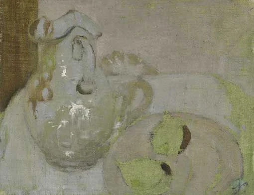
    First the painting in question. I agree with Patricia Read that the drawing of the jug handle and the ellipse of the mouth of the vase are both wrong.  Evidence of his other paintings strongly suggests this is not something he would do - even when he is painting in a less precise style.


    and to give a sense of size....


    Next other pears he painted

    Pears (1938) by William Nicholson
    oil on panel
    Leeds Art Gallery, Leeds Museums and Galleries

    then another sort of fruit - an apple

    Still Life, apple and knives

    Then other jugs with handles...

    First the glass jug in Canada

    Glass and Fruit (1938) by Sir William Nicholson (1938)
    (also known as Glass Jug and Fruit)
    National Gallery of Canada - Ottawa
    Next a glass jug on its own

    The trailed jug (Painted in 1917) by Sir William Nicholson (1872-1949)
    with inscription 'Painted August 7th 1917, at 11 Regent Terrace Edinburth,
    by William Nicholson when on a visit to Arthur Kay.
    The glass is a trailed jug in the collection of A.K., Arthur Kay, 8/7/17' (on the reverse)
    oil on canvas laid on board
    13¼ x 10¼ in. (33.7 x 26 cm.)
    Another glass jug

    Red Roses (1903) by Sir William Nicholson
    Painting - oil on panel | Private collection
    signed with initial and dated 1903
    Sold at Sotheby's October 24, 2005
    Though dated 1903, the subject matter, handling and palate of Red Roses clearly places it towards the end of Nicholson's painting career. The description in Browse of Red Roses in Glass Jug undoubtedly refers to the present work but the dating remains incongruous. No clear explanation exists for the signature and date given by the artist.

    Another (opaque) jug viewed from behind - at a similar angle

    Vase and Bowl on the Table by Sir William Nicholson
    Oil on board, Signed. 60X53 cm
    Lord Israel sieff
    and another - he really seemed to like looking at a jug from the most difficult angle. The year is comparable if the train timetable is to be believed.

    Pink still life with jug (1936) by William Nicholson
    oil on panel, Height: 35.5 cm (13.98 in.), Width: 43 cm (16.93 in.)
    Birmingham Museum and Art Gallery 
    This one looks as if might be the same glass jug - just treated rather differently - although painted round about the same time

    Sunflowers (1933) signed 'Nicholson.' (lower right),
    signed with initials and inscribed 'Sunflowers/WN' (on the reverse)
    oil on panel 16 x 12½ in. (40.8 x 31.7 cm.)
    Painted circa 1933. | Sold by Christie's 16 November 2011
    This is a different sort of jug

    Sunflower in ivory vase, a Nocturne
    Another sort of jug

    Pink Lustre with Carnations (also known as The Lustre Jug) (1936)
     by Sir William Nicholson
    Painting - oil on panel
    Private collection
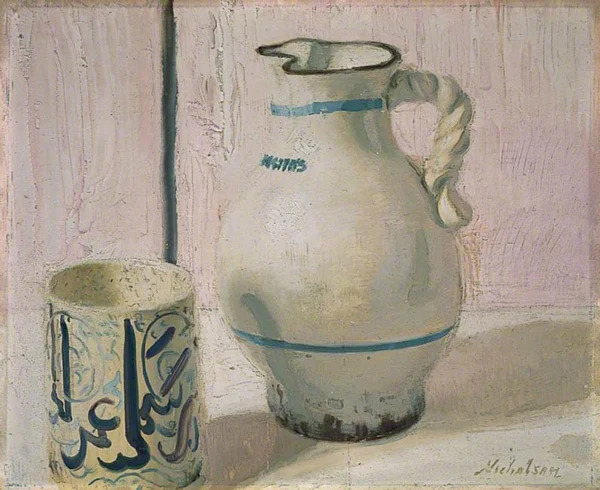
    You may have noticed by now that he paints ellipses which are pretty near perfect - and his handles are very fine.

    Hence the concern expressed by Patrica Read over the painting on Fake or Fortune.......

    The Lowestoft Bowl (1911) by William Nicholson
    Tate
    I rest my case....

    UPDATE: I was sent this photo of a bubble glass jug - the lipe of which seems to make more sense of the Canadian painting. I've reviewed "glass bubble jug" as a query on Google Images - and there are an awful lot of them - and some have the curious wavy top lip.

    a glass bubble jug

    Reference


    My first blog post last weekend - Art on Television #1: Fake or Fortune returns

    William Nicholson

    Lillian Browse