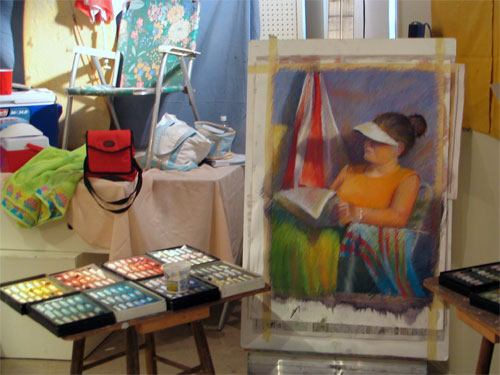
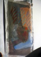
Tuesday, October 31, 2006

The Take-it (Gloucester) Easel

At the Sally Strand pastel workshop, both Rosalie Nadeau and her son were using a Take-It Easel - a version of a Gloucester Easel

I'd never seen an easel like this before and, at first, thought they looked simply enormous. However, as Rosalie showed me, her set-up meant that she had a nice stable ledge just below her artboard on which to place a nice big box of pastels and consequently had absolutely no need at all to have a taboret for her pastels next to a normal studio easel. Everything else hangs off the easel at one point or another.

There are some much better pictures of the easel on the Takeit Easel website., which also has a great annotated diagram of all the different parts of the easel.

Major advantages for plein air painters is its scope to accommodate extremely large canvases or art boards easily - for painters who are sitting or standing. The span of the legs and their adjustability means that it's easy to set up on uneven ground. I was also very impressed by how light the easel was and how easy it was to pick up - laden with pastel painting and an open pastels box - and move around.

The story behind the easel is that Rosalie bought the very last one made by the man who had taken over making them for Emil Gruppe and the Gloucester School of Painting. The easel was originally called the Anderson easel and originates in northern Europe. Her family now have a company which make them and ship them all over the USA and the rest of the world.

Rosalie has studied with Lois Griffel and her work has been included in a couple of books about pastel painting. She produces very colourful pastels, some of which you can see here, although I think I'm right in saying her first love is landscape painting.

Links:
Technorati tags: , ,


Monday, October 30, 2006

The best ever workshop - pastel painting with Sally Strand

Beach Lady
Unison Pastels on full sheet of Saunders Waterford watercolour NOT 140lb
copyright Katherine Tyrrell (set-up by Sally Strand)

Last month, I fulfilled a long held ambition and took a pastel workshop on "The Color of Light" with Sally Strand. The workshop was organised and hosted by the Pastel Painters' Society of Cape Cod.

Without a doubt, it was the best workshop I've ever done (in any medium) in terms of subject matter, the nature of the challenges presented and the teaching/learning process. Plus I got to see how Sally develops her own pastels - on watercolour paper - and gets her great sense of light in her paintings - which is extremely interesting! See her portfolio on her website to see what I mean

It was probably the most ambitious workshop (in terms of what was expected of the students) of any I've ever done. It was also extremely successful and Sally as a tutor was applauded by all the pastel artists who took it. Sally commented that we were a fairly advanced set of students - and as most were members of the Pastel Painters of Cape Cod and a number were professional / semi-professional artists that's maybe not so surprising. For me, it was also really wonderful to work with other people doing great work of their own.

One of the reasons for delaying this post was to sort out what I could post and do it justice. Here are some of the highlights of the workshop for me:
  • Five days of solid hard work - 9.00am to 4.30pm each day - plus lots of input from Sally as tutor - that's how I like it!
  • Sally provided six different still life set-ups - colour-co-ordinated with different shapes / volumes / types of surface and then personally set up the lighting for each. We had three in each room which meant that between 2-3 artists each had a very good view of at least one of the still life set-ups. It makes such a difference when the tutor goes to the trouble of providing a very good set of still life objects which support the tuition objectives for that day. These were the best set-ups I've ever worked on by a very long way.
  • We were also provided with four different models to draw - from life (two models, one for each room on two separate days). Again Sally paid meticulous attention to all the model set-ups and a good part of the responsibility for what workshop participants achieved is due to that level of attention. Everybody had good sight of the model and could work at an easel. I should highlight that Sally does not teach portraiture and indeed is not looking to help workshop participants develop a model's facial features - she teaches how to design and paint people in a moment of time in a setting
  • Seeing how Sally makes very extensive use of a sketchbook for developing her work - sketching / composition try-outs / practical matters
  • Sally's emphasis on the use of thumbnails to determine both design and basic value pattern. She demonstrated and then provided us all with pointers as we all tried her method. Saying this is one thing - getting advice from Sally herself made all the difference as I struggled to reduce to just three values. It's very difficult but I can now appreciate the difference it makes - and how to do it!
  • Her constant and particular emphasis on:
    • the huge importance of values when painting light
    • simplification of subject matter
    • designing a composition
    • the importance/impact of the crop
    • the placement of certain values/colours - and locating the darkest dark and the lightest light right at the start of making pastel marks
  • learning how she works with lighting - in relation to her subject matter and on her own work. She works in daylight and never shines a light on her paper as she finds it distorts her continuous assessment of values.
  • practical matters to do with working with pastels on watercolour paper. I was amazed at the impact of working with a watercolour underpainting and how much pastel I could get on my paper without it being a problem. See below for an example of Sally's initial underpainting and then first marks - and then one the later demos with a model. None are finished but you can see the impact of her approach from the start.......
    • underpainting on watercolour paper - very simple
    • first pastel marks - setting the baseline for value and colour with clear value pattern and lightest light and darkest dark indicated
    • part-completed pastels of both still life and life model - her marks are still very large and broad

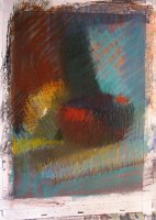
Still life demo and part-completed life model - on a 1/4 sheet of watercolour paper
Set-up and all images copyright Sally Strand

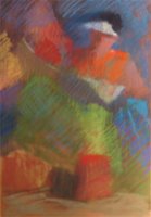
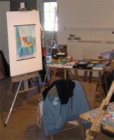
My own work is still somewhere between the USA and home so I'm having to rely on less than perfect photography to show you some of it. The image at the top is my set-up for the first model and it more or less completed. Before starting this we all worked in our sketchbooks to identify and evaluate and then develop alternative designs and crops for this subject. This is something I always do anyway - although my thumbnails are a lot bigger than most. I'd never simplified to just 3 values before though and found that a real struggle at first.

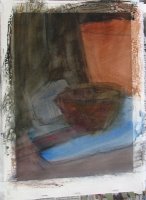
I made the mistake of going too chalky on one we worked on the last day (see below) - this one looked much better about two thirds of the way through. We also realised that my crop left the eye being drawn by the yellow t shirt and it would have been better if that had been a different colour.

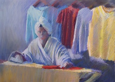
Sally Strand workshop - the colour of white
Unison Pastels on Wallis paper
Copyright

I very much recommend doing a Sally Strand pastel workshop. Much of what she teaches applies to art generally rather than just the medium of pastel. Whether you are an aspiring or advanced pastel artist, if Sally ever does a workshop within scope of your own personal preparedness to travel then do try and get to it - you truly won't regret it. I've waited many years to do one and was so glad I travelled across the pond to do it.

As one fellow (semi-professional) artist put it "I've learned so much that I feel like tearing up everything I've done so far and starting again!".

The upcoming events page on Sally's website is the place to go for details of her schedule of workshops. You can also register for her newsletter which provides information about future such events and exhibitions.

Links:
Technorati tags: , , , , , , , ,

Sunday, October 29, 2006

How to annoy me with your website - an update

Earlier this month I explained about how you can annoy me with your website - and then invited people to comment and suggest what else they find annoying. Here's a brief summary of the results of that dialogue.

Pet peeves of other people (with my comments in italics) include:

GENERIC BASIC WEB DESIGN MATTERS
  • things that make it difficult for us to read:
    • busy backgrounds
    • black backgrounds
    • font and background colours which don't work well together (you can't beat black text on a white/very pale background)
    • fonts which are too small
    • fonts which are too big
  • things that make it difficult for us to get around the site
    • web pages that lack consistency and make us work harder at understanding where the basics are (eg menu and return home buttons have varying locations)
    • pages we can't get out of ('back' button does not work)
    • impossible to find out how to get back to 'home'
    • websites which open up endless new pages for every bit of the site we visit
  • difficult to reference - and bookmark because the site is designed so that there is no html address for a specific page and you cannot link to a specific page and (so what's the chance anybody is going to come back?)
  • 'flash git' mentality
    • anything which assumes we have all the time in the world :
      • a front page which requires a plug-in that (we won't have it)
      • flash intro pages (cut to the chase - show us how to get in fast)
      • nothing that tells us how get into your site (guess what - we don't bother to find out!)
    • music playing - we like to choose our own thank you very much and if we really don't like yours we leave very fast!
    • pages which morph / dissolve (we get all worried and think we've got a virus!)
  • difficult navigation - inconsistent design between pages - work out one design and stick to it so we can navigate easily. (Use of CSS - see below - makes this a lot easier)
ART MATTERS
  • you fail to say what medium you work in (not a problem you'll have with mine I hasten to add - see www.pastelsandpencils.com ! )
  • difficult to navigate
    • unable to switch from larger image to rest without going back to the thumbnails - 'next' button required
    • close the image - and close the link to the website (well that was quick visit - and we're unlikely to return!)
  • poor quality images eg:
    • poor photography
    • image made too small (instead of using less than 72 dpi - latters makes images easy to see on the web without making them easy to reproduce)
  • lack of dimensions for piece
  • lack of prices
Now not everybody will agree with all the above - but it's food for thought isn't it?

Web design from scratch is a website which I think provides some good summaries of things you need to think about. You don't need to buy their services to benefit from their good advice. Here's a taster
I'm certainly not preaching from a position of strength on all matters and I think I might just give myself a refresher!

Links:

Saturday, October 28, 2006

A first hand account - or should that be 'elbow'?

As it's the weekend, I'm being lazy – it's allowed ;) – and posting a story first published on The Huffington Post last week. I'm sure many of you will have heard by now about the man who had just sold his Picasso painting "Le Reve" for the sum of $139 million when he put his elbow through it just before he shipped it off to its new owner - but maybe you've only read second or third hand accounts?

Nora Ephron was in the room when it happened and has written about it here.

If you've ever done something very, very silly and ruined a painting - just console yourself with the fact that it could have been a whole lot worse!

Links:

Technorati tags: art, Picasso, painting

Friday, October 27, 2006

Café Croquis


Pen and sepia ink sketches in a Moleskine sketchbook, October 2006
copyright Katherine Tyrrell

I learned this month that "croquis" is the french for "sketch" and that "cahier de croquis" is a sketchbook. I run out of titles for these pen and ink drawings that I do all the time when eating in cafes - hence the explanation! ;) These quick sketches were done while sitting in the V&A Cafe in London while attending the two courses I did last week.

I find they're great for not only practising my drawing and "keeping my eye in" (which I find is vital) but they're also good for trying to find compositions in my everyday surroundings. Not that I eat in a cafe every day but you know what I mean!

And just for fun - try putting "cahier de croquis" into your search engine and seeing what you come up with.

PS I know cafe has an accent on the 'e' - but Blogger seems to be having a love/hate relationship with that accent!

Technorati tags: , , , , , , ,

Thursday, October 26, 2006

David Hockney and Shirley - sharing art and sketchbooks

"What an artist is trying to do for people is bring them closer to something, because of course art is about sharing; you wouldn't be an artist unless you wanted to share an experience, a thought" David Hockney / David Hockney Portraits
This quote comes from the new book produced to accompany the David Hockney Portraits exhibition at the National Portrait Gallery - and is on the back of the sleeve for my new DVD of David Hockney sketchbooks - of which more later......

Yesterday I met Shirley (from New York) of "Shirley sketches London". We had a simply wonderful time visiting the David Hockney Portraits Exhibition at the National Portrait Gallery, admiring all his wonderfully simple line drawings, the depth of colour he gets with what are described as his "coloured crayon" drawings (my original inspiration for taking up coloured pencils) and the bravado of somebody who paints very large portraits in watercolour without any preparatory drawing on the paper or studies. I've seen a number of the drawings before at the Drawing Retrospective in 1995 and some of the paintings at Royal Academy Summer Exhibitions - but have certainly never seen anything like the quantity of work in this exhibition which is HUGE!

I was particularly struck, for the very first time, how very similar some of Celia Birtwell's features are to his mother's and it made me wonder what she looked like when she was young and whether in fact they did have a similar appearance at the same age. I was also charmed yet again by how well the double portraits work and was commenting on this to Shirley when we noticed that the note next to his latest said that the painting only worked when Hockney had both sitters in the room at the same time!

The exhibition is still only two weeks old and the gallery was very crowded. I think I'll return for another visit well before Christmas. Judging by the numbers, if anybody is thinking of visiting I personally would not wait until the Christmas break if you don't like crowds and do want to be able to see the work - yesterday was the top end of tolerable for me.

We then had afternoon tea/coffee and swopped our sketchbooks - it's always such a great thrill to see how somebody else's drawings look like in their sketchbook. I got to see her new London 2 sketchbook and what she's done this week so far - and can I tell you this lady is simply prodigious! A new sketch everyday and often two or three. Lovely simple clean line drawings and watercolour in a really lovely brand of sketchbook (details on the original post - link below). She got to see my New England sketchbook with sketches from four states which is currently being transferred to my other blog (I've got as far as Maine!)
"Hockney sketches constantly and for the him the acts of looking and drawing are almost indistinguishable. It is as if the movement of his hand over paper is a natural extension of his way of seeing" Note introducing the exhibit of Hockney's sketchbooks
Now for the good news and the bad news.
  • Good news for Hockneyphiles and sketchbook 'collectors' - one of the products associated with the exhibition is a DVD of 15 of the 25 Hockney's sketchbooks produced between May 2002 and June 2003. The sketches are all produced at exactly the same size as they are in the sketchbooks.
  • and the bad news - this is not one of the listed products which you can order online from the NPG website (see David Hockney exhibition books and posters and prints). Do not read on if you think you might want one badly! However if any die-hard Hockney fans who already have my e-mail address want a copy I'm sure we can come up with a solution! ;)
This morning I got to see the new DVD. I had been thinking that £19.99 was an outrageous price to pay until I realised how long I had spent looking at all fifteen sketchbooks. These particular sketchbooks cover trips to Iceland and Italy, Lucien Freud's studio, the Matisse exhibition at the Tate (where he drew the pattern on the floor!), hotel rooms, the minutiae of studio life and everyday objects and portraits of people in his life in London and Los Angeles.......and a lot more including the insides of aircraft. The babies and small children were a revelation - I'm left wondering who exactly are Scarlett, Isabella and baby Matilda!

He draws in sepia ink and sometimes adds in black and occasionally red, blue and green. Towards the end of the year he starts using watercolours as well - sometimes drawing in one colour and sometimes in colour.

His drawings typically place an emphasis on big shapes and clean lines - and often provide interesting compositional crops of both landscapes and portraits. The landscape format of a double page spread in his sketchbooks (4.5" x 12") has an interesting impact on the choice of crop and compositional issues in ones where composition has been deliberate rather than accidental.

He sees and documents pattern everywhere he goes from tablecloths and cushions to striations within the volcanic landscape of Iceland. There are some fabulous drawings of enormous waterfalls.

I also really like the way he is so good at getting an expression on somebody's face. He's very clear that he draws well only when he's drawing people he knows (and will not do commissions as a result). What's evident from these sketchbooks is just how many times his friends and family are drawn on a day to day basis...........which I guess is a prompt for the rest of us to keep at it with our drawings of our own nearest and dearest..........

[Update regarding the DVD - "David Hockney : Fifteen Sketchbooks 2002-2003"

This is for all those people who keep contacting me to ask me how they can get hold of the DVD sketchbook. Apparently the NPG is now saying that they have sold out of the sketchbook as well as the Los Angeles Museum. It is not listed on the David Hockney website although that does link to books about him.

I recommend using the contact form on the Hockney website ( www.hockneypictures.com ) to contact the webmaster and ask for further information about how the DVD can be obtained. I've already used it to feedback about the number of people asking for the DVD and requesting that they put something on the website saying how to get hold of it.

My suspicion is that this DVD initiative was maybe something of a pilot and not enough have been pressed. If you want them to produce some more you need to say so!]

Links:
Technorati tags: , , ,, , , , , ,

Wednesday, October 25, 2006

Pemaquid Point Light, Maine

Bottom Up - Pemaquid Light, Maine
10" x 7", coloured pencil on Arches HP
copyright Katherine Tyrrell

On the inside cover of the "Dorling Kindersley Eyewitness Travel Guide to New England" is a stunning photo of a lighthouse standing above a very interesting geological formation of rocks. As somebody with quite an interest in geology, I'll travel a long way for a good rock formation! It took me ages to work out where it was and, when I did, I knew I'd have to try and fit it into my recent visit to New England so I could see it for myself. Hence my visit, last month, to the lighthouse and rocks at Pemaquid Point in Maine - which is the subject of a separate post on my Travel Sketchbook blog (Friday 22 September: Pemaquid Point Light from top to bottom).

This is the sketch I did while in Maine - sat on rocks with waves crashing behind me! (You can see photos of just how close these were on my sketchbook blog post).

When I got back I fiddled around with the reference photos I took and in the end decided that I liked the portrait format best - looking straight up the outcrop of pegmatite - the light rock which stands above the platform of darker rocks. But there again I may just have another go and try it in landscape again!

This drawing has been a real challenge and I'm not sure it's one I'm yet happy with. It's been very difficult to get the rocks to look like what they are - which is quite important to me as the area has some geological significance in terms of igneous and metamorphic rocks. I wanted to make it clear that the pegmatite (the light coloured rock) had not been eroded at the same rate as the metamorphic layers of former sedimentary rocks which have been contorted so they lie on their side - and subsequently eroded by the sea - hence all the lines. I tried for a broad impression with the sketch and knew I'd need to use the ref photos for developing the sketch. A further visual twist is added through the fact that some of the rocks are still wet (and look darker or have water in them) while others are completely dry - and are quietly baking under the sun!

The sky has also been a bit of a challenge as although the sky really was the colour in the sketch it somehow doesn't look real - so I changed it a bit and I'm not sure I haven't added in a bit too much ultramarine.

So I think I might just put this one down to being a bit of a learning process and I now need to think about what to do when I try again!

Links:
Technorati tags: , , , , , , , , , , ,

Tuesday, October 24, 2006

12 quick lessons in plein air painting


Teaching Pack - slide 1 - "The same location on different days"
copyright Jon Hall

Marion Boddy Evans has highlighted The Limner's Contract - 12 months of a plein air painting a day of the Durham Heritage Coast by Jon Hall - in her Painting.About.com Blog today. I'm really pleased about this as I think his work is terrific which is why I wrote about this very large and significant project on this blog last week. I hope his work gets much more exposure on the internet.

Marion has also highlighted one aspect of Jon's site which I completely missed! So today I'm going to remedy that and refer you all to his excellent teacher's pack of 12 quick lessons on painting plein air - with photos of his work. [Later: I've just got Jon's permission to add one of these as an image to this blog post - see above for an example. Note the copyright and do not copy without his written permission]

You can view either the individual slides or watch the slideshow of some excellent advice about plein air painting. And if you take a look here - you'll see Jon and his plein air students at work on a paintout of the cliff tops of the Durham coastline.

Jon's lessons remind me a bit of Charles Sovek's approach to teaching - condense the key points on to one sheet and illustrate with relevant images. But it also looks to me like Jon has the beginnings of an excellent book there.........I hope to see more.

Links:
Technorati tags: , , , , , , , , , ,

Monday, October 23, 2006

The Path to Nauset Beach #2

The Path to Nauset Beach #2
8" x 10" coloured pencil on Strathmore Bristol Vellum
copyright Katherine Tyrrell

This my second attempt to work up a sketch of the boardwalk path down to Nauset Beach which I did last month when I was in Cape Cod.

You can see a copy of my "Travels with a Sketchbook" blog entry for the day I made the sketch here "Sunday 10th September: Cape Cod National Foreshore".

This is the original sketch. My note says that it's timed at 5.50pm and, as I indicate in the blog post
The early evening light was giving a marvellous colour to the grasses and beach roses and the shadow of the fence was making interesting coloured patterns on the path and in the grasses.
In addition I also noted that
On early Sunday evening, the sea was looking an incredible navy blue colour and I wondered whether this was anything to do with Hurricane Ernesto which had been winding down and moving north the previous week. Nauset Beach has suffered very badly from coastal erosion in the past particularly after heavy seas associated with hurricanes. According to the website of the Nauset Light Preservation Society.....

"...the average natural erosion rate on the Atlantic Ocean side of Cape Cod had been 3.8 feet a year. However, in the area of Nauset Light, the average for the period 1987-1994 has accelerated to 5.8 feet. There may be little or no erosion in some years, and more than fifteen feet in other years."
The drawing was developed from the sketch and photographs I took at the time - both sitting and standing - which basically means the perspective is a bit more accurate in this drawing. Photography has a part to play in recording the way our landscape changes, but in my opinion, drawing and painting the ever changing landscape are also equally important. I wondered what this view will look like if I sketch it again in 10 years time.......

I used Strathmore Bristol Vellum 300 series 100lb for the drawing, which I've not used before. I found it was less smooth and had more of a tooth than the HP papers that I'm used to using (Arches, Fabriano and Saunders Waterford). Not exactly like NOT paper - maybe inbetween NOT and HP. I developed the lighter patches on the grasses through repeated layering coupled with drawing with my battery powered eraser.

At the moment, I think this one will be going back across the Atlantic and will be for sale at the exhibition that Fine Line Artists are having in Keene, New Hampshire in December.

I'm also looking forward to having another go at this one in pastel!

Links:
Technorati tags: , , , , , , , , , , , ,

Sunday, October 22, 2006

A Renaissance Master Class


sample ink drawings with handmade pens made of (left) goose quill and (right) reed
copyright Katherine Tyrrell

I'm now going to make all the art history buffs very jealous - however this is a very long post so bear with me!

On Friday I participated in a Renaissance Masterclass at the Victoria and Albert Museum in Kensington, London. This was another event associated with the Da Vinci exhibition which I have already written on this blog (on the 7th and 18th October).

The masterclass tutor, Philippa Abrahams, gave us an overview of the materials and techniques used by Renaissance artists including the ingredients of paint and the preparation of a panel. In the afternoon we made quill and reed pens and a silverpoint stylus - and then drew with them. Philippa studied at the Slade and the Courtauld and works as a conservator and an artist as well as being a tutor in matters relating to art history and her specialised area which is historical pigments and techniques. She's been instrumental in restoring a Verrochio - in egg tempera on a gesso coated wooden panel. I was suitably impressed! She is a great believer in developing understanding about how paintings were developed by actually gaining knowledge of the media, supports and instruments used to make the marks - and how they all behave in reality rather than in principle.

Media

Artists and their workshops in renaissance times had to be expert at the preparation of paint as well knowledgeable and skilled at what you should/could do with it. We were introduced to all the media used in renaissance times - starting with the sources of all the organic and inorganic pigments and injunctions not to drop the jar of powdered lapis lazuli (weight for weight it's double the price of gold) and to be very careful not to touch the ones which were toxic!!!

The processes used for extracting the pigment were explained and the behaviour of the different pigments was methods of painting (eg tempera; glazing) were touched upon and/or demonstrated. Apparently, nowadays, the main supplier of historical pigments is a German gentlemen called Kremer - who has a website and supplies through arrangements with stores in Germany and distributors in various countries. AP Fitzpatrick in Bethnal Green is the UK distributor.

The sources of different types of ink (eg sepia and bistre) were also examined. Philippa made ink from ox galls - which I now have sitting in front of me! It's a lovely blue-black colour.

Supports

The preference and choice of different geographical areas for different supports was discussed. I now understand much better why artists in some countries and towns chose wood (eg poplar or oak) rather than canvas and vice versa. The practice of a first stretch of a canvas was also demonstrated - and the scope which this gives for adjusting the size and shape of the finished canvas. We also considered the composition and properties of gesso on different types of surfaces - wood, canvas and copper.

Drawing instruments

We first tried drawing with red and black chalk - the substances used to make many of the drawings from renaissance times (and earlier and later periods). They were not unlike having a small flint version of a conte crayon. A sharp edge would produce a fine line. Stroking the chalk worked pretty much like pastels of medium hardness - but using a feather it was much easier to blend the marks made with the chalk to get an even or gradated value.

Then we made drawing instruments starting with a quill pen (from a goose quill - fallen not plucked); then a reed pen and finally a silverpoint stylus. I drew with each of these and found that:
  • the quill pen (drawing top left) provided a nib and a line which was quite flexible
  • the reed pen ( drawing top right) was stiffer - but I liked it and drew easily with it. found that it kept its point stable and usable for longer than the reed pen. However this is as likely to be a product of my skills at cutting!
The Regia website provides illustrations of how to cut a quill pen (I'm expecting to see Jeanette get cracking on this!). Page 1 provides broad guidelines and page 2 shows you how to prepare the quill pen.

The final drawing instrument we made by hand was a silverpoint stylus. I found drawing with silverpoint to be quite easy - but I'm very used to drawing and hatching. I did the sketch (below left) in a couple of minutes. The issue with silverpoint is that it is rather like drawing with an 'H' pencil - the line is quite feint. I enhanced the drawing (below right) so you could see what I did with the sharpened tip of silver wire - which is what silverpoint is. Drawings must also be done on a painted or coated ground and not on paper as otherwise the silver will not react and show up.


Unfinished Silverpoint Drawing
copyright Katherine Tyrrell

Philippa recommended:
"Drawing on the combined expertise of curators, conservators and scientists, it brings together a wealth of information about artists' materials, working practices and techniques."
More next month - when I return to do a two day course in egg tempera painting!

Links:
These are mine and not ones supplied by Philippa - except where indicated above.
Technorati tags: , , , , , ,

Friday, October 20, 2006

Autumn at Sissinghurst

Autumn at Sissinghurst
9" x 12" coloured pencil on Saunders Waterford HP
copyright Katherine Tyrrell

Sissinghurst Castle in Kent closes its house and gardens to the public a week on Sunday and does not reopen until March. I visited the garden late on Monday afternoon when it was very quiet and sketched the sixteenth century tower, in which Vita Sackville West had her writing room, and the grounds from the bank beyond the moat at the back of the gardens.

My earlier post in August details the background to the gardens and in this post you can see a small photo at the end which is the view I was drawing. I still can't decide what is the best crop for this view as one either has a picture with two halves or a picture with very heavy foliage on both side - neither of which is ideal. So this drawing really represents compromise #1 with just a smidgen of a hint of the long Moat Walk on the extreme left and rather more of the orchard in the right half.

Having done a 'not very good' sketch I decided to exercise some artistic license and pushed the autumn colours a bit when I got back. However, I think I've probably introduced rather too many different colours as this was a total nightmare to scan and then colour adjust so that it reads right. I've also got a bit of feeling that my old problem with verticals has come back to haunt this one. There seems to be a distinct lurch to the right going on - which is possibly partly due to having 'eyeballed' the drawing of the tower while sat on the grass on a slope with my Saunders Waterford HP block on my knees. Sissinghurst can be very limiting as to set-ups because they won't allow a lot of things (easels/tripods/chairs) into the gardens because of health and safety concerns as the gardens are so popular. Overall though, it comes pretty close to what I saw around 5.00pm on Monday afternoon.

I then had a pot of tea in the barn restaurant and did another quick sketch of the fields at the back of the barns area. It had three distinct zones - lush green grass (and nettles) in the foreground, bare harvested fields in the middle ground and dusky green blue woods in the distance. As is often the way when you do something really quickly this one came together very quickly and looks like it might deserve being revisited in order to develop a more finished work.

Sissinghurst fields
8" x 10" pen and sepia ink and coloured pencil in a Moleskine sketchbook
copyright Katherine Tyrrell

Links:
Technorati tags: , , , , , , , , ,

Thursday, October 19, 2006

The Limner's Contract


Seaham Looking Northeast (Day 78, November 17th 2003)
Today I was on the cliff top and was near the edge. The upper half of the cliffs are made from bedded sand from a glacial lake left about 9,000 years ago. I kept running away from the easel. I thought the cliff was moving. I would carefully walk back and start painting again. I thought I should tie myself to a fence post.
copyright Jon Hall

"What's a 'Limner'?" I hear you asking. Well according to a dictionary it's a middle English term meaning to describe or depict by painting or drawing.

Jon Hall's "Limner's Contract" was to paint every day for a year between 1st September 2003 and 31st August 2004. After the exhibition held at the end of the contract, he has just completed a website which documents every part of this project.

Unlike some of the recent painting a day projects that people have been undertaking, Jon's contract with himself wasn't a question of painting a small still life indoors when the weather outside wasn't great. As the website indicates..........
This is a contract to sketch every day from life on location for a year along a section of England’s Heritage Coastline of Durham. This part of the project involves the coastline of Durham and several miles inland. Every sketch is completed on site. The project has been several years in the making. Drawing on a lifetime of experience, painting from life on location every day for a year. It is a journey with one goal, to complete the contract.
Jon calls his work "sketches" in the same sense that Constable used the term.

You can see all 366+ of his "sketch" paintings - each painted in acrylics on boards approx 15" x 25"together with Jon's comments and photos of Jon's easel set-up in front of the subject on his website Suncage. It has one page which he has just published specifically devoted to being the introduction to each of the months.

Some classic quotes on the website include the following.......
A pal of mine suggested I take a dictaphone and record the more rarified thoughts and when I played it back it sounded false and kind of forced except for all the interruptions where I'm cursing " the £^%$@ wind and the &^%£$ rain.
Painting with acrylics in the rain has its benefits. One benefit is that your palette doesn’t dry out.
The thing is when you are standing still for a while sketching the cold gets right into you in a way that doesn’t bother you when you’re walking. But It’s not so easy to walk and sketch at the same time.
Those who paint plein air on a regular basis are bowled over by the quality of Jon's paintings and his fortitude to paint from life on location every day for a year. An observer comments.....
Standing in the gallery, one is a virtual tourist and scarcely imagines how it actually feels to paint on location. We see countless canvasses that were created right there in front of the subjects they painted....there will be a special room in heaven for artists who painted on location. If you have never done it, it may be hard to imagine. What wilderness hiking is to tourism, location painting is to art.
Clothing for this particular version of art combined with wilderness hiking and the more inclement weather involved wearing the following (from the feet up):
  • waterproof breathable boots (with insoles)
  • a base layer of thermal underwear under everyday outdoor clothing.
  • cold days - an all in one suit on top (the kind that is used for work in cold stores) with a high neck covering and a hood to keep the body heat in when not moving around.
  • wet or windy weather - loose fitting lightweight breathable waterproofs on top
  • thermal waterproof gloves
  • a warm hat (even when the weather is mild)
  • windy and/or standing on beaches - earplugs. The constant sound of the wind roaring in the ears can be damaging after a while.
As Jon points out, it's best to dip in and out of the section of the website devoted to the paintings because if you took a minute to look at each work you'd spend more than six hours looking at the whole body of work completed during the year!

Jon's new website page devoted to the project had only been up for a day before he got a serious offer for the whole project. I gather that he's pondering it. Having painted it for himself I wonder whether he could ever really bear to part with these paintings?

Castle Eden Looking West (Day Three Hundred and Sixty Six August 31st 2004)
The Last Day........
I looked into the afternoon light and sketched. I’ve learned so much from this project. I have mixed feeling about this last day. I know now that I can go out anytime of the year sketching in any conditions. I hope that this contract with myself is the start of a series. I hope that I have encouraged others to consider doing some outdoor sketching and if anyone would like to then please contact me. Thank You for looking at this introduction to the contract. I hope you enjoyed seeing what it is like to go limnering outdoors.

copyright Jon Hall


Note: The Heritage Coast in Durham is the only place in the country where a magnesian limestone plateau emerges both close to the surface and close to the sea. It gives rise to a unique habitat - you can read more about it here.

Links:
Technorati tags: , , , , ,

Wednesday, October 18, 2006

Drawing inspiration from da Vinci

I attended a Life Drawing Class yesterday - focusing on proportion. This was part of a series of events being run by the Victoria and Albert Museum alongside its exhibition of Leonardo da Vinci drawings and notebooks which I wrote about earlier this month.

(Warning - this post includes life drawings of an unclothed male model).

The class fee included entrance to the exhibition - and the class started with a quick visit to see the drawings about proportion. Yet again I marvelled at how he could draw such tiny figures in ink and at what good condition most of the work was in despite being fifteenth century. Interestingly one of sheets of small figures done in black chalk had virtually disapeared - except for the ones he had inked in. Moral of the story - draw in ink more!

The animations (which you can see online) are very impressive when seen cinema style projected on to the wall above the exhibition cases.

The class had an excellent male model who used a pole to take and hold excellent positions which revealed tension, muscular structure, sinew and veins.

Class started with five minute quickie drawings - to get used to both drawing this particular model and also to try or practice drawing with different materials before choosing which media to use when drawing the long pose. As the drawings are on a middle tone paper I've tweaked the contrast ever so slightly so you can see them more clearly.

First (see left) pencil - just using line, then pencil but only drawing tone (and no line).

Followed by charcoal and white conte, then brown/red conte and finally a seven minute drawing drawing with a brush using indian ink and adding white conte (see above).

The model then demonstrated options for the long pose and the class then chose one which was rather reminiscent of da Vinci's Vitruvian man. He turned side on to the class so that half of us had the rear view and half had the frontal perspective with just a few having a side view. His capacity to stand for long periods while using the poles was phenomenal.

I first drew in a rough shape in mechanical pencil and then developed this long pose sketch using conte pastels - with the odd bit of coloured pencil. I haven't used conte in ages and had forgotten how satisfying it can be to draw with - especially when sharpened. I finished this with time to spare so did another drawing - but forgot to photograph that one!

Links:
Technorati tags: , , , , , , , , ,

Tuesday, October 17, 2006

Prismacolor Premier Lightfast Colored Pencils

Following on the post on Monday, it would be really great to see a colour chart (preferably as a colour wheel) for the full set of 48 colours in the new Prismacolor Premier Lightfast Pencils - named below with their lightfast prefix of LF and color number. They also come in sets of 24 and 12 and you can see which colours are in which sets here.

Key features of the lightfast range are that they all conform to the highest ASTM approved lightfast ratings (I or II) of the ASTM standard (D 6901) for lightfastness. This means that they should all have an excellent resistance to the fading effects of prolonged exposure to light. It goes without saying that they are also artists' quality colored pencils with quality pigments for rich color saturation and enable a smooth color laydown for superior blending and shading.

Sanford maintain that their pencils have thick cores which resist breakage, however experience to date is that their pencils still have cores which break much more often than those made by other manufacturers.

Here's a really ace independent review of the first 24 shades (only) in the new lightfast range by Bet Borgeson who is a very long standing coloured pencil user as well as being a well known artist and author in the coloured pencil world. She concludes

"I'm enormously pleased to have all these new lightfast colors, and that they behave like the Prismacolors I've always used and liked." Bet Borgeson October 2005
In addition, Bet Borgeson also sets out her own method for testing lightfastness which anybody can easily try for themselves .

A further set of 24 lightfast colours were introduced by Prismacolor in 2006 and the full set of 48 colours as of 2006 now comprise:

Canary Yellow LF116
Gamboge LF203
Eggshell LF140
Ivory Oxide LF114
Beige LF197
Light Peach LF139
Orange Ochre LF142
Cadmium Orange Hue LF118
Rose Peach LF127
Carmine Red LF126
Cadmium Red LF124
Permanent Red LF122
Madder Lake LF129
English Red Light LF145
Thio Violet LF195
Light Oxide Red LF285
Manganese Violet LF209
Cold Grey 2 LF2060
Blue Silver LF287
Pale Blue LF224
Cobalt Blue Hue LF133
Dioxazine Purple Hue LF132
Indanthrone Blue LF208
Prussian Blue LF101
Iron Blue LF222
Cerulean Blue LF103
Cobalt Turquoise LF105
Phthalo Green LF108
Titanate Green Hue LF110
Grey Green Light LF289
Phthalo Yellow Green Hue LF112
Sap Green Light LF120
Prussian Green LF109
Cinnabar Yellow LF189
Lemon Yellow LF115
Burnt Ochre LF143
Terra Rose LF137
Brown Ochre LF141
Raw Umber LF146
Van Dyke Brown LF147
Sepia Oxide LF148
Neutral Grey 2 LF2051
Neutral Grey 5 LF2054
Cool Grey 50% LF2063
Gold Metal LF150
Silver Metal LF149
White LF138
Black LF135

I've not yet seen these on sale in the UK and I guess we're not likely to either. However USA online art suppliers do ship to the UK. Just remember to check the mailing costs and the total cost before placing an order.

Links:
Technorati tags: ,, ,

Monday, October 16, 2006

Janet Couture's Prismacolor Colour Wheel


Colour wheel created by Janet Couture
using Sanford Prismacolor pencils, Corel Draw and Tigercolor Color Impact 3

Janet Couture has created a colour wheel for her Prismacolor pencils and describes how she did this in her blog "Janet Colored Pencil".
Here is my Prismacolor Color Wheel. To make this color wheel I made a palette of all the colors I have on paper then scanned each swatch individually as a scanner will not be able to scan the whole page and keep all the colors accurate.

I imported each swatch individually into Corel Draw and used the Eyedropper Tool to pick up the color and made a palette in Corel Draw for each swatch. I purchased a program called Color Impact 3 and plugged in the RGB values for each color that Corel Draw gave me in the palette. The program gave me the approximate position of each color as far as the category goes.

I converted the palette that I made in Corel Draw to Gray scale and used the eyedropper tool on each one to find out the percentage from 0-100% all colors with approximately the same value that are on the same ring. From the center of the wheel you have the darkest values to the outside with the lightest values.

There is a Trial version of Color Impact 3 that can be obtained at the following link: http://www.tigercolor.com/Download/Default.htm
I've got Janet's permission to show you her Prismacolor colourwheel here and she is happy for people to download its image from her blog. I'm sure she'd also like to hear your comments on this very helpful creation. I'll certainly pass any comments made on this blog along to Janet.

From my perspective, Janet's colour wheel really identifies where there is a good choice of colours and also where there are major gaps in the range. I'd love to see it done again for the other brands' ranges of colours so that we could see how they all compared - but since this must have been a real labour of love on Janet's part I won't be expecting that to happen any time soon!

Wouldn't it be nice if all colored pencil manufacturers gave us colour charts which adopted a uniform and systematic way of presenting the colours as a colour wheel. Or is that too much to hope for?

Links:

Technorati tags: ,, ,

Sunday, October 15, 2006

Blogroll Policy and organisation of links

Ever since my great "lost links" debacle in July, I've been spending some time reinstating and then reorganising my links. Here's a quick catch-up on how this is progressing.

First, I'll just take this opportunity to reiterate my overall blogroll policy mainly so I can add this post to the reference posts section as I get e-mails from quite a few people asking me to swop links/add their blog to my blogroll. In future all such e-mails will get a very prompt response referring them to this entry in the reference section!

Blogroll Policy
  • I don't swop links – period. Don't ask.
  • What appeals to me is personal and is no reflection on the intrinsic worth of your art. I got started on looking at other blogs by checking out the blogrolls on the blogs I liked and then commenting on the blogs which appealed to me and I recognise that others do much the same thing. So I try to include only blogs in my blogroll which I get value out of or I just like and/or find myself checking on and/or commenting on, on a regular basis.
  • Most of the blogs in my blogroll are linked in some way to my approach to art (focused on drawing; use of dry media etc) but I also include blogs relating to other areas of art where I like/admire the work. I could add lots more links but I'd prefer to keep the blogroll shorter than it could be and change some entries from time to time.
  • Unless you are an internet chum (and I am already very familiar with your images and narrative), no blog gets added until:
    • Your blog has been up and running for at least 3 months (this is because of the number of blogs which 'curl up and die' during the first 3 months. If you post regularly and consistently for 3 months the chances are that you're likely to continue)
    • You post on a regular basis (this certainly doesn't have to be daily but once a week or once a month doesn't make my blogroll. People who take a break for a long time can be temporarily removed and then reinstated again when they come back)
  • Before I include a blog I subscribe to it and then watch/read it for a while. This is mainly to check out the preceding point and to see whether or not I like it or think it adds value and want to keep reading it.
  • I like reading as well as looking - good narrative works for me everytime! Humour is good when natural and observant rather than forced and constructed. We all get annoyed/irritated from time to time and everybody is entitled to a whinge but if your blog turns into a whingefest you'll find that I start to ignore it and eventually exclude it.
  • I don't have to like or approve of everything posted on the blogs that I blogroll for a variety of reasons but I usually do.
  • I favour blogs which remember proper attribution and I dislike blogs which don't.
You can quote this blogroll policy elsewhere but please remember to attibute it.

A blogroll can make life easier for me when I'm checking out other blogs, however I mainly do this using blog feeds and Bloglines. I've got more blogs on my Bloglines blogroll than I have on this blog.

Artist and art blogs

I've started reorganising links to artists' blogs, group/community art blog or art reference blogs into small groups organized according to the main theme of that artist or that type of blog - the headings for each group is in capital in the right hand column. Today I've introduced a small section for oil painters – which I’m not intending should get much larger.

Links to other resources

All the links to other resources have been reinstated - but in my new Squidoo Lens rather than the right hand column of this blog. New ones are also being added here.

The big advantage of this arrangement is that, although it means one extra click for me (and you - if you use my links as a resource) it also means that I can link to them from my website and anywhere else I post on the internet. In addition, groups of links are easier to organise and I can now say more about each link. This gives a better indication of what a link is is about which means I can find things easier (and you can too!). Plus I don't lose them again due the vagaries of Blogger!

Links to my Squidoo Lens are near the bottom of the right hand column and are as follows:
Drawing and Sketching – Resources for Artists
Pastels – Resources for Artists
Coloured Pencils – Resources for Artists
The Art Business – Resources for Visual Artists

Technorati tags: , , , , , , ,