Unison Pastels on full sheet of Saunders Waterford watercolour NOT 140lb
copyright Katherine Tyrrell (set-up by Sally Strand)
copyright Katherine Tyrrell (set-up by Sally Strand)
Last month, I fulfilled a long held ambition and took a pastel workshop on "The Color of Light" with Sally Strand. The workshop was organised and hosted by the Pastel Painters' Society of Cape Cod.
Without a doubt, it was the best workshop I've ever done (in any medium) in terms of subject matter, the nature of the challenges presented and the teaching/learning process. Plus I got to see how Sally develops her own pastels - on watercolour paper - and gets her great sense of light in her paintings - which is extremely interesting! See her portfolio on her website to see what I mean
It was probably the most ambitious workshop (in terms of what was expected of the students) of any I've ever done. It was also extremely successful and Sally as a tutor was applauded by all the pastel artists who took it. Sally commented that we were a fairly advanced set of students - and as most were members of the Pastel Painters of Cape Cod and a number were professional / semi-professional artists that's maybe not so surprising. For me, it was also really wonderful to work with other people doing great work of their own.
One of the reasons for delaying this post was to sort out what I could post and do it justice. Here are some of the highlights of the workshop for me:
- Five days of solid hard work - 9.00am to 4.30pm each day - plus lots of input from Sally as tutor - that's how I like it!
- Sally provided six different still life set-ups - colour-co-ordinated with different shapes / volumes / types of surface and then personally set up the lighting for each. We had three in each room which meant that between 2-3 artists each had a very good view of at least one of the still life set-ups. It makes such a difference when the tutor goes to the trouble of providing a very good set of still life objects which support the tuition objectives for that day. These were the best set-ups I've ever worked on by a very long way.
- We were also provided with four different models to draw - from life (two models, one for each room on two separate days). Again Sally paid meticulous attention to all the model set-ups and a good part of the responsibility for what workshop participants achieved is due to that level of attention. Everybody had good sight of the model and could work at an easel. I should highlight that Sally does not teach portraiture and indeed is not looking to help workshop participants develop a model's facial features - she teaches how to design and paint people in a moment of time in a setting
- Seeing how Sally makes very extensive use of a sketchbook for developing her work - sketching / composition try-outs / practical matters
- Sally's emphasis on the use of thumbnails to determine both design and basic value pattern. She demonstrated and then provided us all with pointers as we all tried her method. Saying this is one thing - getting advice from Sally herself made all the difference as I struggled to reduce to just three values. It's very difficult but I can now appreciate the difference it makes - and how to do it!
- Her constant and particular emphasis on:
- the huge importance of values when painting light
- simplification of subject matter
- designing a composition
- the importance/impact of the crop
- the placement of certain values/colours - and locating the darkest dark and the lightest light right at the start of making pastel marks
- learning how she works with lighting - in relation to her subject matter and on her own work. She works in daylight and never shines a light on her paper as she finds it distorts her continuous assessment of values.
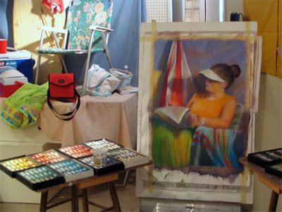
- practical matters to do with working with pastels on watercolour paper. I was amazed at the impact of working with a watercolour underpainting and how much pastel I could get on my paper without it being a problem. See below for an example of Sally's initial underpainting and then first marks - and then one the later demos with a model. None are finished but you can see the impact of her approach from the start.......
- underpainting on watercolour paper - very simple
- first pastel marks - setting the baseline for value and colour with clear value pattern and lightest light and darkest dark indicated
- part-completed pastels of both still life and life model - her marks are still very large and broad
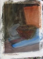
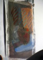
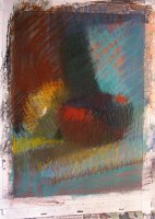
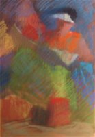
Still life demo and part-completed life model - on a 1/4 sheet of watercolour paper
Set-up and all images copyright Sally Strand
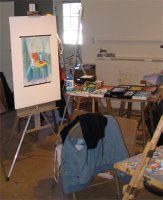
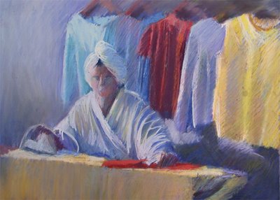
My own work is still somewhere between the USA and home so I'm having to rely on less than perfect photography to show you some of it. The image at the top is my set-up for the first model and it more or less completed. Before starting this we all worked in our sketchbooks to identify and evaluate and then develop alternative designs and crops for this subject. This is something I always do anyway - although my thumbnails are a lot bigger than most. I'd never simplified to just 3 values before though and found that a real struggle at first.
I made the mistake of going too chalky on one we worked on the last day (see below) - this one looked much better about two thirds of the way through. We also realised that my crop left the eye being drawn by the yellow t shirt and it would have been better if that had been a different colour.
Unison Pastels on Wallis paper
Copyright
Copyright
 I very much recommend doing a Sally Strand pastel workshop. Much of what she teaches applies to art generally rather than just the medium of pastel. Whether you are an aspiring or advanced pastel artist, if Sally ever does a workshop within scope of your own personal preparedness to travel then do try and get to it - you truly won't regret it. I've waited many years to do one and was so glad I travelled across the pond to do it.
As one fellow (semi-professional) artist put it "I've learned so much that I feel like tearing up everything I've done so far and starting again!".
The upcoming events page on Sally's website is the place to go for details of her schedule of workshops. You can also register for her newsletter which provides information about future such events and exhibitions.
Links:
- Sally Strand
- Sally Strand - portfolio
- Sally Strand - description of workshops
- Sally Strand - schedule of workshops
- Cape Cod Pastel Society - workshops
Fascinating, Katherine! As I'm just beginning to teach workshops myself I was very impressed to hear what she taught all of you guys in that amount of time and hope to achieve part of that in my own.
ReplyDeleteSo are you saying that she underpainted her pastels with watercolor? Or was it just on watercolor paper?
What Sally does is:
ReplyDelete(1) use watercolour paper
(2) does a very borad brush painting on the watercolour paper - to give her a largely mid value tone - which relates in some way to her design and tonal value pattern
(3) then lays down her base colours for her pastels - big shapes and big marks
(4) then works to refine these, checking values all the while as she goes, until she has resolved the problem she set for herself with the chosen image and composition.
Katherine -- this looks like it was a truly exciting workshop. Was the watercolor paper hot pressed, cold pressed, or rough -- and what was the weight? (I hope you didn't say in your post -- I just re-read it and don't see it, but that doesn't always mean anything!) :-D
ReplyDeleteI've heard that the unison pastels are very intense -- are they worth the money?
Questions, questions, questions ... when I know you just want to get off of the computer and paint! :-)
Sally works on cold pressed 140lb (and good quality eg Arches) I used Saunders waterford NOT 140lb and it worked fine. We wet the sheets and then stapled them to our drawing boards and then taped over the staples to give a good clean edge
ReplyDeleteUnison Pastels are virtually pure pigment and certainly have more impact than most other pastels I've used. Not cheap but they last a long time. Soft but don't crumble and you get a good edge if you want one. But what's really special about them for me is the colours sets - they just make my mouth water. Plus they're really easy to carry around.
This was so helpful to read. As a watercolor teacher, I really appreciated hearing the specific things that made this learning experience so valuable to you. Especially helpful to me was validation of the importance of doing value studies and thumbnails sketches. I find students tend to be resistant to doing those things--they're not as exciting as making beautiful washes or mixing juicy bright colors. But they sure make a difference in the outcome. I also enjoyed hearing the care that Sally puts into her setups. She sounds like the dream teacher. Thanks for sharing this experience!
ReplyDeleteI can certainly endorse the value of thumbnails and also doing these in just three values. I can also forget to do them - and find out all over again why they are such a good idea!
ReplyDeleteJust looking at that finished piece says so much(the model set up)! You must have really enjoyed yourself, with hard work! Thanks for posting, it's a visual treat and so inforamtive!
ReplyDelete