Showing posts with label Interiors. Show all posts

Sunday, July 14, 2019

Watching people just like the Kardashians - in the past - in paintings!

I've just come across this Rijks Tube Video Why Vermeer would have loved The Kardashians in their Is This Art? series

It's very instructive and definitely worth a watch. 

crop of "The Love Letter" (De liefdesbrief) c. 1667–1670 by Johannes Vermeer
Oil on canvas, 44 x 38.5.cm. (17 3/8 x 15 1/8 in.)
Rijksmuseum, Amsterdam
I've skipped the 2 minutes of endless pics of the Kardashians and set the video below to start when the 'host' highlights out how portraits in the past where exactly like watching the "lives of the rich and famous" - and how they dressed and what they owned and what they did.


The proposition is that in addition

  • daily life paintings show real life - and interiors - which can vary from the chaotic and risque to the calm and serene.
  • there are techniques used in Dutch paintings in the past which are still in use today - so that we feel as if....
    • we are invited in 
    • and/or are spying on people
  • we love watching other people because it helps us understand who we really are
So how come if the Kardashians and other 'reality shows' are so popular we see so few contemporary paintings which are reflecting on daily life?

Photographers frequently show daily life - but artists don't for some reason.

I wonder why!  Could it be the need to develop skills in painting more than one person? Possibly?
Welcome to Is This Art? Where we take a closer look at pop culture and try to answer the age old question: Is this art?

Sunday, September 23, 2018

Who knew Giles from Gogglebox was an artist?

I'm devoted fan of Gogglebox and have often wondered what Giles and Mary - the middle England middle aged couple in the rural cottage in Wiltshire with the William Morris wallpaper - "did" in terms of gainful employment.

She seems to spend a lot of time on trains and he seems to spend a lot of time "doing things" outside.

It turns out - courtesy of an interview in the Guardian - Mary and Giles from Gogglebox: ‘Fame hasn't changed us. We fly under the radar' and My life as a Googlebox star - and some judicious googling of their real names - that.....

  • Mary Killen has been writing The Spectator’s Dear Mary column for very many years and regular contributions in many other national publications (the Times, the Daily Telegraph, the Sunday Telegraph, Daily Express), plus monthly columns for Marie Claire magazine and Harpers & Queen) - and 
  • Giles Wood also writes - occasionally - for The Oldie - and is an artist.
Yes, that's right Giles is AN ARTIST.

I never knew! Well who knew? I certainly didn't.

Turns out 
  • he was taught draughtsmanship by Maggi Hambling
  • he's a good oil painter
  • he obviously gets quite a few commissions to sit in people's drawing rooms to paint the interiors of their rather posh homes
  • or the exteriors of their rather posh homes.
What's more he produces impressive paintings of complex subjects. I think he's a man with an eye for detail and painting exactly what's there. He's certainly got a very good eye for both colour and tone. According to his wife he has turned down a number of offers to have his paintings exhibited in London - which I think is a great pity as I'd love to see one up close and personal!

Check his paintings out for yourself. (I'm itching to give him a lesson on how to photograph your oil painting before you frame it! I think I'll wrote a blog post!)

He paints rural landscapes and his website suggests at least some are painted plein air. I'm very definitely somebody who appreciates an artist who likes big vistas. That's because I'm rather partial to a BIG landscape myself.

His website has a gallery for his Landscapes

Eschewing the modernist aesthetic to pare away detail to the logical conclusion of the blank canvas, Wood enjoys painting the clutter of peoples’ lives and popular demand has recently led him away from his trademark landscapes to specialise in interiors.
Paintings of Interiors by Giles Wood
If you want to commission him you have to email him via his wife Mary.

Why does that not surprise me? 😉

Saturday, January 04, 2014

Who painted this? #56

Who painted this? #56
Not the usual subject for a painting that you associate with this painter.

Don't forget besides wanting the answers to all the usual questions (see below) I'd also like to hear about what you managed to find out about the artist and painting - and the best answer wins this week's challenge!

How to participate in "Who painted this? #55"


PLEASE make sure you read the rules before posting a comment - and ONLY POST ON THIS BLOG what you think is the answer.
Click this link to read THE RULES for participating in this challenge (this saves having to copy them out for each post!).

In short:
  • use your brains not software to find the answer - search using words only on a database of images 
  • leave your answer as a comment on this blog - do not leave the answer on Facebook! 
  • if correct it will not be published until the next post - which provides the answer 
  • if wrong it will be published 
  • the winner - who gets a mention and a link on/from this blog - is NOT THIS WEEK the first person to give me a completely correct answer for ALL the things I want to know. It's the person who does all this AND provides the BEST answer (see above)

Who Painted This #54 - The Answer

Tuesday, December 24, 2013

Landscape Nominations for Best Artwork | MAM Awards 2013

The 2012 Making a Mark Prize for Best Portrayal of a Place aims to celebrate and highlight excellence in creating pictures about places in our environment - both landscapes and interior scenes

Listed below you will find the nominations for the Best Picture (Place) on an art blog in 2013.

Three works will be shortlisted (including the nomination I've yet to make) and larger images of the three shortlisted works will be included in the invitation to vote for the winner which will be posted on Thursday 26th December

Voting for the best picture continues until a minute after midnight on 30th December

The details of the nomination process and criteria for submissions can be found in NOMINATE: Best Picture on an Art Blog in 2013 - Place

These are the links to the other nominations for Best Picture:

Nominations for Best Picture of a Place on an Art Blog 2013


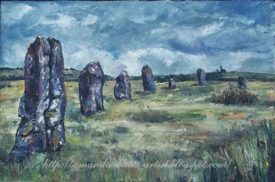
The Hurlers
More Hurlers
Nominated Artwork: Diptych - The Hurlers, Oil on canvas, 20 x 30" + 20 x 30" and More Hurlers Oil on canvas, 20 x 30"
Nominated Artist / Art Blog: Amanda Bates | Amanda Bates: Artist
Post: The Hurlers and More Hurlers -  22 July and 25 September 2013
Nominated by: Amanda Bates

I'm nominating my own work, 'cos I'm allowed to, and because I'm rather pleased with this one (or two - it's a diptych). The second post refers & links to the first post, and shows both canvases together.
  • Why it deserves to be nominated: Because I put a lot of time, thought and effort into these. I even had to tidy the living room up (to use the big easel) twice!
  • Why I like it: I think it has turned out very well. I like the hint of mysticism embedded in the solid reality of the stones; I like the grey sky and grim aspect, because that it what moors are like, most of the time; I like that the site is not one of the really obvious stone circles, but that it's still impressive; I like that it is definitively Cornish (because you can see engine houses), but not stereotypically Cornish (you can't see the sea). I think that the knife treatment, the palette, and the size, all come together to describe this unique place without being exceedingly literal (there are an awful lot of standing stones on the Hurlers site; these paintings only represent a few of them).

Pirie Crossing by Mike Barr
Nominated Artwork: Pirie Street Crossing, 30x30cm, oil on board
Nominated Artist / Art Blog: Mike Barr | http://artofbarr.blogspot.com
Post:  Pirie Street Crossing
Nominated by: Roger Brown My Botswana Art
I love a number of his paintings especially his rainy street scenes as he is quite adept at capturing that type of atmosphere.I like this paintings perspective and how it draws the viewer in its rainy depths.


Nominated Artwork: Cache?? (date??)

Nominated Artist / Art Blog: Jeremy Miranda | Jeremy Miranda 
Post: ??
Nominated by: Maud Guilfoyle
I would like to nominate Jeremy Miranda's landscape painting , 1/ 17/ 2013, the first image of six. I like Miranda's imagery and handling of paint. His paintings of Icebergs are beautiful and iconic. Although the viewer is aware the icebergs are melting, some of his paintings offer an alternative doorway into a semi-tropical landscape or greenhouse garden that is an intriguing sliver of hope.
[Note: I cannot identify one painting.  All Miranda's paintings of icebergs were completed in 2011 and hence are NOT eligible.  This award is about one painting - not a blog of paintings.] 

Monday, December 24, 2012

Landscape Nominations for Best Artwork | MAM Awards 2012

The 2012 Making a Mark Prize for Best Portrayal of a Place aims to celebrate and highlight excellence in creating pictures about places in our environment - both landscapes and interior scenes

Listed below you will find the nominations for the Best Picture (Place) on an art blog in 2012.
  • Three works will be shortlisted (including the nomination I've yet to make)
  • Larger images of the three shortlisted works will be included in the invitation to vote for the winner which will be posted on Wednesday 26th December
  • voting for the best picture continues until a minute after midnight on 30th December
The details of the nomination process and criteria for submissions can be found in Nominate the Best Picture of a Place on an Art Blog in 2012

These are the links to the other nominations for Best Picture:
Saint Andrew's Cathedral, 
Wells, Somerset, England
by John Simlett
Pen and Ink on Cartridge paper (300gsm)
22 inches x 16 inches (56 cms. x 42 cms)
© John Simlett

Nominations for Best Picture of a Place on an Art Blog 2012

Nominated Artwork:  Saint Andrew's Cathedral, Wells, Somerset, England
Nominated Artist: John Simlett (Gatepost Pictures) - Wiltshire, UK
Post: "Finally Posting Again! WELLS CATHEDRAL"
Nominated by:  John Simlett - Wiltshire, UK
I am nominating my own work and am therefore restricted in the use of 'praise.' However, ill health kept me out of art for many years, but now as I approach 75 I return to it once more (driven by my granddaughter). I started blogging this February and the support I received in Blogland has allowed me to develop to the point when I feel that this drawing takes me beyond the heights I reached in my younger days. This drawing is a new departure for me - the limited use of colour really works, and the perspective exceeded my hopes. The values, although just black and white in the main, are such that they allow the viewer to 'enter' the picture and move about the cathedral.
Basilica Palladiana by Jane Minter
watercolour
32 x 41cm
© Jane Minter
Nominated Artwork: Basilica Palladiana
Nominated Artist:  Jane Minter (Jane Minter's Sketchbook) - Italy
Post: Basilica Palladiana-section of facade
Nominated by: Sophia Khan (Sophia's Studio)

I love this watercolor for so many reasons. The painting is loose and suggestive rather than being overly realistic and predictable. It is an interpretive depiction of the basilica, and the colors and technique convey a nostalgic dreamlike quality, as if thinking about the basilica after visiting it. I like a painting to convey the medium it has been used in, and this one exhibits the many attributes of watercolor that make it such an expressive medium. The painting applies the techniques of the watercolor wash to the subject of architecture, which in my opinion is very unique and inventive. It also leaves some things to the imagination and therefore, makes one want to learn more about the basilica after seeing the painting. 

Raining in London by Maria Villioti
colored pencils on Ampersand pastelbord
45cm x 61cm
© Maria Villioti
Nominated Artwork: Raining in London
Nominated Artist: Maria Villioti (Breaths of art) - Greece
Post: The end of the road
Nominated by: Self
SIZE & MEDIUM: 45cmX61cm, colored pencils on Ampersand pastelbord
It was a challenge for me to paint such a picture with colored pencils. It's one of my favorite works. It gave me the opportunity to meet many new friends. Now belongs to one of them.

Time and Again by Terry Miura
oil
40 x 30
©  Terry Miura


Nominated Artwork: Time and Again
Nominated Artist: Terry Miura (Terry Miura) - California
Post: Risks and Rewards
Nominated by: Robin Purcell (Robin Purcell, Watercolors in the Plein Air Tradition)
There is something that haunts me about this image even small and on the computer screen, the atmosphere around the cathedral makes me think about the spiritual purpose of the architecture.


Classon near Pacific by Robert Lafond
oil
18" x 24"
© Robert Lafond


Nominated Artwork: Classon Near Pacific
Nominated Artist: Robert Lafond (Mark and Remark) - Massachusetts
Post: Classon Near Pacific
Nominated by: eLIZabeth Floyd (eLIZabeth Floyd Studio)  - Alexandria, Virginia
This painting just draws me in, I want to visit Brooklyn just to take a walk down Classon on a sunny, cloudless day. Absorbing the urban colors, the rough sidewalk, and how you can still feel so alone in such a densely populated area. I am not sure if this was the goal of the artist when he created this painting, but this is how I react to it.


Please note subscriptions only become live after you have verified the link in the email you will receive

Thursday, December 08, 2011

Nominate the Best Art (Place/Landscape) on a Blog in 2011

You are invited to NOMINATE an artwork on an art blog for
The Making a Mark Prize for Best Portrayal of a Place 2011

This prize celebrates and highlights excellence in
creating pictures about places in our environment

Today the nominations open for the Making A Mark awards - starting with a call for entries for The Making a Mark Prize for Best Picture - Place / Landscape 2011.

This call for entries is also going to highlighted on The Art of the Landscape blog.  If you'd like to nominate take a look at some of the blogs in the blogroll of that blog - there are some excellent artists!

Joint Winner of
The MAM Award for Best Portrayal of a Place on an Art Blog 2010

Canal Sunrise 
by Loriann Signori (Loriann Signori's Painting-a-Day)
pastel
This post covers:
  • eligibility of the artist 
  • eligibility of the artwork
  • who can nominate
  • how to nominate
Previous winners of this award (created in 2009) - who are ineligible for this year's award - are:
Will another pastel artist win in 2011?

PLEASE SHARE A LINK TO THIS POST WITH OTHERS WHO MAY BE INTERESTED

Thursday, February 24, 2011

The Times would like to feature my blog!

Brunch - St Johns, Spitalfields
11.5" x 17", pen and sepia ink and coloured pencils in Large Moleskine Sketchbook
copyright Katherine Tyrrell
The Times is a daily national newspaper published in the United Kingdom since 1785, when it was known as The Daily Universal Register.
Wikipedia - The Times
Today a journalist contacted me to ask whether I could supply images for a feature on my website.  Greatly intrigued I asked for more information.

It was a very nice surprise to find that The Times Newspaper has a feature page called the Daily Universal Register (after the newspaper's original title).

The page covers a miscellany of small interesting items. Each day it includes a focus on a particular website.  Tomorrow it looks as if it might well be the turn of Travels with a Sketchbook!

[UPDATE:  Here's a link to the feature]

I've supplied a couple of images so we'll have to see which one comes up.  One of them (see top) is one I did last year for this post St John Bread and Wine, Spitalfields.

I shall be rushing out in the morning to go and buy a proper copy of The Times to see if my blog is in "proper print"!

Thursday, December 24, 2009

Making A Mark Awards 2009: Nominations for the best picture (place)

The Making a Mark Prize for Best Portrayal of a Place 2009 aims to celebrate and highlight excellence in creating pictures about places in our environment

Below you can find the nominations I received for the best picture (place) in 2009.
  • I'll be selecting three of these to go forward to the vote on the best picture of 2009
  • I'll be including larger images of the three shortlisted in the invite to vote - which will be posted tomorrow.
  • You then have 5 days (until 29th December) to vote for the work you think is the best.
This painting captures the calmness of this beautiful lake, the clear waters inviting you to dip your toes in. It's very much what summer in Geneva is about.
"Helford Regatta"
by Sarah Wimperis
(nominated by
Julie Broom )
I don't recall ever seeing the drama and excitement of fireworks depicted so beautifully. The painting just bursts with energy; the expert use of contrast and colour makes this work truly dazzling.
I love how the light plays on the water - it makes me feel good to look at it, with its vibrant sparkle. I like the colours in the water and the moodiness of the sky. The painting suggests both calm and movement, and I find that exciting and enthralling.
'Pollard Willows'
by Viven Blackburn
(nominated by Cathy Holtom)

It is one of those paintings that has stuck in my mind all year. The contrasts between light and dark, warm and cool are excellent. The touches of unexpected colours are just right.
I particularly like how generous Michael is in describing and sharing his process with us. He work is beautifully restrained with his love of architecture shining through the work. Here are a few more links describing the process he used to complete this painting. This is the underwash
"Lazy River"
by Casey Klahn
(nominated by
Astrid Volquardsen)

Caseys whole River series was stunning. I think he found a really good way to depict various moods of a river.
Tipton's large body of landscape-inspired work masterfully celebrates subjective color, non-descriptive calligraphic brushwork and abstracted forms without ever losing a sense of place or any of the dazzle of the day's light. This piece is his latest to particularly please my eye, but Tipton's endlessly surprising improvisational virtuosity keeps me glued to his work; daily painting at its finest.
________________

Why not tell me which three you would pick?

You can also see

Note: The rules for nominations were as follows:
  • The place can be anywhere in the world, in the town or the country, inside or out, on land, on water or in the air. It can be real or imaginary. The inclusion of figures is entirely optional - however the emphasis should be on the place and not the figures (see another MaM the prize re. figures)
  • In 2009, any artist can be nominated who has created a portrayal of a place - real or imaginary - and posted their work to their art or illustrated blog in 2009.
  • 2D artwork is eligible - artwork can be a painting (in any media) or a drawing (in any media) or a fine art print (using any method)
  • Work is NOT eligible if it appears to be be or more of the following:
    • was not completed in 2009
    • has not appeared on an art or illustrated blog in 2009
    • over-reliant on a photograph not taken by the artist
    • subjected to lots of digital manipulation/tweaks (over and above that needed to make it read 'true' on screen)
  • An artist can be nominated more than once - by different people - for different works
  • An artist can be nominated more than once - by different people - for the same work
  • To be shortlisted the nominated artist must agree to their work being displayed on this blog as part of the shortlist.
  • Anonymous nominations are not permitted. In order to nominate you too must have an art or illustrated blog and be capable of being identified by me. (This is to stop spammers!)
  • All nominations must be in English

Tuesday, December 08, 2009

Nominate the Best Artwork (Place) on a blog in 2009

You are invited to NOMINATE an artwork on an art blog for

The Making a Mark Prize for Best Portrayal of a Place 2009

This prize celebrates and highlights excellence in

creating pictures about places in our environment
ELIGIBILITY
  • The place can be anywhere in the world, in the town or the country, inside or out, on land, on water or in the air. It can be real or imaginary. The inclusion of figures is entirely optional - however the emphasis should be on the place and not the figures (see another MaM the prize re. figures)
  • In 2009, any artist can be nominated who has created a portrayal of a place - real or imaginary - and posted their work to their art or illustrated blog in 2009.
  • 2D artwork is eligible - artwork can be a painting (in any media) or a drawing (in any media) or a fine art print (using any method)
  • Work is NOT eligible if it appears to be be or more of the following:
    • was not completed in 2009
    • has not appeared on an art or illustrated blog in 2009
    • over-reliant on a photograph not taken by the artist
    • subjected to lots of digital manipulation/tweaks (over and above that needed to make it read 'true' on screen)
  • An artist can be nominated more than once - by different people - for different works
  • An artist can be nominated more than once - by different people - for the same work
  • To be shortlisted the nominated artist must agree to their work being displayed on this blog as part of the shortlist.
  • Anonymous nominations are not permitted. In order to nominate you too must have an art or illustrated blog and be capable of being identified by me. (This is to stop spammers!)
  • All nominations must be in English
Vue de toits, effet de neige (1879) by Gustave Caillebotte (1848-1894)
Shown at the 4th Impressionist Exhibition

Musee D'Orsay

HOW TO NOMINATE
To nominate - just comment on this blog post providing all the necessary details (see below) before 24th December 2009
  • Your nominations MUST identify:
  • the title of the piece
  • the name of the artist,
  • the name and URL of the blog (eg The Art Blog - http://theartblog.blogspot.com)
  • the date, title and URL of the blog post in which the artwork appears (please provide a link)
  • SAY WHY YOU LIKE THE WORK - this bit is really important so please do the best you can. Remember that nominations are open and transparent and that it's good to share a genuine tribute.
  • You need to ask the artist if their work can be posted on my blog - and let me know what the answer is.
  • An artist can nominate their own work.
WHAT HAPPENS NEXT
  • Nominations close just after midnight on 24th December.
  • I will then select a shortlist of three works from the nominations prior to posting them on this blog and inviting readers to vote for their favourite artwork.
  • This shortlist of three works then becomes eligible for the overall Making A Mark Prize for best artwork on a blog.
  • Results are published on this blog 30th December
Read Making A Mark: End of Year Review and consult the links below to find out more about the other Making A Mark Awards.
Please also NOMINATE for other MAKING A MARK AWARDS
(see below - links become live as invites are posted)
One more post today - Nominate the Best Art (Portrait/Figures) on a Blog in 2009. The remainder will be posted this week.

In January 2010 I will be starting a major blog project about Landscapes in Art - bookmark this blog or subscribe if you want to find out more about this.

Links: The Making A Mark Awards 2010 for blogging about art - Making A Mark: End of Year Review

Saturday, December 13, 2008

Happy 3rd Blog Birthday - sort of..............


Dining and Sketching at the Club Gascon
pencil in Moleskine
copyright Katherine Tyrrell

Today is the "sort of" 3rd birthday of Making A Mark. In December 2005, I got a blog underway - with a different URL and a longer title. I didn't allow the blog to be listed and primarily used the December to try out this newfangled thing called blogging. I still recommend this as an approach to people. It's like trying to learn how ride a bike without having the whole family watch for when you fall over!

My first post was all about Two of my favourite occupations which discusses sketching in restaurants while eating a fabulous meal!
A tutor once said to me "If you can draw people, you can draw anything" before making a strong recommendation to draw regularly and to draw people as often as I could. Lunch yesterday involved two of my very favourite occupations, eating the excellent set lunch at a favourite restaurant - the Club Gascon in West Smithfield - and drawing people in a restaurant.
After four posts I decided I'd got the hang of it and could think about taking off the stablisers! However I also decided that the blog needed to have a shorter name and then decided that I might as well go the whole hog and have a completely different URL as well!

Hence Making A Mark was born again with a new URL of http://makingamark.blogspot.com. In reality, its first "proper" post was all about Links to artist weblogs and websites on Saturday 7th January 2006.

So I think I'm going to wait and have a "proper" official 3rd birthday then!

Monday, August 18, 2008

Vilhelm Hammershøi - a curious mix of Vermeer, Hopper and Wyeth?

I went to see Vilhelm Hammershøi - The Poetry of Silence last week at the Royal Academy of Arts. This is the first Vilhelm Hammershøi (1864-1916) retrospective in the UK and the exhibition features over 70 paintings spanning the career of this celebrated Danish artist.


I found both the exhibition and the man to be intriguing and so I bought the catalogue and have been digging around for more information about him as well. Hammerschoi is a Danish artist who was painting at the back end of the nineteenth century and beginning of the twentieth century - basically at the same time as the development of Impressionism.

Here are some facts about him - and some observations by me having viewed his work last week.
  • he's a Danish painter whose work has achieved new-found popularity of late. Michael Palin is a huge fan and owns work by Hammerschoi)
A style at once classical and modern, a weird but heady fusion of Vermeer and Edward Hopper. Vilhelm Hammershoi - World of Interiors by Michael Palin
  • his teachers recognised early on that he needed to be allowed to find his own way of expressing himself (artists who allow and encourage people to realise their potential and create based on their own unique unqiue way of seeing the world are real heroes in my eyes)
  • he achieved fame at the age of 21 when his portrait of his sister featured in the annual spring exhibition held by the Danish Royal Academy of Fine Arts. There's an excellent account of the heated dispute which followed here.
......its subdued colour, its loose apparently imprecise brushwork and it unclear perspective construction provoked a heated dispute between Academy representatives and De frie Studieskoler (independent study schools)
Hammerschoi - exhibition catalogue
  • Like Whistler his enduring motifs in painting style are muted colour and compositions reduced to a few graphic elements. In addition landscapes, streetscapes and rooms are frequently devoid of people and any person in a painting is usually seen from behind.
Interior with Woman at Piano, Standgade 30 (1901)
oil on canvas, 55.9 x 45.1cm
Private Collection
  • a lot of his paintings are of the interior of his seventeenth century home and many include his wife who is often portrayed from behind. He started to paint Interiors - which form the main basis of his popularity - when he moved to an apartment in Strandgade 30 in the Christianshaven district of Copenhagen (click the link to see where this is). His most productive period was 1898-1909. The interiors are very reminiscent of Dutch seventeenth century paintings of interiors - including those by Vermeer. He recognised Vermeer as having a significant influence on his work.
  • His paintings often look down corridors, through doors or have a window in the background - you see the limits of his existence but not what lies beyond.
  • paintings of architecture rarely include people - there is an atmosphere of stillness and an alienation from a world which involves people
  • Some of his landscapes struck me as almost contemporary in feel. Most are very empty in character - no people and few, if any trees. He's painting tones rather than nature.
  • there is very little difference between early and late paintings
  • his palette was very muted as you can see in this photograph of his palette.
  • he was very reclusive, led a secluded life, avoided appearing in public, had few friends and was also noted for being taciturn - rendering conversation difficult (according to German painter and printmaker Emil Nolde and German poet Rainer Maria Rilke ). He left no journals and destroyed his letters before his death - making him something of a challenge for any curator wanting to write about him!
  • He was thought by some to be a victim of neurasthenia - but this was a popular diagnosis around 1900
  • He was married - to Ida (who is the model in many of his paintings of interiors)
  • He often travelled abroad and was ultimately more famous abroad than at home in Denmark. His paintings certainly sold better abroad.
  • He liked London and the British Museum
  • He painted a total of 370 works - but people rapidly lost interest in his work after his death in 1916 prior to renewed interest in the 1970s
  • Hammerschoi's work is thought of as coming with the Symbolist movement current around the turn of the century
Here are some of the things I like about his paintings
  • they appear to be very realistic but in fact are not. Edges are often blurred rather than defined, interiors have been carefully stage-managed and simplified.
  • there's a very strong sense of simplification and the abstract - of working out a balance of horizontal and vertical lines, between different sized shapes and planes and the overall tonal range. All detail unnecessary to the painting is eliminated.
  • The grays he uses actually contain colour but are always quiet - it's fascinating to try and work out why paintings which are so monochromatic actually work.
  • he crops his subject matter in an interesting way - it's almost as if his focus is permanently in the middle distance and that he doesn't pay much attention to the foreground/bottom section of the painting. I noticed with one painting that there was precise definition and hard edges to a piece of china sat on a table in the middle distance while edges associated with objects nearer to were fuzzy. It made me wonder about his eyesight and whether he was naturally long-sighted.
  • He paints a figure but rarely paints a person. (I have some empathy with this approach rarely include faces in my sketches of people in interiors)
  • he paints architecture from a different perspective - he's the only person I know who has chosen to paint the side of the British Museum!
  • he never goes OTT - he leaves you wanting to know more.
I bought the hardback catalogue to the exhibition as the reproduction of images was better - and frankly when you're dealing with shades of grey you want the best reproduction you can get! It contains, as you would expect, large images of the pictures in the exhibition, a more detailed listing of catalogue entries for all pictures with precise details of each painting, ownership, where it has been previously exhibited and a commentary on each picture. At the end there is a detailed chronology on Hammerschoi's life together with archive photographs. The main images are arranged in chronological order and are preceded by a synopsis describing what happened in each period of his life. The catalogue also contains two essays concerning
  • a narrative about Hammerschoi's work in the context of his life and the environment of his time
  • a look at the content in terms of Danish painting
  • links between Hammerschoi's paintings of interiors and seventeenth century Dutch Golden Age of Interior paintings
Regular readers of this blog will not be surprised to know that I've created a site as a home for all the links to information that I found - you can see it here Vilhelm Hammershøi - Resources for Art Lovers. It now has a stack of links to:
  • information about his life
  • information about exhibitions of his work (eg the current exhibition at the RA)
  • videos of his work (eg Highlights of the exhibition at the RA )
  • slideshows of his work (eg like this one produced by the Guardian - which also includes archive photos of him)
  • educational publications such as those produced by the RA - the interactive graphic (which analyses and explains the above painting) and the education guide (a PDF publication)
  • where you can see images online - and his paintings in museums and art galleries
  • reviews of his work
Palin suggests he's a Danish version of a mix of Vermeer and Edward Hopper. However, I've been working on a similar site about Andrew Wyeth (there'll be a blog post soon!) and I guess what struck me is that there are some marked similarities between the two men - in terms of some aspects of their work and pallette and the reclusive nature of both men.

It left me wondering whether reclusive people avoid painting with any kind of brash colour. What do you think?

Notes: Authors of the catalogue include
  • Felix Krämer works at the Hamburger Kunsthalle.
  • Naoki Sato is curator at the National Museum of Western Art in Tokyo.
  • Anne-Birgitte Fonsmark is Director of the Ordrupgaard in Copenhagen, the Danish museum of French Impressionism and 19th-century Danish art. She was formerly curator at Ny Carlsberg Glyptotek, Copenhagen. Her research has mainly been devoted to Danish and French art.
Links

Thursday, September 27, 2007

Drawing in a new sketchbook

Fish! Supper
11.5" x 17", pen and ink in Daler Rowney sketchbook

copyright Katherine Tyrrell

Last Friday I started a new 'big' sketchbook and this was the very first sketch - a double page spread drawn in pen and ink.

I have 'a thing' about the first sketch in a new sketchbook. I have to try and set the tone by making sure it is a good one and if possible I like it to be a challenge as well. So I usually have two sketchbooks on the go for a while - the new one comes out with me as I'm getting towards the end of the old one 'just in case' I see the right thing to start a new sketchbook. As it happens I only had a single page left in my old Daler Rowney A4 sketchbook after the Northern Rock sketches and it wouldn't have been big enough for this drawing of the interior of the steel and glass structure of the Fish! restaurant in the middle of Borough Market.

The other things I do when I start a sketchbook is (1) put my name and how to contact me on the inside front cover and then (2) put a sticky label on the top right hand corner of the front cover which dates it and summarises its contents as it begins to fill up. This makes it MUCH easier to find the sketchbook I want when looking back for a sketch to work up. The one I completed was "UK Sketches 2007 (March-September)" and it had all the 'big' sketches done in the Spring and Summer as the smaller ones tend to go in my Moleskine.

For details of about this sketch see yesterday's Fish! Supper in Borough Market on my travel sketchbook blog.

Wednesday, May 02, 2007

Cliveden, Cookham and Stanley Spencer


Fernlea, birthplace and childhood home of Stanley Spencer
11.5" x 8.5", pen and sepia ink and coloured pencil in Daler Rowney sketchbook
copyright Katherine Tyrrell
Yesterday was a glorious day - sunny and warm with a clear blue sky and excellent light which wasn't dazzling. Coming back from a meeting in Oxford, I decided to try and visit two places near the M4o that I'd been wanting to get to for some time, knowing full well that I'd do neither justice. This was very much a late afternoon 'scout round and decide how soon I want to come back if at all' visit!

So first I visited the National Trust gardens at Cliveden in Buckinghamshire. These are located north of Maidenhead and near the Thames just west of Heathrow. Two sketches, neither of them up to much. I suspect it might look better later in the year - although the wisteria was out and looked great.

I then travelled on to Cookham, which is on the River Thames betwen Maidenhead and Marlow in Berkshire. The Cookham Festival is on at present and finishes on May 7th.

I drew Fernlea, the birthplace and childhood home of Sir Stanley Spencer in the High Street (see top) before walking around the village to see various places which feature in his paintings. I now know where the gallery about him and his work is (and that it's currently being refurbished). I finished off by having dinner at The Ferry - and drew the diners.

11.5" x 17", pen and sepia ink and coloured pencils
copyright Katherine Tyrrell

Sketches - and more about the visit - will appear on Travels with a Sketchbook when I finish the set from Yorkshire. I think I probably need a new collection for Travels with a sketchbook in the south of England!

Links:

Saturday, January 13, 2007

Drawing, tea and DVDs at the National Portrait Gallery

Tea at the National Portrait Gallery
11" x 8" pen and ink and coloured pencil in Daler Rowney sketchbook
copyright Katherine Tyrrell

On Thursday afternoon I went back to the National Portrait Gallery for another look at the David Hockney Portraits exhibition which closes on 21st January. I arrived just after 1.30pm and left about 7.00pm (Thursdays and Fridays being late night opening). This must have been one of the most successful exhibitions that the NPG has ever had as it was busy all afternoon and was packed again after 5.00pm.

Armed with the audio guide this time I moved through the exhibition very slowly, drawing as I went. The audio guide was really excellent and included comments from David Hockney from an event held at the opening of the same exhibition at the MFA in Boston and an archival tape from Yale University of Henry Gerzhaler talking about the trials of standing for a portrait. I must confess I very much liked the comments of his sister - very down to earth and very Yorkshire! Then I had tea - and then I went back again for a last look - it'll be a very long time (if ever) that I see all these works again assembled in one place.

Drawing the work of other artists is a very well established tradition - and I'd love to show you what I did but I don't think I can as Mr Hockney is very much alive rather than dead for more than 70 years so copyright restrictions apply. I can justify 'fair use' for educational purposes - and I've now got a much better understanding of how he draws. None of my drawings are for commercial use and I'd show you all my sketchbooks if you were sat next to me - but on the internet I'm not so sure........... Anyway, I've written to the authorised website - so we shall see.

Instead you can see my sketch done in dim light sat in the Portrait Restaurant having a "Portrait Tea". My position gave me a good view of the roof of the National Gallery, Nelson's column (Nelson was just out of view) in Trafalfgar Square and the car lights and rain-soaked ground in Whitehall with Big Ben and the House of Parliament and the tower of Westminster Abbey visible in the background. I'm minded to try and draw this view as the seasons change and at different times of day as I find it endlessly fascinating. It would be an approach not unlike what I'm doing with my Canary Wharf Sky series - but on a bigger scale.

For those people who are Hockneyphiles (you know who you are!), I can confirm that the people providing support to the Hockney pictures (authorised) website are accepting orders for the DVD of "David Hockney Fifteen Sketchbooks 2002-2003". Use the contact form identified here to ask for a copy. Hockneyphiles in the USA have now managed to get a copy of the DVD through this route.

I came away with two more DVDs "Double Portrait" (2003) - about Hockney's year in London doing double portraits in watercolour (produced for the BBC) and "A Bigger Splash" (1974) which I'm looking forward to watching although the latter has had variable reviews.

For recent subscribers and readers of this blog - links to other blog posts about this exhibition are included below.

[Update 8th October 2007: for all those seeking to purchase the David Hockney Sketchbooks as a DVD

I've had an e-mail from Erik Arnesen as follows - with updated information about how to get hold of the David Hockney Sketchbooks as a DVD. I'm reproducing it in full below as it provides all the information you need
In checking google for our website status in certain search fields, I came upon your blog page link dated 8 Dec 06 re: the 15 Sketchbooks.

Since your post we have added a link to the site that allows direct ordering of the DVD. The main site link is: http://hockneypictures.com/that will take you to the site and you will see the "shop" button - it is an online transaction link which can be found directly at: http://www.hockneystore.com/

I am glad I found your blog page and perhaps you can forward the info that the DVD's are available from the Hockney site - we did press sufficient numbers. Thanks for the alert on the NPG and LACMA - we'll contact them as well...

All the best,
for the DavidHockney Studio/Website and Online Shop
Erik Arnesen
I've also added a link to the shop below.

Links:
Technorati tags: , , , , , , , , , , ,