
 Today is the turn of the Blues and the Greys. I don't really do a lot of 'blue' paintings but I so seem to use some of the blue pastels quite a bit for both highlights and darks. Over the years, I 've also grown to appreciate coloured greys more and more.
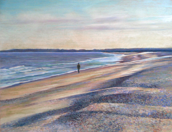
There is a good range of hues in the blues box. From ones which are very useful in more subtle pictures and within a more traditional palette (for example in "Dunwich Single" or "Violets in a jam jar" below) to ones which command attention in brighter more contemporary pieces (see "The Fish Bowl" below). I used BV12 and some touches of BV11 in the latter piece and the pigment strength and cover is simply astounding.
"The Fish Bowl" is an interesting example of what happens when you have a go at using some of the colours you don't normally use! I had tremendous fun doing it although I'm not sure whether it's ever going to find a place on the walls of my home!
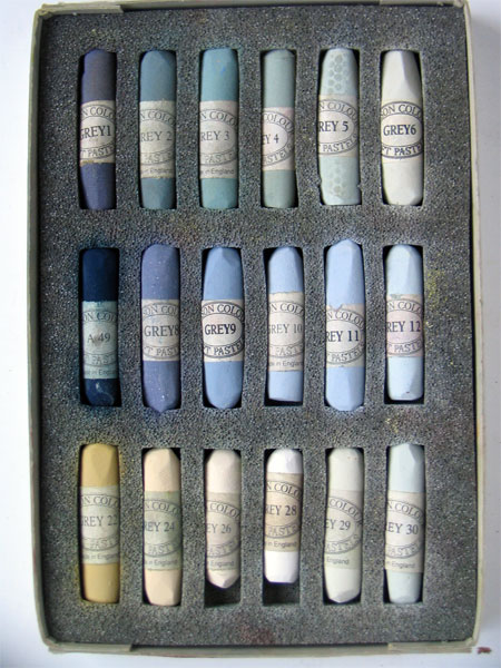
The second box is a personal selection I made from the Greys series 1-36. The top two rows are #1-6 and 8-12 plus A49 which is the very dark indigo blue shade on the middle left. The bottom row from left to right is 22, 24, 26, 28-30. I didn't buy the greys without colour as I reckoned I'd never ever use them but I think I could maybe do with a few more of the yellow/brown greys. Numbers 30-36 which are various tints of a green grey looked to me to be pretty close to some of the pastels I already had in other boxes.
There are also another set of 36 greys called the Assheton Stones (named - I think - after the late Christopher Assheton Stones - a pastel artist and member of the Pastel Society). These shades can be seen on the Heaton Cooper site. These are very similar to the grey set of 36 pastels.
To see what the pastels look like when used in my artwork I've included three pastel paintings. Click on them to see a larger size
- "Dunwich Shingle" (Pastel 19.5" x 25.5") (see Waterscapes Gallery on my website for more art involving water)
- "Violets in a jam jar" (Pastl 19.5" x 25.5")
- "The Fish Bowl" (Pastel 19.5" x 25.5") (the Flowers Gallery on my website has more pastel paintings of flowers


Technorati tags: art , landscape painting , painting , pastel , pastels , still life painting
What fun to see both bright and brash as well as soft and atmospheric! You're a whiz and a wizard.
ReplyDeleteL(lines)
PS Blue is one of my favorite color families. It seems like you use blue a lot, too, but I could be mistaken. I know you use a lot of greens ;D.