
 This is the third in the series of posts about my Unison Colour Value sets. The Greens come in two boxes 1-18 and 19-36.
When I first saw them I couldn't believe how much yellow green and pale blue green colours there were. Subsequently, as I really got into painting trees, I couldn't believe how wonderful it was to have a set of greens which actually gave the range of colours experienced in real life!
On a trip to Australia and Bali in 1997 I really began to understand for the first time the way greens can change quite radically in different countries and that you can't always paint overseas with the same colour palette that you use at home. On the other hand with a good set of pastels you can find the new shades which need more emphasis and then make adjustments to your natural 'colour signature'. And that's where the Unison pastels have been so good. The addition of the new dark greens has only enhanced what was already a good set. It's also great to have the different tint strengths in one box - it really helps with the colour continuity in developing a pastel painting.
There are a few greens out of these two sets I've used an awful lot - these are 1,8,14 and 32. Darks in the painting below were however achieved using a very dark green A43 which is an "Additional Colour".
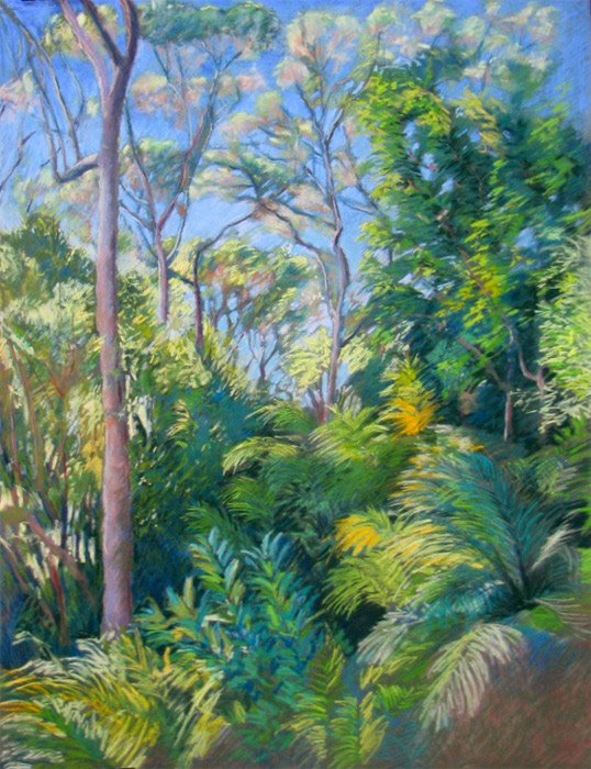 This pastel painting is of the back garden of the house in Sydney Australia that my sister and her family used to live in Sydney. Their back garden was huge and a series of terraces up the side of a hill - however most of it was natural 'bush' and was absolutely stunning.
Most of this painting was done from life one morning in late March 1997. I was positioned in the shade which meant I didn't get too hot and I could see all my colours clearly. Drawing looking up the whole time was an interesting experience as was the selection of colours for the eucalyptus trees, the tree ferns and all the rest of the vegetation. I got about two thirds of the way through and then finished it when I got back home. It felt very weird doing Sydney colours in London but it was great to have so much of the colours done as the photos looked quite insipid in comparison.
You can see more of my paintings featuring trees in the Trees Gallery on my website (yes - I really like them that much!)
(Note: The blue sky was done using a blue Schminke pastel which I found in an art shop in Sydney and colour matched to the sky!)
Linked posts:
Unison Pastels: the Darks and the Lights,
Unison Pastels: Yellow and Yellow Green Earth
Technorati tags: art , landscape painting , painting , pastel , pastels , plein air
Thank you for posting your experience with these unison set, as I have been thinking about buying the complete set myself; I will now go ahead with my purchase. :D
ReplyDeleteThanks Susan. It's funny I was thinking about you as I was writing the post this morning - being as how you're the only Australian pastellist I know!
ReplyDeleteI'm doing the blue greens tomorrow so you may want to wait until you've seen those.
:D... they are so expensive here in Australia that I will have to choose carefully. I am very interested to see what you come up with the blue greens....until then cheers!
ReplyDeleteOh good--you know about Susan Borgas! Katherine, this is so heavenly, this tree piece, as are all of those in your gallery. You exhaust me, though, with your industriousness ;D. So impressive!!
ReplyDelete