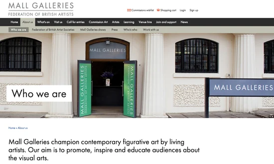
Regular readers will know that I regularly review the annual exhibitions of the UK national art societies which make up the Federation of British Artists which have a home at the Mall Galleries - so this is a big deal for me!
 |
| the "who we are" section of the new website |
...and here's my review of the new website!
The new website is designed for new technology. This is very welcome given that half the visits to websites now take place via mobile devices.
I looked at the website on my 27" iMac, my iPad Mini and my iPhone 6+ (let's just say I'm wedded to Apple!) to see what the website looked like in different formats. It works fine in all of them. I spotted a few areas where there is some finishing off to do - notably the artists' galleries - but other than that it's a huge improvement.
Lots to like
It's got a very clean look - a bit like the Apple website went to an art gallery.
I love the fact that we at last have:
- a mobile friendly website - yay!
- On my iPhone 6+ I've got a bigger screen than most so maybe not the best test - however the website clearly shows up as a mobile version with different methods adopted for navigation.
- On my iPad Mini it's a mini version of the full size website - so text just becomes a lot smaller. However the nice clean fonts and the sizing used means it's still clear to read ie it's not impossible to read without magnification.
- lots more BIG images which give a much better sense of the type of art on display. I very much like the big banner image near the top of a lot of the pages. That should provide some incentive for artists to submit excellent digital images of their art!
- images on the FBA artists's pages have a much better display with one being big and thumbnails underneath - and I like the facility to search by medium and artist's name. If there was one improvement I'd like to suggest it's a third "slice and dice" ie by art society since a number are members of more than one. This would enable those wanting to apply for membership of a society a better chance to take a look at the art of existing members.
 |
| One of the menu pages for the alphabetical list of artists |
- a News section operating in blog mode which means we can see more words and pics about events - and link to the item.
- an excellent section providing much better information about the focus of Learning - for adults and children - and the new Learning Centre within the Mall Galleries. There's also a new page for Artists' Professional Development with this intriguing comment
We are currently introducing new professional development schemes in order to help artists and creative practitioners to further their skills and individual practice by networking and working alongside established artists and industry professionals.
- a "who's who"of who works at the gallery - coupled with an opportunity via a form to send them a message or ask a question. That's a nice innovation!
- Within the Call for Entries:
- there's a new page spelling out the benefits of entering an open exhibition
- the terms and conditions are now much easier to read
- there's a great new page for all the opportunities for award, bursaries and scholarships for emerging artists
- the list of couriers now has a page to itself and better information
- it's now much easier to find information about the galleries as a venue:
- for events - and exhibitions organised by third parties and artists
- plus it's now possible to download a nice new exhibition hire pack and check out the weekly rates!
Room to improve
- the spacing below the banner and above the first item on the page looks odd on some pages. I'm assuming there's space for text introducing the page which is not being used on some pages -hence the odd look of lots of white space
- not all the 'table of content' links are working. It's a common bug with all new websites. One thing I would suggest is an email link somewhere to the webmaster or whoever will sort out all the "found" bugs in terms of links not working etc.
- the artists' pages are obviously not yet complete - but the improvement in display means there's lots of incentives for the artists to get their images sorted for inclusion and/or provide more their mini-galleries!
- the media categories on the artist pages have not yet got links to all the artists
I think a review of sizing and how much actually appears on a screen is something that might usefully be reviewed. It's BIG on the 27" screen - the strapline image stretches to the full width of the screen - but I'm also getting a lot of white empty space between the image and the next item. I think scrolling might start a lot sooner if the gap between the banner/top item and the next one down were to be reduced.
Overall - a welcome and very significant improvement on the old website. I look forward to hearing more about future developments
Also it is vital that they include the dimensions, info on materials used (not just 'pastel' but eg 'pastel on paper') and the year.
ReplyDelete