 |
| Reproduction of the inside of one of the Gallery doors by Eduardo Souto de Moura |
It's sometimes easy to forget that one of the categories of members of the Royal Academy of Arts relates to architecture.
The challenge therefore for the RA is how to represent architecture in its exhibitions.
I guess a number of us will be familiar with the designs and small models of buildings in ever Summer Exhibition - but it's always so crowded it's not a room I tend to linger long in.
Which is really odd given I started off wanting to be an architect when I was age 8.
I used to go to the library in the early 1960s and track down every book I could find on Mies van De Rohe, Walter Gropius, Frank Lloyd Wright and Le Corbusier - and used to sit and look at the pictures and the plans for hours on end.
Sensing Spaces: Architecture reimagined
Seven architectural practices from six countries and four continents.
23,000 square feet.
72 days.
One monumental exhibition.
 |
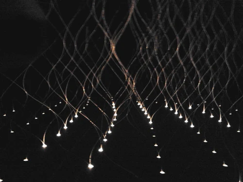
| Installation of split and laced bamboo infused with the oil of cypress by Kengo Kumar |
- how contemporary architects from across the world are designing structures and spaces
- how the RA has created an exhibition about contemporary architecture within the confines of the main galleries.
 |
| Installation by Grafton Partners |
- Shelley McNamara and Yvonne Farrell - Grafton Architects (Dublin)
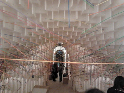
- Diébédo Francis Kéré (b.Burkina Faso) - Berlin based practice, Kéré Architecture
- Kengo Kumar - Kengo Kumar & Associates (Japan)
- Li Xiaodong - China
- Mauricio Pezo and Sofia von Ellrichshausen - Pezo von Ellrichshausen (Chile)
- Álvaro Siza (Portugal)
- Eduardo Souto de Moura (Portugal)
 |
Installation in blue pine by Pezo von Ellrichshausen
|
So is it architecture?
Or is it massive models of what architecture might be?
A sort of exploded and grandiose version of the small models seen in the Summer Exhibition?
I think it's the latter because none of the structures - apart from those created by the Irish practice - are ones which one might seriously expect to see - or experience - in real life.
Only the Irish and Chinese installations provide the experience of being "in the space" or "in the structure" from the outset. The others are mostly viewed from outside.
Also, the exhibition is big on visual - however I'm not sure how many of our other senses will be involved - apart from smell (of cypress oil and tatami) in the installation by Kengo Kumar.
 |
| View down the stair well inside each of the four columns of the Installation in blue pine by Pezo von Ellrichshausen |
 |
| Installation by Grafton Partners |
 |
| Installation by Grafton Partners |
 |
| Reproduction of the door in the Galleries by Eduardo Souto de Moura |
 |
| Installation by Diébédo Francis Kéré an opportunity to push coloured straws into a structure with holes |
I visited the exhibition with Ilaria Rosselli del Turco and I think we both came away understanding the exhibition much better after we watched the videos of the architects and saw them within the context of buildings they had designed and structures which had used some of the concepts seen within the exhibition.
I'd have appreciated a room at the end which gave us additional visuals of their architecture. As such the visuals are limited to the video - with limited seating - and ipads dotted around. It might be clean and minimalistic but I'm not sure everybody who visits the exhibition will get access to or appreciate the context.
I've got some reservations about the exhibition. Entry to the exhibition for under 12s is free. I think a lot of children will really enjoy the exhibition. However it's an exhibition which provides a lot of space for running about, clambering about and admiring how the sound bounces if you shriek. It's not an exhibition I'd want to go and see at the weekends or in half term. It would be nice to see the RA offering child free days or half days for those who prefer their exhibition experiences to be minus unsupervised children.
The exhibition opened on Saturday and continues at the Main Galleries in Burlington House, the home of the Royal Academy of Arts until 6 April. (Tickets)

No comments:
Post a Comment
COMMENTS HAVE BEEN CLOSED AGAIN because of too much spam.
My blog posts are always posted to my Making A Mark Facebook Page and you can comment there if you wish.
Note: only a member of this blog may post a comment.