If you have and you want to know what to do to make your image appear more accurate in terms of colour read on!
Correcting Colour - Learn to Love Levels!
I used to have the same problem until I discovered the Levels function in Photoshop Elements - and how tweaking the RGB colour profile levels of your image can really help you achieve a much more accurate result.
Typically people need to adjust from images which look grey to white.
In this demonstration I'm going to show you how I adjusted a photo of a pen and ink sketch - taken in shade with the Moleskine Sketchbook on the ground of the garden - from blue to light cream. It's a very effective way of showing you how much you can change an image to render it more accurately.
Colour is RGB
You may remember how colour is created and colour is rendered in digital files and on screen.
However if you need a refresher take a look at Colour science, systems and models - Resources for Artists. The aim of this site is to help artists understand more about the science of colour, how it works and how people think (or thought). It was developed as a result of my project about Colour in June/July 2008. The related information site Colour - Resources for Artists which provides links to information and advice about colour and how to understand and analyse it as an artist.
Correcting Colour - how to use RGB levels to move from blue to light cream
This is a demonstration of how you can take a 'blue' image and convert it back to the colour of the paper. I first wrote about this - and tips for correcting colour - in International Sketchcrawl - Great Comp Garden, Kent on my sketchbook blog back in August 2007.
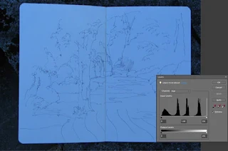
The baseline This is what the photo I took in shade in the garden looked like. I wanted a photograph of the pen and ink sketch before I started adding coloured pencils. I placed my Moleskine sketchbook on the ground in the shade where I was sat and took a photo from above. Although the colour of the Moleskine sketchbook paper is slightly creamy paper it comes out looking blue!
The Colour Profile is in the grey box The grey box on the right hand side shows you what this colour looks like as a colour profile in Levels. You'll notice three peaks in the profile. That's because the red, green and blue (RGB) elements all responded differently and all have their own unique profiles.
Review the red profile: Starting the adjustment using Levels - I first of all selected the red profile from the drop down menu. Below you can see how the image of the sketchbook is unchanged but you can now see the colour profile associated with the colour red - which is very much oriented around the left hand half of the chart.
Adjusting the colour red profile: What I did next was I pulled the little white triangle at the right hand bottom edge of the chart over to the right hand edge of the profile for the colour red. The colour change in the image below is what it looked like with this new profile. If you look closely at the grey colour chart box, you'll see that the white triangle beneath the bottom axis of profile chart has moved from the right hand edge to left of centre of the axis.
Adjusting the colour green and blue profiles: I then repeated this step for the green and blue profiles - see below for the 'after adjustment' image and the change to both colour and colour profile. Note how the colour profiles for blue and green are different.
 Blue 'after' image above
I then decided that the image still had a slight blue cast to it, so I used the remove colour cast function (Enhance/Adjust colour/remove colour cast. I clicked on the part of the image which looked the most blue - and got the image you can see below. The paper in the Moleskine sketchbook is back to looking slightly cream - and you can see the pen and ink drawing done in Great Comp Garden prior to the addition of coloured pencils.
Just to round this off, this is what the sketch looked like after the addition of coloured pencil - as done on a very hot and sunny afternoon in Kent.
 Great Comp Garden
pen and sepia ink and coloured pencil in Moleskine sketchbook
copyright Katherine Tyrrell
And there's more......
There are other ways of also making adjustments. I'll highlight another one next Saturday.


What a useful post - keep them coming! Thanks for showing how to use Levels! How about some tips on using Curves..?
ReplyDeleteFantastic, Katherine. Very, very helpful.
ReplyDeleteThanks for sharing the how to with the different color channels. That's very helpful info.
ReplyDeleteI use levels all the time but do it a little more simply using the Levels' eyedroppers tool in Photoshop. From your screen images it looks like Elements has them too so it might be worth trying them first.
You just pick up the white eyedropper and click on an area of the image that should be white and Voilla! The color cast is removed and whites are white. You can do the same with the black eyedropper to make blacks black.
Splendid and useful post! Thanks for sharing!!
ReplyDeleteUse post... thanks
ReplyDelete