Episode 3 of Portrait Artist of the Year saw some more adventurous portraits from the nine artists selected to paint three sitters:
- Suggs - a singer-songwriter, musician and lead singer with Madness.
- Miquita Oliver - a television presenter and radio personality
- Eve Muirhead - the Captain of the Gold Medal winning British Olympic Curling team
 |
| Waiting for the result of the Judging |
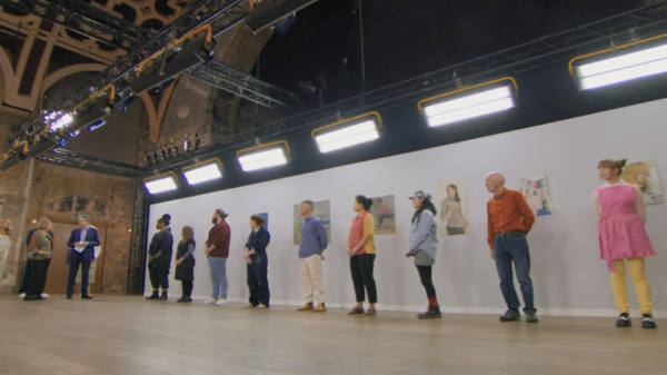
The Artists
 |
| The artists - after they finished their portraits. |
The artists are listed below - and are ordered alphabetically by surname.
You can also see the top down videos of what they painted on this link
The self-portraits in this episode were a huge improvement on those in the last episode - mainly due to the fact there was more of an effort to paint beyond the head and add props! Plus the painting and mark making was more interesting in terms of different approaches.

I found it very difficult to do this analysis this week because of the lack of one decent image of all the self-portraits together - and one that wasn't distorted by perspective. I've never understood why they think it's a great idea to space them out so much which leads to these barrel distortion images.
Sitters' Choices
The Judges commented that all three artists were wedded to their technology i.e. painting from their phones or tablets and not the sitter.
The Judges liked
- Anna Bogomolova - An Actress and Digital Content Creator with a following of 2.5 Million on TikTok. Lives in Kensington, London. Graduated with a BA in Fine Arts from Central St Martins in 2021
- Michael Clarke - based in Birmingham. A Freelance integrated designer, working for various marketing, advertising and design agencies all over the UK. His self portrait echoed da Vinci's Salvator Mundi - which is a good way of getting noticed!
- Anita Conway (Facebook | Instagram) - a secondary school art teacher from Wexford in Ireland. She produced a small head as a self portrait - which was beautifully painted.
- Rob Ellis - Retired. a watercolour artist from Cambridge who started painting during lockdown and has had no formal training. Member of Cambridge Drawing Society. His self portrait was a head and shoulders - but surrounded by his books.
- Sarah Finch (Instagram) - a publisher from Oxford. Her self portrait was full body and was very well thought out and constructed.
- Bryan Hogan (Facebook | Instagram | Twitter) - BA in Fine Art/Printmaking and an MA in Arts Policy and PracticeLives in Dublin and works in Visitor Engagement at the Irish Museum of Modern Art.
- Olivia Pang (Facebook) - a professional artist from Caerphilly in Wales. She works in traditional Chinese ink and likes to create contemporary looking portraits.
- Tim Tozer (Instagram) - an art professor at a University in Wisconsin (how is he eligible given he lives in USA?) Studied at Winchester School of Art and University of Ulster. Moved to USA in 1994 on an Andy Warhol Scholarship at the New York Academy of Art where he gained an MFA in painting. His self portrait had a very mid western filmic feel.
- Alex Westmore (Instagram) - based in Warwickshire, she is a contemporary portrait painter and is a Head of Art at a secondary school in Stratford upon Avon
Size and Content of Self Portrait Submission

FORMAT
What was slightly odd this week is that we had three "stretched" portrait paintings.
- Portrait format x 7
- Landscape x 0
- Square x 2
SIZE
I was pleased to see more larger paintings. It really makes a difference to the impact they have and the chances of moving forward to the shortlist and possibly the semi-final. You can demonstrate much more about how you approach drawing/painting when you work larger.
That said I really liked the small painting by Anita Conway!
- Large x 1
- Large/Medium x 5
- Medium x 2
- Small x 1
- Tiny x 0
SCOPE
It was good to see more artists doing what I've recommended in the past i.e. demonstrating they can paint hands.
- full size or most of body (including hand) x 1
- upper torso + hand(s) x 5
- upper torso (no hands) x 0
- head and shoulders x 2
- head x 1
Special shout out to
- Sarah Finch who was the only one to do a full body - with a very clever and eye-catching composition.
- Alex Westmore who did what looked like some great hands - full frontal!
Themes
The Head: size and position on the support
I picked up a few comments this week relating to- what size to make the head
- where to place it on the support
In general size the size of the head is entirely dictated by
- how much of the person you want to portray and
- what size of support you are working on
Small Heads
One thing which ALWAYS needs to be remembered by artists participating in this competition is that small heads are much more difficult to get right.
Smaller heads are what you do when you try to do a portrait involving torso and hands and/or most/all the body. However you really make life difficult for yourself if you don't bring a support big enough to avoid making the head "too small" - thus making it really difficult to achieve a likeness. Never ever forget this is a PORTRAIT competition and not a painting competition!
However, when you bring a large support and then produce a relatively small head on the support this also looks odd!
Giant Heads / Avoid cartoon and caricature
A few years ago macro heads in open exhibitions and art competitions were all the rage. I think the trend has died down now and it's quite unusual to see a head which is a lot larger than real life
There was one portrait where I felt the size of the head was so out of kilter with the rest of the body in the portrait that it started moving into the realms of cartoon/caricature type portraits. This should be avoided. If you're an artist who is used to doing this I'd very much recommend you need to practice a lot drawing/painting correct proportions to avoid doing this in the heat - due to the fact there's a distinct tendency for a number of artists to "go to comfort zone" in their approach to painting when coping with the stresses of painting while being filmed for television for television.
Sightsize
As a general rule, sight size is a good approach. Make the head on your support the same size as it is in real life. Take aids for measurement with you!
Position of the head
This heat had some discussion about the position of heads.
In general getting the eyes around the sweet spots at intersections of the thirds is a good idea. It's very safe, it's very conventional and the reason for this is it generally provides a good result! If you're deviating for this you really need to know what you're doing in terms of composition and design. (If you don't understand what I mean by the "intersection of the thirds" read my post Composition - thinking in threes)
Tim wailed that he'd intended to avoid the head in the middle of the support and then realised this is exactly what he'd done! I wondered why he hadn't spotted this earlier....
The smiling sitter
Giving your sitter a smile does NOT work in your favour.
There's a very good reason that there are very few portraits of smiling sitters - and that's because it's impossible to hold a smile for somebody who is painting you from life. REMINDER: The people progressing are those who are expected to be able to paint well from life.
Tim Ellis made it very clear that he had not art education and to my mind his choice of a smiling Miquita was one made in ignorance of this convention of "no smiles on sitters". It's a dead giveaway that it's a painting from a photo.
PS When there was the furore about the new portrait of the (now) Princess of Wales in the National Portrait Gallery, the (then) Director suggested to me that most of those making comments about the fact she wasn't smiling needed to go around the NPG and count the number of portraits they could find where the subject was smiling - as he knew there were incredibly few!
Mark-making adds interest
How you make marks with your drawing media or put paint down with your brush adds potential interest to your portrait. Potentially a LOT of interest. It's a very good way of standing out from the rest.
I think it's always good to see those who care about their marks, the variety they use and how diligent they are in how they make them
Turn your canvas upside down
This is a VERY old trick - and the old ones are frequently the best. Turning a portrait upside down as one artist did in this heat is an excellent way of spotting aspects which don't look right - for example shapes which look wrong or tonal values which are making the portrait look odd.
The issue of technology
I've made the point more than once in the past, that the distance artists are from their sitters (which is way further than it would be if they were a real sitter for a commissioned portrait) requires artists to use technology to be able to see some of the details.
However the Judges are not keen on those who are wedded to technology and this replicates itself when creating the portrait.
What was interesting in this heat is that Tim Tozer painted a self-portrait which was self-evidently done from a photo. However he then largely painted from life during the heat. Demonstrating that his style of painting when painting from photos does not deviate that much from the style used when painting from life. That's a pretty big recommendation to Judges that this person can cope with painting a commission where they will be expected to paint from life but will also have to use reference photos.
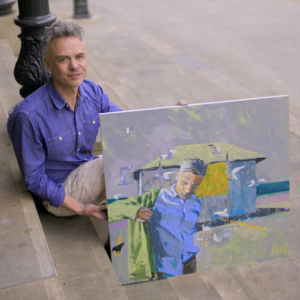 |
| Tim Tozer with his self portrait |
The Judging
The Judging comes first from the sitters before moving on to the panel of Judges.
Sitters' Choices
First the sitters got to choose the portrait they liked best - which they get to take home! The SITTERS chose portraits as follows.....
 |
| Suggs chose the portrait by Tim Tozer (left) Other artists: Sarah Finch and Olivia Pang (right) |
The Judges commented Suggs was a good sitter and all three of his artists were doing really well.
 |
| Miquita chose the portrait by Anna Bogomolova (centre) Other artists: Alex Westmore and Tim Ellis |
The Judges commented that all three artists were wedded to their technology i.e. painting from their phones or tablets and not the sitter.
 |
| Eve Muirhead chose the portrait by Sarah Finch (left) Other artists: Michael Clarke and Bryan Hogan (right) |
Interestingly as you can see, all three artists opted to draw/paint Eve's torso and not just her head.
Critique by the Judges
I found that comments from the Judges at the end were more "short-handed" and less critical than usual.
- good sense of the sitter
- mash-up between traditional approach to sitter with contemporary painting
- intelligent decision-making in terms of composition
- impressive use of line
- the way some painters put paint down / painterliness
- failed to achieve a good likeness
- overwork their painting
- sludge
The latter is getting a bit repetitive. Got the message yet?
The Shortlist
 |
| Artists lined up near their self portraits |
- Anna Bogomolova
- Tim Tozer
- Sarah Finch.
 |
| Shortlisted artists: self portrait and heat painting |
 |
| Sarah Finch: self portrait and portrait of Eve Muirhead |
I really liked Sarah's self portrait. I thought it was both visually arresting and very clever - and seemed to be well painted. She seems to have a talent for making the complex look simple. I applaud her for painting the head torso and hands in the heat - and getting both props in - but I think it was the self-portrait which carried her through to the shortlist.
 |
| Tim Tozer: self portrait and portrait of Suggs |
Tim seems to like painting people on very large supports. There's an awful lot of painting which is just "filling in the background".
His painting is accomplished and he likes to set himself challenges - but I didn't like his painting of the hands which looked sausage-like and muddy to me - and the head seemed too small for the torso.
 |
| Anna Bogomolova: self portrait and portrait of Miquita Oliver |
I thought the self portrait very accomplished - it was relaxed and 'normal' looking and yet arresting at the same time due to the way the eyes look straight at you.
I thought Anna got a very good likeness of Miquita and despite being 'wedded to her technology' demonstrated that she knew how to get a good likeness without looking like she's painted a digital image.
For me the weakness was the shoulders which were too narrow with shapes which look wrong to me. A bit more attention to the shoulders and upper torso might have seen a different decision.
Episode 3 Winner
Oddly the video of him painting the portrait in the heat is marked up as "private" on Vimeo, whereas winners of previous heats are not. (You can see speeded up videos of each portrait painting on this link)
I think Anna Bogomolova might have been in with a shout if at least one of her paintings had been more than a head and shoulders. She works quickly and I think could have done more in the heat.
 |
| and the winner is..... |
I think Anna Bogomolova might have been in with a shout if at least one of her paintings had been more than a head and shoulders. She works quickly and I think could have done more in the heat.
and get an email to your inbox every time I publish
Episode 4
- Bruno Tonioli, (ex Judge of Strictly Come Dancing);
- Yolanda Brown - a British saxophonist, composer, and broadcaster, who looks like she has great hair; and
- Helen Sharman - the astronaut.
Sky Arts Artist of the Year - REFERENCE
This year's heats are:
No comments:
Post a Comment
COMMENTS HAVE BEEN CLOSED AGAIN because of too much spam.
My blog posts are always posted to my Making A Mark Facebook Page and you can comment there if you wish.
Note: only a member of this blog may post a comment.