Wednesday, January 31, 2007

Cape Trafalgar Reggae


Cape Trafalgar Reggae (1995)
24.5" x 19.5" Pastel on Rembrandt Pastel Board
copyright Katherine Tyrrell

This is a very early pastel of mine, done while I was on a painting holiday in Spain with pastel artist Jackie Simmonds. It's of the interior of the beach hut at Cape Trafalgar (as in 'Battle of.....') which is a headland on the Costa de la Luz, south of Cadiz in the Andalucian region of Spain - very close to Morocco and the coast of North Africa.

The title comes from the fact that I was listening to Bob Marley reggae music playing in the back ground virtually the whole time I was doing this pastel which was great!

You may notice a certain 'list' to the right in this piece.! ;) The reason for this is twofold:
  • I didn't do a thumbnail sketch before I started and didn't identify the perspective issues I needed to deal with. (The reasoning being that if I had stopped to think about it I probably wouldn't have tried to do the full painting as it was so complicated - and time was limited!)
  • the beach cafe had a definite tilt - but it wasn't as bad as I had it.
  • I wasn't using an easel and I also hadn't worked out at that stage ways of compensating for the lack of an easel.
I don't get unduly bothered about perspective issues if I treat a work as a colour sketch (no matter how big). I can take photos to review perspective when I get home - but I'd rather spend limited time on getting values and colour right rather than perspective.

I never normally take an easel with me on my travels (I have to strictly limit how much weight I carry and how it is distributed to avoid falls as I tend to end up on crutches for six weeks). However I have worked out how to work round this problem. What I now do when working 'plein air' is as follows:
  • find somewhere where I can sit (essential as my limit for standing still tends to be around 15 minutes)
  • find another chair and reverse it so it sits with its back just in front of the chair I sit in
  • lean lightweight drawing board/foam core sheet (the latter is ideal for air travel) on the back of the chair
  • if the chair is plastic place a garment over the back of the chair to avoid the board slipping
  • the bottom of the board now sits in my lap and I adjust the distance between the seats to get the incline the way I want it
It's a bit like improvising a 'drawing donkey' used in art schools.

I also try and reduce the size of sheet I work on - although working large for a while was a very definite factor in learning how to loosen up my drawing.

This is the photo taken at the end of the pastel painting against the subject. It's always interesting to take a photo like this - not least because if you've got the values anywhere near correct while working plein air it clearly demonstrates the difference between the value and colour of the shadow as you saw it and how dark it becomes in a photograph.

For a really great discussion about the value of reference photos - and whether they are a help or a hindrance see Michael Chesley Johnson's recent post on this topic.

For those interested in developing their pastel work or a painting holiday I can certainly recommend Jackie very highly - and I see from her website that she is offering a painting holiday in Ithaka again in May. This is the link to a WC thread reviewing the same holiday in 2005. You can see photos and read about the experience of others.

(PS And the reason you're getting old artwork is that I keep messing up the tulip drawing!)

Links:

Technorati tags: , , , ,

Get ready for switching to New Blogger NOW

Baga Beach Boat, Goa
Pencil and watercolour
copyright Katherine Tyrrell

I've just noticed a new post in the Blogger Help group dated last Friday which states the following
We've been giving you warnings. The signs have been there. Preparations have been made. Now, it's time!

That's right, it's time to embrace the new version of Blogger! Starting today, a small percentage of users who log in to an old Blogger account will be required to move to the new version. This involves moving your current Blogger account to a new or existing Google Account. After the move, you will need to log in to Blogger with your Google Account username, which is always the email address associated with your account. If you're one of the lucky folks who is prompted to move your account over to the new version of Blogger, you'll be able to postpone this process once (and only once) if you *really* need to get a post out of your head or want to say goodbye to the old Blogger. After that, it's time to befriend the new Blogger!
As predicted - there is no option to remain with Old Blogger. So if you've not switched yet or had the invite as yet, here are a few tips:
  • Read the post "Moving Over to the New Version of Blogger" - a sticky post at the very top of the Discussion Board in the Blogger Help group - it has more details
  • back up your old blog posts
  • copy your existing template to notepad and file
  • identify the third party html code adjustments to your Blogger template which you've added - some will transfer and some will not and you will need to check
  • if you've not got a Google Account think of a name, see if it's available and get one sorted. Bear in mind that if you have gmail/googlemail you'll be wanting to operate your e-mail and Blogger from the same account as logging out of one logs you out of the other. Stupid I know but that's what we're stuck with.
  • and then sit back and wait for your marching orders.
  • When you switch, check first which bits of your old template have moved over and what has been deleted - and then decide whether you want to play with the new templates first or reinsert the old code. Take your time when trying out templates and save copies before making changes.
You can only postpone the switch once only - and then you are required to switch.

Good Luck!

(PS Just in case anybody ever thought I never ever used a brush, the sketch is from 1993 and is probably one of the last watercolours I ever did!)

Tuesday, January 30, 2007

The Bloggies 2007

The seventh annual weblog award contenders have been announced and you can review the nominations and vote here. Voting will close at 10:00 PM EST on Friday, February 2. The winners will be posted on Monday, March 12.

(Note: I haven't tried voting as yet so don't quite know how it works but I assume we're supposed to indicate the individual blogs after we've viewed them)

Then write to Nikolai [ nikolai@nolan.net ] and complain about the absence of a category for the visual arts!

Kew Tulip #1


Kew Tulip #1
8" x 10" coloured pencil on Rising Art Paper
copyright Katherine Tyrrell

I love tulips. They give you such value in terms of the way they develop as they blossom. First of all they're very pert and proper while still a bud, then they begin to open up and develop their full colour and form which they've been hiding. Then comes the full bloom - well structured with gorgeous colour modulations. Then the bloom begins to mature and look a little blowsy and worse for wear - petals begin to droop and 'go south'. And then the petals begin to 'fall off their perch'. And having written all that I'm convinced tulips must be female as it reminds me of all the stages a woman goes through from teen years to more mature years!

This image is of a tulip at Kew which I've developed from a photo I took at Kew in May last year. The tulip season there is really April to May when the beds around the Palm House are full of interesting varieties.

As part of my plan for this year I'm going to be developing yet more tulip studies of a macro variety although most of these are probably going to be five inches square and single bloom views. Blog posts about tulips are included as links below - I hadn't realised quite how many I'd done!

[Update: .........and you can see Julian's take on tulips here. His are white.]

There are various tulip festivals around the UK (and further field) and I'm just trying to decide which to go to so I can see the old varieties. The 'festivals' include Tulipomania at Dyrham Park near Bath, the tulip festival at Pashley Manor Gardens in East Sussex. I've also included some links about tulips below - mainly so that I've got something to refer back to.

I'm going to write a bit more in another post about my search for the paper I did this on - which is from Rising - and that's all I know.

Links:
Technorati tags: , , , , , ,

Monday, January 29, 2007

Society of Graphic Fine Art activities

Painting Party at the Pescheria (part of my portfolio submission)
11.75" x 16.5" Coloured Pencil on Canson Mi Teintes
copyright Katherine Tyrrell

On Saturday, I went to the Annual General Meeting of the Society of Graphic Fine Art. Last year I was elected to Associate Membership of this Drawing Society after submission of a portfolio of work (which included the above image - see also link below). At the AGM, I was elected to the SGFA Council as representative of the Associate Members. I'm looking forward to contributing towards the various development initiatives which are already in hand and generally helping with the further development of the Society.

The meeting started with a talk by Dr Libby Horner (a Brangwyn scholar) on Sir Frank Brangwyn (1867 - 1956), an early President of the SGFA. I hadn't realised before quite how versatile he was. I've included a link to the website she's developed as a definitive guide to Brangwyn below.

Although, the primary purpose of the Society is to promote drawing skills by means of exhibitions for both Members and non – Members work, we agreed that we would try and promote drawing to a wider audience through the regular Drawing Days. We had a couple of international guests - one being my blogging friend Shirley - at the last Drawing Day at the beginning of this month. The general view was that this had been both interesting and beneficial for all concerned and we agreed that in future every member will be able to bring one guest.

Anybody interested in joining or exhibiting with the Society can find details on the website of how to join and the 2007 Open exhibition. Submission to this exhibition is not limited to members and a note about the type of work accepted is given below. Do also use the comments function below if you want to know more about the Society

The Society of Graphic Fine Art - 86th Annual Open Exhibition.

Venue: The Menier Gallery, 51 Southwark Street, London, SE1 1RU. Exhibition dates: September 11th to 22nd, 2007.
Details:
  • Submissions are invited for the 86th Annual Open Exhibition of contemporary and traditional drawings, paintings and prints. Drawing qualities will be given priority in selection.
  • Suitable artwork for inclusion in this exhibition will be drawings in any medium [ pencil, pen and ink, pastel, scraperboard, charcoal etc ], any original form of printmaking, watercolours and acrylics with evidence of additional drawing [ but NOT pure watercolour, unglazed acrylics or oil paintings].
  • The theme this year is ”Chiaroscuro”. Several prizes and awards.
  • Non – Members submission fee £8.00 for up to four works of which three will be eligible for jury selection.
  • Schedules and further details will be available April/May tba and on our website.
  • Closing date for schedules: Saturday 28th July 2007.
  • Contact: Hon. Secretary, SGFA Exhibition, PO Box 7727, Maldon, CM9 6WW.
  • Website: sgfa.org.uk
  • Phone: 020 8655 0221

Links:
Technorati tags: , ,

Saturday, January 27, 2007

New Blogger Update #3: Labels in Blogger


Rousillon
coloured pencil on Canson Mi Teintes
copyright Katherine Tyrrell

With the switch to New Blogger I get to use the new labels function. Which is both a plus and a minus

A plus because.........
  • I can now categorise all my blog posts - so if you want to see everything related to cats (feline art) or all drawings in in (Pen and ink) or anything to do with exhibitions or visits to art galleries and museums (art galleries and museums) you can just click a label.
  • by including labels I seem to be generating extra traffic to the blog.
A minus because.........
  • when you start labelling you think of all sorts of labels/categories - and then see this enormous long list emerging - yikes!!!
  • and then when you start reorganising you find it's not possible to delete labels and that for some reason they start listing posts against the name of the label which don't exist.
  • BUT Blogger doesn't yet appear to have recognised this as a glitch and doesn't appear to be doing anything about it (see Blogger blog re status for new Blogger - and the page about labels)
  • the classic templates only recognise the last 20 posts for each label (an issue which has been recognised).
So basically DO take a look at my new labels (listed just above the archives at the bottom of the right hand column) and DO NOT pay any attention to the ones at the bottom of the list which have less than 2 or less posts against their name. (There are also a very few with more than 2 posts which are also now redudant).

Also - if you have switched to New Blogger (or are about to) and haven't got to grips with labels yet I have a few TIPS.
  • if you like lists you will love the labels function; if you hate lists you will hate it. If you;re one of the latter I suggest you just ignore it.
  • make sure you change from the classic template to one of the new ones if you want to use the function for all posts on your blog
  • your labels do not have to be called labels - mine are called 'categories'. Edit the heading in the page element section of the layout to make it whatever you want to call it.
  • you can change the way in which they are ordered - mine are ordered in terms of frequency, others might want to make it alphabetical
  • before you start to label make a list of the sorts of categories which are the main ones you want to use - that stops your list of labels becoming irritatingly long
  • start by labelling all new posts and then, if you want to make this function really useful for readers, gradually work you way back through all old posts and label those as well
  • use the posts page - accessed via dashboard - to speed things up.
    • tick the boxes of all those which need to be labelled with a particular category (eg feline art)
    • then create a new label and apply that to all those posts. That way you don't have to open each and every post to label it
  • if you have some labels you want to delete in future try to remember this and don't use them any more!!! So this post has a generic label of 'blogging' rather than a specific label of 'blogger' - but I had to check!
The drawing at the top of the post is one I did a while back and is of a small town in the Luberon valley in Provence which has ochre quarries - where I once got interviewed and filmed drawing by the BBC!

Links:

Friday, January 26, 2007

John Singer Sargent and Drawing - and my drawing class

Thanks to both Maggie and Belinda for reminding me that the Fall edition of American Artists' Drawing Magazine contained a long article by about the article by Mark G Mitchell on Drawing out Sargent. I think that it was that article which really began to make me think about studying JSS - initially in relation to the drawing of heads - which the article focuses on.

At the end of this post I have my work from last night's 'Drawing the Head' class but first JSS!
Clearly, he was always drawing,” says Miriam Stewart, an assistant curator of drawings at the Fogg Art Museum at Harvard University, in Cambridge, Massachusetts. “The body of Sargent’s drawings and sketches over the course of his life shows that he was an indefatigable draftsman, constantly drawing and taking notes wherever he went. We have sketchbooks from his years as a teenager that provide the basis of some of his early training.”
The above drawing in charcoal is of Henry James and was executed (and signed) by JSS in 1912. It's not untypical of a number of charcoal drawings he did - note how the background and clothing are sketched in very roughly and yet again there is an emphasis on the full range of values and marked simple shapes. The loose background and clothing contrast with the sensitive way in which the head has been drawn.

There are a number of sources of further information about JSS's drawings:
  • An article from the New York Times comments on an exhibition of JSS drawings in 1985.
  • Copies of his portrait drawings can be found in the Dover publication. Click the link to read the reviews of others who have bought this book. Personally I think it's a great resource for those who are trying to find a looser way of drawing which still represents good drawing practice.
  • You can also see the drawings and sketchbooks of John Singer Sargent kept on the Harvard University Art Museums Database. This now includes sketchbooks and drawings and expanded information for some 800 images. To search the database, select 'search' from the menu, then select search all images and click submit query and this brings up all the images on the database. I'd recommend spending some time reviewing just some of the pages to get an idea of how he drew.
Now for my efforts from last night (click image for larger version)! The first is a graphite sketch on the smooth side of a half sheet of Canson Mi Teintes in a pale blue shade. I couldn't get the white crayon to show up too well and need to try another colour. I was working with softer graphite than usual and made a big mess of my hands and the paper! My sketch of the beams provided an interesting background. The second coloured sketch is on the same paper but drawn quickly at tne end using willow charcoal and a few sticks of conte. I always find it interesting when making two drawings to see how faster and looser the second drawing is. I think I need to work more at differentiating background and clothing from the head at the same time as working on the hard and soft edges. I think my drawings in the next class might be all in charcoal - if I remember the wet wipes!


Links:
Technorati tags:

Thursday, January 25, 2007

Reflections on the London Art Fair

Last Sunday I went to the London Art Fair. It was really buzzing! It had galleries on three floors, used all the available space in the Business Design Centre in Islington and was absolutely packed with people looking at art with their wallets at the ready!

The Fair comprises most (if not all) the leading galleries from Cork Street, Old Bond Street (eg Browse and Darby, Messums, Agnews, ) and beyond (eg the Lemon Street Gallery in Truro) and included some, such as The Fine Art Partnership, which don't have a physical gallery but rather trade exclusively in the original works of art on paper through the internet and select fairs.

It exhibits and sells the sort of contemporary art which gets into the leading galleries - as well as established Masters who are already in Museums - with an emphasis on paintings and original prints although sculpture was well represented. (Maybe a bit more Lucien Freud than Damen Hirst?) Bottom line though it meant that the prices of much the original art was far from cheap. The least expensive things I saw were in the high hundreds and the most expensive were in the tens of thousands.

I gather the fair had done good business - we certainly saw a lot of red dots and some galleries were saying that the work of some artists had been selling very fast. Catalogues for the more popular had run out by the Sunday.

In London, the general impression seems to be that some galleries are not doing so well but that auctions and good quality art fairs are doing very good business. Having seen the depth and range of choice that anybody wanting to buy art has at a fair like this one I can well understand why anybody wanting to buy art will go to a fair in preference to a gallery - or will decide to buy work by an artists and/or become a client of a gallery at a fair. There's just so much choice - any collector will have more confidence about buying art having seen the huge range of alternatives. Unless they liked it all of course!

Do have a browse through the work of the artists represented by some of the galleries I've listed - it's a very stimulating experience, especially being able to see original drawings and original prints by modern masters. I found looking at contemporary art by excellent artists for four hours really helped me to understand better what I liked, didn't like and what sort of path I want my art to travel.

For all those artists who work in pastel take a look at the work - and the prices(!) of Andrew Hemingway (exhibited by Messums)

Some artists I liked included:
I met up with Vivien Blackburn (also known as "Vhere") who is a professional artist and who was there with members of her local Art Society. She's written an excellent post about the fair here - and I cannot hope to better it - well except for the fact that I've got a photo of what it looked like from the cafe area! It's always great to meet somebody you've been corresponding with in cyberspace for ages. As always you feel like you've known the person forever!

Technorati tags: ,

Wednesday, January 24, 2007

SOFA 2007, the Spring Show and Gayle's new cat

"Out of Sight"
10" x 14" coloured pencil on Arches HP paper
copyright Gayle Mason

Last year, Gayle Mason and I exhibited at the 2006 Exhibition of the Society of Feline Artists and round about this time of year we're beginning to think about work which needs to be finished before the end of April if it is to have a chance of being in the very fine brochure produced by exhibition hosts - the Llewellyn Alexander Gallery.

As usual Gayle is way ahead of me in identifying and executing potential work for the exhibition. Her latest cat drawing has just been posted on her blog in a splendid post - From First Marks to Giclee Print - which shows images of all the progress stages - right through to giclee print. This particular drawing has been done using Prismacolor French Grey coloured pencils in French Grey, 10%, 20%, 30%, 50%, 70%, 90% and Black. I think it's excellent and we (at fine Line Artists) think Gayle has probably got another best seller on her hands.

Gayle sells most of her work through fine art prints. Her distributor will be showing this particular print for the first time at the Spring Fair at the National Exhibition Centre in Birmingham. This is an international trade fair which is targeted at buyers from retail outlets which focus on the wider aspects of 'lifestyle'.

The Gallery Hall is the largest art (print) and framing show in the UK. It's not primarily for artists who mainly sell originals but for those interested in marketing their work through giclee prints and who want to do some market research it's an extremly interesting show to go to. The website provides further details for anybody interested in visiting.

The 2007 exhibition of the Society of Feline Artists runs from 3rd - 22nd September 2007. It typically features 300 original paintings in oil, acrylic, watercolour, pastel and etchings - making it the largest exhibition of cat art in the country.

The exhibition is always eagerly awaited by all cat enthusiasts - the Private View is always packs out the gallery and last year they sold very nearly 100 paintings during its 3 week run.

Prices typically range from £75 to £4500 with the majority of the paintings priced between £150 - £950. Members and associate members submit work for the exhibition (if not previously submitted for inclusion in the brochure) on Thursday 9th August. The gallery is situated opposite the Old Vic Theatre and adjacent to Waterloo Station.

(PS This is the third time I've attempted to post this - the Blogger servers appear to be falling over. As it's taking about 3 or 4 attempts to save a draft because the word verification is playing up - so I've switched it off for comments and will switch it back on again when things get back to normal)

Links:
Technorati tags: , , , , , , ,

Tuesday, January 23, 2007

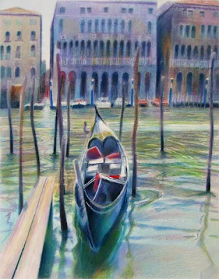
JSS and my gondola - completed

Sargent's Gondola - completed
14" x 11" coloured pencil on Arches HP
copyright Katherine Tyrrell

This, I think, is the final image of this version of the drawing of the gondola which I've been doing for my John Singer Sargent project. The objective was to try and work with big and simple shapes. This is my 'work in progress' blog post where I explained what I was trying to do and how I was approaching it.

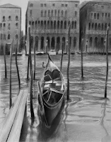
Nicole Caulfield has been using the cutout filter in Photoshop Elements to produce 3 value thumbnails (darkest, mid and lightest values). I decided to try it out when I got to the end of this piece and check out whether or not I managed to stick with big simple shapes and also how it compared with the same exercise on the photo. Photographs are however notoriously difficult to reply on for correct values so when working from the photograph I always make adjustments for the fact any darks in a photo would be lighter in reality.

Then, after I had produced the image at the top, I put the original and my drawing into three different formats using Photoshop Elements. these were:
  • greyscale
  • cut-out using three values
  • cut-out using five values
Below you can see the results.

The top row is the photo (L to R: greyscale 5 values, 3 values) and then the next row underneath is my drawing - and the same order of versions of my drawing. Interestingly my thumbnail of three values (see previous post) is very close to the 3 value cut out image of my drawing as seen below. It's interesting. I can see the adjustments I was making for the shadows in the 5 value but my overall 3 values are not simple enough.


I said 'this version' up above as I think I might redo this - more simply !

Links:
John Singer Sargent Project Update:
Technorati tags:

Blogger Update #2

This morning I'm going to try and resolve the problem that I've had with an unresponsive script since changing to New Blogger and the associated message which comes up every time a link of an image is clicked. You may find that the blog looks odd while I'm trying to find a solution.

The solution which works pro tem for me (but maybe not for you) is to click the 'stop script' button when the error message comes up.

What I can't work out is where the script is that is causing the problem or how to validate the html in the template - any suggestions from people who have had to deal with similar problems would be much appreciated.

3 hours later: I seem to have resolved the problem - in part by changing templates to try and deal with the font size problem I was also having. However I'm still looking for a template which is not as narrow as those designed for very old monitor widths and one which is not as stretched as the wide monitors. I've also removed a bit of code which seemed to be causing problems.

Can people let me know:
  • if this new template causes them reading problems and
  • also whether you can now click on links and images without problems

Monday, January 22, 2007

Unison Soft Pastels - the website

For all those interested in pastels, this is the website for Unison Soft Pastels. (website address http://www.unisoncolour.co.uk/ )

Two of my long-running website quests in recent years have been to find the websites for (1) David Hockney and (2) Unison Pastels. I found the new Hockney website a while back completely by accident. However, although I once found a simple webpage, the website for Unison soft pastels remained elusive until now (and many thanks to Bruce in Long Beach for supplying it).

The problem has been that although Unison is a UK company, based in Northumberland, it has almost exactly the same name as the main union for all public service employees - hence the use of the word 'colour' in the name. So insert just Unison into the UK page of Google in order to try and find the website for Unison pastels and all you get is union branch after union branch - for pages and pages! Try it on the main google.com page and all you get are the very many suppliers all over the world of this excellent pastel. Only if you insert 'unisoncolour' as all one word does the website actually appear.

So - a small plea to all my readers - can we please try to move the website for Unison Colour - Soft Pastels up the browser ranking by everybody clicking on the link please!

And that way you also get to read all about Unison Colour and see all the delicious colour charts. I daren't look because I'd only drool and have to go and get my Unison pastels out when I should be getting on with something else!

For further reference, if you want to get in touch with Unison Pastels, contact as follows:
  • Unison Colour Ltd: Unison Colour Ltd,Thorneyburn, Tarset, Northumberland NE48 1NA
  • Telephone: 01434 240203
  • Fax: 01434 240457
  • Email: info [insert 'at' symbol] unisoncolour.co.uk
I've also included the link in my squidoo lens and links to previous posts about Unison Pastels on this blog are also included below.

Links: Technorati tags: art, painting, pastel, pastels, Unison

Sunday, January 21, 2007

My Singer Sargent Project - in the Piazza San Marco

7am, Sunday morning
8" x 10" coloured pencil on Somerset Black Velvet
copyright Katherine Tyrrell

This drawing is one of the outputs from my John Singer Sargent Project. These are the JSS characteristics I was trying to develop in this work
  • a few values - I tried to work to just three. Did I succeed? I think so - what do you think?
  • a few slivers of light outlining form - very JSS - and I've got those in
  • largely monochomatic with a splash of colour. He doesn't work like this all the time but it's very characteristic of him - and very effective when he does it. I've got more colour in than him but rather restrained for me. Plus I've got the splash of red - he did like a bit of scarlet in his paintings!
  • large expanses of apparent 'nothingness' which he then develops in a very subtle way. That's the expanse of the Piazza San Marco
  • it's about Venice - very JSS - I'm probably at the top end of how much he'd include in a picture. He tends to go for fragments of architecture rather than 'views'.
The image is from a photograph I took on my first day in Venice in May 2005 - which happened to be a Sunday. I got up early, walked down to the Piazza San Marco and walked into the square just as the bells were striking 7am. It was empty and completely utterly unforgettable! The light was brilliant and the shadows and subtle colours were amazing. (And that was a tip specially for Ed who is visiting Venice later this year)!

Yesterday, Shirley (Papers and Threads) went to visit the Sargent's Venice exhibition in New York (which I referred to in the Sargent and venice thread below). This is what she e-mailed me.
(We) went to the Sargent exhibit yesterday - WOW!

The Adelson Galleries are in a beautiful brownstone on the block leading up to the main entrance to the Museum of Modern Art - lots of marble and sweeping staircases etc. So the setting was great.

I can't even describe the beauty of the Venice watercolors - the luminosity was incredible and his palette looked rather restricted - almost as if he used Payne's Grey for the blues, burnt sienna for the reds, and some brownish/gold yellow for the 3rd primary. I'd be curious to know whether there is any information about this in your readings.

They have 54 pieces out of the total of 150 that Sargent did on Venice. Most are watercolors, but there are a few sketches and charcoal type portraits mixed with the oils. We looked at approx. 20 watercolors before we reached the 1st oil and I was amused that my husband said, "I hated getting to that oil. It wasn't very good!" I think it just suffered by comparison.

It was a great exhibit!
I might just have to take a close look at flights to Venice for when the exhibition moves there! I'll be writing more about the book to accompany the exhibition in my next JSS project post.

I'm including full links below as I understand that the script problem is still with us. If you click on a link and get a message to say there is a script problem then click the STOP button and the link will appear. Otherwise copy the link below.

John Singer Sargent Links:
Technorati tags:


Saturday, January 20, 2007

Ed Terpening: Observations on Plein Air Painting #2

Ed focuses on working in abstractions in his second Observation of his new series of observations on plein air painting. He provides images of notan sketches he makes and provides some tips - see below. I like the way he's providing both structure and images for these posts to communicate the points being made.
Here are some tips for designing a painting in effective abstractions.

* Design a value scheme with at least one dominant value, and others subordinate in unequal proportions.

* Divide your picture into at least 3 and no more than 7 shapes. Here’s a quick and easy exercise you can do anywhere: with a sketchpad, look at a scene, and decide where those 3-7 big shapes are, and draw them as interlocking shapes. You’ll almost certainly have to make compromises to abstract the scene, such as merging values together, but this is a necessary part of design (see notans above).

* Limit your values. Some of the strongest designs are just 3 values. it’s really difficult to keep to a solid, limited value structure, but well worth it.

* Here’s a tip to simplify your values: If–like me–you’re near-sighted and wear corrective lenses: slide your glasses down to look at the scene (blurring it) and view your work surface with your glasses as you look down. If you don’t wear glasses, blur your view by squinting (note this is less effective as squinting also darkens your view). I almost always paint most of my painting without my glasses on as I love focusing on accurate color and value first. It works!
Links:
Technorati tags: , , , ,

Plant Motifs and Art #3

On Wednesday I I visited the Winter Fragrance Flower Show of the Royal Horticultural Society at the Horticultural Halls in Westminster. It was a lovely opportunity to see blooms, medal winning botanical art and look at books! If you go on the second day and stay to the end you get the opportunity to leave with some of the show. I came home with an armful of show level lilies with enormously long stems for £3! They're the ones in the circle in the photo.

I was very impressed by the botanical art winning an RHS gold medal - including these lovely auriculas in watercolour by Brigitte Daniel (I have a very soft spot for auriculas and aspire to having an auricula theatre one day!). There was also some splendid work of peonies in acrylic and allotment vegetables in coloured pencil which were most attractive but I completely forgot to make a note of the artists' names. The reason for taking the photograph of the auriculas was that I was also very impressed with the way in which the work was hung - it was quite the best display in the show - in a manner characteristic of classic hanging styles using picture rails. It was also very interesting to note that not all botanical work in the show was framed - some was just matted for display.

One of the books I bought was "The Flowers of William Morris" by Derek Baker published for the centennial. It's described on the William Morris Society website thus
William Morris's flower patterns are known throughout the world for their unique combination of nature and order. This illustrated survey examines the artist's approach to nature and flowers.........
What I found extremely interesting, apart from the images of hand drawn designs where you can clearly see the process from pencil sketch more cetain deign lines through pen to colour washes, was that William Morris apparently also studied the flowers of Islamic art - and in particular the tulip - at the Victoria and Albert Museum in South Kensington. I knew I wasn't the first to have such an idea but I'd no idea that one of my heroes did likewise!

[Update on the transition from Old to New Blogger: I've discovered what the script problem was and have fixed it - see Blogger Update for details - so there should be no more problems clicking on links or images. Now all I have to do is work out how to increase the font size!]

Links:
Technorati tags: , , , , , ,

Friday, January 19, 2007

Sketching at the National Gallery: "Manet to Picasso"

Copy of Edgar Degas's "After the Bath" at the National Gallery
pencil and coloured pencil in Moleskine notebook
copyright Katherine Tyrrell

The National Gallery has displayed afresh its series of paintings by modern Masters in the basement gallery of the Sainsbury Wing in its exhibition "From Manet to Picasso". It's well worth seeing if you are fortunate to be in London before the end of May. It offers the opportunity to follow the sequence of changes in painting in Europe during the nineteenth and early twentieth century; see important paintings alongside ones associated with them which are normally in private collections plus the chance to see the working methods of Manet. For more about these paintings and the exhibition generally click here and here. The website also has National Gallery's Introduction to The Impressionists.

While waiting to get into the Velaquez exhibition yesterday (timed tickets only) I took the opportunity to go and revisit these works - and this time to sketch in colour (Regular readers may remember this "Drawing Monet" post from last year - which describes my technique for sketching works being viewed by others). Those who have my plan for this year know that I intend to study and draw the works of artists I find influential in order to understand both them and their works better. Today it was the turn of Monet and Degas. For more sketches done yesterday in the Velaquez exhibition see the previous post.

Copies of National Gallery paintings from Claud Monet's "Poplars on the Epte" series
oil on canvas
copyright Katherine Tyrrell

I started with two of my favourite paintings from Monet's Poplars on the Epte series. This time I got the audio guide and learned that:
  • there are 24 paintings in the series depicting the poplars at different times of the day and in different weath
  • Monet painted them from a flat bottomed boat borrowed from his friend Caillebotte which had been specially adpated so that it could take canvases of different sizes. ( The painting from a boat habit reminded me of John Singer Sargent who used to sketch in Venice while sat in a gondola - I'm beginning to think about devising a boating expedition!)
  • He had to buy the land that the poplars stood on to avoid them being cut down before he had completed the series!
The one on the left does not compare well to the original due to lack of the right colours in my tiny pencil case. The one on the right worked rather better - but I could have done with my big sketchbook!

I then sketched the Degas pastel "After the Bath" and rather regretted not having a deep yellow with me - but have added that this morning, Interestingly when I looked at the reproduction on the website this seemed to be a much more washed out version which looked rather more yellow than the reality! However drawing in very subdued lighting might account for me thinking it's darker than it really is!

The Degas is interesting because it's actually done on five pieces of paper which have been mounted onto board. I also learned that Degas had his own recipe for fixative (he fixed between each layer and then worked again on top) which I now feel the urge to find out more about. His use of fixative makes some works - such as this one - look more like oil paintings than conventional pastels.
Tip: One of the ways I remember which colours need to be added in later if I don't have them with me is to actually work out and identify the precise colour by name. I find it's much easier to remember that way.
Have you ever sketched in a public gallery - as a child or as an adult - and , if you did, how did you find it?

Links:
Technorati tags: , , , , , , , ,

Drawing Heads - Velaquez and the Prince's Drawing School

Drawing a Head: 18 January 2007
pencil and coloured pencil
copyright Katherine Tyrrell

My drawing class at the Prince's Drawing School (Drawing a Head") resumed tonight. I got there rather late as I was at the National Gallery this afternoon seeing the Velaquez exhibition before it finished on Sunday. I must avoid going to see exhibitions in the last week - it was PACKED solid and is staying open late each night this week. It was very difficult to get round as a result although pictures could be seen close too with a little manoeuvring - it just took much much longer than usual.

Anyway, I went from drawing The Water Seller of Seville and Pope Innocent X (from about 15 feet away with at least half a dozen people in-between me and the picture - it was sometimes a lot more!) to drawing a model in the class. She was sat on a dais hence I'm looking up at her. It was rather nice to actually be able to see the model all the time!


[UPDATE: For all those who like to draw and paint heads, there's an excellent couple of blog posts by Julian Merrow Smith (Postcard from Provence) and his wife Ruth Phillips (Meanwhile her in France.....) about Julian painting Ruth's portrait.......and her take on the experience - both are very educational and also entertaining!]

Note (in the wee small hours of the 19th): I've been having frightful problems this morning and again tonight trying to get Blogger to upload pictures to blog posts. I've got my fingers crossed the problem is now solved.

I'll also be blogging about Velaquez again as part of the John Singer Sargent Project - anybody who wants to take a look at some more paintings by Velaquez should take a look
here )

Links:
Technorati tags: , , , , ,

Wednesday, January 17, 2007

Starting to sketch with coloured pencils

Nauset Light, Cape Cod
8" x 0" pencil and coloured pencil in Moleskine sketchbook
copyright Katherine Tyrrell

I get lots of comments and enquiries from people asking me about sketching and how to learn how to sketch. If you're one of those people, you may be pleased to hear that I'm getting a bit more organised! As part of my plan for 2007, (this is January after all!) I've started to assemble my written advice on sketching on my website as a preliminary to more sharing of information and developing this further (workshops etc).

So - for those interested in learning more about how to sketch - you might want to take a peek at the new page on my website ( www.pastelsandpencils.com ) called Advice on Sketching. I'm going to use this as a place to put read-only Word files (.doc extension) for
  • any of my articles on sketching that are published on the internet
  • any on-line classes on sketching that I tutor - which start with guidance written by me.
There's not a lot new under the sun and the principles about how go about sketching don't belong to anybody. However my approach and my words belong to me and the files are copyright protected. This means that you can download under the "fair use" educational provisions of copyright law for your private use only. What you can't do is download them and then sell them or use them as part of a course for which you're getting a fee. (In other words they should not be used by other tutors as part of their materials. I've no objection to tutors providing a link to my website in their course materials though). I'm working on the principle that people won't abuse this facility - if they do I may need to rethink my approach.

The first article to be loaded on to the website is called "Starting to sketch with coloured pencils". It's an article which was published in the July edition of "From My Perspective" Ann Kullberg's e-zine for coloured pencil artists last year. It's To be honest, when I started to put this article together I decided that teaching people how to use coloured pencils as well as how to sketch was pretty much impossible in one article - so the article is firmly focused on learning how to sketch as a first step. However it is also illustrated with my coloured pencil sketches and explanations of how I went about them.

Do let me know what you think about it. Also do make suggestions about what else you think I should focus on as I shall be developing more articles in the future - all of which will find their way on to the website after initial publication.

Also, for those interested, you might want keep an eye on this new page on the website as I'm currently in the process of loading another item on to it. I'll be highlighting it on this blog when it's published.

The sketch at the top of the page is of Nauset Light on Cape Cod and you can read the associated blog post on my travel sketchbook blog here.

Links:
Technorati tags: , ,

ClustrMaps

I'm been having a couple of problems with my ClustrMap recently - the numbers seem to have got stuck and are not reporting correctly. I find you do tend to stare at numbers as you come up to a big one - and this blog went past the 50,000 mark about 10 days ago according to Statcounter.

The nice people at ClustrMaps (Hi CJ!) are trying to sort out the problem out right now. So while I'm waiting for the fix I've just made the map invisible and it'll be back as soon as it's all sorted. And I now know a new bit of code thanks to the people at ClustrMaps!

Links: