Wednesday, September 30, 2015

Life is the art of drawing without an eraser

...which is why you really need to practice drawing in pen and ink!

10 reasons to draw in pen and ink


When you draw in pen and ink you'll learn...

1. How to observe


When you can't erase, you'll find you learn to become much more observant and practice looking more carefully on a routine basis when you're drawing.

Drawing with a pen and without an eraser means you slow down at first and pay more attention to how and where you make marks

2. How to become develop motor control and become confident in your drawing


After you learned how to observe and practised and trained both your eye and your hand, you also become much more confident when drawing.

I now frequently draw using a pen without looking at the page - it's the drawing equivalent of touch typing!

This is a video of me drawing trees at Chartwell with a pen - it's not speeded up.


3. How to hatch


.....because that's how you create tone when drawing with a line

A head with absolutely no contour lines
drawn entirely from observation
using hatching lines

pen and ink
Katherine Tyrrell

4. How to make marks in different ways


.....because it's fun and effective to draw in ways which don't involve lines.

Plus you also need to learn ways to resolve those mistakes you made....

This drawing of a garden with flowers by Vincent van Gogh
uses all sort of different marks - lines, hatching, dots, circles, - to create the overall effect

5. How many implements can be used to draw with when using ink


I've got a number of favourite and very different pens - and I've also very much enjoyed trying new ways of drawing with ink.

Tuesday, September 29, 2015

Examples of Artists' Statements

Have you ever wondered what the artist statement of famous artists look like?

Jeff Koons, Artist, New York City,
Studio Portrait by Chris Fanning
I've been developing a page devoted to Examples of Artists Statements on Art Business Info for Artists. Or should that be "Artist Statements by Artists"?

Anyway, I think it's a great idea to see examples of what famous and successful artists have to say about their art - it can be very instructive.  It's also very interesting how websites and what artists have to say about their work changes as their careers progress and they become more and more successful.

So I sat down and did an exercise of looking and looking at the websites of various artists. It was fascinating and had some unexpected results.

Famous Artists


These include artists in the USA and UK and one from Germany.
  • Jeff Koons
  • Cindy Sherman
  • David Hockney
  • Anish Kapoor
  • Gerhard Richter
    Fotograf: Hans Peter Schaefe
  • Peter Doig
  • Richard Long
  • Damien Hirst
  • Banksy
  • Tracy Emin
  • Gerhard Richter

Professional Artists


I then started to take a look at the artist statements of various well known and successful professional artists including:
  • Duane Keiser 
  • David Leffel 
  • Kevin McPherson
  • Albert Handell 
  • Ken Howard
  • June Berry 
  • David Curtis

I intend to keep developing these lists - not least because how artists write about their intentions and their work is absolutely fascinating!

To that end I'm now looking for
  • any recommendations of artist statements on the websites of famous and/or successful professional artists you like - and 
  • great artist statements for artists outside the USA and UK

If you've got one that you'd like to recommend please highlight it in a comment below

READ MORE about artist statements on my website: HOW TO WRITE AN ARTIST'S STATEMENT

Monday, September 28, 2015

Urban Sketchers: Gabi Campanario steps down

A major announcement by Gabi Campanario today - he's stepping down from the Board of Urban Sketchers.
Dear fellow urban sketchers,

Since setting up the Urban Sketchers nonprofit in 2009, I've been quite involved with most operational aspects of the organization, from filing government forms and dealing with bank accounts to setting up blogs, organizing events and recruiting volunteers.

As Urban Sketchers has grown and thrived, many others have contributed their time and efforts, and we've built a solid and sustainable nonprofit. That level of shared commitment and belief in our mission is why I feel comfortable that we've reached the point in our natural evolution for the founder to take the back seat. After my term expires in December, I'll no longer be part of the Executive Board.

But I'm not wandering off too far. I have offered to serve on the Advisory Board and plan to continue contributing as a blog editor and correspondent.

I'm very proud of the work we do as a nonprofit, organizing an exhilarating international Symposium every year, promoting workshops and publishing blogs.

It makes a difference in the way people see the world and connect with each other.

I hear it all the time: "Urban Sketchers has changed my life!" people tell me. And I reply the same way: "It has changed mine, too!"

Gratefully and respectfully yours,

gabi
Gabi Campanario has given so very much in terms of time and effort to Urban Sketchers that it seems remiss not to try and mark this change in some way.

Below I've got a timeline - and a few images and links - which those of you who came to Urban Sketchers late in the day may well find interesting, while the rest of us reflect on just how long it has been since Gabi had a very good idea!

Urban Sketchers Timeline - a Gabi perspective


  • 2007: Gabi begins the Urban Sketchers story - and creates a Flickr group for those interested in urban sketching.  This is the original group.
In 2007, a global community of urban sketchers began to form when Seattle-based journalist and illustrator Gabriel Campanario created an online forum “for all sketchers out there who love to draw the cities where they live and visit, from the window of their homes, from a cafe, at a park, standing by a street corner... always on location, not from photos or memory.”  Our history
  •  2008: The Urban Sketchers blog was set up by Gabi - who invited others to join. I feel very privileged to say I was one of the original 100 who joined Urban Sketchers in the very early days. Here's a link to Gabi's introduction as a correspondent - Meet the correspondents: SEATTLE > Gabi Campanario - dated 29th October 2008. (The following day I was introducing myself!)

Sunday, September 27, 2015

I've been really busy!

I've had one of those weeks with lots of different things going on - all of which have contrived to keep me from writing a 'normal' blog post on Making A Mark

However I've learned a few lessons on the way and you can find them below under headings which loosely describe what they are about.

Art Societies in the UK


The new website/blog for Art Societies in the UK
http://www.artsocietiesuk.com
I've published a new blog - called Art Societies in the UK
A comprehensive compendium of art societies in the UK - including information and advice about art society exhibitions, blogs and other activities
but I need to work out why, as yet, it won't produce a feed for Facebook or Feedburner!

It's the first time I've used a "proper" domain name (did you know you can do that in Blogger) as opposed to just having a blogspot one.  I think I've got to go and check all the CNAME settings to make sure I've done them properly!

Anyway - this site resurrects one I originally set up in 2009. However, by putting it on a blog it means I can:
  • profile individual art societies
  • announce exhibitions around the country
  • advice specifically for art societies
You can read what I'm trying to do in Introducing Art Societies in the UK. Esssentially the Pages will hold the static data and the blog posts will communicate new events and information.

I'll be adding in information about the art societies with a geograpical bias outside London as soon as I get a minute.

Do tell me what you think about the NEW way I've presented information about the art societies in Greater London.

Marketing - What do you say about you and your art on your website?


I've started - but not yet finished a blog post about the ING Discerning Eye selected artists. I'm about two thirds way through finding the website links to the artists selected for the ING Discerning Eye - but there's only so much of that task I can do without going cross-eyed! Hence it needs to be done in concentrated bursts!

What I did learn is that there are an amazing number of artists who can't or won't say what they do in one sentence or a couple of lines.

This is a BIG marketing lesson for those who write loads of words but don't provide a succinct summary.

In effect imagine you get in a lift and are getting off at the next floor - that's the amount of time you have for your "elevator pitch" - short and snappy, attractive and accurate - and all about what you do or what your art is or whichever way you want to get people interested in your art.

I ended up writing against one artist's name
lots of words on her website but lacks a succinct summary
So go to your website and imagine you are me and ask your self this question.....

Can you quickly find a neat summary of who you are and what your art is about?

Art Group Exhibitions

I've been fairly preoccupied this week with the preparations for the upcoming exhibition by London Urban Sketchers at the newest branch of the awardwinning Timberyard company - between 2nd November 2015 - 30th April 2016.  See:
The biggest challenge has been working out how many pictures you can get on a wall of a specified size - and hence what needs to be the upper limited on the dimensions of framed artwork!

Today I've been drafting the Entry Form and Terms and Conditions which has been 'fun' (!) and trying to strike the right balance between making it short and accessible and at the same time protecting the interests of all parties.

It's been a few years since I last drafted an entry form and terms and conditions page (and interetingly I look each year and it's still in use!). This time I decided to model it on the Mall Galleries Terms and Conditions - which are very informative as to the things to watch out for. Bear in mind every disaster known to art exhibitions will at one time or another have happened  to them - or been headed off by their T&C.

I know I spotted a few new things which are worth having a think about.

I'll be writing a longer post about this on the new art societies blog in due course!

A new way of blogging


I guess the big change I've made in 2015 is I now tending towards having more dedicated blogs. Which is a bit of a risk as it can become easy to neglect them.

I've just posted to Making A Mark Reviews after months of no posts (while I sorted lots of other sites out) - but this was an important one - see Winsor & Newton change watercolour paint tubes - again!

However I'm not finding it all difficult to come up with a post every week to 10 days on Botanical Art and Artists - and this was the quickie I posted this morning Mally Francis is "Remembering Heligan".

There's a lot to be said for quick and informational posts which take no more than 15 minutes to put together.


Tuesday, September 22, 2015

The Big Draw - October 2015


This is the 16th year of The Big Draw - which takes place throughout October in various countries across the world as well as across the UK

Last year 414,000 people attended over 1800 events by more than 1000 organisers across 26 countries! Now that's BIG!


The theme is announced via drawing

Key facts for anybody interested in drawing 


....or knows children, young people, adults or older people who like to draw

Big Draw Map of  Events across the UK
Plus allied to the Big Draw is the Ruskin Prize art competition - which I've written about previously. See The John Ruskin Prize 2015: Call for Entries - Making a Mark (29 Jun 2015) Overview of the Call for Entries for the John Ruskin Prize 2015 - on a theme of 'Recording Britain Now: Society'. Deadline: 23 November 2015


Monday, September 21, 2015

José Luis Corella wins BP Portrait Award 2015 Visitors' Choice Award

José Luis Corella BP Portrait Award 2015 Visitors' Choice
 Winner of the BP Portrait Award 2015 Visitors' Choice
'Juanito' by José Luis Corella
(the portrait on the right of the above photo)
oil, 100cm x 100cm
© José Luis Corella | Photo © Katherine Tyrrell
'Juanito' by José Luis Corella has won the BP Portrait Award 2015 Visitors' Choice and continues the public's obsession with "big head" paintings with lots and lots of detail.

Corella's large portrait of his uncle received 1,860 votes (9.15% of the total vote) and was the clear winner by some margin.
‘I wanted to show the depth of the frustration of growing old and the solitude of the interior life he now lives.’
You can see more drawings of his elderly relative on his website and view a video of the portrait being painted below


José Luis Corella studied sculpture and drawing at Escuela de Artes Aplicadas y Oficios Artísticos de Valencia and the Facultad de Bellas Artes de San Carlos de Valencia. He previously exhibited in the BP Portrait Award in 2008 and 2009.

This is his blog

The Vote


When you have a painting in an exhibition which gets more than 0.25 million visitors (the visitors in 2014 totalled 281,717) you can be sure that getting a Visitors' Choice Award counts for something.

Of course not everybody votes. Between 18 June and 7 September, 20,312 votes were cast during the exhibition at the National Portrait Gallery. People could vote via screens outside the exhibition and on the website.

Second and Third Places


The irony is that Michael Gaskell has taken yet another second place!  I voted for Eliza and hoped he might win the prize outright this time - but it was not to be.....  The portrait got 1,293 votes (6.3% of the total vote)

So that's four BP Portrait Award second places and one(?) second place in the Visitors' Choice Award....

Eliza and Michael Gaskell at the Awards Ceremony - where he won the Overall 2nd Prize
now also winner of the Visitors Choice 2nd Prize
Acrylic on board
© Michael Gaskell | Photocopy © Katherine Tyrrell
Third Place went to David Jon Kassan who won third place in the 2014 BP Portrait Award.  His portrait got 1,156 votes ( 5.7% of the total vote)

Portrait of Sam Goldofsky, Survivor of Auschwitz (2015) by David Jon Kassan
Oil on acrylic mirror
© David Jon Kassan | Photo © Katherine Tyrrell

The BP Portrait Award Tour


The exhibition closed at the NPG yesterday and now moves to:

BP Travel Award Exhibition


The BP Travel Award exhibition also travels to Edinburgh and Belfast. I've very conscious that I've not yet edited a very long video interview with Edward Sutcliffe, the winner of the BP Travel Award 2014 - and will be sorting this out this week, ready for the tour of the exhibition to Scotland and Northern Ireland. 

(Note: I plead bereavement as an excuse. June was a bit much this year - with the death of a much loved cat happening on 1st June following three months of illness)

Sunday, September 20, 2015

Brian Sewell (1931 – 2015) - he will be missed

Where does one start - except to say he will be missed.

Brian Sewell at the Mall Galleries in 2012
I've regularly highlighted Brian Sewell on this blog and I've got his signature on his biography.

I've even drawn him despite also having a video of him being painted by three different people to constant comments from Brian! (see below for an excerpt on YouTube - which reminds us of that wonderful plummy voice!)

I, for one, shall really miss his wonderfully acerbic critiques when he said the words others were thinking.

Many is the time I've ridden home on the tube enjoying Brian's latest contribution to the arts in my copy of the Evening Standard.

I think the Evening Standard have got it right with their headline - he was a real legend!

He could very definitely be self-important and terribly OTT at times but he did help to get people reading about art and more importantly really looking at it.

Brian Sewell Obituaries

Brian Sewell - The Outsiderat a book launch/signing at the Mall Galleries
Here are some of the obituaries about his death and appreciations of his life. Interestingly Sewell titled his biography "The Outsider"
He called Emin “trivial”, Hirst “f*cking dreadful”, David Hockney “a vulgar prankster” and once claimed graffiti artist Banksy “should have been put down at birth”. (That's my * - no expletives on this blog!)

Brian Sewell on Video


Here's a video of him sitting for his portrait....


Here's the ING Discerning Eye interview with Brian Sewell - he was a selector twice in 1990 and 2011.

Brian Sewell on Art


ING Discerning Eye 2011: One of the walls in Brian Sewell's section of the show
These are some of my blog posts which have featured Brian
At last we got to see what sort of art Brian would choose if left to his own devices in a room full of art!
Here's an extract from one of my posts reflecting on his critiques 
By way of balance - Brian Sewell, art critic of the Evening Standard is renowned for being waspish generally and acerbic about the Tate Modern and conceptual art. He was a judge of the Portrait Prize in 2005 - but has been less than complimentary about it ever since. These are his very barbed comments on:
  • BP Portrait Award 2008 Portrait Award is a Mug's Game - Personally I'd prefer to read rather more analysis and rather less mud-slinging! His points are often sound but for me are spoilt by the rhetoric - I'm often left with the impact of the rhetoric rather than memory of the points being made.
  • BP Portrait Award in 2007 How ugly can the faces get? - I do think he has a very sound point about the risks associated with a sponsor having a representative on the the judging panel. This should be a portrait competition - not a marketing exercise. However, I'm in two minds. He says the sponsor expresses concerns during the judging process about how pictures chosen reflect on the sponsor - and, to my mind, this really should not be a consideration - sponsorship of the arts should be freely given without fear nor favour
 (I'll probably add to this section and/or revise as right now I need to go and pick up some artwork from an exhibition!)

Friday, September 18, 2015

Florum - The Slideshow

I promised more visuals of the Florum 2015 Exhibition which closes tomorrow at 5pm. Here's a slideshow of the exhibition as some incentive to get down there and take a closer look tomorrow!


This is a slideshow of the two parts of the exhibition. I think I've got it all with the exception of the jewellery which I forgot to photograph.  The slideshow works on the basis of walking around the exhibition in both rooms.

You can see who the participating artists are in my previous post Review: Florum 2015.

Florum Exhibition 2015 - the opening view
I was going to write a longer post but this slideshow has taken two days to make off and on (the first time I've tried making a big slideshow using Photoshop Elements 13) and two hours to upload to YouTube - so I'm a tad pooped!

The last day of the exhibition is tomorrow.

Thursday, September 17, 2015

Mobile Browsing: From Serif to Sans Serif

I've just updated the font I use for text on this blog - and moved from Georgia (which is a Serif font I like) to a Sans Serif font (PT Sans 14 px)

The thing is - when both Apple and Google are using Sans Serif fonts because of the rise in viewing via mobile devices it seems sensible to do the same.


The PT Sans font from Google Fonts

The rationale for using a sans serif font for browsing via mobile devices is that:

  • Sans Serif fonts render more easily and accurately and 
  • hence make reading on a mobile device much easier.

The mobile version of my blog had always rendered in Sans Serif on my iPhone - but it still rendered in Georgia on my iPad and - after a little bit of testing - I agreed that it worked better on my iPad in a sans serif font - particularly the side column text.

I only have access to the Google Fonts on Blogger so had to choose from what was available. If they'd had the new Google font I would have gone with that!

I also realised that both my new websites have sans serif fonts - and it took all of 10 seconds to decide to try the experiment - and another 10 seconds to decide to implement the change - so they now all use the same sans serif font i.e. PT Sans

So that's why the text in today's version of Making A Mark looks a bit different to yesterday's!

More information about Fonts


and finally...


Tuesday, September 15, 2015

Review: Sunday Times Watercolour Competition 2015

Yesterday I visited the first day of the 28th exhibition of Sunday Times Watercolour Competition at the Mall Galleries. If you want to see the exhibition you need to make a date this week as the exhibition is only on until Saturday 19th September. It's open every day (10am until 5pm) and admission is free.

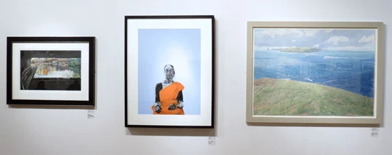
Sunday Times Watercolour Competition 2015 - Prizewinners
Left to right:
Left - Winner of the The Smith & Williamson Cityscape Prize: Drip... Regents Canal, London by Leo Davey
Middle - First Prize: Blue Room by Akash Bhatt
Right - Second Place: Land, Sea, Place by Michael Williams
This post is about:
  • the exhibition of selected works - there are 90 paintings in total in the exhibition
  • which artwork I liked the best
  • the catalogue - and recording of eligible media
  • plus news of a new support for painting with watercolour....
You can read my previous posts about the exhibition here:
I'm tempted to go back on Saturday to see what sold!

Sunday Times Watercolour Competition 2015 - The Exhibition


View of the exhibition from the MezzanineThe prizewinners are in the middle of the left hand wall
As you can see most of the works are medium to large sizes
I always make a note of the initial impression an exhibition gives me when I'm starting to look at it. This is what I wrote as shorthand:
  • large watercolours
  • looks like a "proper" watercolour exhibition (as compared to the exhibition for this watercolour competition)
  • nicely hung
  • huge diversity of styles of painting 
  • generally very restrained and neutral framing (not competing with the work)
  • neither the catalogue nor the labels specify the media used
On a further note, generally many paintings were presented well - however a number of paintings did not benefit from expertise in framing.  A number of artists could do with spending more time and expertise on presentation. For example, a few know how to float mount well while the attempts of others are crude to look at and/or appear to run the risk of becoming detached or deteriorating.

This is a prestigious art competition not a student show. Given the number of paintings being submitted to this show, is it too much to ask that the organisers and selectors ensure that every painting actually selected for hanging should also exhibit excellent presentation or at the very least presentation which meets acceptable standards for a commercial gallery?

I certainly had difficulty equating some of the prices asked with the quality of the presentation and I certainly know galleries which would refuse to hang such works.

Next - lots of images and I expand on those general observations about the exhibition.....

Monday, September 14, 2015

The Chelsea School of Botanical Art

In the summer, I visited the Chelsea School of Botanical Art and was able to see a class in action. This is about that visit and the courses offered by the school.

The Chelsea School of Botanical Art - the home page of the website
The School is based in a building at the Chelsea Physic Garden, founded by the Society of Apothecaries in 1673.

It's located at the Cheyne Walk end of the Royal Hospital Road close to the River Thames.  (You can read more about the garden in this 2008 post and the third section of Review: 'London's Secret Garden' Exhibition at the Chelsea Physic Garden).

The School has the use of a very large, light and airy room in the main building plus access to the Garden's Library and obviously to all the very many plants in the Chelsea Physic Garden.
For more details of the extensive plant collection , see the following:
The only problem I can see with the current arrangements is that it's not accessible for people who cannot use stairs.

A couple of shelves in the Chelsea Physic Garden Library

History of teaching botanical art in Chelsea - and the English Gardening School


A botanical illustration course was originally taught in Chelsea by Anne Marie Evans under the auspices of the English Gardening School - also based at the Chelsea Physic Garden.  It followed a regime for education set out in her book An Approach to Botanical Painting (which is now out of print - and second hand copies are very difficult to source).

Anne Marie Evans retired as Course Director in 2004 and stopped teaching on the Diploma Course in 2009. Following her retirement, Helen Allen BA, PGCEd, Dip EGS, FLS was appointed the Diploma Course Director in 2005 having taught on the course since 2001.

The English Gardening School then closed in December 2012 and reformed itself in May 2013 - but this time without any botanical painting courses. 

This is what led Helen to create the Chelsea School of Botanical Art, with both schools based at the Chelsea Physic Garden.

The new Chelsea School of Botanical Art


I was able to talk to Helen and her right hand woman Mary Ellen Taylor (Course Administrator) about the new courses offered by The Chelsea School of Botanical Art which came into being in January 2014.
  • The School started by offering a new Diploma Course (click the link for an overview of the course content).
  • So far two groups of students (2014 and 2015) have started the diploma course offered by the school.  
  • All I talked to were very complimentary about the course and the quality of the tutors.
  • I was amazed at some of the distances students travelled to attend the course!
During my visit I was able to observe a class by Lucy T. Smith, the award winning and professional botanical illustrator who produces illustrations for Kew Gardens and Curtis botanical magazine. (Note: Lucy is one of the few people to offer botanical illustration in pen and ink classes and she is delivering one this week at CSBA)

Lucy T. Smith teaching a class at the Chelsea School of Botanical Art
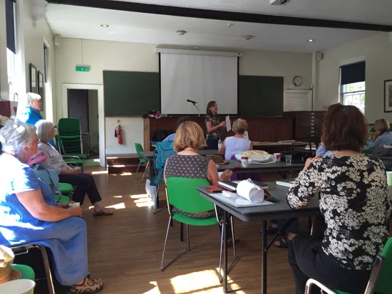
The Classroom used by the Chelsea School of Botanical Art
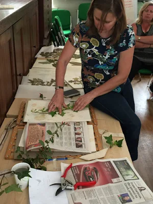
This post is illustrated with photographs from that class - which involved Lucy showing the students how to prepared plants for pressing in a plant press.

Below you'll find my interview with Helen Allen. The bold are my questions and the text in grey are her answers.
_______________________________

What does the School aim to do?
The school aims to prepare illustrators and painters to work confidently and independently to an extremely high standard.

CSBA's diploma is holistic and not just about BOTANICAL ART. It's also about:

  • laying down the firm foundations of good art practice, 
  • deepening knowledge and 
  • broadening personal horizons
The school has developed an excellent team of tutors who work together with the administration to support the ethos and teaching of the school.
[Note: The new Director of the Diploma Course from 2016 is Elaine Searle]

How is the Diploma Course organised?
Lucy Smith demonstrating how to use
a flower press to dry plant specimens
for use in botanical illustration
The structure of the curriculum, based on sound educational principles, is designed to encourage endeavour and aid individual development.

Botany is at the heart of the course, and illustrative techniques are where we begin this exciting and sometimes mysterious journey.


Drawing and painting techniques and compositional theories are learned in class. They are then applied to botanical subjects following Anne-Marie Evans’s unique 5-step approach to painting in watercolour.

Research methods and use of resources for learning, such as London’s great galleries, museums and libraries, are also part of the process we teach and students are required to write and present topics in class.

Working on complex forms and more advanced techniques helps students to complete work with finesse. Accompanied by aesthetics and the development of a critical vocabulary with which to understand and inform their work, students are able then to produce a final project to submit for the CSBA Diploma.
[You can find details of the course on this page on their website]

Does it always stay the same or does the course evolve over time?
Whilst the aims, objectives and structure of the course remain the same, the order of subject matter, delivery and timetable is constantly evolving to suit the dynamics and needs of each year group.
What do you look for in diploma students?
The diploma course is hugely demanding of students and their willingness to learn and practice techniques is paramount.
The 2016 Diploma course beginning on 11th January is now full with a waiting list. Applications are now being accepted for the 2017 Diploma Course in Botanical Illustration and Painting beginning January 2017. Information sessions will take place at the school during the autumn term 2015 and again in spring/summer 2016 terms.
Chelsea School of Botanical Art
[Note: One of the good things about the School is they offer information sessions for prospective students where they can visit the School to see what happens - and one was taking place on the day I was there.]

One of the CSBA students with her specimen and pencil and watercolour sketches in a sketchbook

How do you cater for the different backgrounds, levels of experience and talents of different students on the course?
There is always more than one way to teach and learn a single skill. We endeavour to find that path for every student to guide them towards reaching their goals.

In the classroom original work is seen by tutors and by simply watching the way in which a student applies paint can prompt constructive criticism and help.

Knowing the students, their approach to their work, their fears and woes, is helpful to their technical development.

So many invaluable tips and asides are absorbed in the classroom as well as intelligent critique.
End of the Class: The usual Teacher's Summary of homework for the holidays!

The diploma course is the main course of study - but I believe you offer shorter courses as well
Subject matter for short courses and brilliant tutors widen the appeal for learning botanical art at CSBA.
[Note: You can find the list of short courses on the website. Tutors in 2015 are/have been: Elaine Searle, Sarah Simblet, Lucy T. Smith,  Christobel King, Rosie Sanders]

The Chelsea Physic Garden is organised into beds of plants of different type and origin
This is the sign for the Garden of Useful Plants - used for all sorts of different purposes.
What's it like delivering a course in botanical art in the Chelsea Physic Garden?
The Chelsea Physic Garden is steeped in history and the adventures of the sea captains and apothecaries associated with the garden provide a background and context for the courses.

Where plants live and grow in abundance and the thread of botanical art through the ages is ever present we are constantly aware of the prefect marriage of science and art.
Note: If you are on Facebook you can check out the photographs taken of the students working in the garden on the last sunny day of term - which was when I visited

Plus this is a video prepared by the Chelsea Physic Garden about the outdoor classroom on the doorstep


You can find the CSBA online as follows

Friday, September 11, 2015

Review of Ruskin's Turners at the Fitzwilliam Museum

This is my second review of the watercolour exhibitions currently on display at the Fitzwilliam Museum in Cambridge until Sunday 4th October.

This one is devoted to Ruskin's Turners - and is a little later than planned. You can find out more about them below. However the important things to note is that there are very long intervals between exhibitions of these paintings. The last exhibition was 15 years ago in 2000!

I was very impressed by the exhibition. It's well lit so you can see the watercolours clearly. The images also have very informative annotations. I'm certainly going back for a second look before the exhibition closes.

Note: You can see my review of the Watercolour: Elements of nature (Mellon Room) which finishes 27 September in Two watercolour exhibitions at the Fitzwilliam Museum, Cambridge
Ruskin's Turners

John Ruskin was an amazing man - one would struggle to think of his equal today.
Ruskin was the greatest British art critic and social commentator of the Victorian Age. His ideas inspired the Arts and Crafts Movement and the founding of the National Trust, the Society for the Protection of Ancient Buildings, and the Labour Movement. The Ruskin Research Centre
He was drew and painted in watercolour.  His hero was JMW Turner.

25 of the 55 watercolours owned by the Fitzwilliam were gifted to the Museum by John Ruskin in 1861.

The Fitzwilliam's "Turner Collection" of watercolours was devised as a teaching aid for students at the University of Cambridge. The collection illustrates the development in the use of watercolour by Turner over the course of his very long career as an artist - from age 17 to 68 years old. They include book illustrations, architectural drawings and landscapes.

Ruskin was also one of the first collectors to recognise that light actually damages watercolours which contain fugitive pigments in the paint. He took practical action in two ways to limit the damaging effect of light.
The Mahogany Cabinet made to store
Ruskin's Turner Watercolours
is also on display at the Fitzwilliam Museum.
  • First his gift was conditional on the Fitzwilliam collection of Turners never being lent outside the Museum. Hence they are only shown at limited intervals - which is why this is your last chance to see them for probably the next 10 years.
  • Second, he made sure that when stored that the collection was kept safe from light inside the mahogony of a cabinet case made especially for the collection
You can view the Turner Watercolours online on the website.

This post also contains images of some of the paintings on view.  The link in the title of each is to its page on the Fitzwilliam online collection  website which provides much more information about that individual painting.

Interestingly they're all listed as drawings - because of course watercolour was considered to be a sketching medium rather than a serious painting medium.

I have to say I'm delighted that I've got the large versions to look at and can study his technique!

For all those devotees of the pen and ink and watercolour wash, this exhibition provides an inspiration!  He uses a pencil for loose shapes and then I think he applies simple washes - often using just two colours - and then restates the shapes of the buildings and people and animals very simply using sepia ink. The record says he also uses black ink but I must confess I'm struggling to see where.

Now you know who inspired me to always use sepia ink when sketching!

Brunnen, Lake Lucerne in the distance c.1841-3,
J.M.W Turner (1775-1851).
watercolour over graphite, with pen, brown and black ink on paper
(touches of watercolour, verso, from next page)
height, 225, mm; width, 290, mm
Image: copyright Fitzwilliam Museum, Cambridge
In 1842, Turner presented his dealer, Thomas Griffiths, with a group of fifteen sample watercolours from which he proposed to work up ten large finished watercolours on receipt of commission for specific views. In the event, Griffiths succeeded in finding only three purchasers - one of whom was Ruskin - who between them agreed to buy all but one of the finished group. These Ruskin later described as ‘the ten drawings which Turner did for love'. Turner first visited Brünnen in 1802. During his visits to Switzerland in 1841 and 1842, he extended his knowledge of the central Alps and the northern shore of Lake Geneva, concentrating particularly on Lake Zug and Lake Lucerne and their surrounding mountains. He explored Brunnen most extensively in 1843. In later life, Ruskin came to prefer Turner’s Swiss sketches to his finished views, which he complained Turner had ‘spoiled’ by putting in the ‘ugly hotels’. (Text from 'Ruskin's Turners' Exhibition Website).
Ruskin regarded Turner as "the only perfect landscape painter that the world has ever seen".


Turner for his part considered that Ruskin saw rather more in his paintings than he ever painted!

watercolour over graphite with gum arabic on paper
J.M.W Turner (1775-1851) - given by John Ruskin in 1861
watercolour over graphite, with pen, brown and black ink on paper
(touches of watercolour, verso, from next page)
height, 280 mm; width 400 mm
Image: copyright Fitzwilliam Museum, Cambridge
This image relates to a series made for subsequent line engraving in Charles Heath’s ‘Picturesque Scenery in England and Wales’.  It's thought that this is a view taken from the north-west of Swaledale, between Whitcliffe and High Gingerfield. It's also thought to be based on a drawing made during a walking tour of the North Riding of Yorkshire in about 1816.

Yes - that is a dog performing tricks with a hat on in the foreground!

You can see the five sketchbooks completed by Turner on his walking tour of Yorkshire in 1816 on the Tate Britain website.

Flüelen from the lake c.1840-43
J.M.W Turner (1775-1851) - given by John Ruskin in 1861
watercolour with some red and black ink
 and scratching out on paper watermarked Whatman
Image: copyright Fitzwilliam Museum, Cambridge
This one was last seen in 1959!

As always with Turner, he demonstrates great interest in the weather and atmospheric effects generated within both sky and water.
Fluelen lies at the Southern end of Lake Lucerne, and was an important point on the route to Italy via the St Gothard Pass. A ‘sample’ view of 'Fluelen' (Tate Gallery) was worked up into a finished watercolour in November 1845 for H. A. J. Munro of Novar, one of Turner’s principal patrons. As in that drawing, Turner concentrates on the two most prominent buildings in the town, the baroque church of Sts George and Nikalaus and, behind it, the medieval keep known as Schlösschen Rudenz. Turner visited Fluelen in the early 1840s. Broad stylistic similarities with 'Venice, storm at sunset' in the rendering of the vortex of the storm and agitated water surface support a date of around 1841 for this view.(Text from the 'Ruskin's Turner's Exhibition Website).
Venice from the Lagoon 1840
Venice, from between the Giudecca and the Isola di San Giorgio, with the Bacino di San Marco c.1840,J.M.W Turner (1775-1851) - given by John Ruskin in 1861
watercolour and bodycolour over graphite and black ink on paper
(note the comments about the paper below)
height, 230 mm; width 305
Image: Fitzwilliam Museum, Cambridge
This painting of Venice one was last  on display in 1959 and 2000.  His paintings of both boats and people are gestural - his main interest lies in the overall scene and the colour and atmospheric effects found in Venice.
Ruskin first visited Venice in 1835, and over the subsequent decade became alternately depressed and outraged by the physical degradation of the city. To an extent, he found consolation in Turner’s ‘dreamlike and dim, but glorious’ vision of the city. The fact that he gave all the drawings he ever owned of Venice to either Oxford or Cambridge has been considered by some commentators as a reflection of his dismay at the destruction of the city. This watercolour is executed on paper which is identifiable by its watermark as a forgery of a Whatman paper, possibly Austrian in origin. The surface of the paper is quite different to any other which Turner used in Venice, and makes the effects of bodycolour very pronounced. (Text from 'Ruskin's Turners' Exhibition Website)
 Some of the paintings include groups of figures in the foreground. His treatment of them varies

Orléans, Twilight (c. 1826-1831)
J.M.W Turner (1775-1851) - given by John Ruskin in 1861
Watercolour and bodycolour with pen, red and grey ink on blue paper
height, 140 mm; width 195
Image: Fitzwilliam Museum, Cambridge
Ruskin acquired this watercolour from Hannah Cooper (Turner’s stockbroker’s niece) in May 1858. It is one of a group of ten drawings on blue paper which he acquired at this time, paying fifty guineas per design. He referred to the series communally as Turner’s ‘blue drawings’. The set of views of the Loire was, in fact, the first for which Turner made extensive use of a blue paper ground. The paper was manufactured only sometime after 1821 at a mill near Bath, and Turner’s willingness to use it reflects his enthusiasm for experimenting with new materials. (Text from 'Ruskin's Turners' Exhibition Website).
The paintings above and below are painted on the blue paper which Turner favoured.

For those wanting to try blue paper like the one used by Turner you should take a look at the Turner Blue paper on the Rushcombe Handmade Papers website. This paper mill was allowed access by Tate Britain to the papers in the Turner Collection to test how they were made and then the papers produced today have been made according to the same traditional processes as applied at the time. It's as close as you will ever get to painting on the same paper that Turner used.

Yarmouth Sands c.1824-1830
J.M.W Turner (1775-1851) - given by John Ruskin in 1861
Watercolour and bodycolour on blue paper
eight 185 mm, width 245 mm
Image: Fitzwilliam Museum, Cambridge 
Turner's paintings of people always make me wonder whether he actually saw them like this or added them in from the very many sketches he made over time.
  • In the Orléans, Twilight painting above - which is very small - the figures are characterised by shapes for heads and legs with no a lot of definition in the body. Dabs of paint then differentiate one from the other.
  • In the Yarmouth Sands painting - which is a little larger - the people are painted with more definition and not a little bodycolour.
Sadly, there is no catalogue for this exhibition or for the Ruskin Collection of Turner's artwork as a whole. Surely some sponsor could be found for a book of this particularly unique collection - or a grant sought from the Heritage Lottery Fund?

The exhibition also includes paintings by John Ruskin himself.  It's not difficult to note the difference in colours used between Turner and Ruskin. The sketch of a Palazzo in Pisa below is also focused on the architecture and very much reminds me of the type of sketch produced by urban sketchers around the world....

Palazzo Agostini, Pisa.
Ruskin, John (British, 1819-1900).
Ink used with the tip of the brush, watercolour and some white on grey-green paper,
height 478 mm, width 338 mm
Image: Fitzwilliam Museum, Cambridge