Showing posts with label Japanese Art. Show all posts

Monday, January 13, 2025

My Composition and Design project

This year I'm going to remind people about what I've got in the archives of Making a Mark. I'm going to start with my Composition and Design Project which I started in January 2008

The future may be at the end......

Composition and Design Project - Blog Posts 

Below is a list of the various posts and a short explanation of what they're about.

Some of the hyperlinks these blog posts contain may be out of date and/or moved on to pastures new.

Fibonacci Spiral
Wikimedia Commons

Design and Composition - I'm revisiting this topic to try and understand more about what different people have had to say about composition, what are the 'rules' and why breaking the rules also works. I intend to relate design and composition to specific subject matter (eg landscapes and flowers) and artists that I like and/or will feature this year - such as Degas. I'm starting the year with this topic as it underpins so much of what comes next. It will continue to run as theme throughout the year and I'll be referencing it in other areas of work during the rest of the year.
Katherine Tyrrell - "Making A Mark in 2008 - the Plan"
Singing the Blues
10" x 8", coloured pencil on Arches HP
copyright Katherine Tyrrell

It's amazing how many of us who don't have the benefit of a fine art degree seem to have managed to learn something about the different aspects of what's involved with composition and design without actually ever coming across the idea of the 'elements' and 'principles' of art/composition/design! Or at least that's my experience. I'd certainly never heard about these particular groups before starting this project. Maybe this is what they teach you if you do an Fine Art degree? ;)

Sunday, August 15, 2021

An introduction to Japanese Art on Making A Mark

One of the most popular of my themed projects related to Japanese art and artists - and Hokusai and Hiroshige in particular - and the impact this art had on later artists. 

This post highlights my past blog posts on these topics

The Making A Mark Japanese Art project


South Wind, Clear Sky (Gaifū kaisei) By Katsushika Hokusai (1760 – 1849)
also known as Red Fuji, from the series Thirty-six Views of Mount Fuji (Fugaku sanjūrokkei)
Polychrome woodblock print; ink and color on paper, 9 5/8 x 14 in. (24.4 x 35.6 cm)


Introducing Japanese Art

Below are links to the various posts about Japanese art which have appeared on Making A Mark. 

The majority are associated with an art project I undertook in 2008 to research Japanese art and find out more about the main artists associated with ukiyo-e.

The Making A Mark project serves as an introduction to Japanese Art and ukiyo-e - the Japanese wood block print. 

A significant element of my interest related to the compositional devices used in japanese art - and how these went on to influence western art in the latter half of the nineteenth century.

I created the blog posts from various resources I found online - and I also created a website to record the links as I progressed with the project. 

Each of the links below is explained in the short descriptions

The influence of Japanese Art - a long detailed post!
  • There's something about Japanese Art which draws me in. I'm not sure quite what it is however I'm very sure that learning more about it will help me with the development of my own drawings and artwork. It had a significant impact on the artists who I studied last year so I feel that being open to its influence can only be beneficial. 
  • I'm going to look first at resources and then at how I might usefully frame my approach to this project.
  • These include:
    • books about Japanese art
    • profiles of individual artists
    • Context for the development of ukiyo-e
    • Compositional devices learned from Japan
    • Formats derived from Japan
    • Subject matter
    • Making connections - between Japanese art and other artists, notably Van Gogh, Whistler, Degas and Cassatt
The concepts and characteristics of ukiyo-e
This week, I'm going to try and summarise what seem to be the subjects and characteristics of the Japanese wood block print - ukiyo-e. I'm going to move from overview through to detail as I work through this project so I'm starting with the big picture.
  • This is an attempt an overview of the subject matter.
  • Then I'm going to use the western conventions of elements and principles of composition to organise new information so that hopefully it makes more sense to me within a more familiar context.
  • This post aims to provide an overview of the different elements of design used in a Japanese wood block print - ukiyo-e. (For an explanation of the elements of design see this post Composition - The Elements of Design)
Principles of design and composition and ukiyo-e 
  • My intention was to do an overview about the principles informing the design of Japanese art and prints - but I'm overwhelmed and becoming aware of how absorbing this project might become! My new aim is to set down some initial impressions - and I'll revisit this topic again towards the end of this project.
  • I'm also trying to relate a Japanese way of making pictures to western concepts of what's important in terms of Principles of Design (as discussed in the last project) Again this is more about me finding a way to understand what's going on initially rather than saying the western way of looking at things is best. As we'll see as this project progresses, there's an awful lot of western art which adopted conventions which originated in the East.
  • I came across this fish in a book I bought last Friday. It's called Japonisme - Cultural Crossings between Japan and the West, Lionel Lambourne, Phaidon Press. Lionel Lambourne OBE is the former Head of Paintings at the Victoria and Albert Museum (1986-1993) and a curator.
The Visual Translation of Japan in Late 19th-Century Paris
  • Japonism is the term used for the influence of Japanese art in the west. This post is part of my Japanese Art project and is a combination of my own initial research on this topic and notes I made at a seminar I attended at the National Gallery in February called Gained in Translation: The Visual Translation of Japan in Late 19th-Century Paris - given by Karly Allen.
  • Whistler, Tissot, Monet, Manet and Degas were all buying up Japanese prints. Comparisons were made with the great artists of the western traditions of printing eg Durer. Europeans were 'discovering' Japanese art - which of course already existed even if the western world didn't know about it! Many of the artists developed very significant collections of Japanese Art
  • This blog post is part of my project on Japanese Art (see other posts) and is concerned with how Japanese wood block prints associated with ukiyo-e were made. It contains an overview of what they are and how the prints were made and provides links to further information.
  • We visited the Royal Botanic Gardens at Kew this week and I attempted to draw the Japanese Gateway (the Chokushi-Mon) while at the same time trying to remember all the things I'd been learning as part of my Japanese Art Project. This post is about I designed my sketch and the things I now need to do to translate it into a more formal drawing.
The Art of Hiroshige
  • Throughout my Japanese Art project, I've become more and more aware that Hiroshige produced some really stunning woodblock prints and excelled at landscapes. So for my last post of April I'm going to focus on Ando Hiroshige aka Utagawa Hiroshige.

    Later posts on the topic of Japanese Art


    Hokusai, Van Gogh and the iris paintings (2009)
    I've been studying an expert - Vincent Van Gogh - who, in turn took pointers from another expert - the Japanese artist Hokusai. This post comments on their various approaches to iris paintings.
    • This is the third of a series of exhibitions dedicated to Japanese Artists and Printmakers to be held at the Royal Academy of Arts.
    Hokusai and Hiroshige: Great Japanese Prints (2012) 
    • This is an Asian Art Museum video about Great Japanese Prints by ukiyo-e printmakers Hokusai and Hiroshige
    OASC for Metropolitan Museum of Art Images (2014)
    • This includes who to locate the the ukiyo-e prints of Hokusai
    Refreshed Toshiba Gallery of Japanese Art at the V&A reopens (November 2015) 

    Tomorrow I'll reproduce one of the websites I produced which is no longer online.

    Friday, July 02, 2021

    Lockdown Art #1: 1000 Cranes by Liz Hanan at the Oxmarket Gallery in Chichester

    I'm inviting people to highlight where we can currently see art with some sort of explicit link to lockdowns in current exhibitions - anywhere in the world.

    If I like what I see, it will be featured on this blog with a link to the exhibition it's in and the relevant artist.

    I'm doing this because I'm a big fan of art which records social history
    - and if this pandemic is not social history, I don't know what is! It's changed such a lot of our day-to-day lives and ongoing economies and how we will live and work in the future - forever!
     
    [PS For those expecting to see the post about pricing and sales at the NEAC Exhibition, this will now be on Sunday - when I can update my Excel Spreadsheet with the sales since Tuesday.]
     

    Lockdown Art #1: 1000 Cranes by Liz Hanan


    My first example of lockdown art was sent to me by Sue England, who many of you may recall was one of the finalists in the Sky Arts Landscape Painter of the Year 2019 (at Battersea Power Station)

    I saw you were asking about art created during lockdown. 

    You may be interested in an installation piece of 1000 cranes, hanging in a one and a half metre globe, made from 7000 re purposed vaccination syringe wrappers. Liz Hanan a vaccinating nurse and also a professional artist created it.

    1000 Cranes by Liz Hanan

    The narrative on her website explains that:

    • the 1000 cranes are created out of spent vaccination packages
    • the ancient Japanese tradition of 千羽鶴, senbazuru (literally “1000 cranes”) involves the folding of 1000 cranes which are then hung by strings
    • In doing this, your wish will come true
    • They are also a a symbol of hope, health and longevity in difficult times.
    • The vaccination programme across the world has brought hope to so many people
    • her notion for the work was created in collaboration with the vaccination teams in the Chichester area.
    • the teams collected the syringe packets after use, Liz joined them together and then they are folded and created cranes
    • 1000 Cranes were created out of around 7000 vaccination packets
    • the collaborative process was an important part of creating the piece - reflecting the collaboration of the vaccination programme
    • they are now hung together to form a sphere - measuring 1.5 metres in diameter.

    You can see a video of it on this link

    It's certainly one of the most impressive pieces of lockdown art I've seen to date!


    Exhibition: Artel
    Title: Cranes
    Location: Oxmarket Gallery St Andrew’s Court, off East Street, Chichester, West Sussex PO19 1YH
    Dates: Until 11th July 2021
    Hours: 10am - 4.30pm

    Instagram: @chigroupartel
     
    (Note: It's part of The Festival of Chichester)
     

    Tuesday, November 03, 2015

    Refreshed Toshiba Gallery of Japanese Art at the V&A reopens

    I didn't know until yesterday that the Victoria & Albert Museum has one of the foremost and comprehensive collections of Japanese Arts in the world.

    A view in the centre of the new gallery
    The Museum began collecting in 1852 - the year the museum opened. As such it played a very important part in raising the awareness of the art of Japan amongst both artists and art lovers in the second half of the 19th century.

    It has also of course made a major contribution to the way Japanese Art influenced art and design in Europe during the late 19th century and onwards.

    Toshiba Gallery of Japanese Art

    The Toshiba Gallery of Japanese Art (Room 45) reopens at the V&A Museum in London tomorrow.

    It's undergone a "refresh" of the content on display and how it is displayed. The project has represented a major collaboration of different teams within the V&A from curation to the display teams and those involved with technical lighting and signage.

    I visited the preview yesterday and you can see images of the new exhibition in this post.

    The Gallery of Japanese Art - sponsored by Toshiba - at the V&A is one of my favourite galleries. I always visit it whenever I visit the museum. Some of the objects feel like old friends!

    It's also FREE TO ENTER!  The Japanese Gallery is open daily 10:00 - 17.45 and until 22:00 on Fridays

    Japanese Inro in the Japanese Gallery at the V&A
    The V&A's collection of Japanese lacquerware contains around 2,500 pieces, of which 800 are lacquered inro (small, highly decorated containers that were worn suspended from the sash).
    The Gallery has been closed in order to bring it up to the standards of exhibition space and display that the Museum now aspires to.
    • The original cases remain in place. 
    • However the interior displays and the lighting and signage have all been changed.
    • Plus there are 400 new objects are on display of which some 30 are recent acquisitions. There are two major new displays relating to the developing of Japanese design in the 20th and 21st centuries - covering modern and contemporary objects such as interior design, product design, electronics, photography, graphics and fashion - and it now includes items from Muji and to 'Hello Kitty'.
    • Much of the ceramics collection is now displayed within the revamped Ceramics Gallery - on the 6th floor - (Rooms 136 – 146.  Room 137 houses the ceramincs which relate to Asia)  This is an article about the Ceramics Galleries: Old and New
    There are three entrances to the gallery and hence its layout is themed and linked with no particular recommended route.

    The new exhibition has a pleasing way of reminding you that one of the purposes of museums like the V&A is to influence and inspire those who are designing the decorative arts today.

    Tuesday, May 27, 2014

    OASC for Metropolitan Museum of Art Images

    I do like to look at images in high resolution - there's an amazing difference between high resolution images online and those you see in books or low resolution images online.

    You can now access some 400,000 high resolution images belonging to the Metropolitan Museum of Art through their Open Access for Scholarly Content (OASC) initiative.

    That basically means they are for educational use.

    Below you can find out more about how to access the images and what can be accessed plus a neat reminder of what size an image needs to be to print it.

    In keeping with the educational topic, I'm highlighting images relating to topics which have receeived in-depth study on this block - drawing, botanical art, John Singer Sargent and the ukiyo-e prints of Hokusai

    John Singer Sargent
    (American, Florence 1856–1925 London)
    I love the scribble he uses for the leaves and flowers 
    and wonderful to see a drawing associated with such a famous painting

    What's OASC?

    Lots of museums have an arrangement whereby high resolution images can be accessed and very often an image is charged - and the Met was one of the museums who did that.

    Latterly there's been a move to make high res. images available for educational/non-commercial use.  Partly I guess because it's now relatively easy to spot the use of an image online (see How to do a reverse image search) so identifying commercial use becomes that much easier.

    Here's the arrangements which have been developed by the Met - and what it replaced.
    OASC was developed as a resource for students, educators, researchers, curators, academic publishers, non-commercial documentary filmmakers, and others involved in scholarly or cultural work. Prior to the establishment of OASC, the Metropolitan Museum provided images upon request, for a fee, and authorization was subject to terms and conditions.
    The director commented
    “Through this new, open-access policy, we join a growing number of museums that provide free access to images of art in the public domain. I am delighted that digital technology can open the doors to this trove of images from our encyclopedic collection.”
     Now all we need to see is more art galleries and museums following the trend!

    Violets, Primroses and Other Spring Flowers
    Kubo Shunman

    Part of an album of woodblock prints (surimono); ink and color on paper
    (Japanese, 1757–1820)
    Quite unlike botanical art we're used to seeing from Japanese artists


    What's included?

    This is the link to the Collection Online.
    (OASC) images associated with these artworks can be downloaded for license- and cost-free scholarly and academic publication, according to the Terms and Conditions.
    The FAQs page provides a definition of what can be accessed via this new initiative.  It certainly isn't everything that can be seen on the website.
    Works that are covered by the new policy are identified on the Museum’s website (http://www.metmuseum.org/collections) with the acronym OASC. (Certain works are not available through the initiative for one or more of the following reasons: the work is still under copyright, or the copyright status is unclear; privacy or publicity issues; the work is owned by a person or an institution other than the Metropolitan Museum; restrictions by the artist, donor, or lender; or lack of a digital image of suitable quality.)
    Togetsu Bridge at Arashiyama in Yamashiro,
    from the series Remarkable Views of Bridges in Various Provinces (Shokoku meikyō kiran)

    Katsushika Hokusai 
    (Japanese, Tokyo (Edo) 1760–1849 Tokyo (Edo))
    one of my favourite artists for landscapes - Hokusai has a lot to teach about design and framing a landscape

    What's scholarly?


    There's a debate over on Hyperallergic about the copyright restriction which they claim over the images which have been released - see Metropolitan Museum of Art Releases 400,000 Images, with Restriction

    Personally I find it most helpful to start with the Met's definition of what is NOT scholarly use
    What is not scholarly content?Commercial use, publication, or distribution in any media or format is not scholarly content. Some examples include: commercially published general-interest books in print or electronic media; all products, merchandise, (including posters, calendars, notecards, datebooks, mugs, etc.), advertisements, or promotional materials for any services or products in any media format; feature films or documentaries funded by commercial organizations.
    Essentially it means for non-commercial and educational use. I'm taking the view that this blog is very much focused on educational content for the development of artists. Plus I only ever publish online and all images become reduced  to low res. to make them compatible for a speedy load.

    Plus you need to look for the icon below images in the Collection section of the website to identify images that are part of the OASC initiative.

    The problem is that the Met provides a number of different criteria for how you can 'slice and dice' its collection but OASC is not one of them.  So I went for an artist that I thought might be accessible - John Singer Sargent - only to find no OASC icon.

    I then tried a search using "john singer sargent oasc" - but that produced a "no records" result.

    Bottom line you just have to persevere and eventually you start finding images with the OASC icon.


    Determining the suitability of a digital image for reproduction in a print publication

    This is a topic which has been occupying me much of late as I work through my archive of past images finding ones for inclusion in my book.

    As a result I found the guidance offered by the Met to be invaluable. I'm sure others will feel likewise. It;'s not that this is original so much as it's once of the more succinct explanations I;ve come acrosss.

    When determining the suitability of a digital image for reproduction in a print publication, there are several key factors to consider: resolution, pixel dimensions, and the intended size of the printed output. The following table provides some typical output sizes and the recommended dimensions for a publication-ready image at 150 ppi and 300 ppi—the most common resolutions for images available from the Museum's website.
    Print Output Size
    (inches)
          Resolution      
    Pixel Dimensions
    (minimum)
       
     8 x 10300 (ppi) 2400 x 3000
     150 (ppi) 1200 x 1500
     4 x 6 300 (ppi) 1200 x 1800
    150 (ppi)600 x 900

    Though some images available via Open Access for Scholarly Content (OASC) may not meet the above requirements, this does not necessarily preclude them from publication at smaller sizes. A useful formula in determining the maximum print size of any digital image is as follows:
    Digital Image Print Size
    Note that image resolution is only a factor in determining print output. For digital purposes, the pixel dimensions of an image are the only measurements that determine display size.


    Monday, September 03, 2012

    Hokusai and Hiroshige: Great Japanese Prints

    Below is an Asian Art Museum video about Great Japanese Prints by ukiyo-e printmakers Hokusai and Hiroshige


    Ejiri in the Suruga province (1832) by Katsushika Hokusai
    one of the prints seen in the video
    I found it on the ArtBabble website and then located it on Youtube - which offers more options re viewing.


    This is the Video which was created to promote the Hokusai and Hiroshige: Great Japanese Prints from the James A. Michener Collection, Honolulu Academy of Arts exhibition that took place at the Asian Art Museum from September 26 - December 6, 1998.  It was filmed at the museum's former location in Golden Gate Park.

    The video offers an overview of the context for the ukiyo-e and then provides two profiles of the work of Hokusai and Hiroshige.

    You can also view it in iTunes.  This is the description of the video on iTunes.
    The society of Japan's Edo period (1615-1867) embraced a number of intriguing contradictions. It was a time of unprecedented stability, when Japan, previously a mosaic of violently warring feudal states, finally achieved unity as a nation. Though strictly stratified in four hereditary classes — nobles, farmers, artisans, and merchants — Edo society nevertheless produced a vigorous middle class of enterprising commoners. By the 1800s, commoners enjoyed the numerous amenities of Edo (Tokyo), the world's largest city. They launched businesses, perfected crafts, gained leisure time and literacy, traveled a system of safe roads, and enjoyed art and poetry. While print makers initially illustrated the denizens of the pleasure quarters, or Ukiyo-e ("floating world"), the print also became an acceptable and affordable medium for the full range of expression common to Japanese art, including landscape, flowers and birds, and genre scenes. The most important and prolific were the 19th-century artists Katsushika Hokusai and Utagawa Hiroshige, whose prints constitute the most recognizable images of Japanese art throughout the world. This exhibition was organized by the Asian Art Museum of San Francisco and the Honolulu Academy of Arts.
    Description on iTunes
    The James A. Michener Collection
    Most of us know James A Michener as a famous novelist.  However he was also very interested in Japanese prints and he became a great collector and connoisseur of Japanese prints, and an important patron of the Honolulu Academy of Arts.

    His entire collection of Japanese woodblock prints (nearly 5,400) - ranging from 17th century to late 20th century Japanese prints - was donated to the Honolulu Academy of Arts between 1959 and 1991.  Today, that donation accounts for about half of the entire collection of more than 10,000 Japanese ukiyo-e woodblock prints.

    Webpage for the Japanese Wood Block print Collection of the Honolulu Museum
    More resources about Japanese Art

    Other educational resources about Japanese Art provided by the Asian Art Museum include:
    I've been studying Japanese Art for some time - ever since I discovered its influence on western art in the nineteenth century.  These are links to the resource websites I created:

    Sunday, April 24, 2011

    Making A Mark notches up 1 million visits

    One million visits to Making A Mark - on 24th April 2011
    Little did I realise when I published this blog back in 2006, that some five and bit years later this blog would notch up ONE MILLION visits.

    As you can see visits have climbed steadily over the years - helped along by what is now a vast archive of posts which continue to attract a lot of interest from people.

    Here are ten of the most popular posts those million visits have been to:
    1. 10 Tips for How to Sketch People 
    2. Van Gogh: Drawing media and techniques   
    3. Composition - Principles of Design 
    4. Composition - The Elements of Design
    5. Colour Schemes: Split Complementaries, Triads and Tetrads   
    6. What is a still life?   
    7. The influence of Japanese Art 
    8. Which sketchbook? 
    9. Flowers in Art... and Charles Rennie Mackintosh  
    10. Major Art Competitions in the UK 2011 - a timetable
    Tip - If you think you're going to have a successful blog, get Google Analytics up and running early!  I didn't do this until 2008 hence don't have a complete stats profile for content.

    I've got a much better record of the numbers.  Except the interesting thing I discovered this morning is that I've got a lag of about 20 or so visits between my dashboard on my Statcounter account and the Statcounter counter on the blog.  However the chart up above was created at 7.37am this morning when the millionth person visited and it actually counts 1,00,002 visits!

    Those visits have also generated over 1.5 million pageloads.

    Statcounter has a specific time which has to elapse between visits for any pageload to count as a completely new visit.

    Were you the millionth visitor?

    I had a little count back on my stats and I can't tell who the visitor was but I do know that he or she came from Toni Kelly's A Spattering.  I'll be writing to Toni and sending her a voucher to spend on Amazon for 'making a mark' and generating the millionth visitor to Making A Mark!  I toyed with the idea of announcing a competition but decided to stick with not saying anything at all and just being around to see if I could work out which blog was the nearest to the millionth visitor!  

    PS  There will be no "Who's made a mark this week" as I've been 'out and about' this week with himself and not really looking at blogs.  However later today I will finally get round to the review of the Pastel Society exhibition at the Mall Galleries which continues all next week.

    Sunday, May 23, 2010

    I'm off to the park to draw irises!

    Who's made a mark this week will be delayed until tomorrow as we've got exceptionally good weather today and I want to be out in it!

    This is where I'm going - to Victoria Park - hopefully to draw irises near the East Lake.


    Some of you may remember this post from last year - Hokusai, Van Gogh and the iris paintings which was triggered by trying to draw irises. 

    Have any of you been drawing them this year?

    Thursday, May 14, 2009

    Hokusai, Van Gogh and the iris paintings

    The irises are blooming at the Ecology Park Pond and I'm trying to get to grips with how to draw them. I've been studying an expert - Vincent Van Gogh - who, in turn took pinters from another expert - the Japanese artist Hokusai. This post comments on their various approaches to iris paintings.

    Van Gogh's iris paintings were produced while he was resident in an asylum in Saint-Rémy, France. He entered the asylum in the early summer of 1889 and in the following year - up until his death in July 1890 - he painted some 130 works.

    The iris paintings I've been able to track down are:
    • Irises Saint-Rémy, France, 1889; Oil on canvas 28 x 36 5/8 in. (90.PA.20 Getty Museum - currently on show at The Getty Center, Los Angeles)
    • Irises May 1890. Oil on canvas, 29 x 36 1/4 in. (73.7 x 92.1 cm) (Metropolitan Museum of Art, New York Gift of Adele R. Levy, 1958 Accession Number58.187)
    • Irises 1890 Oil on Canvas, 92 x 73.5 cm Van Gogh Museum, Amsterdam
    As a new patient he was confined to the hospital for observation during the period of his assessment. This meant that he could only paint what he could find in the grounds of the hospital.

    Irises (Saint-Rémy, France, 1889);
    Vincent van Gogh 1853-1890
    Oil on canvas 28 x 36 5/8 in

    Source: wikimedia

    What was present in the overgrown hospital garden were bright blue irises and within the first week, he began Irises, working from nature in the asylum's garden.


    (Left) Irises and (right) Iris flowers and grasshopper (1830-31)
    woodblock colour prints
    Hokusai Katsushika (1760 - 1849)
    Source: wikimedia

    The Getty Museum Irises is very reminiscent of woodblock prints of irises drawn by Hokusai - two examples of which are illustrated above. The composition is closely cropped although it fails to crop the junction between the irises and the earth as the Hokusai prints do. Nevertheless the irises are emphatically the 'subject' of the piece - perhaps because of the sheer numbers. By way of contrast Hokusai seems to go for a 'less is more' approach (assuming he could also have drawn as many irises as Van gogh - they do tend to grow in big clumps as I have observed down at the pond!

    What I also like about the Hokusai prints is the artfully uneven way in which the irises appear on the page and that's an aspect which I think Van Gogh tries to reprise in his paintings. The one thing I'm very clear about now is that they need to have a very unfussy background so that the various shapes and shades can be clearly seen and appreciated.

    There's no known drawing of Getty irises painting so it seems likely that it was painted plein air. His brother Theo was very taken with it and submitted it together with The Starry Night, to the exhibition of the Salon des Independants which took place in September 1889.

    The following year, Van Gogh again painted Irises but this time he painted four still life pictures of in vases prior to his move to Auvers. Two of these were of blue irises and the inclusion of the irises in a vase necessarily means that the irises are quite crowded - no 'less is more' here.
    • The version which is in the Van Gogh Museum in Amsterdam has a portrait format and the violet blue irises are in an ochre vase against what was originally a citron yellow wall. Van gogh was again exploiting complementary colours and was trying to achieve a vibrant image. What struck me about this painting is how the there seem to be too many irises for the vase and some have fallen out as a result.
    • However the version in the Metropolitan Museum was intended to have a much softer and more harmonious palette of pale blues, greens and pinks. According to his letters the background was originally pale pink - however it is now a very pale ivory white which just goes to show how fugitive pale pink is! The landscape format allows the irises to spread out in a more relaxed way across the canvas - much as they grow in real life but not as sparse as they are represented in the Hokusai prints. This painting was owned by the artist's mother until her death.
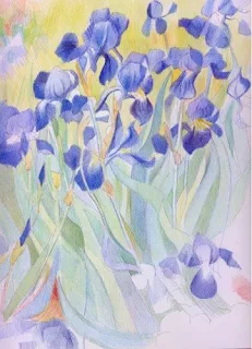
    All the paintings exploit the very curvy calligraphic shapes and movement of the leaves as well as describing the very similar flowers in any number of slightly different ways.

    (part of) Study of irises (after Van gogh) - unfinished
    coloured pencils in Sennelier HP
    copyright Katherine Tyrrell

    How do I know this? Well I've just spent a couple of evenings making a study of the irises in the garden painting and my enormous respect for Van Gogh as a draightsman and keen observer of plant forms has been reinforced yet again.

    and finally......

    In In87, Van Gogh's Irises sold for £27 million - a world record at the time for the sale of a ork of art. Interestingly that sale was in the wake of a stock market crash and the painting had not been expected to reach this sort of sum! It was sold to Alan Bond who subsequently sold it to the Getty Musuem in Los Angeles.

    Links:

    Making a Mark reviews......

    Tuesday, May 12, 2009

    Exhibition review: Kuniyoshi at the Royal Academy of Arts

    Last week I visited the Kuniyoshi exhibition at the Royal Academy of Arts. This is the third of a series of exhibitions dedicated to Japanese Artists and Printmakers to be held at the Royal Academy of Arts. The previous exhibitions have been Hokusai (1991-92) and Hiroshige: Images of Mist, Rain, Moon and Snow (1997).
    Utagawa Kuniyoshi (1797–1861), one of the last great artists of the Edo period (1600–1868), is chiefly remembered for his skilfully drawn, action-packed warrior prints and wildly funny comic images
    Utagawa Kuniyoshi - The Education Guide
    Entrance to the Royal Academy

    I left the exhibition too late to pick up a catalogue so I've been tracking down all the information on the web about Kuniyoshi and this exhibition - as you'll see below.

    The exhibition continues in the Sackler Galleries until 7th June. You can read more about it
    Cover of the RA Magazine featuring "Kuniyoshi - a master of imagination"
    • in The Royal Academy Magazine which contains three articles about Kuniyoshi and the exhibition - you can view the e-mag online
    • The way of the samurai - by Harold Evans
    • Warriors in disguise - by Timothy Clark (who is a leading authority on Ukiyo-e art and who wrote the catalogue)
    • The making of manga mania - by Paul Gravett
    The collection on show belongs to Arthur R Miller who is a long-time eminent Professor of Law in the USA. There was no mistaking his enthusiasm for Kuniyoshi's work on the audio guide accompanying the exhibition (and it was nice too to hear the collector rather than the curator on an audio guide!). He gifted his collection of 1,800 woodcuts by Utagawa Kuniyoshi to the American Friends of the British Museum.

    Harold Evans article in the RA magazine explains how her came to collect the prints and then later became a collector of Hiroshige as well having seen landscapes by Hiroshige on the walls of Monet's house at Giverny.
    ‘Kuniyoshi’s real distinction and importance lie in his entire attitude towards his art: in the unusually large scope of his subject-matter, and in his very distinctive treatment of the subject-matter … Probably no other ukiyo-e artist ever attempted such a variety of subjects, and it is very doubtful whether any other ukiyo-e artist managed to impress
    so much of his personality into his work as Kuniyoshi did.’
    Suzuki Jûzõ, 1973 - quoted in The Education Guide
    The Sackler Galleries on the top floor of the RA have been redecorated and staged to provide a very under-stated suggestion of Japan which I didn't notice to start with but complemented the very colourful prints beautifully.

    The prints on show range from portraits of (mainly) warriors and bandit heroes to fashionable beauties, satirical themes and a few landscapes. I was very struck by how colourful the prints are and vibrant and well preserved the colours are. It made me wonder whether they've been hung or kept in an archive out of the light. I'm guessing that since Miller had 1,800 it was probably the latter.

    The exhibition contains a work in progress display It was fascinating to see an original cherrywood block used to produce a print which was shown above it - complete with the bowls of pigment and the tools used to cut the block and produce the print.
    Kuniyoshi developed an extraordinarily powerful and imaginative style in his prints, often spreading a scene dynamically across all three sheets of the traditional triptych format and linking the composition with one bold unifying element - a major artistic innovation.
    RA website
    I found it fascinating to see the triptychs hung together and to learn why the diptychs and triptychs came about. Apparently the size of a wood cut print is limited to the width of cherry tree. To create a landscape format, an artist had to work across two or three sheets of paper and consequently not only had to work out the design of the whole image in landscape format but also how to split it across three wood blocks so each might 'stand alone' in its own right as well. I guess the width of the cherry block is also presumably the explanation for the long vertical prints which Japanese artists seem to excel at.

    The exhibition also highlights how for every print three people are involved - the artist, the woodcutter and the printer. Essentially this division of labour enabled artists to be so prolific and to produce series of prints involving a large number of different designs. The one which featured significantly in the exhibition is 108 Heroes of the Water Margin (1827-30) which was about Chinese bandit heroes - often with an allover tattoo and frequently shown in some form of combat. It all sounds 'very Robin Hood' to me!

    There's an amazing collection of images of work by Kuniyoshi in the Wikicommons Media website - you have your very own walk around a virtual exhibition!

    If you're interested in Japanese art and print-makers you can find out more in my resources for artists information sites which are listed below

    Links:


    Making a Mark reviews......

    Wednesday, April 30, 2008

    The Art of Hiroshige

    Cherry Blossom Time at Naka-no-cha in the Yoshiwara about 1848–49 (Kaei 1–2)
    from the series Famous Places in Edo
    Artist: Utagawa Hiroshige I, Japanese, 1797–1858;
    Publisher: Fujiokaya Keijirô (Shôrindô), Japanese
    Horizontal ôban; 24.9 x 37.1 cm (9 13/16 x 14 5/8 in.)
    Woodblock print (nishiki-e); ink and color on paper


    Throughout my Japanese Art project, I've become more and more aware that Hiroshige produced some really stunning woodblock prints and excelled at landscapes. So for my last post of April I'm going to focus on Ando Hiroshige aka Utagawa Hiroshige.

    As I always do when studying a topic I've developed an information site Hiroshige - Resources for Artists.

    Hiroshige was born in old Edo (Tokyo) in 1797 and died in 1858. He seems to have more names than most! Two important ones are Ando which was his family name and Hiroshige which was his "studio surname", given to him at age 15 just after he entered painting school by his painting master Toyohiro. Biographical information about him is pretty fragmentary - however he certainly seems to have been a very prolific artist. Some say he produced some 12,000 designs - but it's more likely to have been somewhere between 4,000-4,500. Besides design for prints he also illustrated 120+ books and produced designs for practical objects (eg c.350 fan prints) . He produced very many prints of views of certain popular locations. variations were achieved through the introduction or variations of obligatory features such as snow, moonlight, evening light, fireworks and cherry blossom. He also rang the changes on the different combinations of birds and flowers

    Western interest in Hiroshige dates back to the end of the nineteenth century. In 1887, Van Gogh copied two of his works in oils and Hiroshige obviously provided inspiration for Whistler - in terms of both bridges (and fireworks!).
    Hiroshige is a marvellous Impressionist
    Pissaro (1893) - after visiting an exhibition of prints by Utamaro and Hiroshige
    Another enthusiastic collector of Hiroshige prints was Frank Lloyd Wright.
    In 1906, (Frank Lloyd Wright) staged the first ever retrospective of Hiroshige's work at the Art Institute of Chicago, describing them in the exhibition catalog as some of "the most valuable contributions ever made to the art of the world".
    Wikipedia
    Hiroshige was particularly renowned for subtlety in his art which meant he could represent, for example, the nuances of the climate and seasons. He has been characterised as the artist of mist, snow and rain.

    The Fifty Three Stations of the Tokaido
    - the road between the two capitals Yedo (now Tokyo) and Kyoto, a distance of 323 mile
    from www.hiroshige.co.uk

    He specialized in landscapes and had a number of works in sets or series - famous ones include:
    He worked with Kunisada (another artist who has become one of my favourites during this project) on a joint project Famous Restaurants from the Eastern Capital in which Hiroshige did the top half which was landscape and Kunisada did the bottom half which were actors.

    The 53 Stations of the Tokaido (Hoeido Edition) - 1 Nihonbashi
    published by
    Takenouchi Magohachi (Hoeido) 1831-1834
    format - Oban yokoye
    (www.hiroshige.co.uk - click here to view the whole series with commentary)

    Here's some highlights of the relevant links that I found:
    Front Cover - Cherry Trees in Full Bloom at Arashiyama
    - from famous Views of Kyoto c.1834
    The Mann Collection, Highland Park, Illinois

    Besides the websites listed above I've also got access an excellent reference book called Hiroshige - Prints and Drawings by Matthi Forrer.

    This is a beautiful book produced by Prestel Publishing of Germany. It has excellent production standards and trouble has been taken to only include prints which could be taken from woodblocks which weren't produced on wood blocks which had been worn away.

    The book was produced for an exhibition of prints and drawings by Utagawa Hiroshige the Royal Academy of Arts in London.

    It's the sort of book which you can sit and look at for ages and continue to review for years. One can well understand the appeal that Hiroshige had for artists like Van Gogh and other nineteenth century painters.

    If Hokusai is recognized for his bold compositions and clearly defined forms, Hiroshige is the master of the passing moment - the artist of mist, snow, and rain. The immense popularity of Hiroshige's prints meant that they were continually reprinted, wearing down the woodblocks. For this book, every effort has been made to reproduce only the finest early impressions. Each plate is provided with a commentary by Matthi Forrer who, in an introductory essay, examines Hiroshige's life and work, assessing his place in Japanese art and making important revisions to the generally accepted chronology of his oeuvre. Other essays draw attention to aspects of Hiroshige's life and work which have often been overlooked and place Hiroshige and his art in their social and political context. This volume also includes maps, a chronology, a glossary and a bibliography.
    Publisher's synopsis
    Matthi Forrer is Curator of the Japanese Department at the National Museum of Ethnology in Leiden. He is also the author of Hokusai: Prints and Drawings.

    One of the things I particularly enjoyed about the book is that it includes pure drawings - these are ink drawings on paper rather than wood block prints. Hiroshige has a very sparse and almost calligraphic style of drawing. I'm guessing but knowing how Van Gogh's drawing style changed after he'd seen the work of Japanese artists like Hiroshige (see Van Gogh: drawing media and techniques) is that he may well have seen some of the sketches and drawings as well as the wood block prints. He certainly owned the Tokaido series.

    How Hiroshige worked

    There are very limited records of the way that Hiroshige worked - but this is a summary of some of them - as derived from Matthi Forrer's book:
    • His illustrations seem to be mostly based on first-hand observation (i.e. original sketches - see sketchbook in British Museum). There is a debate about exactly how much was done in this way but sketchbooks and diaries have survived from journies he undertook and there are also stories of his travels.
    • He strives for realistic portrayals - since not everybody has the opportunity to visit places - but does not attempt to incorporate every detail.
    • He chooses vantage points which help tell a tale and he omits anything which detracts from the story. His view was that 'everything lacking in taste and grace must be omitted'.
    • He appears to have been fascinated by climatic and atmospheric conditions which prevail across the seasons.
    Paintings are based on the form of things. So if you copy the form and add style and meaning, the result is a painting.

    To depict a beautiful view the artist must know how to combine with one another each of the elements that constitute the view.
    Hiroshige 1849 Drawing Manual Ehon tehikigusa
    I can go along with that!

    I'm currently struggling with developing my drawing of the Japanese Gateway at Kew and I rather think I need to go back and study some of Hiroshige's work again in relation to his treatment of trees and bushes.

    Note: May is scheduled to be a 'rest' month from projects - and it'll start with a week off from blogging as from next Monday (I want to finish the outline on my book and get it underway). During May I need to get on with artwork visiting gardens now that the better weather has arrived (this is me being optimistic - it's cold and raining outside). However, I'll probably try and do some more blog posts about composition and Japanese prints - as well as writing chapters!

    Links: