Thursday, August 31, 2006

The Big Draw reaches New York!

Somebody in the Drawing Center in New York has noticed the impact of "The Big Draw" (which goes on in the UK every October and which I wrote about in May) and has initiated a New York response

On Saturday 9th September, four venues in Lower Manhattan will provide an opportunity to draw. - or to view others participating in the projects.

This is what the relevant page on the Drawing Center website has to say

The Big Draw
Presented as part of Arts on the Horizon, a program of the River to River Festival
Saturday September 9, 11:00 AM

Inspired by the wildly popular program of the same name in the UK, The Big Draw will engage audiences of all ages in hands-on art projects. Pick up a free sketchbook and participate in artist-led drawing activities from 11:00 am - 4:00 pm at the following fantastic Lower Manhattan venues:

Battery Park City Parks Conservancy's
Teardrop Park

Self-Guided Drawing 11:00 am - 1:00 pm
Artist-Led Drawing 1:00 pm - 4:00 pm

Discover the natural secrets of this beautifully designed park through outdoor drawing explorations with artists Ellen Driscoll and Larry Dobens. Create an monumental Rorschach inkblot on a scroll unfurled in the park’s Grassy Bowl.

Teardrop Park, between Warren and Murray Streets, east of River Terrace, in Battery Park City

Smithsonian's
National Museum of the American Indian
Reading Circle (Ages 5+) 11:00 am - 12:00 pm
Artist-Led Drawing 12:00 pm - 4:00 pm

Experience the Museum's unique collection through a day of exciting drawing activities. Join a storybook reading circle and make drawings inspired by your own life. Gather in the light-filled Rotunda to create portraits with artist Jeffery Gibson.

George Gustav Heye Center, U.S. Custom House, One Bowling Green across from Battery Park

South Street Seaport Museum
11:00 am - 4:00 pm

Alongside the Museum's legendary sailing vessels, weave nautical rope into a giant drawing with artist Zoe Keramea. Celebrate the Seaport's rich history by making sketches and rubbings of the pier or craft scrimshaw like a sailor from long ago.

South Street Seaport, Pier 16, Fulton and South Streets

Winter Garden & Plaza
at the World Financial Center
11:00 am - 4:00 pm

Become part of Monika Weiss' large-scale public drawing performance beneath the Winter Garden's indoor palm tree grove. Outside, visit artist Fritz Welch and architect Matt Gagnon's kiosk, create blind drawings from memory, and tag the plaza and building with day-glo tape drawings.

Winter Garden & Plaza, Between Vesey and Liberty Streets, in Battery Park City

All events are free of charge.

Take the Downtown Connection to all four of The Big Draw events. The Downtown Connection is a FREE bus service provided by The Alliance for Downtown New York, connecting the South Street Seaport with Battery Park City, averaging 10-minute intervals between buses.

For more information about Arts on the Horizon and a map of venues, please visit www.RiverToRiverNYC.com.

Links:
Technorati tags: ,

Wednesday, August 30, 2006

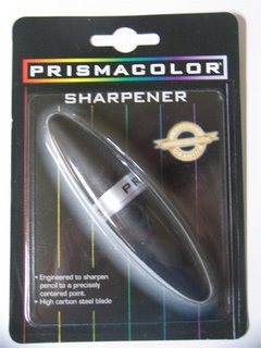
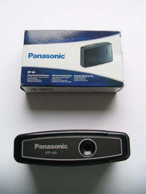
Two new sharpeners - from Prismacolor and Panasonic

When you use coloured pencils a lot, as I do, sharpening tools and instruments become a whole new passion! ;) Especially as artist quality coloured pencils just don't seem to work at all in very many pencil sharpeners.

I'd like to share the two new sharpeners I got while visiting the USA

First is the Prismacolor Sharpener. I assume since it's from Prismacolor that it's been specifically designed to sharpen Prismacolor's wax-based coloured pencils.

It's about 3 inches in length and comes apart in the middle. One side is a cover and the other contains a sharpener. The shavings go into the bottom of the half which contains the sharpener - which is not very big - so fine for the odd sharpen but less good if you need to use it a lot. It's handy size if you've got maybe a small pencil case or can pop it in your pocket. It isn't really a heavy duty 'around the home studio' sharpener for those of us who need to sharpen a lot of pencils frequently.

Oh - and it broke my new Prismacolors which I got at the CPSA Convention. I have a problem here because Prismacolors are known to break - so whether it's the sharpener or the pencil I really don't know.

Next is the big success - my new battery powered Panasonic sharpener - the KP 4A.
According to Panasonic the KP-4A has
A hardened steel cutter blade provides a perfect 16-degree point. Features include semi-transparent shavings receptacle, safety switch, and auto shutter.
What can I say - I'm in love! It's lightweight and compact - but uses 4 AA batteries which make it somewhat heavier. It has a funny grooved cutter thing (rather than a conventional pencil sharpener blade) which rotates extremely fast. This is just like the one in my big heavy duty 'sharp as needles' electric sharpener. When I got home I even caught myself using it in preference to the electric one as I always have leads and things to arrange with that one.

The even better news is that you don't have to depend on the vagaries of your local art store as Amazon stock it on amazon.com here. It's getting 5 star reviews from everybody except for one person in France - when it broke. Personally I've found it to be extremely reliable so far.

A Staples version which looks remarkably like this (so much so that my guess is Staples gets Panasonic to make it for them) was recommended by Dianna Ponting for sharpening charcoal pencils at the pastels workship I attended last month. I gather that might be cheaper.

However my new Panasonic does have an appetite. If used to sharpen coloured pencils, it needs to be fed a graphite stick every so often in order to keep it silky smooth in operation and in tip top condition - juts as I have to do with my electric sharpener. I now buy graphite sticks just to feed these sharpeners and keep them happy - and they just swallow them!

Links:

Sanford Prismacolor - sharpener
Panasonic Sharpener - KP-4A

Technorati tags: , , , , , ,

Tuesday, August 29, 2006

Palacio de Mondragon, Ronda

Palacio de Mondragon, Ronda
Pastel 15.5" x 23.5"
copyright Katherine Tyrrell

When I first started doing large pastels and entering competitions and exhibiting in the mid 90s I had my artwork professionally photographed and 6 x 7cm transparencies produced.

Recently I had these transparencies scanned and transferred to digital file. In doing so I saw an image again which I haven't seen easily for over 10 years - since I packed it up extremely carefully and shipped it off to a gallery in Florida where it sold. This was especially pleasing to me as, not only was it my very first sale, but I had a very appreciative gallery owner who told me how to price it and it sold for a rather large sum of money!

And to top if off this sale proved a rather nice twist to the end of a rather good story which other artists might appreciate.

I visited Andalucia in Spain in 1995 - on a painting holiday with Jackie Simmonds. We were based in Vejer de la Frontera and paid a visit to Ronda while we were there. I was very taken by the Palacio de Mondragon, its architecture and gardens. I produced a pastel painting nearly the same size as this one - which when viewed later in the day evidently lacked some understanding of architecture and perspective - despite the fact that the colour record was OK. All in all I regarded it as a bit of a disaster and a wasted day in production terms.

When I returned home, I got my photos developed and found that I had taken quite a few of the subject. Photos gave me information about the light at the beginning and the end of the drawing session and some detail about the archway. I decided to have a go at redoing it using the photos for the perspective and the colour study for the colour.

I photocopied one of my photos onto A4 paper - and got a greyscale image. I then plotted the photo on to a grid drawn out on an A4 sheet in my Daler Rowney sketchbook (Tip - always leave space to number your columns - you can go scatty while working from one grid to another if you don't!)

I then made a much smaller grid around the very complex architectural features of the arch and courtyard beyond. In doing this close-up study I began to understand much better how the architecture worked - which isn't always so apparent when working on site with the light changing. Mistakes can easily be made as in fact had happened.

I then created a grid of equal proportions on my sheet of abrasive Rembrandt pastel card and used a pastel pencil to outline the main features. Once I'd got positioning right, it was a lot easier to block in main values in colour and to develop the painting from there. It took away all the worry about whether it was going to look silly like the last one and enabled me to focus on the more painterly aspects.

I also used my brand new set of Unison Blue Green Earth pastels for the first time - and these helped to lend a unity to the painting. I was completely 'sold' on Unison pastel sets after doing this painting.

Links:

Ronda
Palacio de Mondragon

Technorati tags: , , , , , ,

Monday, August 28, 2006

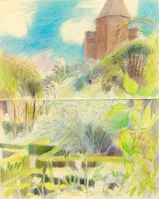
The White Garden, Sissinghurst Castle Garden, Kent


The White Garden, Sissinghurst
coloured pencil in Moleskine sketchbook 10" x 8"

We went to Sissinghurst Gardens in Kent on Friday and I produced the above sketch while sat in the corner of the White Garden. The White Garden only contains flowers which are white and rather a lot of 'silver/grey foliage plants.

There's a pergola in one corner - next to the South Cottage - which is covered (I think) by white wisteria. Underneath there is a table and chairs around it which I've used before for drawing and painting. I sat on the table and "he who must not be bored while I sketch" read his latest book "The Ides of August" for those who are interested)

We were greatly irritated by a helicopter who hovered over the garden at a dangerously low height for about 20 minutes or more - a quite horrendous noise. My guess is that they were taking photographs - and also probably breaching air traffic control regulations!

Sissinghurst Castle Gardens were created by Harold Nicolson and designed by Vita Sackville West who used to have a gardening column in the Observer newspaper. Harold Nicolson suggested that the gardens were in reality the true 'portrait of a marriage'. They are now owned and run by the National Trust and are the most visited garden in the UK. The National Trust describe the gardens as follows.......
One of the world's most celebrated gardens, the creation of Vita Sackville-West and her husband Sir Harold Nicolson. Developed around the surviving parts of an Elizabethan mansion. A series of small, enclosed compartments, intimate in scale and romantic in atmosphere, provide outstanding design and colour throughout the season.
It's difficult to know whether to call it a garden or gardens as there are no many different garden rooms' within the overall garden - which is probably one of the reasons why it proves so popular with visitors. The gardens are located in the Weald of Kent, near Goudhust and Tenderten. Directions to the gardens are given in the at the end. It's certainly well worth a visit any time any time you are in Kent. However, please note that the garden is unfortunately closed from the end of October until the middle of March each year.

You can get a very good insight into what the gardens are like from this website about Sissinghurst which has been put together by a devotee and contains lots of photographs.

Sissinghurst is unusual in that it will not allow either tripods or easels into the gardens while they are open to the public.

One of the things I wanted to do on Friday was plan future visits and find potential alternative places to sit which would be out of the way of people and at the same time give me the space to spread out my kit. This is one of the views I found which will be getting a second visit.

However the NT do run courses at the gardens and you can apply to visit when the garden would normally be closed. There is a tutored workshop by Cheryll Fountain on Wednesday 13th September (when it is normally closed) and there are also photography workshops. For details of events in the coming months see this link.

Links:
Technorati tags: , , , , , , , ,

Other people's travels with a sketchbook

I love looking at other people's travel sketchbooks only marginally less than I like creating my own (which you can see on my website).

Roz Stendhal visited Paris in early June this year and has created an on-line version of the journal she kept on that visit. Her Paris Journal has many pen and ink and watercolour sketches of both her journey there (watch out for the Icelandic geyser!) and the places she visited in Paris as she toured the city with friends – Metro pass in hand. Roz also shows us the journal she handmade for the trip. Roz’s website Rozworks also has many other interesting things to look at and is well worth a visit.

Laura of Laurelines also visited France earlier this year and used her blog to display the sketches she did while she was there. Laura has now created a special gallery for the travel sketches that she's s done on different trips to various countries and writes about travel sketchbooks here. Her work is delightful, relaxed and fresh and I know I'm certainly looking forward with enthusiasm to her trip to Paris in October.

I'm going to include a link to both Roz's and Laura's travel sketchbook sites in my other blog "Travels with a Sketchbook".

If you know of any other sites where there are 'sub-sites' dedicated to sketchbooks and/or drawings/paintings done while travelling I'd be interested to hear about them.

(And many thanks to Laura who has just highlighted my site to her fans when introducing her new gallery!)

Links:
Technorati tags: , , , , ,

Sunday, August 27, 2006

Blogger Beta cosies up to to Google - no thank you!

Am I the only person who is less than enthusiastic about Blogger Beta after I realised that it means linking my Blogger account to my Google account?

However, what I didn't realise when Blogger Beta was announced is that there is no option - all users of Blogger must in due course operate a Google account in order to access Blogger

I've known that Blogger was owned by Google since I started using it. However, up until now it has operated as a separate piece of software - which is the way I like it.

I keep different bits of my life compartmentalised - with different user names and diffferent e-mail addresses for different purposes. I do not propose to have the same user name and password for both an e-mail account and my blog.

I also don't like the idea of having all my eggs in one basket or one entity having too much access to what I'm doing. Which is why I don't use the Google add-on for my browser. I prefer entities which specialise in one thing - they're more likely to give it their full attention and not take their eye off the ball - as AOL did recently when they released 20 million search records from 650,000 users.

In addition, there's the log-in issue. It's already tedious enough that I can't be logged on to more than one gmail account at a time. To realise that being logged on to Google also means being automatically logged on to Blogger - and that closing down Blogger means that I'll probably log myself out of my e-mail facility (as has happened time and time again while I've struggled to bypass the almost default log-on to Blogger Beta that has been created) is not what I call progress.

It's now also causing other problems for people who have switched to Blogger Beta. Judging by the comments in the Google Blogger User group - most of those who have switched to Blogger Beta are desparate to switch back to the classic mode - but can't!

OK rant over. It's definitely a "no thank you" from me to Blogger Beta - I'm not changing my blogging platform until Google and Blogger realise that:
  • they can't decide how I like to operate my passwords
  • give people a few more choices over how they operate their software.
and get all the Beta problems solved so that the Google group doesn't have steam coming out of it's virtual ears.

And if I do need to change - it'll probably be to a different blogging platform - which I get to control! If Goggle/Blogger manage to come up with an option which keeps access - and passwords - separated and it actually works with few complaints (!) then I may reconsider.

In the meantime, if anybody would like to tell me the pros and cons of their blogging software I'd love to hear your views - and I'm particularly interested in how the images bit works in your non-Blogger software works...........

Technorati: , , , ,

Saturday, August 26, 2006

Grand Designs and artists in residence


The Artist in Residence at Chelsea College of Art has initiated an interesting project on the parade ground of a former barracks at Millbank - opposite the Tate Gallery - which now houses one of the buildings of the Chelsea College of Art

Graham Hudson, the Artist in Residence, received a Henry Moore Fellowship and has been responsible for the development of a number of temporary constructions on the site. The latest press item in the long list of references to the project in "The Graham Hudosn Archive" on the Chelsea College website states (which is not attributed byt I think he wrote it!)

Hudson embraced the residency and its grandiose setting, with wit and critique, by building, opening, and 'living' in his studio on one of London's most visible plots. As the months progressed more and more sculptures and events have taken place. And the visibility afforded by the location has encouraged people to interact with and react to the work on the previously barren ground, now (temporarily) its a genuine public square, even if the seating is a little wonky, and the sculptures a little too 'weather-responsive'.

....Hudson's six month performance of live-work constructions on the parade ground won't stop until that day, until such time objects can still be seen half made (or half collapsed) and view the artist and his assistants cable-tying, taping, (and lunching) until the end of the 1st, because then the accumulation and construction, turns to dissemination and re-allocation.

The evening of the 1st will see a live 'no-reserve price' auction of the residency's 'Sculpture Collection'. Half desperate effort at a site clearance (to save on skip bills), and half jibe at the market-mastery of art production. For one night only see an auctioneer wheeled around on a scaff tower (including hard hat and high-vis) it's a great chance to pick up a bargain - then the grave problem of how to get it to your garden.

So what does it all look like? The structures are all made from any material that could be recycled - from old artistic developments, skips, building sites etc and have been put together with varying degrees of 'expertise'. I gather the project was at least partly related to the limited access students have to studios and hence a number of the structures have also acted as temporary studios.

Hudon's own structure - a studio 'house' with a double bow front at first floor level - looks like it was nodding hard in the direction of some of the houses along Cheyne Walk which look over the Thames and have been the home of many famous and creative people (and I never knew Keith Richards used to live at No 3 until I found the wikipedia link for Cheyne Walk! Really?).

This sketch was done after I left the Constable Exhibition at the Tate on Thursday evening. One of the students was busily revamping her structure and I drew her as she appeared on and about her 'studio'.

I wonder how much they're going to go for at auction? You too can attend - as the archive states
This is an RSVP invitation event. For a place on the guest list please email: rsvp@arts.ac.uk
Links:
Technorati tags: , ,


Friday, August 25, 2006

Another Squidoo lens - The Art Business: Resources for Visual Artists

I published another Squidoo lens yesterday - The Art Business - resources for Visual Artists. It contains generic links which hopefully will be helpful to artists getting business-like about their art. I also aim with this blog to highlight resources which are specific to the UK and USA.

Can I just emphasise that this is very much a 'work in progress' - but I suddenly realised that I had assembled rather a lot of links and yesterday's post generated a flurry of activity in the comments and it struck me that now would be a good time to publish. I haven't yet been able to track down all the links that I had in the blog before they disappeared [growl!] but they're out there and they will be making a reappearance

If you think this lens might be useful to you please bookmark it, link to it, whatever works best for you. It will be updated as new links crop up so you might like to check back from time to time........

I'd also be absolutely delighted to hear from anybody who knows of a good link which could be included - please include it below as a comment and I'll review it for inclusion. I've also not got a problem about extending the countries it covers for geographically specific links but I will need some help with identifying appropriate links relating to other countries.

And I'd like to to do a bit of a 'toot' for my other lens which have absolutely stormed up the lensrankings at a breathtaking rate and are all now in the top 250 Squidoo lens. They have also had new links added in to them since they were first published.

You can find out more about Squidoo and my other lens here Squidoo - a new approach to my links

(PS I wrote a long response to comments received yesterday - as a comment. Click on comments in yesterday's post to read them and my response)

Links:
Technorati tags: ,

Thursday, August 24, 2006

"Why artists should blog" Part 2 - the success of painting-a-day blogs

USA Today published an article on 22nd August on Artists taking paintings to masses. It focuses on Duane Keiser and the many other artists who have developed a 'painting-a-day' blog and ways of selling predominantly small works online through auction sites or their blog sites.

What's most interesting is the way it's changing the habits of artists who already had gallery representation - as well as letting people who have never had gallery representation get a toehold in the process of selling their work.

The comments in the article from Julian Merrow Smith are especially relevant to this issue as he was already represented by a 'good' London gallery.

In February, when The New York Times ran a small story about a website called Postcard from Provence, British artist Julian Merrow-Smith had 40 small oils of the countryside around his Provençal farmhouse that hadn't sold since he started his painting-a-day blog, shiftinglight.com.

The day of the article, "we sold everything in about five minutes," Merrow-Smith says. "I have a database of 3,000 people, and it's growing by 30 or 40 people a day."

Merrow-Smith, also inspired by Keiser, sells his still lifes and landscapes from his blog for $120 each, and now dealers have come sniffing. "It's a little embarrassing," he says. "I don't need them."

What the article doesn't mention is that one of the huge added bonues of selling online is that people can buy from artists in other countries extremely easily. Shipping costs can be very affordable when the work is unframed and small or on paper or canvas.

I own works by both Duane (who lives in Virginia) and Julian (who lives in Provence) - albeit I've never managed to buy a small work. They both do giclee prints of selected works and I purchased one from each of them. I know a lot of other artists who sell on-line, including most of my artist friends (Gayle, Maggie, Nicole and Kathy) (mentioned in both my blogs) who are selling their work successfuly online and overseas. Another, Wendy, has just started selling online - and I suppose I really ought to get my act together and do something similar! Although there are moves afoot........of which more later!

Buying online is a very simple online process with very good customer service (from most artists). Why shouldn't it become a popular way for people to buy originals or prints when it's this simple?

Links:
Technorati tags: , , ,

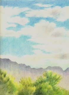
Sketching the Sandia Mountains


As most of the people reading this blog will know, I have a second blog which is specifically about my travels with a sketchbook. At the moment I'm recounting last month's trip - with lots and lots of images - to California, Arizona and New Mexico.

I've just posted about sketching the Sandia Mountains (above) but have provided a detailed explanation of how these two sketches came about in terms of selection, cropping, use of sketchbook, design and development on site which some of you may be interested in.............

For further details, click
Technorati tags: , , , , , , , , ,

Wednesday, August 23, 2006

Pastels - a lightfastness problem with a twist

My friend Gayle Mason had an interesting story to tell me this week - well interesting to pastel artists!

She started a new work on (abrasive) sienna pastel card before going on holiday for two weeks and left the card on her drawing board - which sits next to a window in very good light. Gayle had done the initial drawing of the subject matter and then covered this with a sheet of cartridge paper. Imagine her annoyance when she got back and found the pastel card had faded. Now everybody who immediately thought the card had faded due to being next to the window - 'wrong! Read on.........

The part of the card which was fully exposed to light for two weeks was absolutely fine. However, the part of the card which had been under the cartridge paper had faded. If you go to her blog post about this you can see for yourself as Gayle has posted some photos.

After discussion, our current theory is that, since the cartridge paper is not acid free, it might have had an impact on the pastel card.

Does anybody know why this happened? Do any of you have any other theories about this very odd case of fading?

Links:
Technorati tags: , ,

Tuesday, August 22, 2006

Why artists should blog

When he's not painting plein air and exhibiting and selling his paintings, Ed Terpening is a professional blogger for a bank in California and consequently writes with expertise on why artists should blog.

David Sifry of Technorati also reported earlier this month on "The State of the Blogosphere".

If you're an artist and a blogger, you'll find them both interesting reads. If you're just thinking about blogging you'll find them even more interesting! Do read the comments as well - they also have huge value in giving an insight into what is going on............

If you're not convinced, here are some statistics to make you think - and read more:
  • the global blogosphere is:
    • 50+ million blogs
    • over 100 times bigger than three years ago
    • doubling in size
      • about every 5-7 months - as it has done throughout the last three years.
      • every 200 days - as of June 2006
  • every day 175,000 new blogs are created (but only 8% of these are spam blogs - 'splogs')
  • the volume of blog postings is double what it was a year ago
  • 3% of the US population blogs
  • BUT 25% of the Google links are generated by bloggers - giving blog owners a higher profile than website owners
  • the most prevalent times for English-language posting is between the hours of 10am and 2pm Pacific time, with an additional spike at around 5pm Pacific time (that's 6pm - 8pm and 1am in GMT and 1 pm - 5pm and 8pm EST)
  • in the USA 4 times more people are reading blogs now than were 9 months ago
  • In June 39% of the blog posts tracked by Technorati 39% were in the English language; 31% in Japanese and 12% in Chinese
But it's always worth remembering that art is one form of communication which works well no matter what language people speak

Did any of the statistics surprise you?

Links:
Technorati tags: , , , , ,

Link to this post

Monday, August 21, 2006

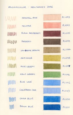
Prismacolor - new colours for 2006 but no change on breakages

At the CPSA conferences in Albuquerque, delegates were given a free pack of pencils in the new 2006 shades.

I was told these shades were so new that they were not yet in the shops in the USA a month ago when I received them. They're still not listed on the Prismacolor website - although I understand these new shades are now being included in the box of 132 Prismacolor pencils.

I've now produced a colour swatch of these new shades - with names and numbers - which you can see on the left. (The paper used is a pale cream)

They're all fairly muted shades. I like the look of the Black Raspberry - it's always good to get more coloured darks - and I really like the look of the 'Artichoke' shade.

The pinks should go some way to making up for those which have now been discontinued due to lightfastness problems. Interestingly - none of them carry the new lighfast Prismacolor logo and I don't know how well each responds to exposure to light.

The blues are interesting - I found the shades of paint used to coat the pencils varied much more than the shades produced when colouring the swatch boxes. The blue pencils also, in my opinion feel a lot less waxy than for example the pink shades.

What has not changed, unfortunately, is the tendency for Prismacolor pencils to break inside the cedar. On the Prismacolor site they say "Thick leads resist breakage"..........and yet, of the 12 pencils in the new pack I'm already having difficulties with three of them - the 'leads' keep breaking. Now since the pencils were a free gift maybe I shouldn't complain? However, breaking 'leads' is not a new problem with Prismacolor colored pencils. In fact it's probably the main issue which leads people to start trying other brands of colored pencils.

Prismacolor are to be congratulated for addressing lightfastness issues however they need to work harder on getting the 'lead' quality and its positioning right. In my opinion, they're still not producing the best quality pencils while pencil leads continue to break in significant numbers, especially since I hardly ever have this problem with other brands. And it's not just me that thinks this - see the review comments left by a number of artists using coloured pencils on the Wet Canvas Product review site and the way in which this problem appears to have affected their views and their product rating. Prismacolor have the most reviews and the worst rating of all the coloured pencils listed and reviewed - all, it seems, because of the breakage problem. All of these reviews are capable of being updated if the problem goes away - but only when it finally does.........

I'm also going to do a swatch of some the new Prismacolor Lightfast colours - coming soon!

Links:
Technorati tags: , ,

Rainer Cherries


This blog has gone far too long without an image. I don't think I noticed too quickly because I was uploading so many images - and kept forgetting that they're all in my other blog!

Anyway this post goes some way to remedying the dearth of images over here.

These are Rainer Cherries which I drew this weekend from life - which means no photos, no tracing, no elliptical tools to aid drawing - and yes I know there's something a little odd about the plate but I rather like that! ;) It's 11" x 14" in size and I used coloured pencil on Arches Hot Press paper.

What makes this drawing work for me is the colour of the background - as soon as I started putting it in the cherries started looking much better. Up until that point the colours had looked really surreal because - bottom line - they really are that colour. I'm not sure I shouldn't have had an even larger quantity of background 'dullness' to balance out the intensity of colour in the cherries.

Try envisaging it (a) without the background and (b) with even more background - what do you think?

Technorai tags:
, , , , , , ,

Friday, August 18, 2006

Time - 50 coolest websites - 4 sketches, 4,598 drawings and a sketchbook

Each year Time Magazine draws up a list of the 50 coolest websites. The one for 2006 was announced this week and includes "Drawn" the collaborative art blog - which focuses on the work of illustrators and cartoonists. Congratulations to those illustrators who read this blog and whose work contributed to Drawn winning this particular accolade!

Last year's Arts and Entertainment section of the 50 coolest websites in 2005 (oh how I HATE that method of categorisation) - covered "A party mix of amusements, from virtual art galleries to TV trivia to talk radio for your iPod, plus some of the best humor writing on the Web" and included two 'art' sites.

These are (and I quote from the article):

Collections:
  • New York Public Library's Digital Gallery
    digitalgallery.nypl.org
    Lose yourself in this vast collection of rare prints, vintage maps, manuscripts, posters, photographs, sheet-music covers, dust jackets, menus, cigarette cards and other artifacts. There are more than 300,000 digital images of original materials available for viewing. Access is free, and you can download images to your computer for personal or research use.
Galleries
  • The Museum of Online Museums
    www.coudal.com/moom.php
    This elegantly-designed portal links to established museum and gallery sites such as those run by the Museum of Modern Art, The Bauhaus Archive and The Art Institute of Chicago. It will also introduce you to countless other online collections, from Van Gogh's letters to Chinese postage stamps to Manhole Covers of the World. For more, go to the MoOM Annex.
I tried an experiment. I searched for 'sketches' in NYPL's digital gallery site - and found only four sketches out of 30,000 digital images here. I did rather better when searching for 'drawings' and unearthed 4,598 drawings. A search for 'sketchbooks' turned up just one record - but it was a Hokusai sketchbook! Take a look at this image as an example. I can think of a few bloggers who have a style which is not dissimilar! ;)

I was unable to search the second website. However a review of the list identified some sites which I knew should be good such as the British Library - and so it proved to be. It has an online gallery providing access to digital versions of some 15 great and rare books such as Leonardo's sketchbooks and the original 'Alice' written and illustrated by Lewis Carroll.

We didn't always have computers and we have been using our eyes and our hands to record things for a few thousand years. However one wonders, in this digital age, whether the hand drawn record of an event or a place is still valued? By way of contrast, isn't it remarkable that digital images now enable us to look at drawings and illustrations in books, notebooks and sketchbooks that simply wouldn't have been possible not that long ago. I'm inordinately grateful for the access - but wish that rather more drawings and sketchbooks were available online as these tend to be the most frail of records and are not often seen on public display.

What do you think of the impact of the digital age on visual records?

One final thing - the survey has made me think it would be great to have a poll of the art websites which people value and return to again and again to see which we think are the best sites. Would you be interested in sharing your favourite sites if I set something up?

Tuesday, August 15, 2006

Shirley sketches London

It's great to see other people including images from their travel sketchbooks on their blogs. I've been trying to work out away of referencing them on my "Travels with a Sketchbook" blog without interrupting the flow of my current trip and decided the best way was to do a post in this one and then reference this post in the right hand column of that blog - and also in my squidoo lens for drawing and sketching. Got it? ;)

So here is a list of the links to Shirley's posts about her visit to London in her blog - "Paper and Threads". Bear in mind she was on a proper family vacation and that for much of the time she had one or both of two young grandchildren aged 3 and 19 months with her. Shirley says
The journal was a linen watercolor by Cachet (7 x 10" spiral bound). I used Pigma Micron pens, Niji waterbrushes (small and medium) and a Daler-Rowney travel watercolor set. ..........I carried my supplies with me and tried to make very quick sketches and then added watercolor washes - both from memory of the colors and occasional photos taken immediately before. ..........Since my goal when I started sketching recently was to be able to keep an illustrated travel journal, I am pleased with my progress.
I think Shirley has done really well for somebody who is new to keeping a travel sketchbook. She should be very proud of what she has achieved in terms of both quantity and quality of post. I was particularly impressed with her images of buildings and museums. My only disappointment was with the size of her images when I clicked on them - and Shirley shouldn't be shy about these - they deserve to be bigger [Shirley has now edited her blog and the images of buildings in Part 1 are now larger]

If anybody else knows of blogs which have a serious number of travel sketches (see Shirley's blog for reference) and which merit a post do let me know and I'll pay a visit. You can contact me via my e-mail address which is on my website or leave a comment on this post but be aware that I check links when moderating comments.

Technorati tags: , , , , , , , ,

Monday, August 14, 2006

Apparently I totally "get it"

I was perusing my blog stats and was happy to see one arrival which came from squidoo and was even happier when I realised that I was the subject of a post in squid blog. I quote........
Katherine Tyrrell over at Making A Mark totally totally gets how blogs and lenses interact.

Your blog lets you go deep, over time. You develop your topic through years of work.

Your lens lets you get specific, quick. It lets you venture away from the stated purpose on your blog and try on new topics. Or a lens lets you build out the details behind your blog, and organize specific content for you and for others.

In so doing, your lenses become back doors onto your blog, for people who might not have known where to knock.
Thanks squidblog - it's nice to know I'm getting it right! :)

Yesterday's post about squidoo and my new lenses is here. For some reason the comments on that post are not showing up on my screen when I click the link but do when I click 'comments'. Duh!? I think the Blogger for this blog might need some help as the comments system works fine on other posts on this blog and also in my other blog.........maybe Blogger doesn't want anybody commenting on Squidoo??? ;)

Technorati tags: , ,

What happens to the other 7,000 paintings?

Each year approximately 8,000 submissions to the Royal Academy Summer exhibition are reduced initially to 2,000 "doubtful" works. They are then reduced again to around 1,200 - of which 1,000 are hung.

So what happens to the other 7,000? Many artists take their work straight round to the Llewellyn Alexander Gallery to try for inclusion in the "Not the Royal Academy" Show which aims to show the best of the work that was submitted to the Royal Academy but not hung. The Gallery was inspired to start this annual show, run at the same time as the Summer Exhibition, by the original "Salon des Refusés" in Paris in the nineteenth century.Each year hundreds of artists bring their work to the Gallery and are told straight away whether their painting has been accepted or not. Oils, watercolours, mixed media and pastels of all shapes and sizes pass through the doors of this lively Gallery which is situated on the South Bank adjacent to Waterloo Station and opposite the Old Vic Theatre. Every picture is for sale and the gallery is completely rehung with new work every three weeks during the period of the exhibition.

I was at the Gallery on Saturday submitting work for another exhibition (of which more shortly) and while waiting commented that some of the work I saw on the walls was, in my opinion, better than some of the work that I had seen in the Summer Exhibition. I gather that comment has been made by more than a few people! Hence why I decided to devote a blog post to highlighting the fact that this exhibition - and the Summer Exhibition - are now in their last two weeks.

The Gallery is open from 10.00am to 7.00pm Monday to Saturday and there is no entry fee. Go and see for yourself and make your own mind up....

Link/Details
Technorati tags: , , , , , ,

Sunday, August 13, 2006

Squidoo - a new approach for my links

In the past, people have told me that they had started using my 'Making a Mark' blog in preference to Google, Yahoo or other browsers when searching for something related to the topics covered by this blog. Apparently, my links generally produced the answer they wanted faster. When my links mysteriouly disappeared from my right hand column just recently I wanted to make sure this benefit could still continue and be available for both me and my readers.

Squidoo is the webware platform that I've decided to use to host all the resource links that I like to share. This means that in future I can:
  • create a hand-built catalogue of my content links for my specialist interests - with my comments
  • share what I like best with others with the same specialised interests
  • raise the profile of websites that I enjoy and/or find helpful
In software terms, this also means that
  • you or I can access and link to each of the different sets of links as a resource which has been developed independently of Blogger and
  • if I want to move my blogging platform at any point in the future then my resource links can be reintroduced without any major hassle. (Like the one that occurred when they disappeared in the first place. I don't mind when I know why something has happened, but to still not know is very perplexing and I could do without the furrowed brow lines!)
Anyway back to Squidoo and some introductions for those of you who may not have heard of it before.

What is it and what does it do? It's a relatively new product (starting in October 2005) and is based on web software. All information and content can be designed to focus on a very specific topic. It was designed as a response to the tiresome way in which searches using current browsers tend to throw up a lot of information you're not interested in.

What does it look like? The Squidoo has individual pages which are called lens. You can have as many lens as you like. These, in turn, can have a number of different modules - you select these from a menu and order them as appropriate for your lens. You can determine the content for each module within a lens. Each lens also carries Adsense text ads. Although these are not too intrusive, I have no choice over which ones show up or where they are situated. It'll be great when each author can have a bit more input to the selection of these.

What does it cost? As with blogger it's free and all you need to do is register.

How many lens will you have? Rather than trying to create one website which tries to be all things (much as I was trying to with the right hand column of this blog), the best thing for me is the way in which it makes it a lot easier for me to comment on categorised links.

I plan a suite of lenses which will all relate to my artistic interests but, at the moment, everything is a "work in progress". Some are partially complete and have been published while others are still in the initial draft stage (although I'm very thankful that I'm an inveterate link saver/bookmarker!)

Here are the links to the Squidoo lens I've created so far relating to:
These are very much a work in progress - there's a lot of links that still need to be included from those that were lost.

I'd be grateful for your comments and any suggestions about:
  • suitable modules for summarising useful links
  • useful links with good quality content
  • useful lens for the lensroll!
Links:

Squidoo was introduced by Seth Godin who's a well known 'man about blogging' and internet communication. You can read about the progress of squidoo on the Squidblog.

  • Seth's Blogs
  • Squidoo
  • Squidblog
Technorati tags: ,

The Pastel Journal - deadline and entry details for the 2006 Pastel 100 competition

Just a reminder that if you're a pastel artist, you have just over two weeks left to enter the 2006 Pastel 100 competition.

Top prizewinners will feature in the April 2007 edition of the Pastel Journal. Details can now be found here on the Pastel Journal's website. In summary they say:
  • Entry is by slide or digital file. (Good slides or digital images have a better chance than poor slides or digital images)
  • You do not need to ship your painting (you donÂ’t even have to still own it) as images from the slides or digital files are published in the magazine.
  • Check rules carefully for entry requirements. Work must be original, soft pastel only.
In essence,
  • the competition is open to all artists except artists who've been honoured with an Art Spirit Foundation award in the last three years in any competition.
  • Artwork which is eligible are original paintings completed using at least 80% soft pastel .
  • Paintings which are not eligible are those painted using oil pastels, and/or based on published material, and/or completed during a workshop under another artist's supervision and/or those previously published in a national publication or in receipt of a major award in a national competition.
  • There are some additional restrictions of the normal sort associated with competitions.
These are links to:
Digital Entries: Image files cannot exceed 500KB and image dimensions must not exceed 500x500 pixels The file format must be JPEG. You can submit an entry online and the constraints on the file size means, so far as I'm aware, that there's no particular advantage to sending via CD rather than online.

The judges are:
  • Landscape and Interior: Elizabeth Mowry
  • Portrait and Figure: Harvey Dinnerstein
  • Still Life and Floral: Jimmy Wright
  • Animal and Wildlife: Greg Biolchini
  • Abstract / Non-objective: Rhoda Needlman
My blog post relating to the 2005 Pastel 100 competition can be found here.

Technorati tags: , , , , ,

Monday, August 07, 2006

Through the fence

What do I do when I get home from sketching my way round the south western states of the USA? I sketch!

"He who must not be bored while I sketch" was in very chatty mode while we drove down to his favourite view at Emmetts Garden in Kent. I sketched the view to the rear of us while we sat on a bench looking at the Weald and idly speculating about which country has the best weather in the world. Well it was a walm and balmy summer's day in Kent - and we decided that Kent was really pretty good!

Isn't it weird that even with a sketch which features an "in your face" fence, barbed wire, a chain mesh fence and nettles that it still looks really peaceful!

This sketch is in my new small Moleskine which I'm going to try and use a bit more. That means that this image is only 7" x 5.5" across a double page spread. It was done 'en plein air' in pen and ink and then I used coloured pencils when I got home.

Just to clarify: Odd - as in "intermittent" - sketches will continue to be posted on this site. Only sketches associated with trips and travelling will go on my new new blog - and they have now started - first sketches were posted today!

Technorati tags: , , , , , , , , ,

The latest chapter in the Moleskine story

I'm just getting back into my big backlog of blog posts to read (thank goodness for Bloglines!). As I am a big fan of Moleskine sketchbooks, Moleskinerie is one of the blogs I keep up with on a regular basis. I was surprised to read that the Italian owners of the Moleskine brand/company have sold it to a French company. Big smiles all round apparently as the Moleskine was originally a french product and a lot of money has just changed hands.

There are a couple of interesting blog posts about this:
It reminds me very much of the business evangelism which Seth Godin has been preaching for some time - small is the new big. It's a heartwarming message for all those artists who have a mind to use the internet to market their work.

Links:
Technorati tags: , ,

Robert Genn "In praise of drawing"

Last week, on August 1st, Robert Genn wrote a piece on "In Praise of Drawing". He obviously touched a nerve as by last Friday more than 1,000 people had responded to his letter. You can read both his letter and a selection of some of the responses he got in this clickback link

His letter comments on the fact that drawing has exploded on to the internet.
It seems to me that these days, while a lot of the fine art drawing has turned to forms of tracing, and high quality drawing is somewhat rare, there is still lots of it around. Particularly with the advent of the Internet, there's an outbreak of drawing-for-its-own-sake. With over 9 million visual artists in North America, and over 70,000 new blogs coming on stream daily, drawing is alive and well and living online.
The level of response he's had on this topic has presumably had an impact as his next letter - concerning John Ruskin - continues the drawing theme.

The stimulus for "In Praise of Drawing" appears to have been the recent exhibition of drawing instruction manuals called "Teaching America to Draw" at the Grolier Club in New York - which has now closed. A summary of the exhibition can be found here

Robert Genn concluded his letter
Folks who never thought they could draw are now drawers.
For many, drawing represents low commitment and high joy.
For others, drawing's the key to everything good.
Fact is, drawing is still important, still relevant, and still irresistible.
So do any of you folks out there identify with any of the above characterisations and, if so, which is the one which describes you best?

Note: You can subscribe to Robert Genn's twice weekly letter to artists at his Painter's Keys website.

Links: Click here to visit the Painters Keys website and here to subscribe

Technorati tags: ,

Sunday, August 06, 2006

CPSA entries to the 2006 annual exhibition

When I attended the Annual Convention of the Coloured Pencil Society of America (CPSA) in Albuquerque last month, I was able to see the slideshow on the Thursday night. Although the exhibition only had some 100+ entries, all 781 entries to the annual exhibition were displayed (in 10 slide carousels - it was very long evening!).

There's no analysis by CPSA of the entries beyond how many fall into which category of art (architecture, abstract, landscape etc) and how many of those are then successful at getting into the exhibition. This information is made available to members.

It is possible to draw conclusions from the slide exhibition. However, it needs to be remembered that:
  • initial entry is done on the basis of slides only (ie how it looks on the slide is what matters for selection purposes)
  • CPSA has no connection with the analysis which follows.
Pieces that had most impact typically appeared to have one or more of the following:
  • a strong value pattern
  • dramatic lighting
  • very simple subjects
  • very simple colour schemes (based on a limited range of colours)
  • or a monochromatic emphasis (eg emphasis on one main colour or mono with one colour)
  • very strong saturated colours
  • a sense of humour
  • demonstrated original concepts
  • had an unusual titles which made you think
Pieces that did not appear to "succeed" in terms of the impact made during the slideshow typically came across as:
  • 'too perfect' i.e. too much technique and too little concept (ie why would you want to look at it?)
  • had poor composition and/or lacked a clear focal point
  • appeared confused as an image on a slide - with too many items competing for attention
  • lacked a good range of values
  • lacked a good crop of the image
  • were vignettes only
  • an emphasis on monochromatic - but lacked a good range of values
  • florals - which were not 'showstoppers'
  • poor presentation in the slide medium (eg image far too dark)
Neither the slideshow nor the exhibition appear demonstrated a lot of:
  • open optical mixing
  • landscapes
It goes without saying that not all the pieces I liked were in the annual exhibition and I was somewhat puzzled by some of the omissions. However, it's always salutary to remind ourselves that it's very often the case (for some at least) that there sometimes appears to be no accounting for the choices and decisions which a judge or juror makes! Those of us comparing notes afterwards at least managed to agree that we wouldn't have picked the same pieces as winners!

Links: CPSA 14th international Exhibition 2006 - prize winners

Technorati tags: , , , , , ,

Saturday, August 05, 2006

Whoops!

Somehow or other my template has been corrupted and it's lost all the coding for the links in the right hand column. Now I'm back at my own computer I'm trying to:
  • sort out what went wrong
  • retrieve the links from various files
  • recreate the various reference sections
This mishap is enabling me (rather faster than I would have liked) to get to grips with a new project I had in mind for organising all my reference links. So maybe it was a good thing...............?

If the link to your blog appears to have disappeared do not fret - all will be restored in due course - which hopefully will be not too long! ;)

Blind Contour First Friday - "Cool"

The subject for this month's image is "cool"

Apologies for the lack of image - I only got back to my computer after 4 weeks away tonight and will be posting tomorrow!

To see other people who contribute to Niff and Sutter's Blind Contour First Friday visit this link

[NB This post will be updated when I post]