Thursday, March 31, 2016

Sunday Times Watercolour Competition 2016 - Call for Entries

The Call for Entries for The Sunday Times Watercolour Competition 2016 has been published.  This is the 29th year of the largest and most prestigious prize for contemporary watercolour painting in the UK.  This is the one that most watercolour painters want to be selected for as a mark of credibility on their CV.
The Sunday Times Watercolour Competition aims to celebrate and reward excellence and originality in the medium of watercolour
This is my annual post in which I...
  • summarise the process
  • provide some tips for those thinking of entering this prestigious watercolour competition; and
  • include links to all the blog posts I've written in previous years about the exhibition, who won prizes and who got selected - and their websites!
So if you want to immerse yourself in the Sunday Times Watercolour Competition this is the blog to read! :)

"Reveal" by Deborah Walker RI

OVERVIEW: Call for Entries


This post tells you about:
  • who can enter
  • what you can enter
  • how to enter
  • the time table
  • the prizes
  • the judges
  • the exhibition

Here is a summary of the KEY POINTS

  • The deadline for submissions 5pm, 13th June 2016. 
  • Entry for the 2015 competition is digital and ONLINE.
  • Your digital file for submission needs to be 300 dpi with a file size of 500kb or less
  • This is the official website.  Plus these are the rules
  • The top prize is £10,000 and the second prize is also good (£6,000)
  • Those who like painting cityscapes compete for a special prize worth £1,500
  • You'll find out on 21 June 2016, via email, whether or not you have been selected for the final judging in front of the selection panel.

I RECOMMEND that:

  • You review the images from past exhibitions (see blog posts reviewing past SWC exhibitions at the end of this post)
  • you review the Facebook Page for the competition - which demonstrates the diversity of ways in which watercolour can be used 
  • Have a go and enter two works
  • The cost relative to the achievement and the experience is negligible

Who can enter

  • The competition is open to all artists born or currently resident in the UK. 
  • There are no age limits for artists wishing to enter.

What you can enter

The Selfie-Conscious by Juliet Benini

Eligible media includes:
  • any water-based media
  • this includes acrylic, inks and gouache (note it does NOT state that watersoluble oil paint is acceptable!)
However you should make a particular point of noting two points emphasised in the rules
Artists should note that whilst any water-based mediums are acceptable, this competition aims to celebrate and reward excellence and originality in the genre of watercolour painting.
and
The judges will therefore be looking for work that makes the most imaginative or otherwise impressive use of a water based medium in this respect.
In other words this is called a "watercolour" competition - NOT a "water-based medium competition".
  • This competition is very popular with the public and they are expecting to see a lot of proper watercolour paintings - demonstrating what it is possible to do when using watercolour paint.
  • In other words exactly what I have lamented as being missing from another prominent competition.

I'd expect the final selection to include other water-based media - however I would also expect that it will be exceptional and other media will not dominate traditional watercolour paint. However that's just my take on it.

I RECOMMEND

Take them at their word. Don't be boring! Show them what watercolour can do....

Process

Wednesday, March 30, 2016

The Facebook Page News Feed Fiasco - and what to do about it

Facebook has been messing around with the news feeds of Facebook Pages and totally disrupting workflow for those managing several Pages.

I can only assume that they don't realise that people actually "like" the Facebook Pages of others so they can read them.


What used to happen

  • I used to log in to my Page from my account - and the profile pic would change from my account profile pic to the one for my Facebook Page. That way I'd know which bit of Facebook I was in!
  • All notifications relevant to that page were in the Notifications feed - nothing related to the personal account or any other Facebook Pages
  • I'd hit the "F" logo top left of my Facebook Page and it would take me to the news feed posts for Pages I liked using that Page (bearing in mind Facebook Pages cannot like Facebook Accounts). In other words they were all relevant. From there I could share them easily on my Page.
  • Facebook Page News Feeds were highly differentiated - which made them a lot easier to read and act on.
Hence.......
  • when in Making A Mark I'd see all the art galleries and museums and other compendium art news pages

Making A Mark on Facebook
  • when in Botanical art and Artists I'd see all the botanical artists and art societies and botanical gardens I'd liked
Botanical Art and Artists on Facebook
  • when in Katherine Tyrrell: 365 Tips for Drawing and Sketching I'd see all the drawing and sketching sites I'd liked
Katherine Tyrrell: 365 Tips for Drawing and Sketching
  • when in Urban Sketchers UK I'd see all the urban sketching pages I'd liked (much less effective as most of the activity is now in groups which can't be accessed!)
Urban Sketchers UK - Events

How Facebook Pages changed #1


First it started pointing to an item in the side column - "View Pages Feed" - see news items from other Pages.

So I'd click it and I'd see a very filtered view of news items from other Pages I liked.

Not very happy with this I continued to hit the F logo at the top and look for a wider range in the normal way.

How Facebook Pages changed #2


Then the news feed I saw on every one of my Pages became swamped by whatever activity I'd been doing most recently. 

So if I'd been working on my Botanical Art page all I'd see in the news feed for Making A Mark was botanical artists. The whole purpose of creating a separate Page was so I could make the needs feeds much more distinctive and differentiated i.e. niche sites!

I must have sent about three or four feedback notes to Facebook saying that I want a highly differentiated feed - one which was particular to each page.

No response other than the usual "we are reading this and thank you for sending in your feedback"

How Facebook Pages changed #3


  • You cannot log into and out of individual Facebook Pages
  • You cannot access your feed by clicking the "F" logo - and what was always a very trimmed feed edited by Facebook now appears to me to be even more "edited"
  • Separate and filtered news feeds have been moved to the button to press in the lefthand column 
There's no way that items from niche interest Pages are going to be able to compete with more popular news feed items - so we're going to be fed downsized pap!

I can only surmise that this is a cunning move on Facebook's part to get you to start using advertising so that your Facebook Page posts will be seen.
  • Plus management of workflow has been decimated. The notifications feed for your Facebook Page has been TOTALLY ELIMINATED making the workflow for dealing with updates to one specific page at one specific time all but impossible
  • Instead you get to see a total mishmash of items in one feed which is identical irrespective of whether you in your account or one or other of your Facebook Pages.
  • It's a monumental mess for those of us with more than one Page.
The net overall result is a LOT of people are going to see traffic to their Pages taking a major dive - as illustrated by my latest stats.

For me this starts to make Facebook a lot less effective as a tool for communicating with people.

How to beat Facebook Page Changes


Below you can find my instructions for how to beat the Facebook changes to the Pages newsfeed. It's a bit more complicated to access the news feed but at least you get to read what you want to see.

Tuesday, March 29, 2016

A biography of Hockney on iPlayer

A film about David Hockney on the BBC escaped my notice - perhaps because it was on at 3.30am in the morning!

Anyway, all Hockneyphiles with access to iPlayer have until 5.30am on Monday 4th April to view Hockney. (It was shown last year at 9pm 14 Mar 2015 - but true fans always watch twice!)

It's a wonderful biography full of his own photographs and videos - I dare say I shall watch it more than once!

A snapshot of a scene from the programme
The following is the full description of the programme on BBC iPlayer (I asterisked one word so that this post would not get blocked by filters)
Hockney is the definitive exploration of one of the most significant artists of his generation. For the first time, David Hockney has given access to his personal archive of photographs and film, resulting in an unparalleled visual diary of a long life. 'I'm interested in ways of looking and trying to think of it in simple ways. If you can communicate that, of course people will respond - after all, everybody does look.' His is a long-term one-man campaign against the pessimism of the world, mastering new media - whether acrylic paint or iPad digits - in the search for a picture adequate to his sense of what it is to be alive.

The film chronicles Hockney's vast career, from his early life in working-class Bradford, where his love for pictures was developed through his admiration for cinema, to his relocation to Hollywood, where his life-long struggle to escape labels ('queer', 'working class', figurative artist') was fully realised. David Hockney offers theories about art, the universe and everything. But as Hockney reveals, it's the hidden self-interrogation that gives his famously optimistic pictures their unexpected edge and attack. As one of his oldest friends says of his early work, 'the pictures are not just about men f***ing'. The subject matter is a way into the picture to see something else, to open our eyes and our minds.

Acclaimed film-maker Randall Wright offers a unique view of this unconventional artist who is now reaching new peaks of popularity worldwide, remains as charismatic as ever and at seventy seven is still working in the studio seven days a week.
PS Many thanks to Dennis Spicer for spotting it!

Monday, March 28, 2016

Review of the 299th Annual Exhibition of the Royal Society of British Artists

Last year, the Annual Exhibition of the Royal Society of British Artists was a pleasure to review (see Royal Society of British Artists 2015 - Annual Exhibition). It had well and truly bounced back from its nadir in 2012 (see see RBA 2012: An exhibition of Middle England?)

This year's exhibition has 445 artworks in the main exhibition and 35 works in the NADFA's RBA Scholars exhibition and 20 works in the NSAE RBA Scholars exhibition - making a total of 501.  So lots to see.

I visited the exhibition last week and have already published a short video relating to the Small Works room (see Video: The Small Works Room at RBA Annual Exhibition 2016 - which is providing quite popular).

This year I'm somewhat perplexed.

One the one hand this is an exhibition which includes a great selection of fine art prints using a variety of approaches - from woodcuts to etchings.

Wall of prints and near monochrome works in the North Gallery
This is by far the biggest and the best woodcut (below) that I've seen in some time. Laura Rosser who produced it is a Faculty Member of the Plymouth University.

We ain't all middle class Bohemians by Laura Rosser130 x 230 cm (edition of 10, 3 available)
Etchings of Venice by Austin Cole
Etchings and watercolour by Meg Dutton
Secret Garden (top left) won the Hahnemeuhle Fine Art UK Award
This is also an exhibition which provides a great deal of space and sponsorship for younger artists via the RBA Scholar Scheme and the NADFAS charity - who in turn are producing some interesting work.

Threadneedle Space displayed the work of the RBA Scholar Scheme
It's also good to see a show which has dedicated some effort to creating an interesting room of small works which are in turn more affordable.

Saturday, March 26, 2016

Wanted: an Executive Director for an International Art Society

I've been fascinated for a very long time by
  • the different organisational forms that art societies around the world choose to take; and
  • how they choose to organise themselves.
Indeed being successful as an art society revolves very much around how the many challenges of running an art society and its various activities are managed. I've seen some laid low while others thrive - influenced very much by the way they were run by the people at the top.

I spent many years as a management consultant unravelling 'what went wrong' in terms of why an organisation was facing a challenge and failing - only to find that the issue very often lay in how well the organisation was managed.

Much as in the 'real world' outside art, how effective an art society is depends a lot on the quality of leadership and the effectiveness of management.  Much can be accomplished if the people are good and the society has good systems and sound control on its finances!

Thus whether or not an art society is ultimately successful seems to be rooted in the choices made about:
  • governance:
    • what sort of organisation it should be in legal terms
    • how the Council or Board or elected members should operate 
    • how elections and appointments work! (never under-estimate how important these are!)
    • what the scope of the roles are for different Council Members charged with different responsibilities
    • how strategy is developed
    • how core activities are managed 
    • how finance is managed
  • staffing of key roles:
    • what competences are needed to fulfil those roles to best effect
    • whether or not Board members have paid help in addition to the voluntary support from what is often a small nucleus of key members
  • expectations - what's expected of members in terms of effort and subscriptions.

Some questions about management and leadership


So what's required of somebody running a very large art society?

For example:
  • Does your art society have:
    • a set of descriptions for roles and responsibilities;  and 
    • a statement of the personal qualifications and competences of those who fill those roles?
  • What do you think is the most important attribute of anybody running an art society?

Let's take a look at one example....

Advertisement for an Executive Director


It was refreshing this week to see an advertisement for a role that doesn't often get advertised.  Hence we get the opportunity to take a look at one society's view of what is required.

Thursday, March 24, 2016

Video: The Small Works Room at RBA Annual Exhibition 2016

I visited the annual exhibition of the Royal Society of British Artists yesterday. This is open every day (10am - 5pm) at the Mall Galleries until the 2nd April.

View of the Main Gallery in the Annual Exhibition of the Royal Society of British Artists 2016
The Royal Society of British Artists (RBA) is dedicated to promoting the highest standards of skill, concept and draughtsmanship in painting, sculpture, printmaking and drawing.

A virtual exhibition


You can view the works in the exhibition in one of two ways:

Small Works Room


In the past, one of the most popular rooms at the RA's Summer Exhibition used to be the Small Weston Room which was crammed from floor to ceiling with paintings of every description.

It was good to see that this exhibition also has a dedicated Small Works Room in the North Galley. This is a video I made panning around the room slowly. You can see an HD version on YouTube on my Making A Mark Videos Channel


The room is a mix of works by member artists and works that were juried into the show from the open entry.

Hopefully this will give those artists who submit work to the RBA a better idea of what gets selected. I certainly saw quite a few works I liked a lot.

If anything, I think I could make a very good case for the RBA using one of the larger rooms in the North Gallery for the small works.

Tomorrow I'll be publishing my review of the exhibition as a whole.

Tuesday, March 22, 2016

Top 20 Universities for Art and Design - in the world

Are these the top 20 Universities for Art and Design in the World?

That's what the latest 2016 QS World University Subject Rankings for Art and Design indicate. The 6th annual edition of these rankings of 1,376 institutions around the world were published today and you can see the complete listing by clicking the above link.  The methodology which produces the rankings is based on academic reputation, employer reputation and research impact and rankings are based on the views of academics and employers - who are not allowed to vote for their own university! You can read the full explanation of the methodology.

The links in the names below go to the relevant website for that institution. 
Last year's rankings come in brackets after the name.

As I worked my way through the websites I couldn't help but notice that some institutions made a bit more effort compared to others to bring design skills to their website! (The "do you practice what you preach?" test!). I've included some screenshots of some of the websites.

1.  Royal College of Art (1) United Kingdom  - this is their blog post about RCA Takes Global Top-spot in Art and Design – Again. The RCA is, of course, a postgraduate institution and one which has long been held in high regard.   This is a list of people who are alumni of the RCA and this is their Facebook Page


2.  Massachusetts Institute of Technology (MIT) (4) United States. MIT is a private university located in Boston. It doesn't have an art school as such - however it does do considerable research into design related matters

3.  Rhode Island School of Design (RISD) (3) United States. One of the oldest and best-known colleges of art and design in the U.S. Nice website!


4.  Parsons School of Design at The New School (2) United States. Parsons is a private art and design college located in the Greenwich Village neighborhood of Lower Manhattan in New York City.  It now has a Paris Campus.

5.  University of the Arts London (8) United Kingdom


6.  Pratt Institute (5) United States. The Institute was founded in 1887 and is primarily known for its highly ranked programs in art, design and architecture. It has campuses in Brooklyn and Manhattan in New York City.

Pratt Institute Ranked One of the World’s Top Colleges for Art and Design by QS

7. School of the Art Institute of Chicago (SAIC) (6) United States


8. Stanford University (17) United States. The University has a Department of Art and Art History. It offers undergraduate and graduate degrees in art history, art practice, design, documentary filmmaking, and film studies.  It's also one of the few websites which highlights works by students

Departmental website
9. Yale University (15) United States. The Yale School of Art was founded in 1864 as the first professional fine arts school in the United States and is located in New Haven Connecticut. It has a great approach to the development of its website! It says who last changed it and anybody can edit it. Impressive!
This website is the continuously evolving effort of many people from many disciplines within the Yale School of Art and its wider circles. It is a wiki, meaning that every graduate student, staff person, and faculty member of the School can change this website’s content or add to it at any time. (Logins for other friends, alums, and members of the school are coming soon.)

10. Politecnico di Milano (11) Italy Based in Milan, this university has an english version of its website. It has a fascinating history.

11. Goldsmiths, University of London (12) United Kingdom - Goldsmiths, in South London, describes itself as being
a close-knit community, a rich academic heritage, a creative powerhouse, a thought-provoking place.
Four global top 40 subjects for Goldsmiths in QS university league table

12.  California Institute of the Arts (7) United States. CalArts is a private university located in the Valencia area within Santa Clarita in Los Angeles. They need to take a long hard look at the best designed websites of the top universities for art and design!

13.  Carnegie Mellon University (16) United States Art and design are delivered by the College of Fine Arts which includes the the School of Architecture, School of Art, School of Design. The website is well structured but lacks visual appeal.

14.  University of California, Los Angeles (UCLA) (18) United States  Not a website that inspires for this subject area.

15.  University of Oxford (13) United Kingdom The Ruskin School of Art provides an art education in contemporary art practice. Other guides also identify it as a leading art school. There's also a department teaching the History of Art
The Times and Sunday Times Good University Guide 2016, the Complete University Guide 2016 and the 2016 Guardian University Guide all identify the Ruskin as the leading art school in the UK
The Ruskin School of Art
16.  RMIT University (20) Australia described as a global university of technology and design and Australia's largest tertiary institution. Website more boring than most.

17.  Aalto University (14) Finland Their website automatically recognises visitors from English speaking countries. Plus they've got their news item up on their website Art and design at Aalto ranked 17th in university comparison

18.  Design Academy Eindhoven (19) Netherlands - an interdisciplinary educational institute for art, architecture and design in Eindhoven, Netherlands.

19.  Art Center College of Design (9) United States. It has an impressive visual and video based introduction to its website.

20. The Glasgow School of Art (10) United Kingdom  The Art School suffered a major fire recently but is recovering and rebuilding.

Glasgow School of Art - extract from the website

Changes in the rankings


The top twenty unversities stayed the same but there was some considerable movement within the rankings.

Climbers include:
  • MIT, USA
  • University of the Arts, London
  • Stanford University
  • Yale University, USA
  • Carnegie Mellon University, USA
  • University of California, Los Angeles, USA
  • RMIT, Australia


Those that have dropped significantly down the rankings (more than two places) in the last year include:
  • California Institute of the Arts, USA
  • Aalto University, Finland
  • Art Center College of Design, USA
  • The Glasgow School of Art, UK

Geographical focus of the top 20 art and design universities 2016

The countries represented in the list are:
  • USA - 11
  • UK - 5
  • Italy - 1
  • Australia - 1 
  • Finland - 1
  • Netherlands - 1
However London is way out in front in terms of the city with the most universities in the top 20. It's got three including the top rated university - the RCA.

More articles on these rankings:


Sunday, March 20, 2016

Changes in Tax and NI for artists in the UK


Artists living in and paying tax in the UK need to stay on top of changes to tax and national insurance contributions.

There is good news and not so good news.

Tax

Good news for amateur artists - a new Tax Allowance

There's a major boost for the amateur artist!

Those making up to £1,000 per annum (after expenses and before tax) from creating and selling art will no longer have to pay tax on that income. (see Budget 2016: some of the things we've announced )
From April 2017, there will be two new tax-free £1,000 allowances – one for selling goods or providing services, and one income from property you own.
People who make up to £1,000 from occasional jobs – such as sharing power tools, providing a lift share or selling goods they have made – will no longer need to pay tax on that income.

Personal Allowance


The government announced this week that the personal allowance will increase
  • from £10,600 for the tax year 2016/17 
  • to £11,500 in April 2017.
The Personal Allowance is the net revenue you can earn after expenses allowed by HMRC and before any tax is paid.

It relates to your total income in a tax year - not just the income you earn from art.

Personal Services Companies


Anybody using a personal services company as a vehicle for providing artistic services to the public sector will find that in future all tax on their earnings will be deducted at source. The move is targeted at those trying to evade tax.

I don't suppose there are many people this will affect - but it will impact significantly on those that are.

National Insurance Contributions


NICs as from 1 April 2016


The changes this April will make a difference to those artists who also have employment (e.g. as an art teacher) that means their pension contributions are contracted out from the State Scheme.​
The State Pension is changing for people who reach State Pension age on or after 6 April 2016.

​The new State Pension will replace the existing basic and additional State Pension and end contractingout and the National Insurance rebate.
You can read more about what is happening in

NICs as from 1 April 2018


Last week's Budget proposes to make some changes to National Insurance which will impact on self-employed artists who don't make a lot of money from their art.

The changes apply from April 2018 - so a little while to wait before the change will be noticed.

  • ​The Class 2 NI contributions for all self-employed individuals are being scrapped.
  • Class 4 NI contributions only will still have to be paid - but only by those who are self-employed and making more than £8,060 profit before tax per year.
The benefits of this are that:
  • it simplifies tax records for artists who are sole traders
  • it saves about £134 p.a. for those earning more than £5,965 pa and less than £8,060 pa.

The Artists Information Company summarised the details as follows in its news blog post ​Budget 2016: More austerity with a sprinkling of good news for the arts
There was also some good news for self-employed artists, with the chancellor announcing that Class 2 National Insurance contributions (NICs) for self-employed people will be scrapped from April 2018.

Currently, the self-employed have to pay Class 2 NICs at £2.80 per week if they make a profit of £5,965 or over per year. Class 4 NICs are also paid if profits are over £8,060 per year.

From April 2018 only Class 4 NICs will have to be paid, with this now contributing towards state pension entitlement and other contributory benefits, which is currenly what Class 2 contributions go towards.
The intention is that the self-employed should still be able to make arrangements for creating contributions for a pension relating to their self-employed status - but the government haven't yet explained what these are.

Insurance


One more thing - for all those using insurance policies for their art activities.

Watch out for premium uplifts as there is a small uplift in the percentage tax on non-exempt insurance premiums! It's very likely this increase will be passed on. See Changes to Insurance Premium Tax: increase to standard rate


Reference:

Thursday, March 17, 2016

Fabriano, R K Burt and St Cuthberts Mill - and fine art watercolour paper for precision painting

The HP surfaces of Fabriano Artistico and Fabriano 5 have changed. (The latter being the paper which is used in the RKB FatPad) .

A number of botanical watercolour artists have recently reported that they have noticed changes to the robustness and performance of the surface of their Hot Press paper from Fabriano. This was also reported by Jacksons in its recent blog post Fabriano 5 Paper Texture Change.

The explanation seems to be mechanical. Fabriano Paper Mills have won a contract to produce a new paper. This means they've changed the settings on the machine which produces the new paper AND the fine art watercolour papers

While such a change in machine settings is very unlikely to be noticed by those using Rough or Not surfaces - this is not the case for those using Hot Press paper. When you are an artist who's looking for the smoothest watercolour paper known to Botanical Artists, there's more than a few who can easily detect any difference in quality very quickly!

However I am beginning to wonder if it is solely the change in the machine setting that is behind the problems being experienced....

About Fabriano Watercolour Paper 


Below are some examples of comments that botanical artists have been making. I'm not going to identify the artists other than to say these are people:
  • who care hugely about the HP surfaces they use as it makes a massive difference to the very precise paintings they produce
  • who are very experienced watercolour painters, who have been painting in the exact same way for some time. When using their own particular techniques they spot very quickly when a paper has changed.
  • who do not make things up!  
  • who return paper or stop buying it when it does not perform as per usual!

About the Artistico


The paper is mould made with 100% cotton, chlorine and acid free and archival. It is sized both internally and externally. It comes in two colours Traditional White (an ivory shade) and Extra White (white with a very pale cream tint) which are both made without any optical bleaching. It has two deckle edges and is watermarked “FABRIANO+ARTISTICO” on the short side.

It's available as both sheets (56 x 76cm and 75 x 105cm)  and and as glued blocks.

My pad of Fabriano Artistico HP Extra White 140lb
Recent comments from artists have included:
I always use both the light (140lb) and heavy (300lb) and have had the same problem, in fact I have returned some of the heavy to the importer. I found an old batch and it was beautifully smooth but the latest purchase is fluffy and although I can work it ok it is not as nice and damages easily. I think they have made a huge dodgy batch and sent it out so I will be checking it thoroughly from now on. (December 2015 - user of both weights of Artistico)
I'm having terrible trouble with the 'new' Fabriano paper and looking for an alternative heavy weight paper that's as smooth as the old stuff. (March 2016 - user of 300lb / 640gsm2 paper)

About the Fabiano 5 (also used in the RKB FatPad)

RKB FatPad - Fabriano Classico 5
The paper is mould made, acid free and comprises 50% cotton and 50% other raw material.
I have always used Fabriano fat pad 140 lb and recently I have found that if I have to wash anything out I have to be so careful as the surface of the paper just breaks up .... I actually had to abandon 1 painting when just taking highlights out of leaves. It looked as though I'd been scrubbing at it for hours. It never used to be like that. (December 2015)
I've found" BITS "coming off the surface &! Only using the first layer of paint & not very wet either (February 2016)

About the complaints


Adverse comments and complaints are tending to come from those who have bought in new stock in the last few months. Obviously those artists who are still working off 'old stock' or buying from suppliers still holding 'old stock' will not yet have noticed a difference.

Tuesday, March 15, 2016

National Open Art 2016 - Call for Entries

The National Open Art Competition opened for entries at the beginning of March. The closing date for entries is 10th July 2016.
  • The 2015 competition attracted nearly 4000 entries and awarded around £60,000 in prizes and mentoring opportunities to 35 winning artists.
  • Th 2016 finalists will be exhibited in NOA’s Winter Exhibition at Mercers’ Hall in October where the prize winners will be announced. 
  • The 500 long-listed entries from this year’s competition will be for sale through NOA’s website and at various exhibitions.
There are two competitions:
  • one for artists living or working in the UK or The Republic of Ireland then you can enter. 
  • one for children (aged 14 and under)
I'm going to focus on the adult competition in this blog post.

I have to say I find the website VERY confusing.
  • It seems to assume everybody already knows what the competition is about and that they all know who can enter and how to enter!  
  • In other words it gets deep into the detail far too quickly - without making the basics upfront and easy to access!
  • the main problem is that all the information ABOUT the competition is under the "enter" button and is not included in the section "about the competition"!
I made exactly the same observation last year - but I don't think anybody at the competition read my post. National Open Art Competition 2015 - Final Call for Entries

I'd like to see much more information about
  • the sort of artwork the competition is seeking and 
  • how the prizes can benefit the artists who might apply
  • who should apply
I will try to provide a digest in this post - and will continue to hope they get the website sorted before next year!

Images of some of the winners in 2015

Who can enter

In order to enter you MUST:
  • a professional or amateur artist
  • live, or be professionally based, in 
    • the United Kingdom (England, Scotland, Wales, Northern Ireland) or 
    • the Republic of Ireland (Éire).
  • be aged 
    • 15 years of age by 1 September 2015 to enter the Main Competition
    • be 14 years of age or younger by 1 September 2015 to enter for the Children’s competition, must

What sort of artwork can you enter?

You can only enter original work

Monday, March 14, 2016

Review of the 2016 RWS Contemporary Watercolour Competition

I visited the annual exhibition of the Contemporary Watercolour Competition run by the Royal Watercolour Society on Friday. 

The exhibition continues until 16th March at the Bankside Gallery (right next to Tate Modern and the River Thames on the South Bank.
  • You can see a virtual exhibition here on the RWS website.  This has hugely improved in terms of the page of works, and each work also having its own page (click image and then click "detail page" to access) which then invites people to share work. This is the standard all shows should aspire to!
  • the names of the prizewinners are listed below 
  • the names of the selected artists are listed at the end of this post and can also be downloaded from the RWS website
A view of the exhibition at the Bankside Gallery
This was the Call for Entries (last Autumn) for those interested in a future submission. Blogs posts about previous exhibitions are also listed at the very end of this post.

What's always interesting is to see the image online and then see it again in a gallery. It's very interesting how one's view can change when seeing an image for real. At the same time some were also much more impressive in the gallery than they are online. This competition now does its first round of judging based on digital submissions and these observations only serve to emphasise how important it is to get your artwork properly photographed if you want to get artwork longlisted for an exhibition

The Exhibition


The exhibition has a strong emphasis on "contemporary artwork'.
The judges are looking for pieces that push at the boundaries of watercolour, promote water-based media at its most accomplished and ask audiences to see the medium in a new and contemporary light.
I've not been impressed with this exhibition in the recent past and have said so - in no uncertain terms (see Review: RWS Contemporary Watercolour Competition 2015 and in 2013).

However this competition and exhibition seems to have turned the corner. I can only imagine that the very low level of sales in 2015 would of itself have prompted a review of whatever the selection panel had been trying to do in the past.

I've included some views of the works on display above and below.


I think I'd sum it up as 'better editing and much better variety of subjects and styles but still has scope to do much better'.  I'm saying that based on shows I've seen in past years.

Thursday, March 10, 2016

Video of Lynn Painter-Stainers Prize Exhibition 2016

This is my video, taken late Monday afternoon, of the Lynn Painter-Stainers Prize Exhibition 2016. The exhibition for this prestigious prize for representational art continues to be on display until Sunday 13th March at the Mall Galleries (10am - 5pm). Admission is free.


You can also read my blog posts about this art competition, prizewinners and exhibition on this blog:
You can also see the individual paintings in the virtual exhibition.

You can see more of my videos of art competition exhibitions on my YouTube Channel - Making A Mark Videos.


Wednesday, March 09, 2016

Interviews with RHS Botanical Art Gold Medallists 2016 - from Asia

This is the first of my blog posts about my interviews with 12 of the 13 botanical artists who won a Gold Medal at the 2016 RHS London Botanical Art Show at the end of last month (27-28 February 2016). [UPDATE: Now includes an interview with Akiko Enikodo]

Best Exhibit in RHS London Botanical Art Show (February 2016)
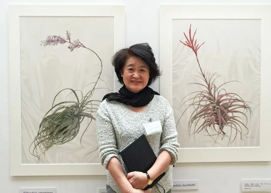
Tillandsia by Mariko Aikawa
The painting second from the left was bought by the RHS for the RHS Lindley Library.
I've decided to divide up the gold medal winners by geography. Thus this first post covers the FIVE Asian artists namely:
  • Mariko Aikawa - Tillandsia 
  • Sansanee Deekrajang - Tropical Climate plants 
  • Akiko Enokido -  Classical Camellia Japonica 
  • Hiromi Hyogo - Leguminous plants 
  • Chiyoko Ohmi - Paulownia tomentosa
I've also updated the page devoted to leading botanical artists from Asia on my website - including a new section about leading botanical artists in Thailand.

You can read tips from the Gold Medallists in the post I wrote straight after the exhibition - Tips from 2016 RHS Gold Medal Winners - Botanical Art

You can also see the complete list of medal winners in RHS London Botanical Art Show 2016 - Medal Winners

Mariko Aikawa (Japan)

Mariko Aikawa GM with the two largest of her display of six paintings of TillandsiaCopyright: artwork - Mariko Aikawa photograph - Katherine Tyrrell
Mariko Aikawa's display of paintings of Tillandsia (air plants) won the Best Exhibit in Show Award.  The painting on the left was bought by the RHS for the Lindley Library and she sold at least four of her other five paintings. Having the best exhibit of a plant which is not often seen at the RHS Show can also be financially rewarding!

What I liked about her display was that it was very coherent in terms of the colour palette and how the individual images were arranged - and she also painted some big paintings!  At the same time it was clear how each plant was different from the next. Overall it was a very graceful and aesthetically pleasing exhibit as well as being informative in a botanical context.  I also very much liked the fact that her labels were printed with a font size which made them very easy to read.
Tillandsia is a genus of around 730 species of evergreen, perennial flowering plants in the family Bromeliaceae, native to the forests, mountains and deserts of Central and South America, the southern United States and the West Indies.
She began botanical illustration in 2004 - and became a member of the SBA in 2009.

Her subject for her display was a bit of a challenge. I don't think I've ever seen a display of air plants at the RHS before. The plants are very rare in Japan, very expensive to buy, and they bloom and bear fruit only once in their lifetime. It can take 2-3 years but can also take between 5-10 years for the flower spike to develop - plus they tend to grow in the tops of trees! They have no roots but are not really parasitic as there is connection to the host they use for support. Other plants are merely used as a kind of trellis!

She bought some of her air plants and then borrowed others from friend who was a collector of bromeliads.

She prefers to work on Fabriano Artistico Extra White HP 638g/m² (300lb). She paints using a lot of water at the beginning - and drops the paint on to the very wet surface. She then uses a dry brush technique to paint the texture. At present she uses Winsor & Newton (old stock) but also likes Da Vinci paints

Sansanee Deekrajang (Thailand)

Sansanee Deekrajang GM - Tropical Climate Plants
Copyright: artwork - Sansanee Deekrajang photograph - Katherine Tyrrell
The story of Sansanee Deekrajang's journey to an RHS Gold Medal for Botanical Medal is a sad one.

Tuesday, March 08, 2016

Lynn Painter-Stainers Prize Exhibition 2016 - Prizewinners and Review

The £15,000 Lynn Painter-Stainers Prize for 2016 - and a Gold Medal - has been awarded to Henry Kondracki for his oil painting of The Cowgate - in the snow - by The Worshipful Company of Painter Stainers and the Lynn Foundation.

This is a prestigious prize for original, two-dimensional works in any painting or drawing media. The prize has two aims:
  • to encourage the very best creative representational painting and 
  • to promote the skill of draughtsmanship

Winner of the Lynn Painter-Stainers Prize
The Cowgate by Henry Kondracki

oil on canvas, 89 x 114cm
It's a great painting of a historic street - The Cowgate in the Old Town part of Edinburgh - in the snow and poor light. The lights shine out and there's a very bright lemon yellow beacon right in the middle of the painting. They're all the more effective because of the subdued and coloured greys which surround them.

Kondracki provided this comment on the painting
"A well worn part of Edinburgh, the Cowgate’s history goes back a long way … My memory is part of the story of the city, but only a small part. I am aware of all the people who have walked these same snowy streets, leaving tracks that record their journeys, rather like drawing – a moment in time frozen.”
Henry Kondracki studied at the Byam Shaw School of Art, London and the Slade School of Fine Art, London (1982–1986) and his work has been widely exhibited in the UK and overseas. In terms of prizes he has been awarded:
  • The Scottish Arts Council Award (1978); 
  • The Slade Prize in Fine Art (1985 and 1986); 
  • Cheltenham Drawing Prize (1999) and 
  • 1st place in The Hunting Art Prize (2004)
This is a video of Henry talking about his art and his painting practice - in which you can see a part-complete Cowgate lurking in a corner of his studio as a work in progress.


The Young Artist Award (£2,500) 


This was awarded to Bernadette Timko for her oil painting Studio 7.

This was by far my favourite painting of the show. I predict a very bright future for Ms Timko - I just wish she'd get a website organised so she can start to make the most of the opportunities which come her way.

Winner of the Young Artist Prize (£1,500)
Studio 7 by Bernadette Timko

Oil on linen, 152 x 150cm
She is currently a student at Heatherley’s School of Fine Art, London studying portrait painting. She is also one of the two Drawing School Scholars for 2015-16 of the New English Drawing School and won the top prizes in the Young Oil Painter Awards at the annual exhibition of the Royal Institute of Oil Painters. (See my blog post - ROI Exhibition: Young Oil Painter Awards)

Personally I think she is already a very mature painter and would have been a very worthy winner of the top prize.

Exhibition

This exhibition will be on display as follows:
  • until 13 March 2016 (10am to 5pm every day) at The Mall Galleries, The Mall, London, SW1Y 5DB Dates: 7 – 13 March 2016 Opening Hours: 10am – 5pm
  • for the first time it will also tour to the Guildford House Gallery 155 High Street, Guildford, Surrey, GU1 3AJ Dates: 25 June – 17 July 2016 Opening Hours: Mon-Sat: 10am – 4.45pm. Sundays: 11am – 4pm Admission: Free
Most of the works are for sale. You can also view the exhibition via the online gallery.

The exhibition this year is much larger - it features 139 works - and it attracted many more entries compared to usual.  You can find out more about the artists chosen for the exhibition in Lynn Painter-Stainers 2016 - Selected artists and works

This year for the first time, the exhibition is only running for a week - due to the building works during January.

You can see it this week in the Main and Threadneedle Galleries at the Mall Galleries.

Frankly I much prefer this bigger exhibition. I think it lends the exhibition more weight and gravitas. If the choice for me were to be more time and fewer works compared to less time for the exhibition and more works, I'd personally go for the first option every time.

Next some views of the exhibition and then details of the other prizewinners.

I've also taken a short video which I hope to process and include here and on my Facebook Page in the next day or so.

Monday, March 07, 2016

30 questions: a Website Checklist for Artists

Do you know what questions to ask when considering what to do about your artist's website - and whether or not it needs improving? Working your way through the 30 questions in this post will give you a "to do" list for improvements you need to work on.

I look at a lot of websites while writing this blog. Some of them are very good, some are shambolic and a lot could be improved in both major and minor ways.

Sometimes the changes that need to be made to make it a much more effective website are very simple and easy to do. Sometimes they require a bit more effort to get a payback.

This post is NOT about which website host or builder to use.

WHAT THIS POST IS ABOUT is:
  • how you communicate about yourself as an artist - and your art 
  • whether you share the content of your website efficiently and effectively
  • whether you control the content of your website
When you get to the end you may want to consult the pages listed at the end to find out more about things to think about when developing or improving a website.

CHECKLIST: 30 Questions about your artist's website


Try asking yourself these questions and see how many you can say "YES" to

Communication 

  • Have I told people what my name is?
  • Have I told people who I am - and why I make my kind of art? (Have you told the story of you?)
  • Have I told people how to contact me?
  • Is my website simple and easy to read? (see Writing for the Web)

Domain Name URL

  • Does my domain name identify me by name? (Using your own name for your domain name is by far the fastest way of making sure potential future galleries or collectors can find you easily online).
  • When I google my name do I see my website on the first page of Google? (A real test can only be conducted on a machine unconnected to you. To find out whether this happens borrow somebody's smartphone and google your own name. 

Context

  • Can people tell which country I live in?
  • Have I told people where they can see my art in person
    • on my website?
    • online elsewhere?
    • in galleries?

Images