Wednesday, February 28, 2007

Van Gogh and John Updike - a review

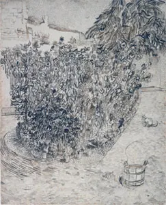
Cypresses, 1889
Vincent van Gogh (Dutch, 1853–1890)
Reed pen, pen, and ink, graphite on wove paper; 62.2 x 47.1 cm (24 1/2 x 18 1/2 in.)
Brooklyn Museum, New York
Frank L. Babbott Fund and the A. Augustus Healy Fund


Yesterday I came upon a wonderful essay/review by John Updike of the 2005 exhibition of Van Gogh Drawings at the Met. in New York (in the New York Review of Books dated 1 December 2005) and its catalogue Vincent Van Gogh: The Drawings by Susan Alyson Stein, Colta Ives, Sjraar Van Heugten, Marije Vellekoop and Vincent Van Gogh(Illustrator)

This review is a MUST read for all Van Gogh fans.

The catalogue's not bad either.......
This book presents approximately 120 works in charcoal, ink, graphite, watercolor, and diluted oils. The authors explore enduring questions that surround Van Gogh's drawings, including their manufacture, artistic precedents, and contribution to Modernism. In addition, the text discusses the significance of the artist's drawing practice to his development as a painter. The essays and entries feature the most current research on Van Gogh's drawings and provide fresh interpretations of the motivating influences that shaped the artist's contributions to the history of drawing. (Metropolitan Museum of Art Store description)
The drawing of cypresses is part of the impressive drawings collection of the Brooklyn Museum (while the painting of the same subject is in the Metropolitan Museum of Art).

Readers interested in Impressionism will probably want to visit the Brooklyn Museum's current exhibition focuses on Landscapes from the Age of Impressionism. And you don't have to be in New York to see it as this exhibition will travel to the Ringling Museum, Sarasota, Florida, where it will be on view in summer 2007, as well as to other United States venues to be announced.

Links:
Technorati tags: , ,

Tuesday, February 27, 2007

Van Gogh: The Complete Paintings (Taschen)

I bought a new book about Van Gogh a week ago and have been mesmerised ever since. Van Gogh - The Complete Paintings by Ingo F Walther and Rainer Metzger (published by Taschen) is a complete survey of all the paintings.
This comprehensive study of Vincent van Gogh (1853-1890) represents a rarity in art history: a detailed monograph on his life and art combined with a complete catalogue of his 871 paintings. This volume also reproduces most of van Gogh's paintings in color for the first time. (Amazon Summary)
Quite apart from the comprehensive nature of its scope, the book itself has merit by being a complete and utter bargain. It was published by Taschen in August last year as part of Taschen's 25th anniversary editions featuring various artists. It has 736 pages, is a small paperback and costs £7.99 (or less if you buy it on the Internet). Taschen's laminated flexi cover is much more robust than that found on an ordinary paperback. This book shows every sign of being bound to a very high standard.

The book scores high marks from me by providing complete coverage of all the paintings (and some of the drawings). I guess the tendency of very many reviews of Van Gogh's work has always been to focus on the more famous works. So much so that I have to confess I was completely bored by most of them - hence why I stuck to the drawings for this month long project. However this book has really opened my eyes to what Van Gogh actually achieved. I was simply amazed by some of the paintings it contains which I had never seen before. If I didn't think a lot more of Van Gogh after starting this project and studying his drawings I certainly did after I started to peruse this book.

It's organised in chronological order and tackles key themes as his life progresses. The huge bonus of a survey of paintings is that you can see the themes much more clearly. The progression of style over time also becomes much clearer. Drawings are published next to the associated painting. Having a detailed monograph which repeatedly draws upon Van Gogh's letters (referencing them in detail) is another huge asset. At the end of the book there is also a very detailed chronology - with photographs - of Van Gogh's life followed by an exceptionally detailed bibliography. I'd go so far as saying that anybody who has studied Van Gogh in detail and has delighted in his work will find that they are bound to learn something new from this survey.

There is also a jumbo version of this book (priced at £25). According to some of the reviews of the jumbo version on Amazon, some of the colours of some of the reproductions are a bit off in that version. I have to say I have no quibbles on that score given the challenges of colour processing at every stage from photography to production. I'm not paying 'top dollar' and I've seen some very iffy colour production in very expensive books before now. I'd far rather have a book which is completely unpretentious and offers perfectly reasonable reproduction of the complete set of paintings for a really great price. In fact I'd go so far as saying the reproduction is better than much I've seen in far more expensive books. You can see inside the book at the quality of the reproduction by clicking on the link to the Taschen site at the top of this post.

My only complaint is that I'm finding it impossible to read in sequence as I keep jumping around and reading different sections!

Other Taschen anniversary editions feature artists and art movements including Dali, Hopper, Impressionism, Japanese Graphics, Kilmt, Matisse, Monet, Picasso, Piranesi and Symbolism.

Links:
Technorati tags: , , , , ,

Monday, February 26, 2007

"Postcard from Provence" - new in site auction system

Green Apples on a Blue Ground
15cm x 10cm, oil on card
copyright Julian Merrow Smith
Price: $150 inc. shipping & tax.
This painting will go on sale at midday EDT Monday 26th Feb


Phew - at last - the announcement has been made and I am so relieved that I can finally come out from under the confidentiality of being a beta tester! Julian Merrow Smith has today announced three important changes to his extremely popular blog/website "Postcard from Provence", namely:
  • a very clean NEW look - I like the white background which sits well with his other website for larger non-auction artwork.
  • a NEW in site auction site - a major innovation. I've been beta testing this and it's very simple and very helpful to bidders. I've also been dropping strong hints to Julian that this might be an innovation others would like to adopt also! Let's see what happens.......
  • a NEW arrangement for auctions - on one auction each week Julian is hoping to give priority to bids to somebody who has never won an auction before.
This is what Julian had to say this morning to the c.4,000 members of his mailing list .
February marks the second anniversary of 'Postcard from Provence'. In the two years since it's inception shiftinglight.com has received a quarter of a million visitors and nearly 2 million page views and the mailing list has nearly 4000 members, a success beyond our wildest dreams. As we celebrate the move into the project's third year, we have redesigned the site and put in place - and this I believe is a first - an in site auction system. The auction system is designed not only to improve the way the daily painting is made available for sale but in its near complete automation it will give me more time to devote to art and life, to my painting and my family.

The auction system has been tested extensively over the past two weeks (which is why it may have seemed a little quiet) and has proved robust and elegant. If you would like to bid on a painting or watch the auction, you will need to create an account at: http://auction.shiftinglight.com which takes all of two minutes.

Please feel free to comment or send me feedback, we are still adding functionalities to the site and your thoughts and suggestions are always helpful and appreciated.

Julian
So - whether you're a bidder or a blogger, do hop over there (see links below) and take a look at what is a great new innovation.

Links:
Technorati tags: art, art auction, art blogs, art business, art marketing, art websites, artist weblogs art marketing daily painter, daily painting, daily paintings, painting

Alfred Wainwright's Pictorial Guides to the Lakeland Fells

Grasmere, December 1994 (from the rear of the Gold Rill Hotel)
11" x 17" pen and sepia ink in Daler Rowney sketchbook
copyright Katherine Tyrrell

Last night I watched a television programme about Alfred Wainwright and the development of his Pictorial Guides of the Lakeland Fells. Between 1952 and 1966, Wainwright created seven hand written and hand drawn guides to fell walking and all 214 fells in the Lake District and published them himself. His books have been an inspiration to many walkers in Lakeland (as he liked to call it) over the past 50 years.
Being an Illustrated Account of a Study and Exploration of The Mountains in The English Lake District (subtitle for the Pictorial Guides)
When I was a child, Wainwright was the man who produced the very small books about walking in my parents' bookcase which I used to find fascinating. When I studied geography at school and university, I always used to produce very neat maps and diagrams of geomorphological form - just like Wainwright's. When I became older I became, like him, that very curious mix - an accountant who liked to draw in pen and ink. (He was Borough Treasurer of Kendal Borough Council between 1948 and 1967). When I became older still I became an examiner of accountants and every December used to make the journey up to Grasmere in the Lake District to find out how much that year's candidates knew about 'management'. On breaks from examiners' duties and when time permitted, I walked the fells and started to draw them in pen and ink - albeit very quickly (see top) as there were always more scripts to mark! Maybe that very early exposure to Wainwright drawings enabled me to understand how drawing can be used to record the landscape we know and love? Those annual visits to Grasmere in winter certainly reawakened my love of drawing in pen and ink.

The books are still published in their original format - now by Frances Lincoln . A boxed set of the Guides was produced to celebrate the 50th anniversary of their production (see link at end). There is also a project to update them which will take several years. Royalties from his books go to support an animal rescue shelter in Kendal.

Wainwright went on to write and draw many other books - including the pictorial guide to the Coast to Coast walk which stretches across 190 miles from St Bees Head on the west coast to Robin Hood's Bay on the east, passing through the Lake District, Yorkshire Dales, and North York Moors. (see link below). This walk was rated second in Country Walking magazine's 50 Best Walks in the World.

"Wainwright - The Man Who Loved The Lakes" was an hour long documentary on BBC4 to celebrate the 100th anniversary of Wainwright's birth. It's repeated tonight at 7.30pm and is followed at 8.30pm by the first of four programmes "Wainwright's Walks" covering four of his fell walks. Tonight the walk is to the tarn at the top of Haystacks - chosen by Wainwright as the final resting place for his ashes after his death in 1991.

The Wainwright Society keeps a Register of all those who complete the ascents of all 214 fells - and features on its website:
  • Ellen Regan who completed them all by the age of 9 years and 10 months - having completed her first age 3 years and 11 months! If you'd like to know more about what it's like to fell walk in the Lake District read Ellen's account "The Youngest Completer?"
  • Jordan Ross - who inspired by Ellen went on to complete them all by the age of nine years and 7 months; and
  • Jonathan Broad - five days older than Jordan from Cockermouth, who managed to complete all 214 in one year.
Links:
Technorati tags: ,

Sunday, February 25, 2007

So you want to know all about framing artwork?

Still Life with Onions (Private collection, USA)
coloured pencil. Prints available from website
copyright Wendy Prior

You always wanted to know more about mounting/matting and framing artwork didn't you? I know I did. This week Fellow Fine Line Artist Wendy Prior has been featuring her six part tutorial on framing artwork on her blog (see links below).

Wendy lives in Christchurch, New Zealand and is a dedicated kiwi as well as being the only antipodean member of Fine Line Artists. She explains how she came to develop her knowledge about framing below.
"My interest in coloured pencils came about after discovering some coloured pencils in my local art store. I'd only just picked up a regular pencil after a long break and the idea of adding colour to those early sketches was irresistible. Once I started completing coloured pencil drawings, the next step was to find out how to frame my work and like any good kiwi, I'm a "do-it-yourselfer". Soon my husband, aka "The Kent", and I had professional framing gear and were picture framing professionally. These days we both do more art and frame just for ourselves. I've had to learn to share my art supplies with my devilishly creative husband...and attempt to be graceful about it. "
Wendy Prior developed a tutorial for her fellow Fine Line Artists a little while ago when we all started to do much more exhibiting. As a result, we've all been able to do much more for ourselves - albeit with varying degrees of success. I for one am still yearning for a nice Logan mat cutter and have spent hours trying to source one in the UK.

This week Wendy has transferred her tutorial to her blog. It assumes that you start with a frame that has been purchased or made up as we haven't asked for a 'make a frame' tutorial yet! The different stages come with helpful photos and much more information than a lot of other sources provide. Do take a look at the links below:
  1. Measuring and cutting the mount/mat - including a double mat
  2. Positioning and hinging the artwork to the back board
  3. (a) Archival materials and practices (b) working with drafting film
  4. Assembling the framed work
  5. Taping the back
  6. Attaching D rings and final finishing. (I'd just comment re. this last post that galleries I've used in the UK won't allow any back projections at all as they use mirror plates to hang. I'd suggest that yu are always careful to find out what a galleries specific requirements are.)
If you've got any questions I know Wendy will be more than happy to answer them. Just use the comments function to state your question - either here or on Wendy's blog and she'll provide an answer really quickly.
"When it comes to my creative life, my greatest joy next to my art (my passion), is sharing what I've learned with others (being noble) and wisecracking (being annoying). Those three things come together in my blog." Wendy Prior
Links:

Saturday, February 24, 2007

Art galleries and artists: a business-like relationship

Bart's Lily (8" x 11" coloured pencil on paper)
copyright Katherine Tyrrell

Have you ever wondered what art galleries can do for an artist? Or how to present your work to an art gallery? Or how to 'do business' with one? One of Maggie Stiefvater's galleries is Chasen Galleries in Richmond Virginia and Andrew Chasen, the owner, recently kindly agreed to let Maggie interview him for her blog.

You can see the first half which concerned how galleries can provide their clients with a good service on Maggie's blog here. It's a good read for those who've not bought from galleries before.

I've reproduced the second half below. This focuses on the relationship between artists and galleries and provides some information which readers contemplating gallery representation might find very useful. I think it's really great that Andrew has taken the time out to provide a very helpful perspective on how galleries like to do business with artists.

[Maggie suggested I give it a 'Tyrrell touch' - hence my comments on Andrew's very helpful responses. These are the italics bit in square brackets - like this. These comments are very much generic though and do not refer to Chasen Galleries unless indicated].
1. Traditionally artists have been told to approach galleries with informational packets and portfolios, but of course the Internet and sheer number of artists out there has changed things. How do you find most of the artists that you represent?

Artists contact us via the Internet as well as through US Mail. The Internet has truly simplified the process and I prefer receiving initial photos via email. If there is question about actual quality, then I may ask to see the artwork in person. I have also sought artists I have read about.
[Read Andrew's instructions for artist submissions to his own gallery here. Not all galleries do this. If they don't provide advice then it's generally a good idea to give galleries a ring and ask what is their preferred way of artists approaching them. If a gallery isn't happy about using computers and the internet then expect to spend a lot of time wordprocessing letters and using the post. Remember also it's quite likely that this will also be the way that this gallery will be contacting their clients. Pause for thought...........]
2. What is the biggest mistake you see emerging artists make when approaching you? Is there anything in particular that screams "don't take me!"?

I think the biggest mistake emerging artists make is to not have enough of their artwork for me to judge. Another error is to have too many different styles or techniques to choose from.

Too big an ego is also a turn-off. When an artist guarantees me their artwork will sell, I am scared off. I do not care how successful an artist has been selling their work. What matters to me is how effective I feel we can be in selling their artwork.
[Comments about a body of work follow. Being clear with galleries about what sort of work has sold and for what sort of prices is something most galleries will want to know about.]
3. On the flip side, what makes an artist attractive to a gallery?

Showing me a concise yet appropriate body of quality artwork makes me take notice. Something new and different is always intriguing.
[A lot of galleries now also take a look at an artist's website before seeing them - but won't necessarily announce this to you. Just expect them to check you out - just as their internet savvy clients might. Does your website present your work as if it were on a gallery wall - is it coherent and co-ordinated? Are themes clear?]
4. How many pieces should an artist have before looking at gallery representation? Framed? Unframed? Is "gallery wrapped" canvas the new black?

The number of pieces an artist has depends on how many galleries they want to approach. I will take on a new artist who has at least 5 or 6 pieces I can display. Art buyers want a choice, they want to see what the artist can do. They want to see consistency in style and technique and they want to see variety of imagery.
I prefer framed artwork for the gallery, however, it has been my experience that most artists are unwilling to spend enough on the framing. Artwork in unattractive frames makes the artwork look cheap. If you won't spend the money on good looking frames, then consider the gallery wrap. A gallery wrap gives the art buyer the choice of framing the painting or leaving it as it is with no further expense. The gallery wrap, while appropriate for some artwork, is not necessarily the look that a very traditional client will appreciate.
[Remember that "at least five to six pieces" that can be displayed does not mean a gallery will love everything you show them. Give them a choice. You'll need more than five to six of one theme!

Getting a good fit between how you like to frame and what the galleries likes to hang can be important. Make a note of what they like and/or get their advice about what would display your work to best advantage. Costs can be reduced and artwork can still be presented in good quality frames if you to work to frames in standard sizes. That way you can swop art in and out of frames and recut mats to fit. Metal frames are often unacceptable. Projections on the back of frames are outlawed by many galleries to avoid damage to other stock when not on the wall.]
5. Do you think the gallery scene has changed in the last five years? Ten years? Do you think it will change substantially in the near future?

The gallery scene is definitely changing. While limited editions (giclees and serigraphs) on canvas have been extremely popular, the trend now is toward original paintings. The art industry,not unlike other industries, goes through cycles. The print buyers of the last several years and newer collectors now want moderately priced original paintings.
[When scouting out a gallery, check the price range they sell in. Also check what artwork similar to yours sells for. Remember that gallery artists who are popular and have a track record of good sales will sell for higher prices than emerging artists. Bear in mind that if your work is similar to an existing gallery artist, the chances are that a gallery won't want to show you since they need to keep existing gallery artists happy as well as clients!]
6. What should an artist expect from a gallery, marketing and sales wise? And conversely, what does a gallery expect from an artist? Is there a period of time after which you decide to drop a non-selling artist?

An artist should expect the gallery to present and display their artwork in a professional, expert manner. The gallery should be able to speak easily and convincingly about the artist and their background.

The gallery expects the artist to provide artwork on a continual basis as needed. If the flow is disrupted, it is possible to lose the momentum the gallery has worked so hard to develop.
[Probably the most important thing to test before approaching a gallery is to see whether you can keep producing work in a steady way irrespective of 'artistic block' and domestic and/or family crises. Do you have or can you make the time to build up stock to keep galleries fed with a steady flow of work should your work sell?]
7. Tell me about medium. Oil has traditionally been king of the hill. Do galleries prefer oil? What about more "fragile" media that have to go behind glass: pastel, colored pencil, watercolor?
Oils and acrylics are treated almost equally. Some purists only will buy an oil, but that is rare. I have avoided other media on paper. My preference is artwork without glass so as to avoid and, therefore, eliminate any difficulty with glare.
[Galleries seem to fall into two camps - those that sell work behind glass and those that don't. If like me you draw and/or work in media which needs to be glazed for protection then this automatically limits the galleries you can approach. However it's worth exploring ways in which you can present work eg pastels without a mat.]
8. Artist-Gallery contracts – good thing? Bad thing? Necessary thing?

Any business relationship should have a reliable source of information in case of dispute. Hence, the artist-gallery contract. Although I have rarely had to refer to a contract due to a dispute with an artist, it is a safety precaution nonetheless.
[This is a business relationship and needs to be business-like. Check that any contract stipulates what the gallery pays for and does for the artist and what the artist pays for and does for the gallery - and what sort of costs might be involved. It goes without saying don't sign it if you've not read it thoroughly and are happy with it.]
9. If an artist markets themself well, what's the advantage to the artist of having gallery representation? In other words, what can galleries offer an artist for the commission they extract?

For an artist to make major marketing impact, they need gallery representation to enable exposure to a wider audience. They need to deal with reputable, established gallerists. How long have they been in business? What is the gallery reputation? Ask around. Ask artists who have exhibited in the gallery.
[Make sure you know what the commission rate is - it can and does vary! If seeking gallery representation, try asking a gallery about how many people they typically invite to private views and what proportion they expect to come from their client list and what proportion from those people (ie potential buyers) that you send invites to. Successful galleries will always have an extensive client list and they'll also expect you to have one. They build good relationships with their clients through events and good communication (eg the electronic newsletters of Chasen Galleries). Check if galleries will share the names and addresses of people who bought your work with you - many won't if it's one of their clients.]
10. I see a lot of big name artists with multiple galleries representing them. How many galleries should an artist have, anyway?

There is always the danger of having too many galleries represent an artist. If an artist cannot keep up with the demand (not necessarily a desirable problem), then it is time to begin reassessing which galleries are working best. It may also be a time to consider raising prices. There is also the danger of diluting the artist's work by seeing it everywhere. It can kill the demand for the work. Thomas Kinkade is a good example of this marketing over-saturation. How many Kinkade galleries are still around?!!
[Some galleries may well expect an exclusive deal for a specified geographic area around their gallery. However, galleries in different parts of the country are generally not competing to interest the same clientele.]
11. Describe your perfect artist. How many pieces, what sort of style, what sort of behavior they exhibit – what does this perfect artist do to make your life as a gallery owner easier?

My "ideal" artist would have a style with broad appeal (does anyone really know what that might be??), and should be eager to provide us with new, updated work when necessary. The artist should also be open to suggestions from the gallery and its clientele. An artist who can speak with clients and promote their own artwork in a gallery show setting is always a plus. Buyers like to meet the artist and learn more about the artwork and the methods. An artist who provides marketing materials is also extremely helpful to the gallery by providing information for their collectors and prospective buyers.
[I recently suggested that a blog can be rather like what you do as an artist at a private view. You talk about your work - what inspired it, how you created it etc. It can also tell readers where your art for sale is located. Galleries may also read them prior to making a decision about you.

Some galleries will expect artists to fund the marketing material for exhibitions but may get very nervous of using any marketing material which includes information (eg website address and/or e-mail address) which means that their clients can contact you independently. They take the view that clients visiting a gallery are clients of the gallery not the artist. Business-like artists know that their gallery representation will be very short-lived if they don't immediately refer any gallery clients who contact them back to the gallery. At the same time it's good to do business with a gallery which recognises that its clients are perfectly capable of googling an artist's name even if a website address is not publicised within a gallery.]
12. And finally, every artist has a dream gallery they'd love to represent them one day. Do you have a dream artist that you would love to represent?

It would be my dream to represent the work of Wayne Thiebaud. I have always loved his work. My clientele, however, may not appreciate his prices!

NOTE:
Art is a passion for Andrew Chasen. He started collecting art as a child, began selling posters out of his car in 1983 and eventually quit his job to start selling art wholesale. He opened his first gallery in 1994. Chasen Galleries - in Richmond, Virginia and Charlotte, North Carolina - now represent artists, sculptors and glass artisans from around the world. Andrew aims to provide high quality original artwork and an unprecedented customer service for his clients.

Links: Chasen Galleries,
3554 West Cary Street, Richmond, Virginia 23221

Technorati tags: art, art blogs, art business, art galleries, art marketing, art websites, artist weblogs

Friday, February 23, 2007

RHS Gold Medal Botanical Art

Last week I again visited the RHS London Flower Show. This one was themed around "The Romantic Garden" and the stands were wonderful - full of spring flowering plants and bushes. As well as the floral exhibits, there was a competition of botanical art which attracted exhibitors from all over the world including Australia, Japan, France and the USA.

The winners of gold medals for botanical art were:
  • Yvonne Marie Arnsdorf (UK): Watercolour & colour pencil 'botanical elegance'
  • Lara Call Gastinger (USA): Ten walks in Virginia
  • Keiko Sasaki: Watercolour rubus
I was lucky enough to be there just before two of the ladies winning gold medals were about to start packing up their collections - and you can see photos of a sample of their work below. I think it's maybe interesting for people interested in botanical art to see just how big some of these pieces are. This sort of size was fairly typical as well of the artists winning medals for their quality of their botanical art.

a sample of "Botanical Elegance" (watercolour and coloured pencil)
by
Yvonne Marie Arnsdorf - winner of an Royal Horticultural Society Gold Medal
Drawings copyright Yvonne Marie Arnsdorf
Photo copyright Katherine Tyrrell

"Ten Walks in Virginia"
a sample of drawings from Lara Call Gastinger's RHS Gold Medal winning collection
Drawings copyright Lara Call Gastinger
Photo copyright Katherine Tyrrell

I covered the January Show in this post, in which I confessed to forgetting to make a note of the names of the gold medal winners and I'm pleased to redress that now. They were
  • Beverly Allen (Australia): Watercolour epiphyllum species & hybrids
  • Brigitte Daniel SBA: Watercolour show auriculas
  • Margaret Walty: Paeonia Gansu Group in acrylics. These were absolutely stunning in person and I note that Margaret has now got prints of them on her site - check them out.
Sylvia Sutton also won a Silver-Gilt Grenfell for her "Plants from the allotment" series in pencil and coloured pencil - which was delightful. I was particularly interested given the use of coloured pencil - it really does seem to be an excellent medium for botanical art. Sylvia is a Gloucestershire based botanical illustrator who has been awarded gold and silver-gilt medals from the RHS for her work. She has taken part in exhibitions held at Nature in Art and is delivering a course for them next month.

Yvonne Marie Arnsdorf does not yet have a website - but very much needs one as her drawings are wonderful. I hope she gets one soon so that more people can see her wonderful drawings. She told me that the anemone on the left was done really quickly - it only took two weeks!

Lara Call Gastinger is an artist and botanical illustrator from Charlottesville, Virginia. She is already a member of the American Society of Botanical Artists.

Currently, she is the chief illustrator for the Flora of Virginia Project. Her series on 10 walks in Virginia was absolutely fascinating for the range of botanical material she drew and the way in which it was composed within the picture plane. All material was dated as to the day and place (county) it was collected. All in all the series is extremely pleasing. I can think of a few Virginia residents who might like to take a closer look!

The next RHS London Flower Show is on 13-14th March and will focus on Mediterranean Plants.

Links:
Technorati tags: , , , , , ,

Thursday, February 22, 2007

Van Gogh: Drawing media and techniques

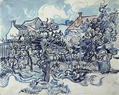
Old vineyard with peasant woman,1890
Vincent van Gogh(1853-1890)
Brush in oil and watercolour, pencil on laid paper, 44 x 54 cm
Van Gogh Museum, Amsterdam

This post focuses on Van Gogh's drawing materials and how they influenced his style.

Here are some of the things I've learned about Van Gogh's approach to drawing.

Drawing Media:

  • Pencil: He employed pencil for preliminary drawings and then combined it with ink. He often worked with a carpenter's pencil. He liked to press hard and often worked on wet paper.
  • Pen and ink: Van Gogh had a remarkable gift for pen drawing and graphic technique.
    • Most of Van Gogh's pen and ink and brush drawings (such as the one above) are executed first in pencil first. He then inks/bruhes over the pencil marks once he is happy with them.
    • some of his pen and ink drawings are drawn without any preliminary use of pencil
    • During his visit to Arles in 1888, Van Gogh discovered the reed pen (made from local hollow-barreled grass, sharpened with a penknife). It changed his drawing style. He created some extraordinary drawings of the Provençal landscape, including a series of drawings of and from Montmajour (east of Arles) , in reed pen and aniline ink on laid paper. The ink has now faded to a dull brown.
    • The Van Gogh Museum is conducting research into pigments and drawing inks in use in the period 1888-1890 and comparing this to the inks Van Gogh used [UPDATE: See the Research Results REVIGO: Paintings - which also comments on inks] 
  • Prints: He studied prints from periodicals and wanted to make graphic art which would be affordable to the lower classes.
  • Print materials: He experimented with using a lithographic crayon - drawing over pencil and then removing it to get lighter effects. He sometimes also used printing ink in his drawings.
  • Use of brush and colour: At Saint-Rémy and Auvers-sur-Oise, he experimented with rhythm and colour - often exploring further the impact of the use of complementary colours such as in the orange and blue used in the above drawing. For colour he used gouache, thinned oils and coloured inks (some of which have now turned brown) with a brush. [UPDATE: See Unravel Van Gogh App - which presents information about media used in paintings]
Trees with ivy in the asylum garden, 1889
Vincent van Gogh (1853-1890) Saint-Rémy-de-Provence, May-June 1889
pencil, reed pen and brush and ink, on paper, 61.8 cm x 47.1 cm
Credits: Van Gogh Museum, Amsterdam (Vincent van Gogh Foundation)

Drawing Techniques

When he died, one commentator remarked that
"It may be certain that in the future the artist who died young will receive attention primarily for his drawings."
What seems to surprise people looking at the drawings is to find that the sort of marks he used in his paintings were first developed in his drawings. Van Gogh's drawings - particularly in the later years - will be immediately recognised to be by Van Gogh by anybody familiar with his paintings. All that is missing is the impasto finish, the saturated colour and optical mixing. Which is quite a lot, which in turn says something about the strength and style of the marks he made. 

However, once one understands that Van Gogh thought that drawing was the root of everything and that it was necessary to master drawing before proceeding to paint and colour, then it makes sense of how a style could become so well developed initially through drawing alone.

Van Gogh's earlier interest in Japanese prints may have sparked an interest in calligraphy. It's certainly the case that when a brush is used in his drawings he seems to use it a very sinuous and calligraphic way. Marks are independent and rarely blended. The pointillism used by some of the Impressionists also seems to have influenced him.

As well as making drawings in advance of paintings, Van Gogh also used to make drawn copies of paintings he was particularly pleased with or for his brother or when he was seeking comments from others. The drawing of the tree, in the asylum of the garden of the asylum at St Remy, is one example of this practice. His drawings are frequently not mere copies but rather seek to continue to explore the subject and the scope for mark-making.

His use of pen and ink demonstrates very good motor control of both his hands and his chosen drawing instrument. I'm not bad at drawing myself, but having drawn using my reed pen during the course of this project I have to say I am now even more impressed with his pen and ink drawings. His control of line direction and weight and ability to leave the ink untouched by a stray finger leaves me in awe! (And you now know why you haven't seen my efforts!).

The notion of Van Gogh as a man who studies, plans and works with control as well as energy is maybe not one that fits neatly with some of the more popular myths. All I can say is that actually trying to use a medium in the same sort of way tells me far more about an artist than anything else. 

Eric Gelber commented extremely eloquently on Van Gogh's mark-making in his article commenting on the drawings exhibition in 2005. Here's what he had to say.
There is a reason why Picasso’s praise of Van Gogh was never qualified. Van Gogh’s uncanny graphic intensity was not simply the by-product of mental disease, expression run rampant. Van Gogh teaches us that a drawn line is not just a drawn line. He instilled his line with veracity and an energy that continues to elude classification. His graphic resources, stippling, cross hatching, a barrage of multi-directional slashes and whorls, were always contained in smartly delineated compositions, and Van Gogh also chose startlingly original subject matter, a lone pair of shoes, a dramatically sloping hole in the ground. His ability to frame wild expanses of plant life allowed him to avoid the pitfalls of horror vacui, present in so much outsider art.............By carefully modulating the direction, shape and size of a limited vocabulary of hand drawn marks, Van Gogh convincingly evoked a variety of textures and forms and vistas. He was masterful at playing dot and circular form off of line or slash and his nuanced and commanding outlines of forms are products of a finely tuned imagination. His outlines are vibrant summaries of forms that are thoroughly convincing and hold our attention without resorting to self conscious distortions. (Eric Gelber)
NOTES:
For further information: If you can't get hold of a copy of Sjraar Van Heugten's book "Van Gogh - The Master Draughtsman" published by Thames and Hudson, then try reviewing the many reviews of the Drawings exhibition held at the Metropolitan Museum of Art in New York and the Van Gogh Museum in Amsterdam. The MMA also has a very useful essay on his drawings.


E
RIC GELBER is Associate Editor at artcritical.com. An artist as well as a critic, he has also written for Sculpture, Artnet and the New York Sun.

Wednesday, February 21, 2007

The Van Gogh Project: the artists' contributions #2

Garden of a bath-house, 1888
Vincent van Gogh (1853-1890)
Reed pen in brown ink, pencil on wove paper, 61 x 49 cm
Van Gogh Museum, Amsterdam

This post gives you the new blog posts in the Van Gogh project since my last post of 9th February.

As before click on the post titles to find out more about Van Gogh and/or how each artist is tackling this project.

If anybody else is participating and I've left you out please feel free to draw my attention to your blog and relevant posts by leaving a comment and I'll include you in the final round-up. If you've already told me and I've just overloaded my brain cells temporarily and forgot then I''ll update this post as well!

FINE LINE ARTISTS GROUP

Making A Mark (Katherine Tyrrell - living in London and loving the research and the drawings)
Greywaren Art (Maggie Stiefvater - from her brand new home and STUDIO in Virginia)
Wendy Prior ((on her very own VG epiphany in New Zealand)
Fur in the Paint (Gayle Mason - drawing cats and dogs and crowded by collies in Yorkshire - and currently getting over a rather dramatic flood after my last post)
Daily Painter (Nicole Caulfield - has been busy with some other very nice paintings - do take a look - but will be along with a VG still life very shortly)

FRIENDS OF FINE LINE ARTISTS

The Colourist
(Casey Klahn - who is a BIG Van Gogh fan - speaking from Davenport, Washington State, Holland and Provence - is becoming VERY SILLY as well as being very industrious! ;) )
Have Dogs Will Travel (Robyn in Tuscany - drawing in new ways)
Purple Tastes Good (Rita Wooburne - somewhere, out there in CA)
The Studio News (Lisa Bachman - also working in pastels and coloured pencils)
Rose's Art Lines (Rose Welty - also battling computers in North Texas)
Feel free to copy these links to your own blog.

Technorati tags: , ,

Royal Talens Van Gogh Coloured Pencils


It seems appropriate during Van Gogh project month that I should finally find the link to the excellent Van Gogh coloured pencils on the Royal Talens website.

This link takes you to the English version of their main (Dutch) site. The route from there is then 'other'; 'English'; 'products' from top menu line and then 'pencils' from the left hand menu. The web page then provides you with information about all the various sets of pencils they produce but does not provide any technical information about pigments used or lightfastness (see last post for general gripe about that)
(Talens Van Gogh website)
....These pencils are unique due to their guaranteed lightfastness. Royal Talens has combined its expertise in the use of pigments in artists’ paints with the specific properties of pencils. The result is a complete range of fine art pencils with an excellent colour transfer and colour intensity.
  • Complete range of fine art pencils
  • Colours remain unchanged thanks to guaranteed lightfast
  • Manufactured with the greatest of care from cedar wood that has been acquired in a responsible manner
  • Excellent colour release and colouring power
  • Easy workability
The website also has a tips section for using coloured pencils and even has an outline and then an approach for using their coloured pencils to draw Van Gogh's famous painting of his room in Arles! You can download it from here.

Here's my review of these pencils:

Pros:
  • very smooth application - creamy soft. This applies to both artist and watercolour pencils; the latter are only slightly drier.
  • excellent pigment strength; lots of scope for getting saturated colour quickly
  • Van Gogh Talens participated in the very first ASTM test of lightfastness in coloured pencils and the pencils are guaranteed to be lightfast.
  • range of colours is not as extensive as other makes - but the range available is a very good choice. I find I want to use their colours a lot.
  • an excellent range of greens and blues - very useful for the plein air sketcher
  • If was going out to sketch and could only take one brand and a limited range of colours in my sketching kit I would take my Van Goghs. Apart from anything else they have a rather nifty carry case!
  • the Van Gogh watercolour pencils (white top) are the best I've come across so far - although I'm no expert in this particular area.
Cons:
  • it's quite difficult to get hold of these pencils. Which is surprising given how good they are and that they are guaranteed lightfast. I'm very lucky in having Paintworks, the main importer located very close to me and can buy colours from open stock for both artists and the watercolour products. (They also do mail order both for single colours and tins - you can find prices quoted in the drawing catalogue)
  • You can find suppliers which sell Talens goods on the Talens website. Unfortunately the site does not provide a list of colours.
  • these are very soft pencils which sometimes get eaten rather fast by sharpeners.
  • the fastening on the carry case can be irritating at times.
If you ever get a chance to try Van Gogh Coloured Pencils, you'll be very pleasantly surprised. I'm very happy to recommend them.

Note: For general information about lightfastness in coloured pencils and specific information about all reputable brands of lightfast pencils see various links on Coloured Pencils: Resources for Artists.

Links:

Tuesday, February 20, 2007

Colourfastness in coloured pencils

Coloured Pencils: Brazilian Lightfastness Test
(Jan. 2006 - Jan. 2007)

(click the image to see a larger version and check the brand and pencil no.)
Colours exposed to Brazilian daylight for a year on the left;
colours preserved in conditions without light on right

Lucio Rubira is a 43 year old comics artist and professional illustrator living in São Paulo Brazil. He uses coloured pencils both for his job and his own personal artwork (see below) and given the strong light found in Brazil is particularly interested in the quality and lightfastness of material used for his own artwork.

Lucio recently posted a thread about a year long colourfastness test he has been conducting on the Wet Canvas Colored Pencil Forum. This involved testing the lightfastness of Prismacolors, Polychromos and Pablo coloured pencils of similar colours (see above) in identical light conditions and against a control chart of colours kept away from all light for the duration of the test.

Hong Kong 2005
coloured pencil
copyright Lucio Rubira

I invited Lucio to contribute to my blog about his test and he sent me larger versions of his colour charts than those available on the forum. For details of how the tests were conducted see Lucio's explanation below. As you can see the colours most affected are Prismacolor 1013 (Deco Peach) - which has completely disappeared - and Prismacolor 1028 (Blue Slate).
Colourfastness in Colored pencils

Lots of CP artists are concerned about the colorfastness of their colored pencils. As CP artwork once sold may not be framed and exposed to light to museum standards we all need to be careful to avoid any pencils that fade when exposed to light. I work mainly with Pablo from Caran D´ache and Faber Castell's Polychromos, but I got some samples of Sanford's Prismacolors to put them side by side in a small test.

I made two color charts on Fabriano 4 acid free paper using a Prismacolor pencil and then and the nearest colours to that using two other brands (Faber Castell Polychromos and Caran d'Ache Pablos - with Stabilo pencils used to fill some gaps). I put one chart in a drawer inside a black envelope. I attached the other chart to a window and it was exposed to intense daylight for one year from January of 2006 to January of 2007. This wasn't direct sunlight but it was tropical sunlight as I live in São Paulo, Brazil.

I am a illustrator and my works are scanned and later they rest in a dark place safe almost forever. However, if I produce work which is going to be displayed (eg a portrait) I am very concerned with the resistance of colors to light. Imagine a baby portrait made with a lot of Deco Peach ( Prismacolour 1030 ) I would have a disaster in a couple of years of inappropriate exposure to bright daylight!

I think the color comparison is self explanatory. I have to say that if the test was made with the charts protected with good fixatives and/or UV glass it's likely that the results would be different. Some UV glass has a protection factor of more than 90% . Ordinary thick glass will also probably help to protect the more fragile colors.
Traditionally, the colours which tend to be most robust when exposed to light are browns. Those that are most fugitive are pinks, purples and all light shades. Sanford recognised the very serious problem it had with its Deco colours and has now introduced a set of lightfast pencils. I understand that it has also withdrawn all those colours which caused the most problems in terms of lightfastness - which includes all the deco colours. It's certainly the case that they are no longer listed as part of the Premier Pencil range by Sanford - although Blue Slate (1024) is still listed and maybe its inclusion should be reviewed again?

Lucio goes on to comment.....
Serious artists have considerable difficulty at times making sure they are working with top quality products. The colored pencil makers usually rate the colorfastness of the pencil in the body of the pencil but some times we have to search their websites to find what the information means.
I agree with Lucio that it would be a huge bonus for all serious CP artists if all the coloured pencil manufacturers were to make good quality and detailed techinical information about lightfastness easily accessible on their websites and using universal technical terms and standards. I'm not clear at the moment which manufacturers are signed up to the new lightfastness standard.

If you have not already done so, I recommend that you should:
  • review lightfastness information supplied by manufacturers
  • identify pencils which don't have a good lightfastness rating
  • go through all your pencils and separate out all those which don't have good lightfastness ratings and/or are no longer listed as being supplied by the manufacturer. In general, colours withdrawn are those which are now recognised to be fugitive.
  • Unless you only produce prints and don't sell originals and/or keep artwork in sketchbooks you should now chuck all the pencils with fugitive colours. If you're being really rigorous get rid of all those except the most lightfast.
  • make sure all your future pencil buys involve pencils with good lightfastness ratings.
You might also want to take a look at the new lightfastness module within my squidoo lens "Coloured Pencils: Resources for Artists". This includes all the links I can find to information about lightfastness in coloured pencils which is independent of that provided by the manufacturer. It includes:
  • all known links to the websites of coloured pencil manufacturers - including a new link (hurrah - found it last!) to the Royal Talens Van Gogh lightfast pencils.
  • an explanation by Bet Borgeson of a simple way in which you can test your coloured pencils in your own home and
  • an example from another artist, Sarah Longrigg, of her own test on black paper (over a two and a half year period). Her test was conducted at her home close to the West Highland Way in Scotland - a bit of a difference from São Paulo Brazil!
An exercise still needs to be done comparing watercolour pencils with artist pencils - as dilution with water generally impairs lightfastness when pigments are less than the best.

In the meantime, Lucio also tells me that if any manufacturers would like to engage him to test any of their existing or new coloured pencil products in Brazilian sunlight and would like to send him pencils to try he'd be very happy to oblige! Lucio can be contacted either by leaving a comment on this blog post or via me.

Links:
Technorati tags: ,, , , , , ,

Monday, February 19, 2007

Van Gogh, colour and a colour study

"Lines in a Languedoc Landscape" - a colour study - after Van Gogh
11" x 14" pen and sepia ink and coloured pencil
copyright Katherine Tyrrell

This is the previous pen and ink drawing done as part of this month's Van Gogh project further developed through the addition of colour. I decided that rather than working from the photo and colour sketch I'd try basing it on the Van Gogh's colours in his painting The Harvest (painted during the harvest in June 1888) to develop this piece.
Depicting the Harvest The vast landscape has been built up in horizontal planes; in the foreground lies the harvested wheat, while in the background the purple-blue mountains rise up into the turquoise air. (Van Gogh Museum)
I was conscious of trying to use the complementary colours which Van Gogh seemed to favour - blue/greens and oranges and yellows and mauve/purples (see below for more about this). Overall, it has resulted in the drawing having much more saturated colour and being brighter than I might have done if I'd been following the rather more muted colours from the day of the original sketch - on which the Mistral blew making everything seem rather hazy.

Van Gogh's letters contain some 324 references to colours. The Van Gogh Musuem also has some interesting narrative about use of colour:
  • the way in which Van Gogh changed his palette
Experiments in colour: Soon after arriving in Paris (in 1886), Van Gogh senses how outmoded his dark-hued palette has become. He paints studies of flowers, which Theo describes as "finger exercises"-practice pieces in which he tries to "render intense color and not a gray harmony." Van Gogh keeps balls of wool with threads in different hues-red and orange, blue and yellow, orange and gray-to sample and test the effect of different color combinations. His palette gradually lightens, and his sensitivity to color in the landscape intensifies. Van Gogh regularly paints outdoors in Asnières, a village near Paris where the Impressionists often set up their easels. Later, he writes to his sister Wil: "And when I painted the landscape in Asnières this summer, I saw more colors there than ever before."
  • the brightness and colour contrasts associated with his work after Japanese prints "Van Gogh used different, brighter colors, or enhanced the color contrasts."
  • his use of still life for experiments with colour
Still Lifes as Color Studies: During his Paris period, Van Gogh painted a number of still lifes. Based on scientific theories of color, they were designed to help him understand the effects of various color combinations. He experimented with contrasting pairs of colors, such as blue and orange, red and green, or yellow and purple. He first painted a series of flower still lifes in which the subdued tones are increasingly replaced by bright, unmixed colors. He then turned his attention to various other subjects – books, fruit, plants, shellfish, glass – all captured on canvas in brilliant color and with a loose brushstroke. (click the link to see examples of the still life color studies at the bottom of the web page)

  • Finally, a A current exhibition at the Van Gogh Museum also focuses on "Hidden Colors" Red, yellow and blue in the early paintings of Vincent van Gogh. The exhibition closes on 7 October 2007.
I've also included Marion Boddy-Evans's neat summary about the palettes and techniques of Van Gogh on the painting.about.com website.

Links:
Technorati tags: , ,