Friday, June 30, 2006

The nature of serial process

I published my blog post about Maggie and went off to read my e-mail and found and opened my latest Robert Genn letter. My mouth dropped when I realised he's done it again and written about something I've just been discussing!

Maggie and I have talked quite a bit in the past and during her interview about how she settles on a theme and then develops it. It works for her because she becomes more confident in what's she's doing and feels she can then take risks, push a few 'boundaries, and try things which are a bit more unusual - it's a combination of steady application with a bit of excitement thrown in. It works for her customers who collect her work because they can build a set of paintings which have a continuity about them.

So what does Robert Genn write about in his twice-weekly letter to artists? Only "the nature of the serial process"! I'm going to quote a brief extract from the letter - but seriously urge you to go and read it in its entirety when it's published on the Painter's Keys website shortly (e-nmail subscribers always get it first).

Robert talks about
"The steady worker who applies his craft daily is more likely to make creative gains than an intermittent one. Even when tired, or even because of it, the rolling creator can generally squeeze further."
In addition - he highlights the stages in the creative process
  • Initial attraction and recognition of potential.
  • Commitment to virgin understanding and first rendition.
  • Secondary attraction to nuance and sleeper elements.
  • Further "aha" recognition that the thing has legs.
  • Re-dedication to specific exploration and variation.
  • Development of personal touches and sensitivities.
  • Progression through excited highs to creative climax.
Drawings and sketches work in the same way. I can see the progress made every time somebody selects a theme and develops it - with a good example being the monthly sketchbook themes of Laura's Laurelines blog (watch out for the mid-year assessment of the 2006 art plan review due to be posted today!). I know I go to my weekly drawing class for the discipline of drawing a live model. However I now also push my weekly study to include composition and the 'making of a picture' - even if it doesn't always work out - like last night! But when it works, I know it, get quietly excited about it and the drawing just flows out of my fingers.

I can highly recommend Robert's newsletter, it always gives me something stimulating to think about each time it lands in my in-box. The "clickback" (containing the letter and readers' response to it is also very well worth reading - and features readers' work!) This is the current clickback.

Relevant Links:
Technorati tags: , , , ,

Maggie Stiefvater - two of everything

Maggie Stiefvater is an up and coming artist who has developed a significant following on e-bay over the last year.

I've come to know Maggie very well and admire her hugely. She has done what a lot of people only dream about doing – handed in her notice at the day job, started a career as a full-time artist and become a collected artist. However, Maggie did all this while producing and raising two babies under the age of two. Maybe they provide the extra incentive to do well? She's certainly off to a flying start with her work now selling before it's even completed. Here’s what Maggie told me.
When I was small, I drew horses all the time but never ever thought that one day I would be an artist. It wasn't until I joined “Wet Canvas” that it occurred to me that people might want to hang my art on their wall.

I’m now am independent, self-taught, self-representing artist. I'm making progress because I'm always willing to learn from the experience and knowledge of others but also enjoy trying things out for myself. In everything I do, I learn by researching what works and how it works and then experiment by doing it my way. Inevitably this means I sometimes fail but I never let that discourage me and I try new things all the time – in terms of both my art and the way I do business. I always get really excited with every new piece of art because of an element of uncertainty as to whether or not I'll be able to pull it off. That excitement is only matched by trying out the latest idea I’ve had for marketing my work!

My artwork is divided into two. It began with realistic colored pencil portraits, mostly of my first love - horses. My aim when creating portraits is always to show character. I prefer a sketchy finish to the very precise realism which is very common in the coloured pencil world. While I enjoy doing larger portraits, I’ve also found a lucrative niche market in tiny art cards.


The other half of my art personality produces bright, bold streetscapes in acrylic which address a major fascination of mine: the juxtaposition of old and new. I love cars and they nearly always represent the modern element in my paintings. These have been doing incredibly well since I introduced them. I now have collectors who really love my work! In order to stay in close touch with them I've begun a new blog greywarenart.blogspot.com where I post my art as I complete it so that people can see and comment on it before it’s listed in my e-bay store. My website also displays my work but in a more traditional format and is now also set-up so that it works closely with my eBay store.

My two toddlers help me to be very organised and focused. Planning my art and my business activities has to be all about planning my time. My husband told me that I needed to take all of my spare moments during the day, clump them together and then put that time to good use. Very wise advice! I mark off blocks of time in the week for art and allot myself "weekends" for ‘time-off. And most importantly, I paint or draw whether or not I feel like it. When art is your living, the freedom of "not feeling like it" is taken away from you. That's my main suggestion for anybody who wants to become a professional artist: start treating it like a job.

Anybody who wants to meet me in person can find me throughout the summer at horse shows and exhibitions in Virginia – they’re all listed on my website.
Maggie is also a budding author with a book which is currently being considered for publication………..but that’s another story!

Artwork: click on either image to see a larger image
"Persephone" 11" x 14" (coloured pencil)
"The Hot Seat" 2.5" x 3.5" (coloured pencil art card )

Technorati tags: , , , ,
, , ,

Thursday, June 29, 2006

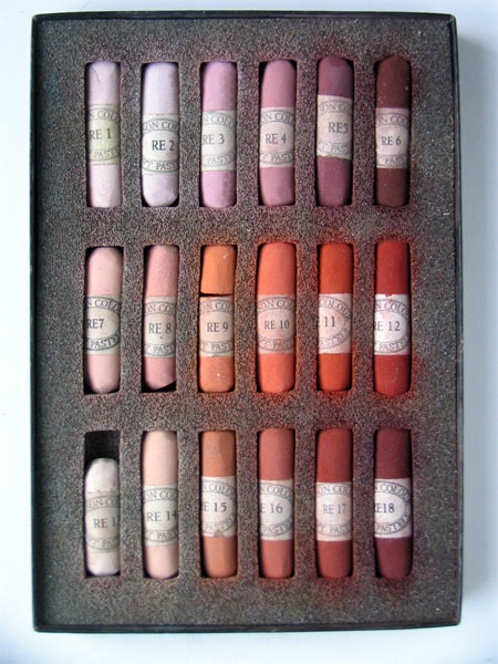
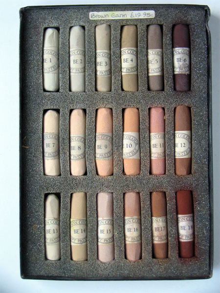
Unison Pastels: Red, Red Earth and Brown Earth

Some technical information today in the sixth of this series of posts about Unison Pastels.

John Hersey, an artist used to working with charcoal, created the pastels as a result of his enquiry into the nature and properties of colour.

The pastels appeal to colourists as they provide strong pigment colour with a soft pastel performance. The pastels are pigment rich, have very little binder and are developed as a series of hues. Many of the pastels are pure and single pigments which are then blended with a little white (chalk) to create the tints.
"The pigments used are the traditional ones: Cadmium (with a limit of 0.01% or 100ppm soluble Cadmium), Cobalt, Oxide of Chromium, Viridian, the Ultramarines, Cobalt Chromes, the natural and synthetic Iron Oxides, Titanium Dioxide and China Clay. These colours have stood the test of time and are very durable and lightfast."
The sets are based on Hersey's theory about colour integration hence the title - Unison. The cycles of hues and tint variations were influenced by the light in Northumberland which show the colours of nature very clearly. For me, this approach also explains why - in my experience - all the colours work so well with one another - as demonstrated by my plein air painting of the lake temple, Pura Ulun Danu Bratan, near Bedugal in Bali (below) which mixes shades from the the red earth and red sets with blues, blue greens and yellow greens.


Unison pastels are hand-made in Northumberland. The process used to produce them means they are considerably softer than many of those made in factories. Rather than being compressed and extruded from a pastel mixing machine and chopped into uniform lengths by another machine, each stick is hand-rolled and air-dried. Consequently they're not a uniform shape although each stick measures approximately 2-1/8" long × 5/8" diameter (54 mm × 16 mm). Pastel colour sets are then packaged in a robust black cardboard box with good quality foam insert which provides a protected home for 18 pastels.

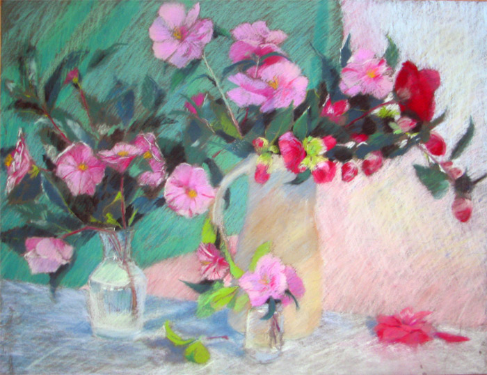
My sixth post in this series combines the Red, Red earth and Brown Earth pastels. I have to confess I was a bit worried about how to cover the brown ones as I don't use them a lot. But they seem to fit in happily next to the Red Earth set. One of the worries of many people, on the other hand, is how some pigments cope with light over time. I have Devon Camellias #1 under glass on the wall of my sitting room for about 12 years with no obervable deterioration. The reality is that pastels are lightfast rather than fugitive if pigments are well chosen.

Artwork: click on the small images to see a larger painting
Pura Ulun Dana Bratan 19.5" x 25.5"
Devon Camellias #2 19.5 x 25.5"

Technorati tags: , , , , , , ,

Wednesday, June 28, 2006

Unison Pastels: Blues and Greys

Today is the turn of the Blues and the Greys. I don't really do a lot of 'blue' paintings but I so seem to use some of the blue pastels quite a bit for both highlights and darks. Over the years, I 've also grown to appreciate coloured greys more and more.

There is a good range of hues in the blues box. From ones which are very useful in more subtle pictures and within a more traditional palette (for example in "Dunwich Single" or "Violets in a jam jar" below) to ones which command attention in brighter more contemporary pieces (see "The Fish Bowl" below). I used BV12 and some touches of BV11 in the latter piece and the pigment strength and cover is simply astounding.

"The Fish Bowl" is an interesting example of what happens when you have a go at using some of the colours you don't normally use! I had tremendous fun doing it although I'm not sure whether it's ever going to find a place on the walls of my home!

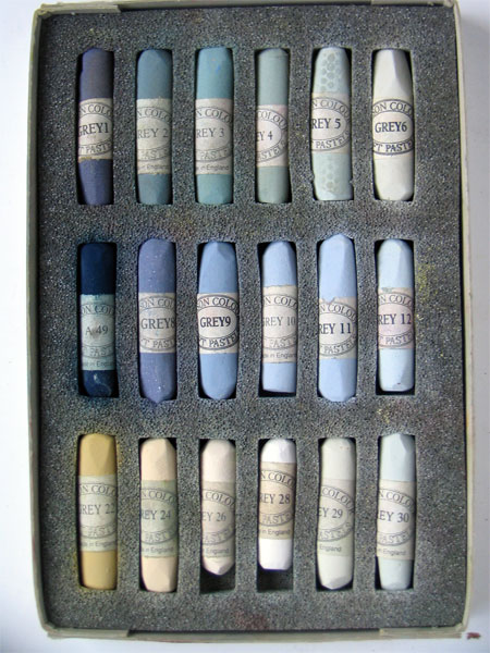
The second box is a personal selection I made from the Greys series 1-36. The top two rows are #1-6 and 8-12 plus A49 which is the very dark indigo blue shade on the middle left. The bottom row from left to right is 22, 24, 26, 28-30. I didn't buy the greys without colour as I reckoned I'd never ever use them but I think I could maybe do with a few more of the yellow/brown greys. Numbers 30-36 which are various tints of a green grey looked to me to be pretty close to some of the pastels I already had in other boxes.

There are also another set of 36 greys called the Assheton Stones (named - I think - after the late Christopher Assheton Stones - a pastel artist and member of the Pastel Society). These shades can be seen on the Heaton Cooper site. These are very similar to the grey set of 36 pastels.

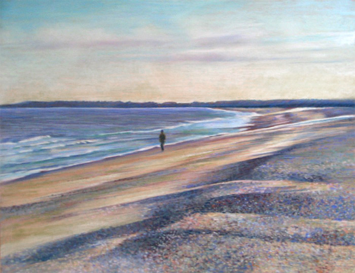
To see what the pastels look like when used in my artwork I've included three pastel paintings. Click on them to see a larger size
  • "Dunwich Shingle" (Pastel 19.5" x 25.5") (see Waterscapes Gallery on my website for more art involving water)
  • "Violets in a jam jar" (Pastl 19.5" x 25.5")
  • "The Fish Bowl" (Pastel 19.5" x 25.5") (the Flowers Gallery on my website has more pastel paintings of flowers


Technorati tags: , , , , ,

Self Portrait Marathon #3 - The mouth is wrong!

"A portrait is a painting with something wrong with the mouth." John Singer Sargent

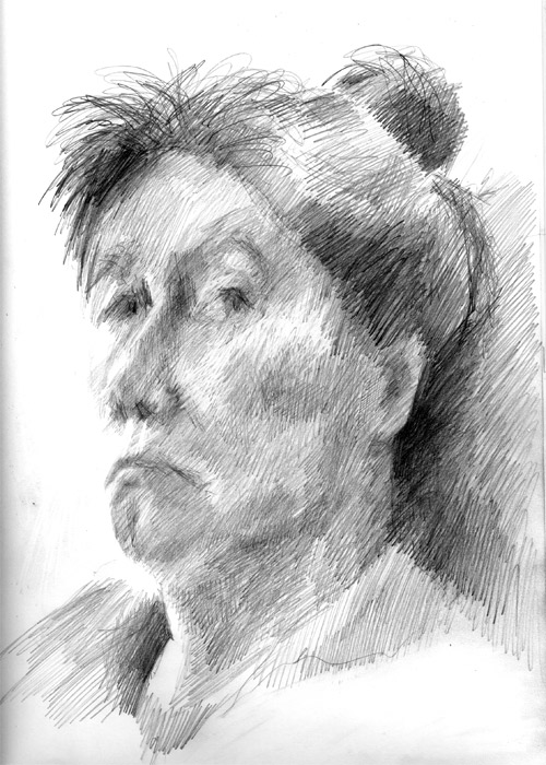
This also applies to self-portraits - and here's #3 in my contribution to the self-portrait-marathon.

I think I've given up on the jigsaw idea as it's just so difficult actually finding an angle at which to draw that has decent light.

I again took off my glasses and I cannot tell you how grateful I am for having learned that this can be a good thing to do. As before I lost detail on the face and couldn't see what I was doing at all on the paper and just had to work on the basis of tonal shapes as I couldn't see individual lines. I'm really quite pleased with this in terms of the use of hatching and the relative accuracy while being very loosely done.

There is, of course something wrong with the mouth - and in the end I decided that I could live with that being on view to however many of you there are today (it was over 200 the other day!!!). Readers - you need to understand that in real life I don't really look mealy mouthed and very glum - except when I'm drawing myself! I can however rustle up a very steely glare on occasion as I discovered at an early age that I have the ability to stare without blinking! My cat Polly finds it very disconcerting when we're having a tustle over what she is and is not allowed to do.

The Self Portrait Marathon juggernaut continues to rumble on - felling trees in its path to cater for all the paper being used. It's passed the 250 portraits mark and goodness knows what the final number is going to be as there is definitely something about it getting easier the more you do - so you do more..........

The marathon was featured yesterday in an item on About.com Painting and Sparkling Walt (that's him in the picture) provided some very interesting comments about the process so far. He's also now set up a gallery on Flickr which shows all the SPs (as we "marathon artists" ;) call them) produced to date.

Reference Links:
Self Portrait Marathon - June 8 - July 8: The Rules
About.com painting: Self Portrait Marathon
Self Portrait Marathon gallery on Crackskull Bob

Technorati tags: , , , , ,