Wednesday, December 13, 2006

Christmas Lunch at the Cherwell Boathouse

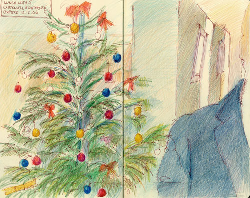
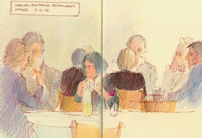
Yesterday I had 'the Office Christmas Lunch' at the Cherwell Boathouse restaurant in Oxford and did a couple of sketches in my Moleskine of the christmas tree and other diners.

My companion and I used to be managers in the same organisation. At this time of year, we try to get together for a reconvened 'Office Christmas Lunch' if possible. This year, as we were meeting up in Oxford, I was keen to try the Cherwell Boathouse restaurant which I hadn't been to in some 30 years.

The boathouse is situated next to the River Cherwell - which runs through Oxford and has a restaurant, river bar and a punt station in the summer months.
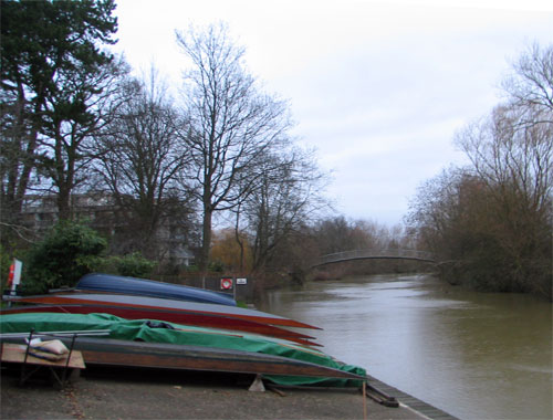
I had vivid memories of coming here with friends who lived in Oxford for the ritual punt up the river on a sunny, warm summer's evening followed by a drink on the terrace and maybe a meal. Yesterday however, we had greyish skies, drizzle and the Cherwell was swollen with rain.

My companion, who is something of a wine connoisseur, was very impressed with the scope of the restaurant's wine list and even more so with the prices. I deferred to his judgement - and I know he'll be pleased to know that several listings agree with him.
On reflection I found the food on the Christmas menu to be disappointing - the overall impression was of small portions and blandness.

I always work on the principle when eating out that I'll try menu items I've never had before - and have had some very pleasant surprises as a result. Yesterday I had two new dishes - the Newbury rabbit pate with grape chutney (one small slice, one small slice of toast and a tiny heap of frisee) and braised pheasant pie with creamed potato - again a very small portion. Both were distinctly unmemorable and rather different from the delicious food I remember from the rather less upmarket boathouse of some 30 years ago. Maybe my palate has aged!

For any future visitors to Oxford, I've included the local listing given by the tourist office for Oxford for restaurants and cafes in Oxford, its link to the reviews for the Cherwell Boathouse and the Oxford Guide - one of the new network of collbaorative and community-edited city guides.

The sketches are done using my sepia ink pen and were initially coloured using my tin of 12 Derwent Coloursoft pencils. However I couldn't get the colours I wanted with these and wished I'd brought my pencil case of 'shorties'. In this instance the colours were given a 'spruce up' when I got home - that's a christmas tree joke!

Update: I've been reminded that today my blog is one year old! It's been a really interesting year learning about lots of new blog techie 'bits and bobs' and made very special by lots of new blogging friendships. Now I've got to go and try and think of a suitable blog anniversary post for tomorrow!

Links:
Technorati tags: , , , , , ,
, , , ,

Tuesday, December 12, 2006

Tate Britain: Drawing from Turner

One of the current exhibitions at the Tate Britain challenges the notion that copying is no way to learn. It comprises a small sample of drawings from the Turner Bequest which is housed at Tate Britain together with drawings created as a result of copying those made by Turner by a number of professional artists and art students from the University of the Arts in London, as part of a collaboration with the Tate.
The fifty-eight artists participating in the ‘Drawing from Turner’ project were able to choose from a representative group of thirty-five drawings chosen from amongst the thousands available in the Turner Bequest. Each artist working on the project chose a Turner drawing which interested them in some respect and was requested to analyse their chosen work through visual means in order to learn something from the great master. (Tate Britain website)
Art students copying from an artist in order to develop their skills is a very old tradition and one which Turner himself was involved with. However copying from the artists to learn how to draw and to develop artistic skills is an 'art' which has not been practiced much in art schools the recent past - just as drawing from life slipped out of favour for a while.

An essay by Stephen Farthing on the exhibition website makes an interesting read - it summarises and explores the rationale behind the research project
This exhibition is the outcome of a research project that set out to improve understanding of the process of learning to draw by making drawings of fine examples. It comes at a time when both within secondary and tertiary education there are few shared assumptions over how we should either define or teach the subject. But in the light of the fact that for the past fifty years at least there has been just one solid area of agreement, which is that copying is no way to learn. This exhibition questions that assumption.

.........Each person was invited to make their own drawing of one by Turner from a sample group of about thirty drawings selected from the Tate’s Turner Collection. The aim was for the individual to discover what they could learn about their chosen subject by drawing it. The aim was not to make either a slavish copy or an extravagant interpretation, but through the process of study and drawing to better understand, the methods, inventions and creativity of its maker. What remained open-ended throughout this pilot was both how we defined the word copy and whether we choose to use it at all. For this reason, participating artists were asked to try to work forensically with their chosen drawing ‘re-treading’, as it were the hand of the draftsman. The goal was not to forge, but to try to understand. (Stephen Farthing "Drawing from Turner: so as to better understand" 2006)
If you'd like to have a go, you can see the Turner Bequest and a great many more of Turner's drawings here. Turner bequested the entire contents of his studio to the nation on his death in 1851.
In addition to finished oil paintings and watercolours, the Bequest includes approximately 37,000 drawings and watercolours ranging from fully worked-up studies to the scrappiest sheet recalling the briefest touch of the artist’s hand. Whether complex design or cursory doodle, the Bequest as a whole represents a rich, visual record of a lifetime’s endeavour (Tate Britain website)
Have you ever copied the drawing or painting of an artist? What did you learn? Have you ever set out to try and understand how another's hand created certain effects and how a drawing or painting was created?

Links:
Technorati tags: , , , , ,

Monday, December 11, 2006

Maggie Stiefvater makes her mark

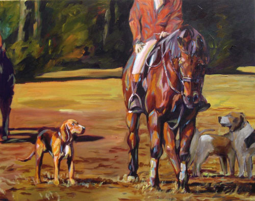
"The Understanding"
Available as 24 x 30" original on canvas (see below) or 11 x 14" print
Copyright 2006 Maggie Stiefvater.

Calling all fans of equine art and all would-be equine artists - a couple of pieces of information which you may well find of great interest.

Sporting art featuring horses tends to fall into two major categories - the race track and the hunt (horses and foxhounds). In relation to the latter, the Masters of Foxhounds Association of America is linking with the Cross Gate Gallery, a premier sporting art gallery based in Kentucky which specialises in equine sporting art, to produce a prestigious travelling exhibition of about 200 paintings on a hunting theme to commemorate its centennial in 2007.

Maggie Stiefvater, friend and fellow member of Fine Line Artists, has begun to make her mark in the equine art world. Her painting "The Understanding" (see top) has just been selected for the show.
"I was asked to create and submit a piece after my work was seen at the American Academy of Equine Art's Fall Exhibition, and so "The Understanding" will be travelling all over the country in 2007. Very exciting!"
This is the current schedule of where the exhibition will be travelling to in 2007 - the 20 or so venues will be updated as more venues are added. I'm sure it will be of great interest to both people who like equine art and all those artists seeking to develop their artistic skills in portraits of horses or hounds.

Artists should also note that, as the exhibition will be travelling around the USA for the next year, Greg Ladd of the Cross Gate Gallery has indicated that artists should continue to paint - presumably to replace art sold as the exhibition travels around. Contact the gallery for further details.


You can find more of Maggie's portraits in the equestrian portrait gallery on her website Portraits with Character. I asked her whether there were other opportunities to see her equine art in person.
I'll be at many of the major horse shows in Virginia in 2007 and I'm really starting to eye the big shows in Kentucky and Pennsylvania as well. I should be updating the workshop and show dates calendar on my site by the end of this month.

Maggie has always been very generous about sharing her approach to producing her art and during 2006 she's started to teach others on a more formal basis. She now includes workshops on coloured pencil (details on the calendar).

You can also check out a very detailed work in progress/tutorial concerning an equine portrait (count the stages!) that she has started on her blog - Greywaren Art. Maggie has told me that she's very happy to answer any questions about the tutorial or her work generally on her blog or in comments section of this post.

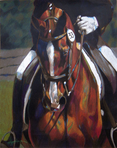
(Note: All images in this post copyright Maggie Stiefvater)

Links:
Technorati tags: , , ,

Sunday, December 10, 2006

The Mother of all Art History sites

Occasionally, you stumble across a link and think "That's looks interesting - must bookmark that and go back for another look later". That's what happened to me when I came across The Mother of All Art and Art History Links Page - not least because its authors have the nerve to use that name!

It provides an extensive set of links to all manner of sites connected to art history and the visual arts. It's fairly well organised if unsophisticated with a menu on the first page and then menus at the top of each page after that. A lot of the links have a decent narrative explaining what the link is about and what sort of resource it has to offer.

For some reason the images item on the menu does not work and you need to copy and input the following html address http://art-design.umich.edu/mother/images.html into your browser to access the links to online collections of images.

It displays a better knowledge of what is available within the USA. The coverage of sites with USA origins is much better than those located outside the USA - which is maybe not unsurprising given that this site is hosted on the website of the University of Michigan School of Art and Design.

For those of you who like art history:
  • either go and get a steaming hot mug of your favourite hot drink and the cookie jar and settle in for a long browse
  • or avoid starting to look at it just before you need to be doing something else!
[Update: thanks to Susan Borgas for correcting the link to images which has now been updated above.]
Technorati tags: , ,

Saturday, December 09, 2006

Ampersand Pastelbord

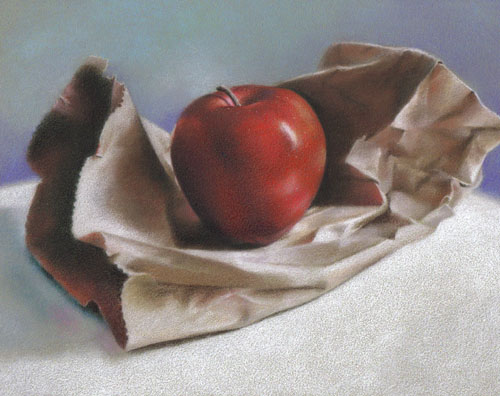
"Red" (Private Collection)
"8 x 10" Coloured Pencil on Pastelbord
Copyright Nicole Caulfield


Nicole Caulfield began experimenting with a variety of abrasive surfaces this summer and, on her recommendation, when I was in New England in September, I bought an 11” x 14” Pastelbord by Ampersand to try out. I sourced mine from the Charettes retail art store in Woburn, just north of Boston.

Reader - I am in luuurve! This is just so perfect for me – so long as I can work to the sizes and colours it is supplied in. I've only tried the grey shade so far but the other three colours - green, sand and white - look very useful. I've also only used it for coloured pencils but given the level of adhesion I do not doubt it will be good for pastels as well.

It's available in most American standard sizes (i.e. inches not metric) between 7" x 5" up to 24" x 36" with the grey shade having the most options. 18" x 24" is the most easily available large size. Further information is available on the websites of Ampersand and USA suppliers (see the end of this post for links).

What is pastelbord?

I’m going to quote from Ampersand's excellent information sheet which comes with each sheet.
"Pastelbord is a clay-coated hardboard panel designed for pastels that is suitable for paints of all types, especially acrylics. The granular marble dust finish holds many more layers of pastels than traditional pastel papers and can be reworked wet or dry without affecting the integrity of the surface......the rigid 1/8" hardboard backing makes this an ideal panel for on-location work and standard sizes fit in pochade boxes and carriers easily. pastelbord is acid-free and non-yellowing, making it a truly permanent museum quality surface. Choose from Gray, Green, Sand and White"
Concerns about yellowing, curling, warping and separation are apparently a thing of the past with Pastelbord. Preparation and benefits, according to Ampersand, includes:
  • hardboard base is made using a wet manufacturing process that removes the lamella from the wood that can cause discolouration in paintings
  • the tempered hardboard is manufactured without thick tempering oils and is made from Aspen trees, which have more unform fibers and a more neutral Ph than that of other woods
  • less prone to warping due to the highest tensile strength of any art hardboard available
  • acid-free ground produced by using two coats of acrylic to seal the hardboard before application of the acid-free clay coating.
Key features for artistic use include:
  • very fine tooth with capacity for rich colour
  • ability to use wet or dry techniques on the board eg watercolour painting under pastels
  • heavy water applications do not affect the integrity of the surface
  • acrylic washes stay wet longer
  • flexible use for multi-media people - also suitable for use with oils, acrylics, watercolours and other types of pain
Don't you just love it when they get all technical! I'm unlikely to use it with any wet media but I have to tell you that the whole feel of the board says 'quality' to me.

Read about Nicole's views on pastelboard here. You can see one of the works she has produced on pastelbord at the top of this post.

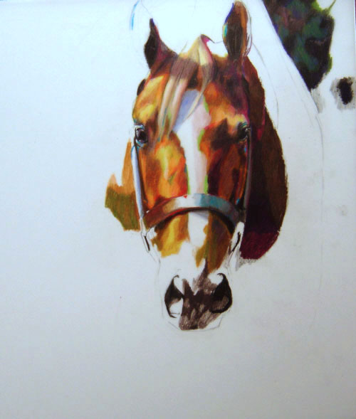
I've got a problem showing you the whole board as I'm using it to develop a '21st birthday' portrait which is still a 'work in progress' and I'd need the individual's permission - however I can show you part of it (don't you think I'm brave to show you the mouth!)

Although the surface is quite hard in wear terms on the coloured pencils, I seem to be producing very little dust as I can do on more obviously abrasive surfaces. The amazing thing is I can layer and layer and layer and it never loses its surface - marble dust is very robust! The very fine nature of the abrasive surface also makes it really easy to blend as you can see from the sample image.

More importantly, my initial findings are that I can develop good rich dark tones on it without any problem - there's no sinking into the surface or dulling down as can happen on some abrasive surfaces.

OK - so there had to be a downside! I cannot find a supplier in the UK so it looks like I'm going to have to import. I'm currently working out an order to maximise boards and minimise delivery charges with Dick Blick in the USA - who is being very helpful. Other US suppliers include Pearl Paint and the Fine Art Store. Blicks has the best selection of sizes.

I've included a link to Ampersand Pastelbord on my Squidoo lens of useful links about Pastels.

I'd be very interested to hear from anybody who has also used Pastelbord and what their thoughts are on it.

Links
Technorati tags: , , , , , , , ,