You are invited to VOTE for
the Making A Mark Award
for the
BEST PICTURE ON AN ART BLOG in 2013
the Making A Mark Award
for the
BEST PICTURE ON AN ART BLOG in 2013
There are FOUR polls below - please take your time and vote on each
The results will be announced in a post on this blog on 31st December.
The results will be announced in a post on this blog on 31st December.
One will become Picture of the Year.....
The shortlist for Best Picture of an Art Blog 2013
On Christmas Eve I published the results of nominations in the FOUR different categories of the Best Picture on an Art Blog Award in FOUR separate posts.Today I've drawn up the shortlist for voting via the Poll
- I chose two works from the nominations
- I then selected two works myself. The aim here is to give a balanced range of artwork to vote for in the Poll - with the criteria varying per category (e.g. media used, nationality of art blogger). I've also tried to reflect the artwork I've enjoyed during the year.
- the award categories - and a commentary on that category
- the shortlist - including an image and details of the artwork and details of who nominated the work
- the poll
HOW YOU CAN VOTE FORBEST PICTURE ON AN ART BLOG IN 2013
Please note: LOBBYING IS NOT ALLOWED. However a selected artist can a link to this post on their own blog and explain how to vote - in a post of their own blog.
Others can feel free to share a link to this vote if you want to encourage people to look at the options generally - but please do NOT tell people to vote for anybody specific. I've had to eliminate an entry from the poll in the past for votes being distorted by lobbying.
Vote for the artwork you like the best not the person you like the best!!!
- You have one vote for each category - so make sure you get the result right first time as you'll be blocked from changing your vote.
- The deadline for voting is 23.00 hours (GMT/London) on Monday 30th December 2013
- I suggest you view larger sizes of the images before voting - right click on the image and it should open in a new tab in your browser - so you can see all the work properly.
- Decide which picture you like best (see images below) in each of the FOUR different categories below and then vote in the poll relating to each category.
- When you've voted you can then:
- view the results by clicking on the 'view result' link in the bottom left hand corner (just above the polldaddy link).
- see the percentages of the vote which each piece attracts - but not the number of votes.
- share a link to any of the polls on your own blog. Just click the 'share this' link for the poll you'd like to share
- The work which attracts the most votes in total is also declared PICTURE OF THE YEAR!
I will announce the winner of each category in the Best Picture - Making A Mark Awards in a post on Tuesday 31st December.
[Note: At the end I've made a note of the things which struck me as I was making my choice of paintings to nominate]
[Note: At the end I've made a note of the things which struck me as I was making my choice of paintings to nominate]
The Making a Mark Prize for Best Portrayal of a Place
on an Art Blog 2013
aims to celebrate and highlight excellence in creating pictures
about places in our environment - both landscapes and interior scenes
You can see
- the nominations in Landscape Nominations for Best Artwork | MAM Awards 2013
- the four works by the four artists in the shortlist below
 |
| Diptych #1: The Hurlers oil on canvas, 20" x 30" © Amanda Bates |
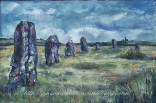 |
| Diptych #2: More Hurlers oil on canvas, 20" x 30" © Amanda Bates |
Diptych: "The Hurlers and More Hurlers" by Amanda Bates | Amanda Bates: Artist
Post: The Hurlers and More Hurlers - 22 July and 25 September 2013
Nominated by: Amanda Bates (self)
Nominated by: Amanda Bates (self)
My preference is for diptychs which are designed as diptychs from the outset rather than ones which develop during painting.
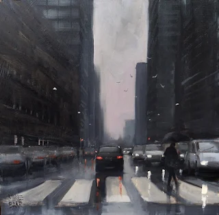 |
| "Pirie Street Crossing" by Mike Barr | Mike Barr Recent Paintings 30x30cm, oil on board © Mike Barr |
The monochrome palette and the vertical and lateral lines in this painting are exceptionally strong. They're relieved by small dots and dashes of movement and highlights. It certainly leaves you feeling as if you're sitting in an urban traffic jam.
 |
| "Galley Hill Allotments in the Snow" by Haidee-Jo Summers | Haidee-Jo Summers artist (UK) oil © Haidee-Jo Summers |
Nominated by: Katherine Tyrrell (Making A Mark)
I've seen this painting in the recent ROI Exhibition - plus it was saved by the artist since January for this exhibition - and it sold straightaway. Haidee-Jo has an excellent eye for colour and tone and her draughtsmanship is pretty good too. She paints in a looser impressionistic way. One of the things I like particularly about the way she works is that she keeps going back to the same place and painting what is basically the same scene from slightly different perspectives and in different seasons.
 |
| "Afternoon Siesta" by Sarah Wimperis | The Red Shoes (Cornwall) oil on board, 800mm x 610mm © Sarah Wimperis |
Nominated by: Katherine Tyrrell (Making A Mark)
This particular nomination relates to a painting which takes me straight back to that particular sunny place and a painting holiday in Provence in 2011. I also chose it because it seemed to me the place category needed a bit of sunlight! Sarah is also an excellent example of a painter who produces a lot of paintings which sell.
NOTE: ANSWERS ARE RANDOMISED - check the names carefully
__________________________
The Making a Mark Prize for Best Artwork about People
on an Art Blog 2013
aims to celebrate and highlight excellence in portraiture and/or artwork
on an art blog predominantly involving figures
(right click the image and open in new tab to see a larger image)
I review at least three top notch portrait exhibitions each year as well as seeing a lot of paintings of people - as portraits and figurative work - in other exhibitions. I had two thoughts when trying to find artworks for me to nominate this year:
- I was amazed at just how many people paint portraits as "heads" which have no background and no interesting lighting.
- Where's the background which explains who this person is?
- Why stop at just the head?
- Why was this view the of an individual person chosen from the options available options?
- I cannot tell you how depressing it is to view images on blogs which come up in response to specific queries on Google. There are far too many bad copies of photographs of celebrities!
- There are far too few paintings of people which incorporate more than one person - and far too few that then locate them within a context
You can see
- all the nominations in Portrait Nominations for Best Artwork | MAM Awards 2013
- the four works by four artists in the shortlist below
 |
| "Night Scene" by Therese Oaxaca | Drawing and Painting Journal © Therese Oaxaca |
Nominated by: Natasha Kimstach
It's very rare to see such an animated person in a person - which is the reason I selected this painting from those nominated. I also like the use of chiaruscuro and the fact that not all the features are in the light and the painting might have used a photograph for reference but is not hyper-realist photographic in style. The foreground of bottles and glasses looks natural and is a good foil for the rest of the painting - while adding in a subtle threat that this might be a man who is out of control.
 |
| "William" by Ian Price| ianpriceart 10 x 12" oil on gessoed MDF © Ian Price |
Nominated by: Ian Price (self)
Portraits executed in a landscape format appeal to me for some reason - maybe because the space around the head gives them room to breathe. I'm also very fond of portraits which use a Holbein Blue background although this one has not adopted the smooth and flat approach employed by Holbein.
 |
| "Breakfast Alarm" by Belinda Del Pesco (Belinda del Pesco Fine Art) 7x7 Collagraph with colored pencil on Arches paper © Belinda del Pesco |
Nominated by: Katherine Tyrrell (Making A Mark)
Belinda del Pesco is a figurative artist rather than a portrait artist - which means she regularly creates artwork based on her observation of the things around her. This one ticks the boxes for grouping, context and not being afraid to portray a person while not showing all their face or features. What I like about this image is you get two 'portrait's for the price of one. It also has context and a reality which will amuse all cat owners who are very familiar with this particular tactic for getting breakfast served! Plus it's a collograph accented by the use of coloured pencils - and I always like people who explore the full range of media available to an artist.
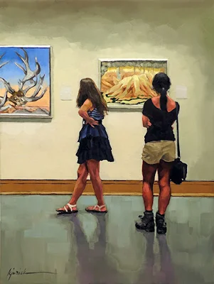 |
| "O'Keeffers" by Karin Jurick (A Painting Today) oil on panel, 9" x 12" © Karin Jurick |
Nominated by: Katherine Tyrrell (Making A Mark)
This painting appealed to me for three reasons - first this painting also has more than one person and a context! Second, I'm a big fan of both Karin Jurick and her paintings. Third, I'm a big fan of Georgia O'Keeffe so to get both Karin and Georgia in one painting is fabulous! I was also greatly amused to learn from her post that both she and I spend time and effort on our floors in terms of colour, tonal value and reflections! I see so many paintings where people have filled the space in round the people in a fairly cursory way whereas people like Karin think about the whole space. Finally, Karin Jurick is also the mistress of the natural pose and the cut in with respect to negative painting. Her paintings repay careful study.
NOTE: ANSWERS ARE RANDOMISED - check the names carefully
__________________________
(right click the image and open in new tab to see a larger image)
Some strong nominations in this category this year and it was difficult picking the two to carry forward to the Poll. This year we're seeing more flowers and plants nominated in a category which has to date been dominated by the animals and birds.
You can see:
Post: Japanese Chrysanthemum: Continuing an Unfinished Artwork 10 December 2013
Nominated by: Vicki Lee Johnston
I could select this painting just because it's a fine painting. However these awards are about by art bloggers and what also distinguishes this painting is the wealth of information contained in its associated blog post. Eunike repeats this process of writing about her artwork and providing excellent images in all her blog posts.
Post: Nearly There
Nominated by: Shevaun Doherty
I love compilations with a theme - particularly if they're of natural items. Creating a pattern which varies line, form, colour and texture while at the same time maintaining unity is rather like a puzzle - and it's great when you see someone who has worked hard to arrive at her very effective solution. I like the way Claire takes us through a complete year and all the seasons in a welsh wood of oak trees.
I've had the pleasure in 2013 of seeing Sarah's work hanging in exhibitions and in my opinion, while images on her blog are excellent, they don't do justice to the work in real life. She never disappoints me. I also chose this work because it's monochrome and a drawing.
Post: Museo civico di Zoologia di Roma (27 February 2013)
Nominated by: Katherine Tyrrell (Making A Mark)
The Making a Mark Prize for Best Portrayal of Nature
on an Art Blog 2013
values the natural world and its plants and animals
and celebrates excellence in portraying every aspect of nature
(right click the image and open in new tab to see a larger image)
Some strong nominations in this category this year and it was difficult picking the two to carry forward to the Poll. This year we're seeing more flowers and plants nominated in a category which has to date been dominated by the animals and birds.
You can see:
- the nominations in Nature Nominations for Best Artwork | MAM Awards 2013
- the two works selected from those nominated plus my two nominations can be seen below.
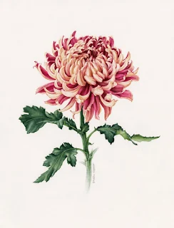 |
| "Japanese Chrysanthemum" by Eunike Nugroho | Eunike Nugroho (Indonesia) watercolour, 28cm x 38cm © Eunike Nugroho |
Nominated by: Vicki Lee Johnston
I could select this painting just because it's a fine painting. However these awards are about by art bloggers and what also distinguishes this painting is the wealth of information contained in its associated blog post. Eunike repeats this process of writing about her artwork and providing excellent images in all her blog posts.
 |
| "Welsh Oak Woodlands" by Claire Ward | Drawn to Paint Nature (Wales) watercolour, 84x60cm © Claire Ward |
Nominated by: Shevaun Doherty
I love compilations with a theme - particularly if they're of natural items. Creating a pattern which varies line, form, colour and texture while at the same time maintaining unity is rather like a puzzle - and it's great when you see someone who has worked hard to arrive at her very effective solution. I like the way Claire takes us through a complete year and all the seasons in a welsh wood of oak trees.
 |
'Gone' by Sarah Gillespie (Sarah Gillespie - Artist) Devon Charcoals and watercolour on Arches paper. 13" X 13" © Sarah Gillespie |
Post: Autumn Darkens
Nominated by: Katherine Tyrrell (Making A Mark)I've had the pleasure in 2013 of seeing Sarah's work hanging in exhibitions and in my opinion, while images on her blog are excellent, they don't do justice to the work in real life. She never disappoints me. I also chose this work because it's monochrome and a drawing.
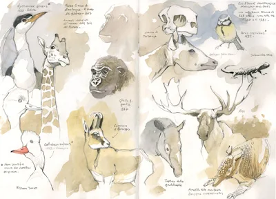 |
| "Sketchcrawl at the Museum of Zoology, Rome" by Federico Gemma (Italy) pencil and watercolour in sketchbook © Federico Gemma |
Nominated by: Katherine Tyrrell (Making A Mark)
Many times I hear that wildlife artists have to work from photographs because they can't get close to or access to the wild animals. By way of contrast, I especially like artists who demonstrate to me, time and time again, that those who have an excellent eye and a practised hand can draw and paint plein air (often via a field telescope) if they do it enough (i.e. putting in the hours enables many people to become excellent at whatever you do). Museums also offer a wealth of opportunities to draw animals shapes from observation - and with the huge benefit that the animals do not move! These sketches - as a double page spread in a sketchbook - is an excellent example of the sort of keenly observed animal art I admire. I could have nominated any number of works from Federico's sketchbooks and blog but this one caught my eye because of the multiple subjects.
NOTE: ANSWERS ARE RANDOMISED - check the names carefully
__________________________
The Making a Mark Prize for Best Still Life
on an Art Blog 2013
aims to highlight and celebrate excellence in creating pictures
which help us to reflect on how the small and/or still can be beautiful
(right click the image and open in new tab to see a larger image)
You can see
- the nominations in Still Life Nominations for Best Artwork | MAM Awards 2013
- the four works by the four artists in the shortlist below
 |
| "In the Spotlight" by Ramesh Jhawar Opaque Watercolor on Tinted Paper, 12 x 16 inches © Ramesh Jhawar |
Nominated by: Roger Brown My Botswana Art
A very simple and very effective painting of an object with meaning to people all over the world.
 |
| Foiled Again 40" x 30" oil on linen © K Henderson |
"Foiled Again" by K Henderson K Henderson Fine Art
Post: Foiled Again by K Henderson, 19th December 2013
Nominated by: K. Henderson Fine Art (self)
I like people who play around with the commonplace and make them into something new.
 |
| Bowl of Apples Oil on canvas. Approx 18"x18" ©Michael Naples |
Post: Bowl of Apples No.4 (13 March 2013)
Nominated by: Katherine Tyrrell (Making A Mark)
In an era of apparently endless dayglo still life paintings it's really nice to see a painter who knows how to balance out hue and tone to best effect. I'm very impressed with the coloured grey!
 |
| Chocolate Truffles oil on linen, 5 x 7" © Oriana Kacicek |
"Chocolate Truffles" by Oriana Kacicek
Post: Chocolate Truffles (September 2013)
Nominated by: Katherine Tyrrell (Making A Mark)Three very convincing truffles which have greater impact because of the space above them which allows them to have a presence. It's also nice to see the treatment given to what are in effect three simple spheres.
NOTE: ANSWERS ARE RANDOMISED - check the names carefully
__________________________
Notes on my choices
I started to make notes as I was looking for art to nominate and posted them to my Facebook Page - and I'm repeating them below.
- It's fascinating how I can be reviewing images only (ie not names or media or price), and I think I spot a definite possible - only to find that it's somebody who has won in previous years who's not eligible!
- I don't pick artists who are trying to copy the style of other artists - I'm looking for those who develop their own unique style
- It's very frustrating when trying to pick out work to be totally unable to tell from the post whether or not this was produced in 2013. I note a fair few artists who I'm pretty certain are posting their archive.
- The problem with artistic licence and 'faking it' is that somebody people know the view you're painting!
- I've been finding painters who do remarkable work and have art blogs - but fail to post their work to their blogs!
- I stop looking at art pretty quickly on blogs which have image files which are too big and load too slowly.
At the weekend, two more posts continue the Making A Mark Awards for Art Blogs. You can still nominate art blogs that you value for these awards - see the side column
Starting on Sunday 29th December:
- Generating Art in 2013
- The Showcase Shield
- The Best Art Blog Project Virtual Challenge Cup
- The Best Art Society Blog
- Getting Out of the Studio in 2013
- The Painting Plein Air Plus Prize
- The Travels with a Sketchbook Trophy
- The Going Greener Gong
- Learning about Art & the Art Business in 2013
- The FAQs and Answers Really Useful Medal
- The Make Me Think Gong
- The Best Book by an Art Blogger Blue Ribbon
- The Home Front in 2013
- The Most Gorgeous Mouthwatering (MGM) Studio of the Year
- The Art Innovation of the Year Award
- “The Moose” - the award for the best animal in an illustrated blog
A lovely selection of artworks in each category - appreciate the time and effort involved in pulling it together so quickly.
ReplyDeleteHave voted and would love to have any one of them on my walls.
Congratulations to all the nominees.
Thank you so much Katherine, for adding my painting to the vote, I'm feeling very honoured. Hope you've had a wonderful Christmas too. XX
ReplyDeleteThank you Katherine for including my painting in the nominees - you make me so proud.
ReplyDeleteWhat a strong collection - so hard to choose just one in each category. I am, as always, amazed at the amount of work you put into this blog. It's a fantastic resource.
ReplyDeleteHonored to be included among so many great paintings. Thanks Katherine!
ReplyDeleteThank you Katherine for including my painting among these awesome artworks. Feeling humbling to be honest. Thank you for your time and effort to make a great selection in each category.
ReplyDelete* Katherine, the nomination Best Portrayal of Nature, ""Japanese Chrysanthemum" . Clicking the image links to her blog and does not open into image on your blog.
ReplyDeleteThat said it did not affect my voting for the category.
As always it is a tough decision when down to the final four but we do have to choose one. I know I spent a lot of time considering each nomination.
What a great idea, I'm a newcomer to your blog, but have cast my votes - and seemingly have picked the favorite in each category! Lovely work. Catherine
ReplyDelete