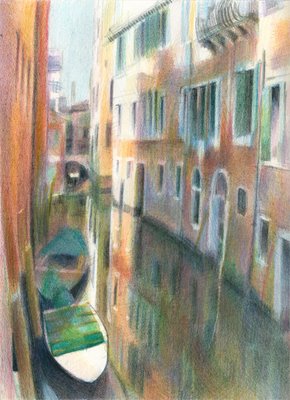
 "A Venetian Backwater - a study in contrasts"
8" x 10" coloured pencil on Arches HP 140lb
copyright Katherine Tyrrell
I've recently been developing this coloured pencil work of a canal and ordinary residential housing in the back 'streets' of the sestiari of San Polo and Santa Croce in Venice.
On my visit to Venice in may 2005, I walked back from the square in front of the Santa Maria Gloriosa dei Frari church to the area just to the left of the Pescheria so I could draw the Ca d'Oro just across the Grand Canal in the afternoon sun. (This is the link to the blog entry for that day).
My journey involved walking through a maze of narrow allies just behind and outside the San Polo area which fronts on to the Grand Canal between the Pescheria and the Rialto Bridge. One alley was very narrow and I couldn't set up and sketch and so I took a photograph instead. The reason for wanting this view is because so often when one talks of Venice you tend to think of the rather grand and set piece views - while there's actually a lot of interest in all the places which are a bit more off the beaten tourist track.
I find it much more difficult to work work only from a photo - although luckily I can recall why I photographed the scene. I remember I liked the contrast of both the light and shade and the complementary colours of the warm sienna / burnt orange plaster and the peacock green shutters and covers on the boats.
This drawing has been an exercise in values and I've spent an awful lot of time squinting to try and see them more clearly in simple terms given the complexity of the actual shapes contained within the drawing.
The reason for posting it this morning is that I'm stuck. Is it finished? For me the question is now rather more of an artistic one rather than whether it's faithful to the photograph - especially as photos introduce all sort of distortions which can be very misleading when it's your only reference source.
So - questions:
- do the values need to be strengthened any more?
- should I push the colour more or leave it as is? I'm very conscious of not wanting to lose the degree of tonal contrast and that shaft of late afternoon sun that underpins the stucture of the drawing.
- has anybody got any suggestions for a title?
(PS I've already had one suggestion that I correct the lean - by somebody who knows I have problems with my verticals at times. However in this instance the lean is totally genuine - that's what a lot of houses do in Venice!)
Links:
- Travels with a sketchbook - Venice (May 2005)
- Pastels and Pencils: Venice sketchbook
- Pastels and Pencils: Venice paintings in coloured pencil
- Making a Mark: Travels with with a sketchbook in Venice
Please keep the lean in all your drawings I love the personal touch it gives to your work. I love this the way that it is but a screen version can be so different to the real thing
ReplyDeleteI like the 'lean' as well. I would push the darks, especially in the water. That is personal preference, though. It is a great scene and lovely as is.
ReplyDeleteThanks again for all your time spent on organizing and info for all of us lazy ones!
Jo
It's lovely, Katherine! Since you've asked, my eye admits to wanting one area of more saturated color, a color focal point, even just a smallish color accent to add spice---some pure cobalt somewhere, or burnt sienna or cadmium red drybrushed over cobalt----somewhere. However, it is lovely as it is and could easily be finished as you've posted it.
ReplyDeleteKatherine, to me it is finished. It has the impact, artistry and color contrast necessary for a good work of art, in my opinion. I love it!
ReplyDelete