It's changed and it's better lit and some galleries are a lot more colourful.
 |
|
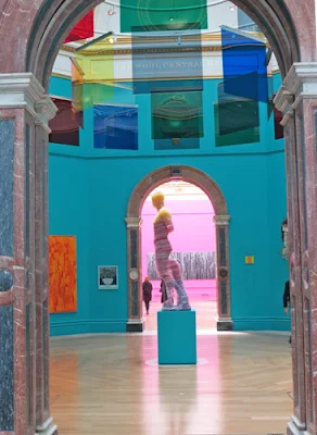
Captcha No.11 (Doryphoros) by Matthew Derbyshire
and
Applied Projection Rig by Liam Gillick
|
It's a really difficult exhibition to get right. That's in part because it continues to be the largest open art exhibition in the world.
What's the best way to display and show 1,131 artworks - some of which are by very celebrated (and very expensive) artists while others are by people who are less well known - and sell for a lot less?
On top of this the Hanging Committee don't have much of a clue as to what they will be asked to hang until they start.
That's because they only know what has come through the open entry. They don't have a clue what members are going to submit!
Plus each Co-ordinator likes to 'make their mark' on the exhibition - and this year a number of artists were invited to make work for the show or create an installation specific to the galleries.
 |
| The stairs up the Summer ExhibitionZobop - an installation in coloured vinyl tape by Jim Lambie It seems to be making a habit of visiting art galleries.... |
However, put simply, I found it one of the most pleasing Summer Exhibitions I've seen in a while. I liked the fact that somebody who understands structure and colour has co-ordinated what it looks like.
Below if you click the link embedded in the Gallery nameit will take you to a view of the artwork on display in that Gallery
1. The layout of the exhibition and rooms have changed significantly
Michael Craig-Martin RA was appointed co-ordinator of this year's summer exhibition. He's apparently a big fan of the main galleries in Burlington House and wanted them to be used in a classical way with big feature pieces at the end of the eyeline when looking along lengthy views across and through the galleries
 |
| Richard Long's large artwork Mississippi River Blues is the feature on the far wall as soon as you enter Gallery III |
Hence:
- Architecture has moved to the Large Weston Room - which has previously been used for prints or large installations. To my mind this works extremely well
 |
| Architecture has moved to the Large Weston Room |
- Large Paintings and Prints reclaimed the rooms with very good light which were traditionally used for architecture - and often seemed claustrophobic due to the way the models were rammed in!
- The small works have moved out of the Small Weston Room and are now in Gallery I where there is much more room to see the work - plus it allows some scope to hang some larger works alongside them
 |
| Gallery 1 - Small Works One of the galleries which looks more like the exhibitions I see normally - and includes works by artists I know! Entrance dominated by 'Julie and Rob' - a large tapestry from his House for Essex project by Grayson Perry But it stops dominating once you turn and look at the other works |
The relocation of smaller works to Gallery I this year is a reflection of the strength of the submissions.Nearly 150 small works are included in the room together with a few larger pieces! Artists I know whose work I know well who are is included in Gallery 1 include: Diana Armfield RA (age 85), June Berry RWS, Francis Bowyer, Bernard Dunstan RA (age 85), Anthony Eyton RA (age 82) , Emma Howarth, and Melissa Scott-Miller, David Tindle. Three of those artists are in their 80s!
2. The galleries look very different - and some are a lot more VIBRANT!
All the galleries are top lit. The covers on the overhead lights have been removed, the glass seems to have been given a wash and, as a result, the rooms are flooded with light.
I don't think I've ever seen a Summer Exhibition which has felt so light and spacious.
I can't help thinking that part of this initiative might relate to or result from some of the current work being done to open up and overhaul the Royal Academy of Arts campus.
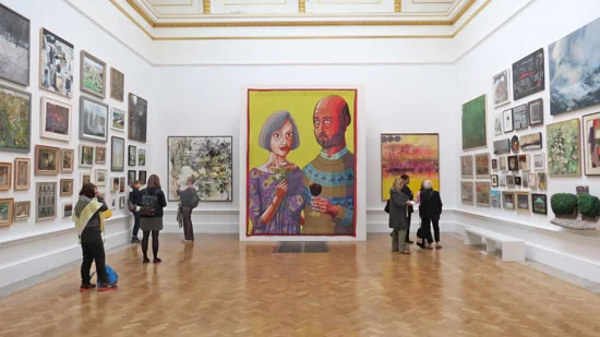
Vibrant colour also plays an important part in making the central axis of galleries look very different. These galleries have all been painted in some very 'interesting' colours - fuchsia pink, peacock blue and a strong sky blue. Around them the rest of the galleries are a very neutral white making an excellent backdrop for the artwork. I actually felt like I was in a contemporary art gallery!
Craig-Martin maintains that ‘magenta enhances the colours and form’ of the individual works selected to hang in the gallery.
 |
| Gallery III - typically all works by members of the RA This year it includes a work by Jasper Johns as well |
3. Much more figurative art
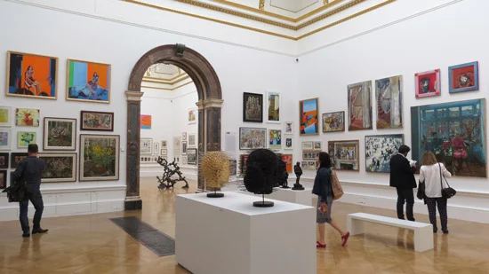
I have a sneaking suspicion that maybe somebody has been looking at where the sales have come from in the past. All I know is that the artwork which often has the most interest from visitors now has a lot more room!It also feels like there has been a debate prior to the hand about the way to present work and how to make sure the figurative and the more abstracted works don't swamp one another so neither looks good.
Anyway, for what's it's worth I came away with the distinct impression there's a lot more figurative artwork. By which I don't mean realistic work so much as representational artwork.
But I also mean there's a lot of artwork with figures in it - but a very small number of works which might be described as a portrait (see Three celebrity portraits at the RA Summer Exhibition 2015)
 |
| Gallery VIII - the Paintings |
4. An untraditional focus on landscape
There's actually an awful lot of landscapes in the exhibition. They crop up right the way throughout the show - and are particularly strong in the paintings, prints and photography.I wasn't particularly struck with the selection of landscapes in Gallery II. I think it was my least favourite gallery. I couldn't decide whether it was the hang or what had been chosen - or the mishmash of other works that were also hung in the gallery. Click the link in the gallery name and check out the work to see what I mean. There are certainly good works hanging in the room - but they're not always easy to see eg Ruth Stage's Wild Geese and Benjamin Sullivan's Backs
 |
| Gallery II - Jock McFadyen RA’s first experience of working on the Summer Exhibition Includes David Nash's Cork Dome - this is a smaller version of the original which I last saw at Kew Gardens (see Review: David Nash at Kew - A Natural Gallery) |
The room also has a lot of quotations about landscape around the room which I found fascinating.
 |
| This is the suite of etchings of the Galapagos by Norman Ackroyd lots of landscapes - plus animals and birds. These feature as part of an installation at the one of the buildings featured in the Architecture room (Large Weston Room) They're sandwiched between two versions of the Golden Temple of Garbage by Rob Taylor which I found impressive |
 |
| This wall includes: imagined landscapes - Searching for Treasure by Emma Howarth realistic landscapes - Holloway Back Gardens with Self Portrait by Melissa Scott-Miller and abstracted and ethereal landscapes - Fire burnt the Land like a language X by David Firmstone |
5. Fine Art Prints look great - split between two rooms
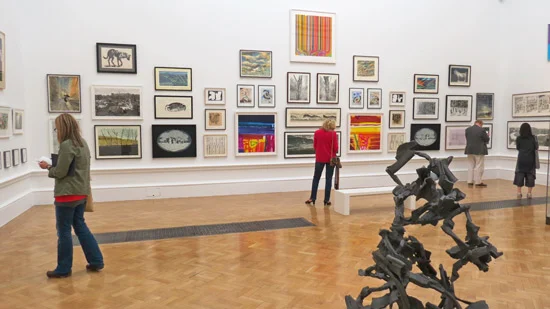
There's a different feel to the two print galleries (both curated by Norman Ackroyd Hon RA do click the links it's a great set of pages in his profile)- but it's difficult to put your finger on exactly what is different.They both feel full and spare at the same time. They also sandwich the gallery curated by Michael Craig-Martin - and complement it beautifully.
 |
| Gallery V - the First Print Gallery curated by Norman Ackroyd RA Lots of space for the crowds! |
 |
| The other end of Gallery V - the traditional hang of a lot of small works all of which will doubtless sell well! |
 |
| View of Gallery VII |
6. A Bias towards the Older Artist
Interestingly, this exhibition has a very distinct bias towards the older artist.
Michael Craig-Martin wanted to bring the public's attention to as many artists from the older generation as he could. His thinking is that many of them missed out on the popularity that art now enjoys and need to "emerge" for a second time!
I would never have guessed that most of the artwork in Gallery VI which he curated has been contributed by mostly older artists! Fictions 3 by Tim Head has been chosen for the cover of the small exhibition catalogue
 |
| Gallery VI - curated by Michael Craig-Martin This was the most contemporary and spare of all the galleries and I liked it a lot It's full of artwork by "old emerging artists"! |
 |
| (Top row) The original book, (Middle row) the first version and (bottom row) the current version |
This year it's an older artist.
Tom Phillips Hon RA has the last gallery - Gallery X - to exhibit all the pages from his altered and annotated book A Humament (if you click this link you can find out more about it) which he has been working on since 1966.
On the walls you can see both editions
 |
| More of the 500+ pages completed to date. |
7. The Sculpture Challenge
There's a huge amount of sculpture in one room. So much that it's difficult to see some of it clearly.
 |
| An awful lot of sculpture in the Lecture Room |
I'm saying that because I found it difficult walking around and finding a pathway through the room - and there were relatively few people in it when I was there.
Then there's the prohibition on photographing the work by Antony Gormley. I've got it strategically hidden behind Tim ?? great big black thing
I do wish the RA would experiment with the use of much taller plinths. It would be nice to be able to see some of the smaller sculptures nearer eye level.
 |
| More small sculpture on podiums |
8. You can see the artwork online
There's a BIG bonus for all those who can't get to Burlington House in person. There's a major innovation this year - you can see all the artwork online.
- go to the Home Page for the exhibition
- scroll down and
- then hit the link which says Launch the Summer Exhibition Explorer
- It's responsive and works well on my iMac, iPad and iPhone - it actually works fastest on my iPhone and iPad! Very sluggish on my iMac!
- you can interrogate by artist, category of work, size and price
So, for example, there are 28 small paintings, 37 large, 10 medium sized and 3 small drawings in the show and 84 extra large prints!
9. You can now see which work sells
One of the bonuses of ALL the artwork being online is that you can see which artwork sells (i.e. it's marked sold after it sells!). I'm guessing that might also prove rather useful to the RA.
I could be forgiven for thinking that this is, in part, behind some of the changes in rooms and which media categories got a bit more space.....
However the database also provides YOU with information about the range of prices charged at the exhibition for a specific size and category of art - and then whether or not they sold. It's uncommon to get quite so much market information! I could spend hours extracting data trends from the database!
10. Plus you can take photographs!
The RA has caught up with the realities of the visual world online. For the first time you're allowed to take photographs.
I can't remember whether this was announced in the 'call for entries' - I can't remember it so I suppose this might come as a bit of a surprise to some exhibiting artists!
There are a few works which cannot be photographed - but for the most part expect to see an awful lot of images of the exhibition on Twitter and Facebook and blogs over the next two months!
PS You can see who won the Prizes here.
Other reviews of the Summer Exhibition
You can read other reviews of the RA's 2015 Summer Exhibition in the articles listed below:
- The Guardian - Royal Academy's Summer Exhibition goes on a candy cavalcade
- The Telegraph - Summer Exhibition 2015, Royal Academy, review: 'a high-end junk shop'
- The Independent - The Summer Exhibition, Royal Academy of Arts, review: Has 'co-ordinator' Michael Craig-Martin made it a coherent show?
- The Mail - Will you be making an exhibition of yourself? Red-label bargain or blue-label bank-breaker - see if you can be an expert at the year's big art show This challenges you to match the price tag to the artwork!
- Eveing Standard - Summer Exhibition, 2015, Royal Academy: How to brighten up art’s Groundhog Day
- The Spectator - Royal Academy’s Summer Exhibition reviewed: a jumble sale with pizzazz
- Huffington Post - Review: Summer Exhibition, Royal Academy of Arts 'A Riot of Colour'
Previews reviews of the Summer Exhibition
- 2014 - Summer Exhibition 2014 at t he Royal Academy of Arts
- 2013 - 10 reasons to visit the RA Summer Exhibition 2013
- 2012 - Review: 244th Summer Exhibition at the Royal Academy
Thanks Katherine for such a great review! How awesome to view online!! Looks like the quality of painting has improved for the better too!
ReplyDelete