Sunday, November 05, 2006

Botanical Art - Resources for Artists

I've created a new Squidoo lens about Botanical Art and the resources that are available for artists.

Regular readers of this blog will know that I'm very keen on flowers, fruit and vegetables as objects for my artworks (see my galleries for flower and botanical drawings, flower paintings and fruit and vegetables on my website). I also love going to shows involving flowers, fruit and vegetables - and you can't keep me away from visiting gardens. My big love being the kitchen gardens!

It isn't such a big jump then to get wondering about whether to study botanical art on a formal basis. I've been accumulating a lot of information in the last year in the form of visits to gardens, shows, books and links. Unfortunately I lost most of the links from this blog in "the great links loss" while I was away in July (hence the development of squidoo lens for links!).........

This morning I published my new Squidoo Lens for Botanical Art and am really enjoying being able to write a bit more about each link this time around. This new lens is still very much a work-in-progress and will be developed over the next few months. So far, I've included modules on:
  • Botanical Art Societies
  • Botanical Art Instruction Books
  • Examples of Botanical Art - by members of the national botanical societies
  • Books of excellent examples of Botanical Art - both historical and contemporary
  • Botanic Gardens and Horticultural Societies
I'm expecting to add in websites belonging to artists who produce outstanding botanical art.

I've got quite a few links saved but still have to include them. In the meantime if there are any links you'd like to suggest please leave a comment here. Thanks.

Links:
Technorati tags: , , , , ,

Saturday, November 04, 2006

Resources for artists - my new squidoo groups

Judging by the comments I've received since starting my squidoo lenses, artists really value having access to sites that contain well-organised hyperlinks to relevant information for artists, especially where each link has an accurate explanation of the content associated with it.

I'd like to start to start by saying a big "Thanks" to all those people who have said very nice things about the squidoo lenses I've already created - and then tell you about new developments on this front.

If you liked my existing squidoo lenses then you'll probably be interested in the new squidoo group I've created called Resources for Artists. This is a compendium of squidoo lenses which provide both useful and well organised links to a specific aspect of art likely to be of interest to artists.

I originally started the group so that I would have all my existing lenses (which already had the "Resources for Artists" tag in their title) in one place and hence one icon for my Firefox toolbar, one link for the blog etc. This group has been created and is called "Making A Mark - my personal squidoo group"

Having ticked that box, it then occurred to me to explore a bit to see if other people had done the same thing as me in terms of developing squidoo lenses which are mainly about providing resource links for artists. Guess what - they had! I discovered a few lens by Jan Blencowe, Karen Margulis and Susan Borgas which seemed very similar and which also looked very useful so included them. Then started to look further afield and found some more.......and included them. So this particular squidoo group was expanded to include both new categories (eg plein air and art cards) and lenses developed by other lensmasters.

The purpose of the Resources for Artists Group is as follows
This group focuses on resource links for artists - it's not about promoting the artwork of individual artists. To be included the majority of content in a lens should provide useful information for other artists.

There are three main groups of lens:
(1) The Art Business
(2) Your approach to art - media related lenses
(3) Your art product - lenses devoted to popular formats for marketing artwork
My main criteria for adding in any new lens to this group is that the majority (80-90%) of the lens is devoted to information and the links are explained. Lenses which are purely or mainly about promoting an individual artist or just link lists will not be added. I guess I may need more criteria as the squidoo group progresses but that seems all that is needed for now.

Please feel free to link to this group if you think you will find it useful. There are also links to both groups in the right hand column of this blog.

If you know of a lens which might be suitable why don't you suggest it - either in the group or in the comments below?

And if you can think of category which should be added please suggest that also - and I'll search for suitable lenses. However I would add that there seems to be gaping hole around oil painting........which I certainly can't fill!

Links: Technorati tags: , , ,

Friday, November 03, 2006

"I have a question..........."

One of my readers sent me a question - and as I thought it might be something which others have wondered about also, I'm going to answer it here
I have a question. I hope you don't mind. Do you put down a line drawing or anything before you start to lay in your color with color pencils? I have been putting a light line of graphite pencil in but it shows thru the color. I'm not sure I can just start without a pre-drawing.
Thanks for the question J - and it's a good one.
You are in excellent company in needing to do a pre-drawing and in using a pencil. Many artists and draughtsmen use a pencil or some other erasable media for their initial drawing. Da Vinci used to ink over his initial chalk drawings (isn't it nice to know he needed a pencil drawing first as well?!) - and we know this because in some of his notebooks the only drawings that have lasted are the ones he inked in - the ones still in black chalk have faded and been rubbed away. He also created cartoons in black and red chalk which were then pricked to transfer the outline for a drawing to the surface for the painting. Van Gogh also inked over initial pencil drawings in producing his pen and ink drawings done using a reed pen.
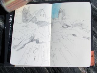
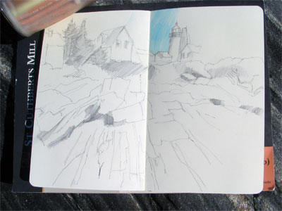
I generally use a graphite pencil line before I start to use coloured pencils. My pencil of choice for this is a mechanical pencil with an HB lead. This is because I get a light and thin line and I don't need to worry about the graphite transferring to the colour pencil (unless I start using it to shade in the tonal values). I've included a photo of my Moleskine on the rocks at Pemaquid Point and my initial pencil outline - which you can then see developed further here.
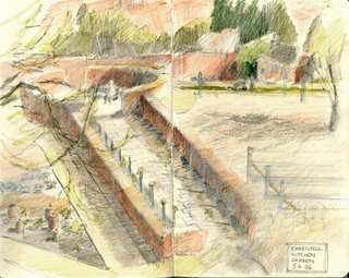
If I use the pencil to produce tonal values then it influences how the CP looks - but this is not necessarily a negative. This sketch of the kitchen garden at Winston Churchill's home Chartwell, in Kent, illustrates what it can look like

In my sketches I also use pen and either black or sepia ink and, of course, this shows right through the coloured pencils, although the sepia ink is less obvious than the black.

In artwork which is intended to be a more finished drawing I also generally draw lightly with a pencil initially - and then I often erase it in the area I am working with coloured pencils. However this depends on the colour being used - if I know the area is going to be dark I quite often don't bother - but if it is going to be a light value then I will generally erase.
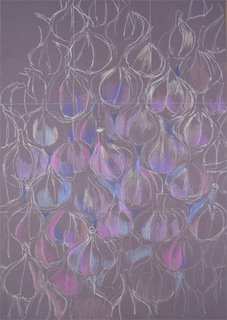
If I'm working on a coloured ground, then I might draw using a coloured pencil, usually a fairly light coloured one. On the left you can see an example of a very early stage in "A wall of ophioscorodon" where I've created a very basic 'thirds' grid and outlined the shape of the garlic bulbs in white coloured pencil before starting to lay down initial colours.

From my perspective, the answer to the questions of whether or not a pencil line should show through or not or whether this is a 'good thing' or not is that it is purely a question of individual choice by the artist concerned. It's essentially a question of what the artist wants to do and personal style. If you look closely at some artwork in watercolour or pastel by famous artists selling for many thousands of pounds/dollars, you can quite often see the pencil showing through - it's not regarded as a fault per se. Some people like to show the process they used to produce their art.

Personally I'm not that fussed about it - but I feel it also can depend on the subject and the degree of finish I'm trying to achieve.

What do other people think?

Links: Technorati tags:, , , , , ,

Thursday, November 02, 2006

The Val-U-Viewer

At the Sally Strand workshop last month we all shared our tips for improving the way we work and making our art life simpler and safer. Sally's contribution was to introduce us to the Val-U-Viewer (see left) which she had discovered in California.

The concept behind the Val-U-Viewer is very simple. Red acetate is placed between two pieces of card which have a viewfinder shape hole. When you look through the red acetate it converts all images to greyscale values - which helps with making better decisions about composition and cropping.

On the reverse of the Val-U-Viewer, next to the edge of the viewer is printed a 10 point value greyscale. When you come to develop your artwork you can assess where any tonal value you can see through the viewer comes on the greyscale printed on the Val-U-Viewer - and then compare it to the work in progress to see where values need to be developed further.

By the end of the workshop those who had acquired a Val-U-Viewer were commenting very positively about how much it helped them to see values when drawing from life - helping both composition and rendering. I also had to scan an order form and send it off to a friend of mine recently as all the members of her art group, having seen and tried hers, have now decided they want one too!

The Val-U-Viewer has been trade marked and copyrighted by Don Murphy Studio Gallery. Each Val-U-Viewer comes with a checklist of questions and instructions on how to use it.

[UPDATE: This post has been edited as the chap who made this was Don Murphy Studio Gallery, PO Box 3881, Torrance, CA 90510 but I understand he's no longer operating. However the principle underpinning the viewer still works - i.e. use red acetate - and you could always make your own]

Wednesday, November 01, 2006

Which works of art matter the most to you?

The Guardian's new online sites - the Arts Blog and Art and Architecture section (featuring online visits to new exhibitions) - decided they'd get off to a good start last week by tackling the question, long beloved of art historians, of which works of art matter the most.

Jonathan Jones is inviting people to nominate what they think deserves to be on a list of 50 works which "matter the most" - the ones you want to make sure you see before you die! He's started with his personal list of 20 which matter the most to him and is using the comments section of his post "The works of art which matter the most?" to attract nominations for contenders. Here's his list.
So - what are the journeys that are really worth making to see art? To launch the Guardian's new arts blog, let's work together to make a definitive list of works of art everyone should, at least once in a lifetime, travel to encounter - a list of 50 Works of Art to See Before You Die.

I'm kicking off the debate by listing my own top 20 (see a slideshow of the works here):

Jan van Eyck, The Madonna of Chancellor Rolin, c.1435, Musée du Louvre, Paris

Caravaggio, The Burial of St. Lucy (1608), Museo di Palazzo Bellomo, Syracuse, Sicily

Rembrandt, Aristotle with a Bust of Homer (1654), Metropolitan Museum of Art, New York

San Rock Art, South African National Museum, Cape Town

Paul Cézanne, Mont Sainte-Victoire from Les Lauves (1904 - 6), Pushkin Museum of Fine Arts, Moscow

Michelangelo, Moses (installed 1545), Church of San Pietro in Vincoli, Rome

Leonardo da Vinci, The Adoration of the Magi, (c. 1481), Uffizi Gallery, Florence

Mark Rothko, The Rothko Chapel (paintings 1965-66; chapel opened 1971), Houston, Texas

Vermeer, View of Delft (c.1660-61), Mauritshuis, The Hague

Matthias Grünewald, The Isenheim Altarpiece (c.1509-15), Musée Unterlinden, Colmar, France

Hans Holbein, The Dead Christ, (1521-2), Kunstmuseum, Basel

Velázquez, Las Meninas (1656), Museo Nacional del Prado, Madrid

Funerary Mask of Tutankhamun (1333-1323BC), Egyptian Museum, Cairo

Jackson Pollock, One: Number 31, 1950, Museum of Modern Art, New York

Masaccio, The Expulsion of Adam and Eve from Paradise (c.1427), Brancacci Chapel, Santa Maria del Carmine, Florence.

Pablo Picasso, Guernica (1937), Reina Sofia Museum, Madrid

Titian, Danaë (c. 1544-6), Museo Nazionale di Capodimonte, Naples

Raphael, The School of Athens (1510-11), Stanza della Signatura, Vatican Palace, Rome

Parthenon Sculptures ("Elgin Marbles"), c. 444 BC, British Museum, London

Henri Matisse, The Dance (1910), Hermitage Museum, St. Petersburg, Russia
If you want to see what they all look like then try the slideshow on the blog site. This will be a feature of future items on the blog - online versions of new exhibitions - with commentary.

Jones confesses his list is a very eurocentric view of what's worth travelling to see. However, what surprised me most was the total absence of 'big names' like Van Gogh and Monet - or any female artists at all. Which, since the Guardian is the original home of the 'wimmins' page', strikes me as a bit of hook to get women writing in. Either that or maybe he has yet to have a full induction into the 'way we do things round here' at the Guardian. Whichever, he's obviously in need of some further education!

Check out also the suggestions made by those making comments underneath the item. they're coming in fast and furious - it's a very long list already and it's only been there for two days!

His criteria for being a work of art which matters the most is.....
These are the works I swear by, always return to, and cannot forget. They are masterpieces that I guarantee will enrich, even change, your life......I think a work of art worth travelling to see has to be a really great statement about serious things. Something not just to fill your life but deepen it.
I've travelled to see quite a few works of art which matter the most to me and which aren't on his list and am thinking of starting a list of my own personal top 20 - the ones I'd want to see again and the ones I'd still travel to see. It would certainly include two sets of paintings /frescoes whose size and audacity simply took my breath away when I first saw them:
What else? I can see I'm going to have to do some thinking to narrow it down........

How about you - what have you travelled to see or what is on your own list of art you want to to see before you die?

Links:
Technorati tags: , , ,