Wednesday, December 05, 2012

Review: New English Art Club Annual Exhibition 2012

There are 419 works of art - plus a few ex catalogue works - in the 2012 Annual Exhibition of the the New English Art Club.  It continues until Sunday 9th December at the Mall Galleries.

Every year I really look forward to this exhibition.  NEAC has a lot of excellent artists and the standard of painting is generally very good.
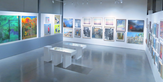
NEAC 2012 - The Threadneedle Space
However for some reason, this year I'm less excited by the exhibition.  It's not that the standards of painting have slipped per se (with a few exceptions) so much as it didn't "zap" me in the way I normally expect it to.

I find a really good test of an exhibition is to think about it the day afterwards and see what you can remember.  If it's got strong visuals and work which is visually striking then it pops up straight away - and therein lies the rub.  I can remember one really good wall and some excellent paintings by a few artists and that's it.

It may very well be me.  I have, after all, just recovered from a nasty bug, have been feeling very drained and am still less alert than usual.

NEAC 2012 - The view as I entered the North Gallery
However what niggles is that I that did notice some things.  Skip this paragraph if you really don't want to know about the negatives. For example I noticed work I didn't like (e.g. murky pictures as opposed to masterful coloured greys and muted colours which were very evident elsewhere in the exhibition). I also reluctantly came to the conclusion that maybe some artists were in a rut as I have begun to find some of their paintings just plain boring as in "same old same old" (e.g. There are just so many bland paintings of artists' studios I can view - again!)   Some of the work on display (by members) was just plain awful - and I was extremely surprised by that as it's not something I normally associate with NEAC exhibitions. Plus I wasn't ecstatic about the hang for a number of reasons.  For me it didn't feel like a really coherent exhibition in the same way as those I've been repeatedly impressed by in the past.

For example, by way of contrast, here's my comment on the 2010 Exhibition
I walked in and more or less immediately made a note as follows "an object lesson in not being bashful or reticent". The exhibition was bright and full of large and attractive paintings which were singing with colour. There was something very energetic and vibrant about the work on show. It is also hung very well with well positioned pieces which knitted walls of paintings together and created a very good impression.
Maybe that exhibition set the benchmark for me? Maybe I now expect all their Annual Exhibitions to be as good as that one was?  However I've looked back at my photos of previous exhibitions and they just "look" better! (You can find links to previous posts reviewing previous NEAC Annual Exhibitions at the end of this post.)

Maybe it's this year's Selection and/or Hanging Committee?  I actively disliked the end wall in the West Gallery which, for me, is the "set the tone/make or break" wall in that gallery and for the whole exhibition. So much spins off that wall.

Maybe the Selectors this year like very different things to me in visual terms.  I have no idea whether they rotate or it's the same people every year.  Maybe it's the need to find paintings which look good in the Threadneedle Space that's unbalancing the rest of he exhibition?

It's just all very odd. I'd gone expecting to be energised and instead came away feeling a tad deflated.

Anyway having done this review the wrong way round and started with the negative - I shall now relentlessly try and pursue the positive.

Prizewinners

The Doreen McIntosh Prize: Eyjar by Sophia Rizvi (Non member / Open Entry).
This is a really strong painting which I think must come from a series she seems to have painted in Iceland.  A little bit of detective work suggests this is probably a painting of fire, water and steam and an extremely new part of Iceland in Vestmannaeyjar (aka the Westmann Isles). Such a pity this was hung in a corner when to my mind it should have been a pivotal painting holding a wall together.  Take a look at the Threadneedle Space photo to see what I mean. (I can only imagine that this is Jacqueline Rizvi's daughter although their painting styles are in no way alike.)

Eyjar by Sophia Rizvi
0il, 42 x 52 inches £5,500
Winner of the Doreen McIntosh Prize
The David Messum Prize: Bowler Hat by Paul Gildea (Non member / Open Entry).  
Also hung in the Threadneedle Space, this is the sort of painting I expect to see at NEAC - big, bright, bold, painterly and begs me to come hither from 30-40 feet away.  It's interesting that it comes from the brush of a non-member.  He has two works selected and they were hung together and looked excellent.

Bowler Hat by Paul Gildea
oil, 29 x 47 inches £8,000
Winner of the David Messum Prize 2012
I am painting the world around us, just a picture of the flesh, the matter made visible by life-giving sunlight, copied to the canvas before the sun moves too far, the bus drives off or the model complains and leaves...
The Manya Igel Prize: Reflected Cloud Formations (Egg Tempera) by Ruth Stage NEAC.
I was very pleased to see Ruth Stage winning a prize.  I absolutely adore her egg tempera paintings and need to work out how I can afford to buy one or two or three - although I think her work is a bargain!  This one for me was symphony of very quiet muted colours with just a flash of blue.  It's an exercise in quiet restraint and texture in 2D.

Reflected Cloud Formations by Ruth Stage
egg tempera, 32 x 28 inches £2,900
Winner of the Maya Igel

The Prize of the Worshipful Company of Painter-Stainers: The Voices of Silence II by David Carpanini NEAC
This is a somewhat unusual painting in that it's pencil and watercolour.  It's very well drawn and I lke the painterly effects with the washes.  I'm not sure I'm as convinced by the grouping of the figures. It just feels a little too staged for me.

The Voices of Silence II by David Carpanini
Watercolour and pencil 40 x 47 inches £3,250)
Winner of the The Prize of the Worshipful Company of Painter-Stainers
The NEAC Critics Prize:  Studio fireplace by Peter Brown NEAC
I've seen several paintings by Peter of his studio mantlepiece but I think this is the first time I've seen a painting of the fireplace in all its disorderly glory.  I exempt this painting from the boring studios category as it comes across to me very much as an "as is" painting with Peter painting what he finds in his own studio very much along the same lines as how he paints the streets of Bath - he paints whatever is there.  It has integrity.

Studio fireplace by Peter Brown

The Arts Club Dover Street Prize: I didn't spot this one.......

I note the number of prizes has reduced.  This seems to be the way of the world for art societies in these difficult economic times.

Work I liked

Inside the door, near the Reception Desk there is a wall of very strong and attractive paintings of various sizes by various NEAC members Saied Dai, Diana Armfield, Ruth Stage, Fred Cuming and Bernard Dunstan - all artists whose work I like.  That was the "WOW" wall for me with Ruth Stage and Fred Cuming as the standout painters.  I'm very tempted by Intense Light Verdon by Ruth Stage.

Paintings by NEAC members: Diana Armfield, Ruth Stage and Fred Cuming
Below are two of the very best paintings I've seen Melissa Scott Miller produce (and that includes ones which have won prizes!) and I'm not in the least bit surprised that Regent's Canal at Angel has sold

North London Summer (oil, 44 x 52 inches £5,500)
Regents Canal at Angel (oil, 34 x 54 inches £5,500)
© Melissa Scott Miller
The wall of work by Judith Gardner demonstrated mastery over coloured greys and muted colours and looked excellent.  It was also finding favour with collectors.  Such a pity her paintings were not hung so they could be seen more easily from across the gallery.

Paintings by Judith Gardner
(click this link to seem them in more detail)
Peter Kelly NEAC's work - particularly his thoughtful compositions - continues to impress.  Click the link in the artist's name to see these better

Add caption
I loved this wall of work by Richard Bawden - complemented by the drawing by June Berry bottom right

Etching and watercolours by Richard Bawden
Charcoal and chalk drawing by June Berry

Some final points
  • I tracked around the gallery marking up sold paintings in the catalogue as I went.  It's very clear that the £1k is a very strong barrier to purchases.  I noted more sales below this level than above it - with £850-£950 being a popular banding which was generating sales.  I see little point in pricing just above £1,000.
  • Some artists were doing well at selling work - notably artists I liked!
  • It seemed to me that there was some confusion as to the purpose of the far North Gallery which is emulating the Small Weston Room of old at the RA's Summer Exhibition.  It struck me that those whose works arrived in this room via the open entry appeared to understand very well that small does not always necessarily equal 'cheap' or 'fast'. Some members work also looked very good however some had included work I'd never ever see in any other exhibition - so why this one? While I can well understand some desire to offer some rather more affordable paintings it seemed to me the standard of work on offer was just too variable and some works were "letting the side down".  Whether affordable or expensive, to my mind the standard should be that ALL the work must be excellent.  That way lies more sales as this approach makes all the work look good! :)
See my post on Sunday for details of the events this week.

Links

Tuesday, December 04, 2012

BP Portrait Award 2013: Call for Entries

The Call for Entries for the BP Portrait Award 2013 was published this morning by the National Portrait Gallery in London. 

This year the first prize has been increased to £30,000. The Second Prize winner will receive £10,000 and the BP Young Artist Award winner £7,000.

It's a real pleasure to review this Call for Entries each year, not least because in the past at least one artist has read this post in the past, then entered a portrait and won a prize.  This year maybe it will be you!


BP Portrait Award 2013 call for entries
BP Portrait Award 2013 - Call for Entries
The Portrait Award, now in its thirty-fourth year at the National Portrait Gallery and twenty-fourth year of sponsorship by BP, is the most prestigious portrait painting competition in the world. With a first prize of £30,000 the Award is aimed at encouraging artists to focus upon and develop portraiture in their work.
Entry is online and the closing date is Monday 11th February 2013. You can also download a postal entry form from the website.

You can find out who can enter and how to enter below.  
This post provides:
  • reasons to enter this art competition
  • how to get selected
  • an overview of the requirements for all those who would like to enter a portrait
  • links to past exhibitions and reviews on this blog
NOTE: All quotations are from the BP Portrait Award website.

Reasons to enter the BP Portrait Award

From past experience I can think of a number of reasons WHY portrait artists should enter this competition - just to be selected for the exhibition.

Monday, December 03, 2012

J.R.R. Tolkien - the artist

Dustcover for The Hobbit 
- published by Allen and Unwin
A very long time ago, I read The Hobbit by J.R.R. Tolkien as a child in primary school.  Its book cover was rather wonderful and very striking.  It's probably the book cover I remember best of all the books I read as a child.

Tolkien is, of course, a very popular and well regarded author.  In addition, I've always had a lot of regard for JRR Tolkien as a wonderful mapmaker of fantasy places.  However what I didn't realise until recently (see Jonathan Jones article in The Guardian Why Tolkien was a fine modern artistwas that he was also an artist who liked to develop a number of paintings in colour to illustrate his books.
Drawings and sketches, often in preliminary form in the margin of the text, can be found throughout the handwritten manuscripts. Marquette Univerity - J.R.R. Tolkien Collection
It's interesting that Tolkien commented in his letters that when he started to develop his work he was conscious of recording what was already "there", rather than inventing anything.

The images I've been looking at recently have left me wondering what were the influences on his illustrative style which seems to have become very developed and refined in terms of style over time.

Apparently as a child he liked to draw landscapes and trees and to my mind there is a certain child-like naievete present in his paintings.  The colours also seem to be used in a very symbolic way to indicate the mood of the place.

The Hill, Hobbiton-across-the-water by JRR Tolkien

From 1911 onwards, it appears he began to draw from his imagination.  Apparently the drive to portray places came from the knowledge that invented languages needed to be associated with a people and a place.

Wikipedia suggests the romantic medievalist paintings of Edward Burne-Jones and the Pre-Raphaelite Brotherhood as having a strong influence on his work given that Birmingham Museum and Art Gallery owned a significant number of their works.

That's a perspective which is maybe not shared by Birmingham City Council in their overview of Tolkien's childhood and youth in Birmingham since they make no reference to his access to artwork within the city.

There again the books and the Elvish language developed out of Tolkien's deep interest in Old Norse literature and mythology and he was, after all, the  Rawlinson and Bosworth Professor of Anglo-Saxon at Oxford University.  I therefore wondered whether any of the Scandinavian artists and illustrators had maybe influenced him.  Certainly some of the paintings remind me very much of a certain style but I can't remember the name of the artist I'm thinking of.  Perhaps readers can help me out?

Some of them - such as the dustcover - make me think they were conceived as a woodcut or linocut.  However I wonder whether this is to do with the cost constraints of the publishers rather than the way Tolkien originally conceived the work

I know that some of the coloured maps he produced had to be amended from the originals so they could be printed without it costing he earth'.  So for example, some illustrations were re-rendered in line-block and half tone.

However original paintings do exist and can be viewed - in books and online!

Rivendell - painted by JRR Tolkien
Introducing J.R.R. Tolkien - the artist

There are a few sites where you can see the images of JRR Tolkien the illustrator and artist.
I'm wondering how long it will take Wikipedia to relaise that its Middle earth portal lacks any reference to Tolkien's artwork!

Books about the Art of JRR Tolkien

Tolkien kept nearly all the art he produced and hence archivists have been able to trace the pattern of development of some of the finished paintings.  This is illustrated and discussed in the books about his artwork.

There are also books about the art of Tolkein which contain very many black and white and colour illustrations of his artwork for various books. These are:
  • The Art of the Hobbit by J. R. R. Tolkien, Wayne G. Hammond and Christina Scull (27 Oct 2011).  This was published to mark the 75th anniversary (last year) of the first publication of The Hobbit and contains over 100 drawings, sketches, paintings and maps related to the book.
To celebrate the 75th anniversary of the publication of The Hobbit, the complete artwork created by the author for his story has been collected in The Art of The Hobbit by J.R.R. Tolkien. Including related pictures, more than one hundred sketches, drawings, paintings, maps, and plans are presented here, preliminary and alternate versions and experimental designs as well as finished art. Some of these images are now published for the first time, and others for the first time in colour.
  • J. R. R. Tolkien: Artist and Illustrator by Wayne G. Hammond and  Christina Scull (16 Feb 2004).  This book explores Tolkien's art from start to finish, beginning with his childhood paintings and drawings and finishing with his final sketches.
Tolkien inspired art

I didn't realise until I started this post just how much artwork Tolkien has inspired.  It's all over the Internet and it's actuallly quite difficult to separate out the artwork done by Tolkien from that inspired by Tolkien

What is known is that Tolkien had some strong views on how his books should be portrayed.  He was very much against any 'disnification' of his characters!

Over to you.  Did you know Tolkien was an artist?  What do you think of his paintings?

Sunday, December 02, 2012

2nd December 2012 - Who's made a mark this week?

The Dobell Prize for Drawing is Australia's most prestigious prize for drawing.  Sad to say, but 2012 is the last year it's going to be awarded.  Apparently there are too many prizes for drawing! So it's to be replaced by the Dobell Australian Drawing Biennial which will start in 2014.

Dobell Prize for Drawing 2012 
winner: Gareth Sansom Made in Wadeye 2012, 

suite of 20 drawings on white cartridge paper, ink, lead pencil, graphite, coloured watercolour pencil, 
felt-tipped pen, ballpoint pen, egg tempera, earth, collage,
29.7 × 42 cm each sheet, 119 × 210 cm overall
The 2012 $30,000 Dobell Drawing Prize was won by Melbourne artist Gareth Sansom (age 73) for his drawing Made in Wadeye.  Wadeye is an aboriginal community in the Northern Territory. His drawing beat beat 638 entries and 46 finalists to win the very last prize.  It comprises a suite of 20 drawings measuring 119 × 210 cm overall. Each drawing drawn on white cartridge paper (29.7 × 42 cm) using ink, lead pencil, graphite, coloured watercolour pencil, felt-tipped pen, ballpoint pen, egg tempera, earth, collage. 
The winning work, Made in Wadeye, was made during the artist’s visit to a remote Aboriginal settlement south-west of Darwin during September 2012, where his wife was engaged in clinical work as a doctor. Reference to the Wadeye community can be found in a small, collaged, photocopied map, and earth, captured in the egg tempera paint. But although the visit to Wadeye was the impetus for the series, it was not its subject. As the artist states: ‘I make stream-of-consciousness drawings with sources going back years
Artists and Art Blogs

Drawing and Sketching

Urban Sketchers were out in force this weekend. On Saturday
Skaters at the Natural History Museum Ice Rink
pen and sepia ink and coloured pencils in Moleskine Sketchbook, 8" x 10"
© Katherine Tyrrell
Landscape
Mural Painting
  • Jimmy Savile: Banksy-style mural appears outside BBC Television Centre - whether it's Banksy or not, there's certainly something very pointed and appropriate about a mural of a small child throwing a Jim'll Fix It badge down a drain on a hoarding opposite the BBC television Centre.  Small wonder it was painted over within an hour if it's appearing - which seems like the visual art equivalent of "looking the other way" and "sweeping it under the carpet".  I'd have thought more of the BBC if they'd left it up!
Portraiture
  • Daphne Todd, the ex President of the Royal Society of Portrait Painters and BP Portrait Award Winner, talks about portraiture, painting from life, her time at Heatherley's, female artists and submitting work to an art competition in a very articulate interview on YouTube. I'm going to be doing an interview with her on the 10th December at the opening of her solo show of paintings, featuring oils painted as Official Tour artist to TRH The Prince of Wales and The Duchess of Cornwall during their tour of South Africa and Tanzania, at the Mall Galleries (10th - 23rd December 2012).  You can see more of her portrait paintings on her website


Pastels and Pencils
Who painted this?
Art Books
Art Business and Marketing

Copyright
Marketing Art
Art Collectors / Art Economy
Art Competitions
Masai Woman by Jeanette Jobson
colored pencil and pastel, 25''x19''
currently on display in the
Portrait Society of Canada 2012 Portrait Exhibition
© Jeanette Jobson
Art Crime
  • It appears the Marcos Art Collection could generate a few new books about art crime and hunting down missing paintings!  The Telegraph article Van Gogh among 146 missing Marcos paintings indicates that 146 paintings - including works by Picasso, Rembrandt and Van Gogh - collected by the Marcos family 'could be anywhere'.
They didn't only hoard shoes. Former Philippine dictator Ferdinand Marcos and his wife Imelda amassed a remarkable art collection, paid for with stolen funds, and many of the masterpieces remain missing.  
Art Education

Tips and techniques
Art Exhibitions

Art Exhibitions in London
Art Society Exhibitions
Art Bloggers
Art Museums and Galleries
I imagine it's tough when you're not on the scene of such a disaster to imagine what it's really like. The types of responses to accounts by arts writers I've read in some places strike me as so heartless and, well, some of them downright clueless, that I thought I'd share what it feels like to have the business you've struggled to build for years get washed away overnight.
Art Materials and Supplies
  • What is Archival Paper? was intended to address the little bit of confusion I come across from time to time about what exactly is archival paper.
  • Yesterday I posted the results of the two opinion polls I've recently set up with a view to finding out what people think is the best artist-quality watercolour paint - see W&N: the best brand of watercolour paint for artists.
    Techies

    Those of you followed the big PC vs Apple debate nearly three years ago when I was buying a new computer will know I plumped for an Apple iMac.  Not only that but I subsequently bought an iPad and an iMac for my Mother.  It's going to be rounded off this week when my better half finally places an order for his very own iMac!

    Neverthless as an ex PC person I remain vigilant about security - even though there have been absolutely no issues to date!  However I spotted this article this week Securing Your Mac: A Guide for Reasonable People, Version 1.0 which is on TUAC - The Unofficial Apple Weblog by TJ Luoma. It has some sensible advice.

    and finally......

    This is a great collection of images of women and cats on Flickr.  Who knew there were so many or that this has been a perennial subject over the years?

      Saturday, December 01, 2012

      W&N: the best brand of watercolour paint for artists

      Winsor & Newton Artists' Water Colour have been voted the best artist-quality watercolour paints in two separate polls.

      However there is a back story!

      The Two Polls

      My original November Making A Mark Poll (POLL: Which are the best artist-quality watercolour paints?) in the side column ran into problems very quickly.  It started to lose votes and was horrible to watch so I moved it to the bottom of the column

      I then set up a second Poll. This was the blog post POLL #2: Best professional watercolour paints.  This meant moving very fast to set up the website to host the second poll which I thought I had all month to set up!  This is it Which is the best brand of watercolour paint for artists? - and these are the links to the two polls

      Then the first Poll recovered so I moved it back up and let the second poll continue as well.  The intention is that the latter will run all year round.

      The Two Answers

      What's interesting is that the two polls came up with the same answers but not the same numbers!

      So we're going to have two charts and I'm going to ponder on what's going on.  Particularly since the outcome diverged from the initial indications which is odd as that doesn't often happen.