Pages

Friday, March 31, 2006

Artists' Kew

I'm currently keeping an eye on the Kew bulb map (which indicates what's blooming in March and April) - but need some better weather for a plein air painting visit! I keep monitoring the BBC 5 day weather forecast and have learned that it doesn't do to trust the prediction for the fifth day. I've watched predicted sunshine - and planned a trip out - and then watched it turn into a prediction of blustery rain as the day got nearer on more than a few days this month! And then watched the rain go past my window in a horizontal fashion. I christened horizontal rain "Penzance rain" a few years back due to an unfortunate but very intimate acquaintance with rain straight from a trip over several hundred miles of the Atlantic Ocean. London has felt a bit like Penzance at times this month...........

The Spring edition of the Kew Magazine indicates that there is going to be an exhibition "Artists' Kew" in the Kew Gardens Gallery between 9 May and 18 June during Garden opening times. The website introduces it as follows
Artists' Kew is an exhibition celebrating the Royal Botanic Gardens and its surroundings in Kew. The pictures will express the whole Kew experience from the botanical treasures of the Royal Botanic Gardens to the charms of the riverside and the architectural heritage of the local area including Kew Green, Kew Village and Kew Bridge.
Technorati tags: , , , , ,

The Society of Botanical Artists is 21!

The Society of Botanical Artists is 21 and is holding its 21st anniversary open exhibition in the Lecture Hall of Central Hall, Westminster from today - Friday 31st March - until Sunday 9th April. Admission is free and all work is for sale - although I'm not sure whether it's possible to purchase on-line.

Over 700 pictures are going to exhibited and the link to the exhibition (above) provides images of some of these. A number of these push the boundaries of what many people might think a conventional botanical flower drawing or painting should look like. I'm personally very pleased to see that there's room for all manner of interpretations. I'm currently planning to visit the exhibition next week to see whether any of the work I'm producing might fit within their range.

The SBA website also provides:

Last year I bought Margaret Stevens' excellent book and practical instruction guide "The Art of Botanical Painting" (produced in association with the SBA) without realising that this is now set as the basic text for the Diploma course. It's a truly comprehensive and very impressive volume covering :
  • the nature of botanical art
  • materials - the discussion of various supports is particularly helpful
  • plant anatomy
  • drawing techniques
  • a very good section on foliage colour and mixing greens
  • an excellent 'library' section on the colour palette required for mixing the colours of many diufferent flowers (there are sub-sections covering flowers found within each main colour)
  • composition
  • examples of various drawings and paintings using different materials - including coloured pencils - hence my interest. Many of these include a step by step guide to how they were accomplished.
  • issues and practicalities associated with working in the field
  • building a library of references
  • botanical illustration
  • painting fruit and vegetables
  • painting flowers in the garden - with a gallery of the sort of paintings which can be submitted to the "Flowers and Gardens" annual open exhibition. These are very similar to the paintings shown on the website.
  • and final sections covering presentation, framing, exhibiting and selling.

I personally think that anybody really interested in drawing or painting flowers would find this text to be absolutely invaluable even if they're not wanting to reach SBA standards. I learned an awful lot from it. I've included a link to this book in the new resources section relating to all things floral in the right hand column, along with links to the SBA and the Royal Botanic Gardens at Kew.

Technorati tags: , , , , , ,

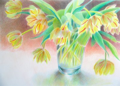
It's the same tulips........again! (but no red stripes this time)

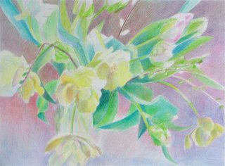
So this is the same bunch of tulips as those you saw in the last two posts - but when they started to open up they made really nice shapes and I decided to do them again but this time without the red stripes.

So I set them up in the same place, drew them again (now much more open than before) and changed the colour emphasis. Got most of that done fairly fast and then pondered the background for days and days and days!

This is coloured pencil on Arches Hot Press watercolour paper (I'm using the 14" x 20" block at present). The size of this one is 12" x 16.75" (which is a slight mistake and this may well get cropped - suggestions welcome!)

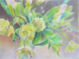
I've also included a couple of samples of the background from scans so you can see what I'm doing. It's a sort of scribbling/open hatching approach with the hatching marks using every direction so no one hatching direction dominates. It is also deliberately open so that the optical mixing of the colours in use is easier to achieve. This also helps to achieve subtle transitions and soft edges. And it's absolutely brilliant for making coloured greys.


I hope you find it interesting - but this is the reason the background doesn't get finished so quickly. It's not the speed of doing it that's the problem so much as the speed of me making my mind up that the mix is about right!

Technorati tags: , , , ,

Thursday, March 30, 2006

Some experimental drawings

I did some drawings while working on my red tulips. I always like to work around a topic as you get to know it better. And if I get stuck or it's not working, then I generally find that stopping and doing a drawing often helps to sort it out.

This time I tried drawing in a new way. The first one is done using sepia ink and coloured pencils on fine white cartridge paper.
The second one is on peach coloured Canson Mi Teintes and is done using graphite and a white coloured pencil.

Neither are finished. It was the process of drawing which was important rather than the finished product.

In terms of the experiment with different approaches to drawing I shall certainly have a go at both again. Neither wowed me but seem promising........

Technorati tags: , , ,

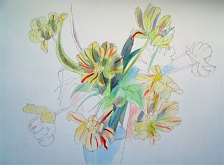
Tulips with red stripes - finished


I've completed the work I started last week. As before most of the work done subsequently was done with flowers sat in front of me doing naughty things like opening up! So I had to go for colour on what was there but lost the detail around the shapes. However I made a great big murky mess of the shadows in the flowers and at the weekend stripped it back within the blooms areas and started again. Other work I did related to the background and strengthening the leaves and shadow.

Technorati tags: , , , ,

Wednesday, March 29, 2006

Artists Workbooks Yahoo Group

I recently discovered the Artist Workbooks Group on Yahoo and joined. I know some of the other people who read this weblog and whose weblogs I read are also members. But I wondered whether maybe there might be others who read this journal who would also be interested in joining this group, which currently enjoys a membership of over 100 people.

This is their description of what the group is about and who it is targeted at:

Do you use your art journal or sketchbook to do field sketches, value studies, or test paints, pens or work out creative solutions to other projects? Is your journal your practical, hands-on workshop for painting design, textile, fiber art, jewelry making, sculpture or book design? Does it include watercolor tests and color experiments or explorations of new calligraphic styles? Do you work out ideas for landscape or fashion design? Is it crammed full of swatches and photographs, dye samples, pottery glazes or interesting ideas to try? Are you a digital artist who keeps track of your Photoshop experiments, brushes and filters? Have you made your own workbooks for these purposes? If so, you're in the right place to share ideas with like-minded people, many of whom are working professional artists, dedicated students of the arts and art teachers.

These workbooks are tools we use in the process of creating art somewhere else in the world, whether we do it as professionals, as fine art students or as dedicated, committed hobbyists.

It's a place where a watercolorist might get ideas by seeing the journal of a landscape architect, and where someone working in oils might get a glimpse into the inner working life of a quilter. You may be inspired by someone's on-going figure drawing or perspective studies, or participate in a discussion with botanical illustrators.

BUT they also make very clear what the group is NOT about (and it's my emphasis in capitals):

The workbooks we refer to here are NOT primarily illustrated journals or everyday diaries, NOR are they altered books or gluebooks. It is NOT a place for novices to learn to paint or sketch, or get motivated to face a blank page. You will NOT find any journal prompts, ephemera exchanges, round-robin journal, ATC
or secret sister swaps. There are other excellent groups that focus on those topics.

So - anybody else interested?

Technorati tags: , ,

Tuesday, March 28, 2006

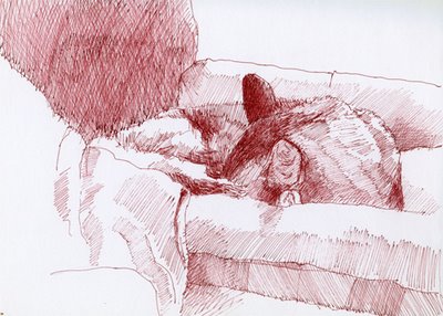
Catnapping #6 and #7


Cosmo (my Somali cat) absolutely adores his new bed which I got at Crufts earlier this month. It’s BIG and has just the right mix between firm and squishy plus a comfy sheepskin cover. All in all it’s absolutely spot on for a really big cat who likes to be comfortable. In fact he loves it so much that Polly (my Abyssinian) is making a bid to take it over. So naturally he has to defend his territory and it’s now his #1 place to have a quiet kip in the evening. And last night I finally found my sketchbook for catnapping drawings which I had mislaid. So here’s yet another catnapping drawing (#7). This is done in sepia ink which I'm rather fond of for drawings of brown cats.

Plus I've included a graphite drawing of him done last month (Catnapping #6) when he failed to co-operate until the end - hence no front feet!


Technorati tags: , , , , , , ,

Monday, March 27, 2006

Historical illustrations and cartoons

I like looking at the work of illustrators from time to time, especially the work of some of those recognised as experts in their field. I've recently come across a couple of sites which provide a lot of images from and links to the work of some of the best in illustration. These are
  • the website run by Chris Beetles and
  • the blog 100 years of Illustration and Design developed by Paul Giambarba.

The Chris Beetles Art Gallery in Ryder Street, St James, London holds an Annual Illustrators Exhibition between November and January which the gallery indicates is recognised as being the largest of its kind in the world for cartoon and illustration collectors. Examples of the work of very many illustrators and cartoonists are exhibited on the website - which is a bit of a masterclass in the different types of drawing over the decades with everything from Arthur Rackham and Mabel Lucie Attwell (echoes of my childhood!!!) to Dan Dare!


The second site is a blog called 100 years of Illustration and Design - which has a much more american feel to it - and includes links to NC Wyeth, Norman Rockwell and Maxfield Parrish.

Technorati tags: ,

Saturday, March 25, 2006

I love my Clustr Map!

I find the whole notion of writing something which wings its way around the world curiously intoxicating! I've got a degree in geography and have always been interested in other countries and what they're like. Right now I'm absolutely fascinated by how the people who have accessed this blog in the last week live in a huge range of different places .

Today's new Clustr map shows that I've now had 679 visits from around the world - including at least one from every continent (except Antartica!) in the last week. I just wish they had a zoom function as I want to see exactly where some people actually live - but in the meantime I'd like to thank all the people who visited from Alaska, Argentina, Australia, Brazil, Finland, India, Indonesia, Japan, New Zealand, Nigeria, Peru and Turkey as well as the UK, Canada, the rest of the USA and various other european countries.

I love my new Clustr Map! :)

Technorati tags: ,

Charles Sovek - Lessons from the Easel

I found a veritable feast of resources for all sorts of artists when I browsed around Charles Sovek's website after being given a link to one part of it as a reference for a project (thanks Jamie!).

Although Charles Sovek works in oil, acrylic and gouache, the material he provides about art is universal. Sadly, it's very rare to find such a comprehensive and good resource on an artist's website - and so I'm obviously going to share!

I've included a link to his main website within the artists websites section. But I'm also going to include him within the Drawing and Painting resources sections (right hand column) in terms of the three main sections of the Lessons from the Easel part of his site:

What is particularly excellent is that the lessons are all reduced down to one side of A4 - with images and the nitty gritty of the key points. It's a very coherent presentation of an awful lot of information.

Charles Sovek has been a Contributing Editor to "The Artist" and the Articles section contain text and illustrations from the original articles he contributed to various art magazines exactly as they originally appeared between 1984 and 2005. His Speaking of Art" summary articles archived on the site are also very good.

All in all this site provides an excellent range of information and good advice for those wanting to develop their skills and those who need a rethink about what they are doing and where they are going with their art and/or a bit of a refresher about some of the things they were taught a long time ago. A good place to go if you've temporarily "lost the plot"!

Enjoy!

Technorati tags: , , ,

Friday, March 24, 2006

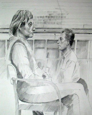
Drawing a Head: 23rd March 2006


This is the drawing I did last night at my Drawing a Head class. It's mechanical pencil with an HB lead on heavy white cartridge paper. This image is about 18" x 15". It's been added to the Drawings of People page on my website - where you can see some of the other drawings from this class.

I've gone back to the approach I feel most comfortable with - which is to provide the model with a bit more context. And last night I managed to get a space where I had a good but rather curious view of both models. They appear to be facing one another but are actually sat some 3-4 feet apart and can't actually see one another.

I've cropped a bit off the bottom, which I added late, since it doesn't actually add much to the composition.

I'm quite pleased with both faces which actually manged to look like the models this week!

And this was the last class for four weeks - I'll have to go and find some new subjects to draw!

Technorati tags:, , , ,

Thursday, March 23, 2006

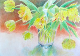
Tulips with red stripes - a work in progress


Regular readers of this journal will have worked out by now that I just love tulips! I'm trying to do as many as I can right now before they stop being available - and last night I started a new work.

I've no idea what these are called but they're daffodil yellow parrot tulips with red stripes. The red is strong but not dark (cadmium red medium maybe?). I've gone for another cropped composition but remembered not to do it from the same angle as the last one (just in time!) and I've left quite a lot of 'white' space this time and am focusing a little more on the vase and reflections - which I'm really quite pleased with so far.

This is not finished - but I'm hoping to get it finished today. It's nearly 12" x 16" and is coloured pencils on Arches HP.

, , , , ,

Wednesday, March 22, 2006

Michelangelo Drawings: British Museum 23rd March - 25 June

Tomorrow an exhibition opens in London which is one of those genuine "once in a lifetime" opportunities to see how the work of a true master of the arts evolved over time.

For the next two months, the British Museum is hosting an exhibition of drawings by Michelangelo called "Closer to the Master". The drawings are from collections held by:

  • the British Museum
  • the Ashmolean Museum in Oxford
  • the Teyler Museum in Harlem

Michelangelo died aged 88 in 1574 (having survived 13 Popes!). According to Vasari before his death he destroyed a great number of his drawings. This exhibition will therefore reunite material not seen together since the dispersal of the artist's studio more than 400 years ago. The museum microsite for the exhibition indicates that it will

"offer a wholly different perspective on the defining genius of the Italian Renaissance."

and

"The exhibition traces sixty years of Michelangelo's stormy life, from intimate studies made when he was in his early twenties to the visionary Crucifixion scenes carried out shortly before his death."

I'm taking advantage of the micro-site before I visit as it offers to me (and all those of you who can't get there) some amazing material including:

There is also a full events programme associated with the exhibition including a Mega Draw on Saturday 22 April in the Great Court - the site urges booking in advance.

Tickets are already on sale and pre-booking is strongly recommended for timed entry - details available here

So I've now got a bit of thinking to do - which events to attend and whether or not to buy a season ticket!

Tags: , ,

Tuesday, March 21, 2006

Better-looking books

Books have always been my big [read 'huge'] indulgence. I've been collecting art books for nearly 20 years and they have been making a bid to take over my home for some time now. In fact, I was getting rather worried about what might happen if the "big pile" of those sitting in the hall still waiting to be returned to their shelf after use actually fell on me. We had a bit of a battle just after Christmas and they won and the academic books lost! The ones in the piles are not only all back on the bookshelves but they're also now all readily accessible on all the best bookshelves. I have to confess that I'm deeply nerdy about this and have got them all sorted into categories as well!

When I visit other people's websites or blogs I've always enjoyed it when somebody has referenced an art book and has included an icon from Amazon which shows you what a book looks like and provides a link straight to where you can check out the on-line price, maybe have a look inside and generally find out a bit more about it (I love reading the reviews!)

Also, I've already had feedback from people saying how much they're enjoying the book they bought after reading my comments. And since I love my art books and also like writing about books I thought I better get a bit better organised about this.

So, after much umming and erring (.......and then a bit more umming and erring.......) I've finally found out what one has to do to become an Amazon Associate. Basically it means I get the code to include the icon in a post when I talk about a book and can also include some good basic reference books in the resource sections in the right hand column - which breaks up the long lists and provides a bit of colour as well! ;). Anyway, the system all appears to be quite simple and I get some pennies out of it as well which is nice. Except I opted for the voucher system as in the end, given where everybody lives, I decided to go with Amazon.com on the blog rather than Amazon.co.uk. And the voucher system is probably a good idea as I try really hard now in art shops not to buy a book at full price and to wait until I can get back home and find out what the online price is. I'm not always successful but I am trying..........

I have no wish to be cured of my 'affliction' of collecting art books am always interested to hear from people who have got the same 'bug'. And if anybody wants to know what I think of a book then I'm happy to write a review for them if I've got it.

, , , , ,

"Where is the focal point?"

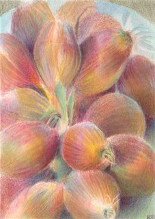
I've just had a reminder that ducking the focal point issue never ever works. I created this at the weekend, working directly from life - they sat on a plate on a table right next to where I usually work. And yes, this was yet again a case of going round the supermarket doing the weekend shopping and finding a still life subject on my way round (and I've got another one in the fridge which needs to be done quickly, and then there's the flowers - I've got a queue waiting for me!)

It's a small work in coloured pencil - size 7" x 5" on Arches Hot Press paper. (I'm totally devoted to their blocks of HP paper, they're just so easy to work on - but I digress.....).

Anyway, I showed it to my best painting buddies on Sunday night - you know, the ones who'll always "tell it like it is" - no happy clappies or shirking allowed!

And back came the comment - as I should have known - from one of them.............

"I like them, but I'm having that "where is the focal point" thing going on"

And yesterday I was pondering what to do, again with the help of buddies..............
  • Can the work be rescued - can a focal point be created?
  • Would the best (and possibly quickest?) option be to mark this one down to learning and get on and do another one with a better composition?
  • How do you create a focal point in a string of scallions? (Which is where I started on Saturday!)
  • Can you have a painting which has form and pattern and no focal point - and it works?
I'm never ever averse to putting a work on one side and starting again and do it quite often. My reasoning is that so long as I get some learning out of what I've done to date that's bound to help me tackle the next one (and the one after that........).

I was sort of hoping that writing all of this down might give me the answer - I'm leaning more towards starting again but I'm still well and truly stuck on how to get a focal point into this - or do I just go for a macro form and pattern option - with no specific focal point?

So, OK - I'm now open for a bit of extra input - what do you think?

, , , ,

Monday, March 20, 2006

"Making their Mark" - an audit of visual artists

Having a blog called "Making a Mark" means that you tend to find out about all the other things with a similar name - one of which is an audit of visual artists in Scotland which was commissioned by the Scottish Arts Council and published in 2003.

When I set up this blog I decided that due to the reality that few artists make a living from selling their art, one of its purposes should be to share information and comment on influences on the development of art careers. So I thought it might be a good idea to highlight some of the main findings. So having duly got my written permission to quote from the survey from the Scottish Art Council - here goes!

Bit of background - the Audit was commissioned to provide evidence of the characteristics of the visual arts sector in Scotland and the contribution made by visual artists to the economy. I suspect there was probably some rationale behind it which related to the Council's own funding agreement with the government.

Making their markAn audit of visual artists in Scotland 
- Summary Report
Published by the Scottish Arts Council
"Making their Mark" - the summary report is an interesting read. It tells us about what sort of aspirations artists had in Scotland in 2003, what sort of challenges and difficulties they faced, and what opportunities artists identified and what their views were on their needs for continuing development. Although the findings are specific to Scotland, it's unlikely that the themes are very different from those experienced elsewhere in the world judging by comments I've seen being made in various art forums on the internet.

I personally found the extent of the level of professionalism in terms of initial art education/training and gallery/agent representation both in Scotland and elsewhere to be most encouraging. However, the levels of income being achieved and the level of attention to and spend on marketing and further professional development are rather more negative.

I've summarised the summary(!) of the main findings below. They cover a variety of topics:

Practice
  • Media: 60% of all respondents working in the visual arts are engaged with the disciplines of drawing and painting - but there is fair degree of cross-over between different media and new technology is having an impact
  • Exhibiting: 94% of respondents had had work exhibited in the previous 2 years. One third had exhibited internationally and a similar percentage has undertaken an overseas residency
  • Professionalism: 27% had agent or gallery representation; 19% were represented by an overseas gallery or agent; Respondents were highly trained - 45% are graduates and 37% hold postgraduate art degrees
Working conditions and artists' resources
  • nearly 40% of artists have access to a dedicated studio at home;
  • older artists are more likely to have a studio at home; younger artists are more likely to rent a studio
  • 18% are tenants of a publicly subsidised studio (28% of urban-based and 3% of rural based)
  • 63% of those who don't have a studio said cost was the main bar to having one
  • of those who have a studio, their main concerns are heat and lighting costs, security of tenure and working conditions
  • the report suggests home based studios might have a negative impact on effective communication and networking with peers and wider networks - which can affect professional practice
Information
  • the survey identified a clear need to signpost funding schemes and creative opportunities more effectively
  • a variety of sources are used to obtain information - the majority use the Scottish Arts Councils; 66% use a-n The Artists Information Company; 41% use the Internet and 15% get their information from other artists
Income and tax
  • 38% of visual artists are self-employed with most of them earning their main income from art - although only 7% are registered for VAT (on their gross turnover)
  • The report concludes that the levels of income being earned challenges the viability of artists' practice. Levels of income are low compared to the national average and levels of professional qualification;
  • Although over 80% of visual artists regard art as their profession,
    • 82% are earning less than £10k gross from their art
    • 10% earn between £10-20k and
    • only 7% earn in excess of £20k from their art.
  • 40% of under-35s are making art with no income attached and 44% of younger artists rely on grants and awards for income; by way of contrast some 49% had received no support at all from public or private funds
  • earnings other than derived from their artwork come from a variety of sources:
    • 66% derive income from other arts related practice (teaching art 37% and arts related occupations 27%)
    • 24% earn income outside art
    • 25% derive income from benefits and other financial support (while 53% receive no form of state support)
Expenditure
  • average spend on practice (by those who responded) was £5k
  • average spend: materials 30%; then around 10% spent on each of premises, equipment, assistants/assistance; travel and framing
  • only 2% was spent on each of research and professional development/training
Opportunities
  • around two thirds of artists identified a significant untapped opportunity to develop sales of contemporary art in Scotland. This opportunity might be better exploited by raising awareness of opportunities to buy contemporary work, more effective use of art fairs and developing buyers confidence
  • artists were very clear about their continuing professional development needs - identifying prime needs as being
    • improved marketing and promotion skills (60%)
    • fundraising skills (40%)
    • IT skills (40%)
Barriers
  • Artists believe their contribution to culture, society and the economy is not fully recognised (57%) - this offers the opportunity to highlight the role artists can play in communities. Interestingly those located in rural communities felt very much more valued than those living and working in urban settings
  • Individual practice suffers from the need to generate income from other work (60%) with under 35s feeling this particularly strongly
  • Artists want to invest more of their time in:
    • research and development of their work (60%)
    • production of their work (60%)
  • Artists suffer from poor or localised structures only for promoting their work. Main promotion vehicles are:
    • informal, rather than formal, networks. Almost 50% of the respondents indicate this as being the primary way they promote their work
    • private galleries (44%)
    • their own (modest) publications (42%) [I wonder if this included their own websites?]
    • broadcast media (9%)
  • Marketing and promotion were identified as a key professional development need by artists. Nearly 40% of artists feel the need to invest more time in promoting their own activity
    • only 20% of artists believe galleries are the most important for promotion
    • only 10% consider informal networks and public galleries to be the most important for promotion (despite the fact that almost half use informal networks and 36% use public galleries for this purpose)
  • Three-quarters of women felt they were unable to develop their practice to its full potential compared to 55% of men - with the inability to afford childcare being a barrier to 40% of artists who are the primary carers of their children.
  • The collective voice of artists is difficult to hear. Membership of artists organisations is very unevenly spread. While 55% are members of one of five organisations, 43% of respondents not a member of any sort of organisation.
  • Only 13% of respondents felt that "bias" or a "closed shop" mentality was an issue or barrier to them.
This is the link to the full report for those who'd like to know more.

    Can I just highlight [read "very small boast" hence very small letters] how, during the course of writing this post, I learned to do nested lists in html as part of my continuing drive to improve my IT skills! [big grin!]

    Sunday, March 19, 2006

    Artist Resources - more links, a new resource section and a map!

    I've been surfing the web on a regular basis for the last 12 years and have become an inveterate collector of links to some interesting and useful sites during that time. One of the purposes of this weblog is to be able to share some of the sites which I've found over time relating to painting, drawing, coloured pencils, pastels, plein air painting etc.

    Existing sections
    I've added a lot of additional links into the various sections in the right hand column - and will continue to add more links as I come across or them (or, more likely, remember I've already got them!). The aim is to be content rich with the links so rather than providing a superficial summary of them all today, I'm going to be highlighting various ones on a routine and regular basis in the future.

    Existing sections include

    • general art resources
    • coloured pencil resources
    • drawing resources
    • landscape and plein air painting resources
    • pastel resources
    • pencil resources
    • general blog reference sites
    I'm already including resource specific blogs (eg about pencils) in these sections rather than in the list of art weblogs at the top of the coloumn - which are essentially about people making art. I'd be interested to know whether people would prefer to see the websites (not blogs) of artists (eg coloured pencil artist) added into the relevant section (like the new manufacturers sub-section in CP) or kept separate. My inclination at the moment is to still keep them separate as not all artists focus on just one medium or type of work.

    New section - The Art Business
    I've also added a completely new section which will be devoted to the sites I read and/or review when working on business development and marketing of my art. This section has two parts covering blogs and websites specific to the art business - as well as ones which are attuned to the way the internet is developing generally to support my sort of art business.

    I'm planning to add one more section in future relating to 'light and colour' - but want to do some more development work to my website first.

    A Cluster Map
    I've also added a map (just under the subscriptions bit) of where all the people live who read this weblog. I have to thank Martin Stankewitz (who draws wonderful buildings and the landscape where he lives - see Freiluftmaler) for this as I spotted it on his site and went to take a peek at website of the people who are promoting this. Having checked it out, IMO it's informative without being intrusive in terms of invading people's privacy. It also updates on a regular basis if viewer numbers change by more than 10%.

    If you want to see whether you might like to get one as well you need to go to http://clustrmaps.com/index.htm

    , ,

    Saturday, March 18, 2006

    Realism and Artifice

    After writing yesterday about the exhibitions at the National Portrait Gallery I explored Stuart Pearson Wright's website a little more. It includes a record of the presentation (text and slides) he made at the British Museum - "Realism and Artifice" in 2002 concerning the nature of portraiture and the two dominant tendencies towards:

    Realism - recording what is there in the spirit of enquiry - searching for the truth and some understanding about what is observed rather than just a likeness.

    "The depth of realism is determined by the depth of enquiry, not necessarily in terms of naturalism but in psychological depth also. Many portraits represent the sitter in as far as they are recognisable but offer little more. Realism is a matter of penetration."

    and

    "(Artifice is)the tendency to be economical with the truth, to lie, to modify the image of the subject in order to fulfil an agenda, either personal to the artist, defined by the subject, conditioned by the fashion of the time, or else in the case of a totalitarian regime, dictated by the state."

    His website does not provide a URL for the individual sections. The record of the presentation is contained in section 9 Writings. It comprises a Word document of the text and a large powerpoint file containing the slides used in the presentation.

    It's a fascinating read.

    , ,

    Two exhibitions at the National Portrait Gallery

    I met up with an old friend yesterday and, since we had arranged to lunch in the Portrait Restaurant at the top of the National Portrait Gallery, we saw a couple of the current exhibitions. More details from the NPG website are available on the links below. Links are also made to "The Guardian" crits and images of the Stuart Pearson Wright portraits mentioned and to the latter's website - which has been added to the artist website section in the right hand column.

    1. Icons and Idols: Commissioning Contemporary Portraits (2 March - 18 June 2006) Most of the works in this exhibition are ones which people visiting the NPG will have seen before. However this time - and what makes the exhibition interesting - they are accompanied by a narrative describing the process of commissioning and executing the commission. The exhibition also includes references to people who never had their portraits executed despite requests from the Gallery - such as Ted Heath - who is the only Prime Minister in the last 200 years not to have his portrait in the NPG despite three separate attempts. What struck me as I went round the exhibition was (a) how critical the matching of artist and sitter is to the success of a commissioned portrait and (b) the variety of approaches artist use when undertaking a commission. I'd find it helpful to see such narratives more routinely displayed around the gallery in relation to the NPG commissions generally.
    2. 'Most people are other people': Portraits of Actors by Stuart Pearson Wright (Until 11 June 2006, Room 37a). This exhibition celebrates actors from featuring actors from film, theatre and television. The artist aims to provide an insight into the lives of actors in their private moments, playing themselves and to query the concept of 'self'. I really, really like these drawings which are essentially monochromatic. Mostly because I aspire to being able to draw people like this one day. The artist has a meticulous figurative style (which is not photo realistic) and has excuted most of the drawings in graphite. A number also include charcoal, some limited use of coloured pencils and pen and ink. They remind me very much of a self-portrait drawing by Stanley Spencer executed in silverpoint which I guess is in the NPG store at the moment as I haven't seen it for some years. You can see these drawings and others plus paintings at the website of the artist, Stuart Pearson Wright . An awful lot has been written about this artist. The RSA commissioned him to do a portrait of Prince Phillip - which will probably go down in the annals as a classic example of mismatch between artist and sitter. The original painting is Figure 44 in the paintings section of his website and the revised version is Figure 37. By way of contrast, the NPG commissioned him to do a portrait of J K Rowling and he produced an innovative portrait much praised by the sitter as showing more of her than any photo has ever shown. Initial sketches for the painting are Figures 98 and 99 in the drawings section of his website. A larger and better lit image can be seen at Figure 61 in the paintings section of his website. This provides a link to an interesting account by the artist of the process adopted for this particular commission.

    Finally, for anybody visiting London, I can highly recommend the Portrait Restaurant for lunch - it has fantastic views and is very light even on a dull day.

    Here is a stitched scan of two double page spreads of a couple of sketches I made of the view on a visit last October, while "the other half" sipped two cups of tea and read his "The Economist"! These were the result of some fast sketching of an awful lot of rather challenging architecture for maybe 20 minutes. I have every intention of going back on my own and drinking an awful lot of tea while I try to draw this again properly on one sheet of paper. My aim is to do a monochromatic and a colour version as part of a series I'm developing on London views.


    , , , , , , , ,

    Drawing a Head: 16th March 2006

    I was so disappointed with my efforts on Thursday night at my "Drawing a Head class, that I didn't look at my drawings again when I got home until this morning. And while I didn't manage to achieve what I set out to do the drawings are maybe not quite as bad as I thought they were. So, feeling brave, here they are.

    I'm drawing in pen and ink in the first - using a Pilot G-Tec-C4 with a 0.4 point. The face is much too long - I'm obviously displaying a Modigliani tendency even when the sitter isn't.


    The second is drawn using a mechanical pencil using HB plus a Faber Castell clutch pencil with a 4B lead - and is better - but the proportions were still out. Interestingly, I think other people may have had problems catching the likeness as well as there was more variation than usual in the class drawings at the end of the evening.


    , , , , ,

    Friday, March 17, 2006

    The Pencil Revolution moves forward

    A quick update on the progress of the Pencil Revolution following my post yesterday.

    I commented on the difficulties of navigation and the problem now seems to have been partially resolved. More of the existing posts have been categorised - although the odd one still seems to have escaped correct categorisation - and information can now be accessed using the categories function.

    This makes the site much more useful in the short term - and accessing the categories this morning was a much more helpful and informative experience. As a result, I'm now happy to add this blog into the right hand column - but I'm including it within the Pencils section rather the blogs as it's not really generating art per se. (But nice effort for St Patrick's Day!)

    However as reviews accumulate over time, the existing arrangements for navigation are going to become very cumbersome. Access within categories is on a chronological basis only and there are no sub-categories within the pencils category. I'd very much like to see some consideration given to whether the development of a more conventional website based database solution for storing review data might be a better solution if the information generated by this new resource is going to be easily accessible. The blog might then continue to provide a a very useful and helpful "front end" for communicating new developments and news and communicating with reviewers and those interested in pencils. I look forward to hearing about further developments.....

    ,

    Thursday, March 16, 2006

    The Pencil Pages

    My reason for commenting on the type of materials I use when producing my artwork - and using this blog to share information about resources I know about or come across - is because I find that the intrinsic properties of the material I use has a very significant impact on the nature of the drawings and paintings I produce.

    How I draw with a mechanical pencil is very different from how I draw with a graphite stick or hard pastel. And the differences between drawing implements which are ostensibly the same (eg a wood pencil, a mechanical pencil, a coloured pencil) can be very wide as well.

    I've been remiss in not previously including The Pencil Pages in the right hand column - and following my last post decided I'd better remedy this. The site has been developed and is maintained by Doug Martin.

    Good points: For anybody who wants information about pencils this is a really good website to visit. It's now been going for over ten years and is VAST and provides a huge digest of links to various pencil sites and some other information! It's also well organised so it's easy to locate the source of information you're after within the myriad references provided. You also frequently come away knowing a whole lot more about pencils after being distracted into looking at some of the other pages as well!

    Gaps from an artist's perspective: One needs to recognise that this site is essentially targeted at pencil collectors. This means that although it covers some technical aspects, it doesn't really focus on how they are used for art and doesn't provide reviews or link to past reviews of the way in which different pencil products perform in practice (which I guess is where sites like Pencil Revolution site might well fill this gap).

    Here's some aspects of "The Pencil Pages" which may be of interest to people reading this.

    It's a site which is definitely worth visiting if you want to know more about pencils in a generic sense, like trying out different types and want to know what you've still got left to try(!) or want to know how to contact a manufacturer for more information.

    (Incidentally - for any teachers and tutors out there - another website developed by the Incense Cedar Instriture provides a simpler and more accessible introduction to pencils for children and adults with no knowledge of pencil technology. This can be found at www.pencils.com and confusingly is also called the Pencil Pages!)

    , , ,

    Wednesday, March 15, 2006

    The Pencil Revolution

    I came across a blog yesterday that I'd not seen before - the Pencil Revolution is at http://www.pencilrevolution.com/ but I'm not quite sure who's leading it. Its strapline indicates it's about pencil philosophy, wooden wisdom, product reviews and ephemera. It certainly contains an awful lot of information about pencils - if you can find it.

    The site has received a 100,000 hits since July last year so it must be finding all those wonderfully nerdy people (like me) who are deeply interested in the merits and otherwise of different sorts of pencils. (Actually I think some of the reviewers might just possibly be a teeny weeny bit nerdier than me - only about pencils, of course!) They have various people contributing reviews across the whole spectrum of all things pencil - even the erasers and the sharpeners are getting a look in! I certainly learned a few things reading through past posts.

    However, the main problem with the site is you can't find anything easily. Which is a bit ironic for a blog which aims to lead the pencil revolution and has the review of pencil products as part of its purpose. It doesn't list previous posts, doesn't have a link to any of the individual posts and doesn't appear to have got its categories sorted as yet so that it's really difficult to find anything without trawling through all the archives on a month by month basis. But it's an interesting idea, has developed a small community of people eager to share their knowledge about pencil products and has recently transferred from Blogger to Wordpress. I hope they get the blog logistics sorted out soon.

    OK - so it's not yet going in my list of blogs on this site as yet but I'll be keeping an eye on it and if it starts looking like it works better as a reference source then I'll add it in. And I might just offer to review artist quality coloured pencils for them.............

    By the way - to link to this post alone you should:
    • either click on the title - which has got an embedded URL link
    • or find the name of the post in the list of recent posts and then click on that.

    ,

    A few more pencils...........

    I had such a shock at the garage this morning after I found out how much a new remote control key for my car was going to cost. (Is losing your remote control better or worse than leaving it in your jeans when you put them in the washing machine???) So much so that I had to go and have a quick therapeutic visit to the huge warehouse which houses my local art supplies store and which is just around the corner from the garage.

    And, of course, I've been really, really good of late and haven't bought any pencils. But this is the place where I can buy Lyra Rembrandt from open stock (and FC polychromos and Pablos) and I'd so enjoyed using the Rembrandts on the last few pieces (they slip and slide like no others) I decided I'd better buy a few "just in case". Anyway, said art store did not have a stock of Polydraw which my friend Gayle tells me is the best thing ever for her drawing - and I want some. So I came out with a few sheets of Arches and Fabriano HP instead - including a sheet of Arches engraving paper which I'm trying for the first time.

    And, of course, I then had to try my other local art store. Which didn't have Polydraw either - but they did have the last 5 Greyed Lavender Karisma pencils in the UK (well that I've found anyway) so I had too have those as well and then just a few more of other choice colours I use a lot of. Well they have been discontinued and it puts off the order to Mr Blick a bit longer. And then I noticed that I didn't seem to have all the Van Gogh artist pencil colours in my stockpile - so had a few of those as well. And then I found my absolute favourite sketching pen which I can never ever find anywhere (Pilot-G-TEC-C4) in the sepia ink colour (extremey scarce) so had to have a few of those as well.

    All in all, it was very satisying but rather expensive therapy for that very expensive remote control key! I'm going to have to go on the wagon again - no more visits to art shops this month!

    A final thought - I'd actually gone out shopping to find a new monitor and price it as my existing one is showing every sign of imploding on me in the near future. Didn't see any of those though................the pencils seduced me again!

    , , , ,

    Tuesday, March 14, 2006

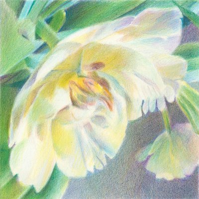
    And finally..............Parrot #3


    I've had two hiccups with this third parrot tulip. First I totally "killed" it by making the shadows rather too murky - and had to start again. Then, as I didn't have any greeneryy in the first version I decided to add some in to the second version - but then produced a very wooden leaf. Which had to be erased and the foliage rebuilt. Anyway, I think this is the final version of Parrot #3

    And this is what the set of three Parrot Tulips now looks like.


    , , , ,

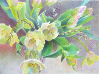
    Mixed Parrot Tulips - in coloured pencil

    I started this a week ago - just after I did the pastel version - see Parrots In Pastel. The first two stages were done from life.


    Unfortunately I had to break off due to various commitments last week - but managed to get it finished last night as most of the work that was left was the work required to strengthen the colours and values.

    This is the final version is now included in the Flowers Gallery on my website "Pastels and Pencils" - this is the link http://www.pastelsandpencils.com/flowers.html


    , , , ,

    Saturday, March 11, 2006

    ..........and another parrot tulip makes three WIP

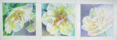
    I'm getting quite excited. I photographed my part-finished third parrot tulip bloom with the other two this morning when I was photographing the amaryllis. I just couldn't wait to see what they all look like sat next to one another............it was the impact of the first two which made me want to do this third one.


    And this is what I got. I've just laid down the sheets of paper next to one another. Bear in mind that the third one on the right is only half finished.

    And then I got that nice comment from Linda on the last one suggesting I do maybe another seven instead of another one!!!

    And I'm already eyeing up some more parrot tulips - can you tell they are one of my favourite flowers? But I've also got the amaryllis, the pussy willow and the narcissi to do as well!!!

    What this exercise has convinced me of is the value of doing a small series of the same flower at the same time - and I'll certainly be trying this again.

    I'll post the third bloom when completed together with another shot of the three together.

    , , , , ,

    Amaryllis - pen and ink drawing


    I've got three stems of amaryllis (what's the plural of amaryllis?) for my "flowers from life " project - so I thought I'd better practice drawing them before starting a painting. And the best way I know of really focusing on working out how somethings "works" is to draw in pen and ink. The fact that erasing is not an option makes me draw my lines rather more carefully in the first place.

    However, every time I do a complicated pen and ink drawing I remember that I really love to do contour hatching and cross-hatching. Which might sound a bit nonsensical - so I'd be interested to hear what you think.............

    This is on Daler Rowney Lyndhurst - which is a double sided high white smooth cartridge paper which suitable for line and wash. The pad is 20" x 15" and the image I'm showing you is about 15" x 12" and was drawn using a Pilot B-Tec C$ with a 0.4 fine point.

    , , ,

    Friday, March 10, 2006

    Small Works: Parrot in Profile


    I've done a second "small works" version of the Parrot Tulips - this time it's called "Parrot in Profile".

    And I just love working with these colours.........if you look at the front page of the page for new artwork on my website you'll be able to tell very easily what is my preferred palette for both landscapes and still life!

    I think it looks very good next to "Solo Parrot" which I did earlier this week in the Small Works Gallery of my website. They were meant to be a pair but I like them so much I'm now looking to see if I've still got the material to make a third one.

    , , ,
    , ,

    Sketching in The Mall and at Crufts!

    Two very quick sketches of people during the last couple of days:

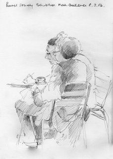
    Wednesday: during another visit to the Pastel Society exhibition at the Mall Galleries, I drew two ladies having tea while I also had a cup of tea and some event for that evening was erected around me!

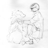
    Thursday: trying for the first time to sketch owners exhibiting their dogs at Crufts, I decided that this was maybe getting a little too ambitious since I don't draw dogs very often! This sketch lasted about 2 minutes!


    , , , , ,

    Tuesday, March 07, 2006

    Chuck Law is now showing.........

    ..............in his new blog, which I've added to my list along with his website.

    Chuck Law started painting full time a year ago and I'm very impressed with the patterned still life paintings on his website which he has created over the course of the last year. I think my favourite is "Cool Beans".

    And he's recently started a blog which is showing a lot of promise in terms of regularity of posting (10 posts in two weeks) - and I'll be adding it to my Bloglines list today.

    And Chuck, who has many many years experience as a floral art designer, has recently provided those of us participating in the flower painting project with lots of excellent advice about how to select and care for flowers and design floral arrangements for painting. You can read his advice here.

    Small Work: Solo Parrot


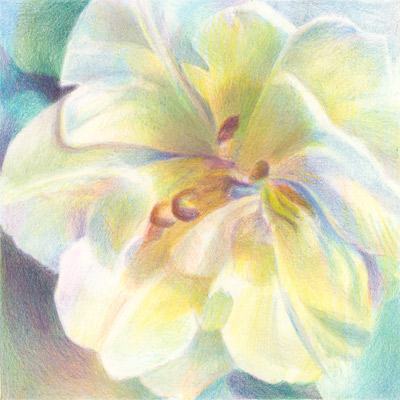
    This is a new small work. It's a single parrot bloom. The image is 6 inches square and was produced using coloured pencils on Arches Aquarelle Hot Press Paper. This small work is for sale and has been added to the Small Works Gallery on my website. This is the gallery where artwork can be purchased without having to have a major think first!

    I'm rather pleased with this one. It started off as a colour study to see what might happen if I pushed the colours a little bit - but became rather more than just a colour study.

    So much so that I think I might do a series of single blooms in 6" x 6" format.

    , , , , , ,

    Parrots in Pastel

    I'm doing a project on flowers - working from life - this month, so hopefully there's going to be a lot of flower paintings and drawings this month.

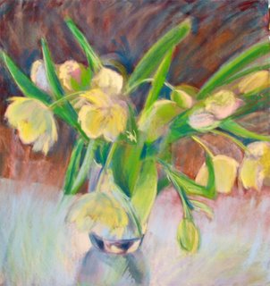
    Here's the first one. This is in pastels on an abrasive support (which I think is Sansfix). It's approx 50 cm square
    I'm posting an early stage (which is too bright) and then what I think might be the finished image (which I'm thinking is looking a bit too subdued maybe). The difficulty with this one is getting the colour of shadows on the very pale yellow parrot tulips - I've been through a lot of pale blues / lilacs / pinks.........

    I'd love to hear any suggestions for any possible improvements..........


    , , ,

    Friday, March 03, 2006

    Drawing a Head 2


    I'm putting up a post of my recent efforts in my drawing class, and will continue to do so periodically. And I'm being brave and even putting up the ones I'm not ecstatic about!

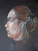
    The man and the girl in the centre are both done on A2 size heavy white cartridge paper (220 gsm) using a mechanical pencil and a graphite stick. The girl on the right is done using Derwent Drawing Pencils on Winsor and Newton Lana Tints Pastel Paper - this has a grained surface and I have a pad with six different colours.

    I always use multi-directional hatching as my main 'technique' and this is what it looks like close up on the grain of the Lana Tints paper


    , ,

    The Pastel Society - Annual Exhibition 2006

    On Wednesday, after the Drawing Lecture at the National Gallery, I walked the short distance to the Mall and went to see the 107th Annual Exhibition of the Pastel Society (UK) at the Mall Galleries. The exhibition is on from 1 - 12 March with an art event evening next Tuesday 7th March - which I shall probably try and get to.

    I've been exhibited by the Pastel Society in the past - which was a huge thrill but I haven't submitted any work in some time. Unfortunately I missed the exhibition last year and had thought about submitting work for this year's exhibition but decided not to until I'd had a chance to see what was getting into the exhibition and whether styles were changing.

    Getting your work juried into a competitive exhibition can be such a 'hit and miss' affair. There are a number of sources of good advice about what to avoid doing - but what makes one piece get exhibited and another not does seem rather like the luck of the draw at times. Which of course is down to the fact that those making the decision usually change each year.

    Anyway, I was there to look at the paintings and do my research! When I go to see a juried exhibition I have a number of objectives - some of which relate to any future submissions and some of which are rather more market-oriented ie what's selling! Usual objectives are to:
    • identify how subjects and styles are changing (if at all)
    • see what is selling within the context of the prevailing economy (I usually go at the beginning and end of the exhibition if I'm really interested in this) - and also what is NOT selling. I'm looking here mainly at style, subject and size as well as at price.
    • try and identify what it is about a painting which merits the prize it has been awarded.

    I always go armed with a pen and annotate the catalogue. Various cryptic remarks get made - mainly to remind me of what the painting looked like so I could remember it after I left the exhibition (see below for my comments on juried exhibitions and the use of the Internet)

    I need to go back again as I didn't finish looking round by the time the gallery closed - but initial impressions are:

    • usual emphasis on the representational and observed subjects rather than symbolic or conceptual; but many more abstract, or semi-abstract, paintings than I remember seeing at past exhibitions.
    • more of an emphasis on the impressionistic rather than the realistic - very little 'photo-realistic'
    • lots of landscapes and few (I think) florals
    • not a lot of conventional portraits (not unusual)
    • very few drawings
    • very little use of coloured pencil - which is a permitted medium
    • an awful lot more use of solvent? Some of the more 'painterly' paintings seem to have brush marks which aren't about a gesso underpainting on the support - are people trying to make pastels look like oils because pastels do not sell as easily as oils?
    • some interesting framing solutions - more being framed as if oils (ie no mat)
    • very few sold after the Private View and first day - which I would guess is prime time to make sales. A reflection on the artwork or the marketing?

    Some small whinges:

    • I do wish that the catalogue included dimensions and media used - instead of just title and price. I spent a lot of time staring at some of the paintings this year trying to work out what surface had been used and how the painting had been produced.
    • It's incredibly irritating having a catalogue ordered by the artists name - in alphabetical order while the exhibition is hung in a completely different order. When there are 390 paintings that makes for an awful lot of flicking backwards and forwards!
    • I wish more societies (including the Pastel Society) created a website for their exhibition with links to the artists websites or galleries. By and large such exhibitions seem to be still treated pretty much like conventional gallery exhibitions and don't seem very attuned to the Internet as a way of communicating and marketing artists' work.

    An honourable exception to the last comment is the exhibition held by the New English Art Club (NEAC) which demonstrates a much more business-like approach. Despite the exhibition closing in mid-December, it can still be viewed on-line and sales can still be made through the NEAC website. It also means that you can go back and view a piece without having to return to the gallery and the actual physical exhibition.

    , , , , , , ,

    Thursday, March 02, 2006

    Crassness and Cruelty

    This was the latest lecture (on 1st March) by Deanna Petherbridge .in the Drawing towards Enquiry, Enquiry towards Drawing lecture series at the National Gallery.

    Another fascinating lecture with lots of interesting slides - a slice of art history without it being an art history lecture. Her juxtaposition of slides by historical and modern artists was fascinating.

    Here are some odd comments and conclusions from the event which gave me pause for thought

    • a caricature may be more like a person than a normal drawing
    • very sophisticated artists are quite capable of employing deliberate distortions in a child-like fashion - caricaturing with a "fun" pencil and "a rough charged infantilising line"
    • infantilism and coarseness are often put together and are often interchangeable
    • caricatures can flout all the normal "rules" of drawing, composition etc
    • artists often focus their drawing activities (caricature) on the edgy relationship between artist and dealer and artist and connoisseur - it's been a key theme of many artists over time and is investigated again and again
    • historically there has been a view that the painter who has done caricature has "let the side down"

    , ,

    Coloured Pencils: Using Zest-It solvent

    My great friend and fellow artist Kathy Ellis has produced a step by step lesson on how to use solvent - specifically Zest-it - with coloured pencils. It's just been published in the new March edition of Ann Kullberg's e-zine "From My Perspective" which can be accessed on subscription via Ann's website - see below.

    Solvent basically makes getting good coloured pencil coverage on paper much quicker and easier than the endless layering technique which a lot of people do with coloured pencils. Why spend hours and hours doing 20 layers to get a nice solid colour when you can do a few and then use solvent to spread the wax or oil based pencils around the page in much the same way as watercolour. Or so the reasoning goes.

    On the subject of layering - I'm just not that methodical and I've personally never worked out how many layers I do as I don't work in a section by section way. I work all over at the same time and pick up and put down pencils as I go............

    Anyway, knowing about the impact of solvent and knowing how to do this are, of course, two completely different things. Kathy has been using Zest-It as a solvent for some time now but this is the first time I've seen exactly what she does - with pictures for all the different stages. The great advantage of Zest-It is that it is a natural citrus based solvent which is completely non-toxic. And the smell of oranges is great too! I have my bottle of Zest-It at the ready - and I'm ready to go!

    A link to Ann's Kullberg's website which provides the access to her e-zine is now located in the coloured pencil resources section of side column. Besides the e-zine it also provides great advice and other resources for those interested in drawing and painting using coloured pencil. It also includes galleries of work done by artists using coloured pencils.

    The Zest-it site also provides a link to the article which Ann Swan did for the UKCPS - in which she also explains how she uses Zest-It for her very precise and beautiful botanical drawings. I've also added a link into Ann Swan's website in the artists section of the side column.

    You can see Kathy's work at www.katherinellis.com - she does absolutely amazing dog portrait paintings as well as simply stunning still life paintings with coloured pencil. One to watch in more than ways than one - especially if you live in New England!

    , , ,

    Wednesday, March 01, 2006

    Thumbs down for Technorati Favourites

    I'm not at all impressed with Technorati Favourites. Reason - I'm experiencing major problems with the way the function is recognising the latest update from a blog when the blog URL is added to the favourites list. And of course if it doesn't recognise a blog has updated then I can't read the update!

    Examples include:
    • Postcard from Provence (which updates every day/Movable Type base) - is listed as having last updated 3 days ago
    • Craftmonkeys (Typepad) - doesn't register as ever having posted (and I've tried every variation I can think of with no luck at all)
    • Fur in the Paint (Blogger) - listed as having last updated 11 days ago - wrong!

    In the end I tested my blog (Blogger) - updated 3 hours previously - and this is listed as having last updated 3 days ago as well! At which point I decide to write this post!

    There's no apparent rhyme nor reason to it. Laurelines (Typepad based) and A Painting a Day (Blogger based) are both reading accurately within Technorati favourites.

    So I'm going to stick with nice/reliable/easy to use/easy to access "Bloglines" to read all the latest posts in the blogs that I follow - and tag this post appropriately with Technorati tags to see if anybody over at Technorati is monitoring the feedback!

    , , ,

    Wally Torta's self-portrait

    Wally has done a great self-portrait in pen and ink and posted it in his latest entry in his journal - which I highlighted a few posts back. It deserves a much wider audience than the huge numbers who go to look at his journal each day.

    See his post "End of the Line" and take a look at the last drawing. There's a fairly gushy comment from me underneath - but it is a really great self-portrait!

    And self-portraits are the hardest thing and the easiest to do. Easy because you always have a ready model to hand - and hard because you have to:
    • find a mirror that's big enough
    • make sure mirror won't fall over if being used where you normally draw
    • look at this person with the sort of gaze which you have been avoiding for the last few years since the pounds started to pile on and the wrinkles put in an appearance
    • avoid the fixed glare look of somebody who is looking very hard at something the cat just dragged in
    • spend hours deciding whether or not you're going to smile or not
    • faff about while you decide what's the best media for your self-portrait (posterity you understand! ;) )
    • kick yourself for not having had your hair cut when you meant to - as you now realise just how much it needs a cut
    • make a mental note to start going to bed earlier because those bags under your eyes are simply NOT going to be in the next self portrait
    • decide it would be better to wait until summer when your skin is looking at little less pasty
    • ..........and more of the same..........

    All in all a very nerve-wracking experience - at the same time as probably being one the best drawing and painting exercises you can do. And wimps don't do self-portraits - you need nerve!

    Well done Wally!

    (Edit: Whoops - forgot the Technorati tags again!)

    , , , ,