A top art blog for artists and art lovers: news about major art competitions and exhibitions, interviews with artists, techniques and tips for art and business
Pages
Wednesday, May 31, 2006
Blatant breach of copyright by Deviant Art Member
This is the link to the page where the theft and breach of copyright occurs - and this is a link to Gayle's website where the image in question is clearly evident. It doesn't stop there, images are also included of one of Gayle's best-selling cat prints "Eye Candy"
It is Gayle's good fortune that somebody recognised her work and immediately notified her. Gayle is extremely well known in the pet portrait world and regularly posts her much admired artwork in various internet forums as well as having a website and selling her very popular prints on e-bay.
It's maybe predictable that the offending member's posts garnered an avalanche of admiring comments within 24 hours of joining the site. I gather that these are now going to be followed up by a number of comments from people who will be identifying the images as theft.
It's very sad that anybody wanting to share their artwork on the internet runs the risk of having it stolen and misrepresented - and quite possibly marketed independently. Short of making images absolutely tiny and the lowest possible image quality - which is what the up-market galleries frequently do - there is not a lot one can do to stop theft of this sort. However there is quite a lot one can do to pursue those who commit the theft and all the sites which breach the copyright. There's a link in my right hand column to Lorelle VanFossen's blog aticle on "What to do when somebody steals your content". which is worth reading.
I know that Gayle has contacted Deviant Art and advised them of the theft. Let's all hope that by the time you read this post the link to the DeviantArt member's page - and gayle's artwork - will have been taken down by the DeviantArt Adminsitartors and disappeared.
UPDATE: 11.50am (London) The original post was written just about 10.3oam this morning. The situation became worse. It appears that the person concerned also stole Gayle's identity. Many posts were sent to the site this morning by various friends of Gayle's identifying the theft. As a result of the representations by Gayle and her very many friends the page of the person has been taken down and the person whose member name was "vanillafloat" is now no longer a member of Deviant Art. It's very pleasing to see that a concerted effort by a number of people over a very short space of time can get the right result. Now we have the question of what action Gayle takes about the identify theft - apart from calling the police.
Technorati tags: copyright ; copyright theft
Tuesday, May 30, 2006
The book reviews of See.Be.Draw
Very methodical, incisive but accessible - a definite 'must read' for anybody interested in the process of drawing and books about it.
It does however need a health warning or your plastic locked away first.........I can see another couple of purchases coming up sometime soon for me.
Tecnorati tags: art , book reviews , drawing
Do you ever sketch in public?
At the time of writing it has attracted 581 votes as follows:
- 28% sketch anywhere and everywhere
- 13% sketch - but only somewhere they won't be noticed
- 18% sketch sometimes
However:
- 16% don't sketch at all - because they're too intimidated
- 9% have thought about it - but haven't started yet
- 2% used to sketch in public - but had a bad experience and stopped
Finally 6% don't sketch and 5% had 'other reasons'.
Are you surprised by any of these percentages? Is there any one result which stands out for you?
For me, there were a couple.
- Firstly, that 60% of artists and would-be artists are already sketching in public, which I personally think is an excellent result.
- Secondly, that only 2% of artists have actually had a bad experience while sketching in public. Fear of 'something awful happening' (which might be a variety of things depending on an individual's perspective) has been suggested in other places as being one of the main reasons why people don't sketch in public.
And thanks to Marion Boddy-Evans and the people at About Painting for hosting this very informative poll.
Monday, May 29, 2006
Fixing a Broken Moleskine Band
Thanks to Marion at About Painting for the link.
Technorati tags: moleskine
London Sketchbook
 One of the books I bought in Marlow last week was "London Sketchbook" which has paintings by Graham Byfield and text by Marcus Binney.
I've previously bought the Venice Sketchbook in the same series. As well as being a nice book to look at, I also found it enormously helpful to locate different places worth drawing or painting when I visited Venice last year.
The "London Sketchbook" book also has great coverage of all manner of interesting places worth seeing - and sketching - in London. I was absolutely fascinated to find that I'd seen most of them at one time or another (maybe I've lived here too long?!) - but didn't know that the Imperial War Museum in Lambeth is housed in the former Bethlehem Mental Hospital or that Constable used to live in a house in Well Walk in Hampstead!
The 150 watercolour paintings and pencil drawings are accompanied by:
- a handwritten short commentary by Byfield on each individual painting
- an introduction to each chapter written by Binney which says something about the places, the architecture and the historical associations.
- a more technical gazetteer, again by Binney, which provides more detailed information about the age and background of each building.
His panoramic views of the City of London from the top of Greenwich Park were rather fine - but were obviously pre-Gherkin. I must have a go sometime........
I found I had already drawn some of the things in his book - and I'm not surprised his drawing of the interior of St Pauls has no colour as you are very limited as to what can be taken inside the cathedral to draw. And I'm wondering what size paper he used as that interior is a BIG CHALLENGE! Took me ages. You can see my various versions in the "Drawing the Bigger Inner Space" Gallery on my website.
Now it looks like we might be able to get a London Sketchcrawl off the ground in October (Big Draw month) so maybe this book could give us a few ideas of where to go........
Further details about this book are in the link to the book in the right hand column.
Technorati tags: art , drawing , London , pencil , plein air , sketching , sketchbook
Drawing Basics 102: Class 2 - Creativity with Mary Lelevier
The aim of the class is to help drawing students to awaken and find their creative spirit and learn something about following the path to abstraction.
There are two assignments in the class:
- the first challenges the conventional format used to create pictures and uses a viewfinder with a 1:4 or 1:5 ratio to create images with a vertical or horizontal orientation - or a 'slice of life' as one of my friends calls it. If you'd like to see what one might look like, visit the Art Journal of Nicole Caulfield who took a geological survey approach to a sundae recently - you can see the result here.
- the second assignment is about trying to create something distorted and abstract from something realistic.
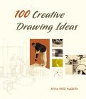 Mary is using 100 Creative Drawing Ideas as her reference book for the lesson (having got permission from the author, Anne Held Audett). I've popped a link in the drawing books section of the side column for anybody who wants to know more about it.
The way the drawing classes in The Classroom work is that people with limited drawing experience are asked to do the Drawing 101 series first - with Drawing 102 operating more at an Intermediate level. The classes never actually end, although they have a period when there is active learning as part of the first group to do the class - which is what is happening now with this class. People can join classes anytime and always get a friendly welcome in both of the Forums.
You can read about the scope of the 34 lessons in Drawing 101 here.
Meanwhile, as I'm tutoring Class 3 on Sketching I need to get on with writing my class prep. as it starts next Monday! More information about this class will be posted before Monday.
Technorati tags: art , creativity , drawing
Saturday, May 27, 2006
Which coloured pencils to use on drafting film?
She's been posting recently about her experiment to find the best brand of coloured pencils to use on Polydraw, which is the brand of drafting film which Gayle uses. She's been creating a colour wheel chart to compare Prismacolors with Polychromos and so far Polychromos is proving to be the most successful. See the chart on her blog.
Technorati tags:
art , coloured pencils , colored pencils , drawing , rough collies ,
Sketching at BlueWater
 Yesterday I had my annual trip to the opticians to get my eyesight checked and prescriptions reviewed. I've been thinking for some time that I should get some glasses for computer use - so, as my prescriptions had changed, I ended up needing to change the lenses in both my varifocals and reading glasses - and got a new pair of 'intermediate' prescription glasses for the computer. Just a bit expensive - but at least I came away with the reading and computer glasses (stylish blue titanium!) the same day although I have to wait a little longer for my varifocals.
Varifocals are absolutely marvellous for sketching and painting as you don't have the problem of not being able to see either the scene or your paper! When my eyesight first started to deteriorate I was able to manage with little glasses perched on the end of my nose so I looked over them at the scene and through them on to the paper. This stopped working and I switched to varifocals - and have had a great time ever since!
Anyway, all of the testing and fitting took a bit of time - so out came the Moleskine! The first sketch is of the opticians. Mandeep and Fred who were sorting my glasses for me and the others working there were all fascinated by the process, the result and the fact that it would end up in my blog and my sketch got shown to everybody. (Fred would like to draw and, in case he's reading this, I recommended to him the book I always recommend to people who want to learn - which is Betty Edwards's "Drawing on the Right Side of The Brain").
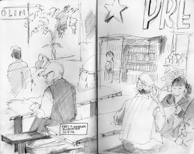 The second sketch is of Pret a Manger where I went for a sandwich while waiting for the new lens to be fitted. It can't, of course rival Wally's Starbucks sketches - but I try!
Technorati tags: art , drawing , moleskine , pencil , sketching , sketchbook
Friday, May 26, 2006
Drawing Class 25 May
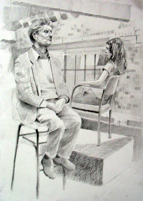
Drawing Class yesterday was really good. I liked the male model's face (he had features which reminded just a bit of Samuel Beckett) and the clothes were more interesting than usual. The drawing went well, the line just flowed and I erased very little. The male model's face was done in about 15 minutes and both the class tutor and I were suitably impressed with it. And I had so much time left I started drawing bricks!
Isn't it weird how some classes can be such a struggle (hate the models / hate the lighting / hate the drawing etc.). Then along comes a class where everything just flows. Personally, I think how well a drawing class involving life models goes has something to do with the extent to which freehand drawing/sketching from life has been practiced in the previous few days. Working on a 'finished piece' where everything is a bit more planned and calculated doesn't seem to work the same trick. Spending 10 minutes on Tuesday drawing rowers zooming in and out of their rowing club and then sketching over dinner seems to have worked a treat!
Now the techie bit. This is a drawing in mechanical pencil with a little bit of graphite stick around the floor areas on heavy white cartridge paper size A2. It was completed in 2 hours - and I made a note last night of how I worked on this:
- Arrive late! First session (30 minutes left) - find position and get set up with chair and drawing board. Map out the outline and main structure of the male model's form and clothes. Establish size of head but don't work on it. Start to establish the outline form of the females model
- first 15 minute break - continued drawing getting all the infrastructure established (chairs, platform, windows, wall, cross beams etc) I don't need the models to do any of this bit - and having a background in actually makes it much much easier to get the correct positioning of the two models relative to one another.
- second session (45 minutes) - continued to work on form of male model while he got settled and then started his head and did most of it in one go of about 15 minutes; refined outline of girl and corrected sight sizing / placement / angle of key features relative to background markers; worked on overall value pattern and the design of the drawing
- second 15 minute break - had a break/stretch/chat
- last session (30 minutes) completed drawing of girl's face and hair; reinforced shading of forms - and started drawing bricks!
Technorati tags: art , drawing , drawing class, drawing people , portrait , pencil , sketching
Thursday, May 25, 2006
Eating - and sketching - Alfresco
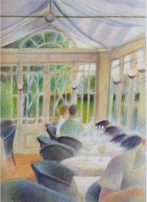 This is the second sketch I did while in Marlow and is another one for the "sketches of restaurants I have eaten in" collection!
The sketch was done while sat in the Alfresco Brasserie of the Compleat Angler, which is a hotel on the banks of the Thames inbetween the suspension bridge and Marlow weir (quite spectacular). It's got a good reputation for its food and had been on my target list of restaurants for far too long! I'd imagine having dinner there on a sunny evening would be delightful - unfortunately on Tuesday it rained very hard on and off all day. So plans to draw outside had to be abandoned and I drew inside instead. And I wasn't 'dressed for dinner' so I decided to give the restaurant a miss and tried the brasserie instead.
This is a free hand and sight-sized sketch done on an Arches HP block while I ate my dinner. This was the scene at the beginning of the evening - it filled up with people over the course of the evening. It's got all sorts of perspective and structural errors and omissions in it - but it's a good record of what it was like on that evening in that light. If I want to work it up I've got photographs I took while it was empty to correct the drawing of the architecture and perspective.
For the record, I had the Feta parcel with fig marmalade and celeriac salad and then Fillet of sea bass with fennel, butternut squash salad and haricot blanc and lemon dressing and finished with a lemon tart with creme fraiche ice cream - well it took a long time to do! The fact I enjoy good food is neither here not there!
Many people are afraid of sketching and drawing away from their normal environment, particularly if drawing from life in a public place where people are part of the subject. In my experience people are always completely fascinated by what you're doing and always want to know if they're in the picture! I always tend to draw people so that they are clearly a person but wouldn't be recognised. Judging by their comments, the people at the next table were both intrigued and impressed by my sketching but one of them did 'complain' as they were leaving - because he wasn't in the picture! The other thing that happens is that the waiters always want to see if they're in it or not and I invariably get better service when drawing in restaurants! In this instance the waiters were very impressed and even wanted to show it to their colleagues in the kitchen - so off it went into the kitchen as I packed up.
I'd just like to thank the staff of the Compleat Angler for allowing me to sketch there - and for a very fine dinner!
Technorati tags: Arches , art , drawing , coloured pencils , pencil , restaurant , sketching
Wednesday, May 24, 2006
Rush Hour at the Marlow Rowing Club
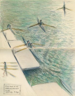 I had to go up to Oxford yesterday and decided I needed to come up with a strategy to avoid the rush hour on my way back to London.
I studied the map and eventually decided to visit the Stanley Spencer Gallery in Cookham on the way back down the M40 but then got distracted by the sign to Marlow as I wasn't sure about the opening hours for the gallery! I checked this morning and it turns out I needn't have worried.
Anyway, Marlow is a very fine and relatively unspoilt English town situated on the banks of the River Thames inbetween Henley and Maidenhead. I parked up and took a walk through the town and only managed to buy two new books en route to the river which I thought was pretty good for me!
I arrived at the bridge over the Thames about 5pm and was amazed at the amount of traffic in and out of the Marlow Rowing Club - whose rowing HQ is right next to the bridge. Rush hour was truly alive and well amongst the rowers on the River Thames - and what's more was running extremely efficiently - no traffic jams here!
I stopped to sketch them in the trusty Moleskine - which was a huge challenge as they were all extremely athletic and never stopped moving! I decided not to attempt the first sight I saw as I came across the bridge - four ladies hefting their boat out of the water and up above their heads to return it to the boat house. What I wanted to sketch was the dazzling light on the water and the strong shapes of the jetty, boats and rowers against the water as the sun moved lower in the sky.
So techie details - this sketch is mechanical pencil on a double page spread of my Moleskine with coloured pencil added later. The initial sketch took no more than 10 minutes standing on the bridge - and I focused in particular on the light on and the flow of the water as the ripples were being influenced by the jetties and the craft as well as the very strong currents. When I got home I added the colour of the water and the oars with coloured pencil.
BTW, do take a look at the website of the Rowing Club - it's very impressive. I now understand the speed and efficiency of rush hour!
And maybe rowing on the Thames is a suitable topic for the Big Draw month in October (see last post)?
Technorati tags: art , drawing , coloured pencils , moleskine , pencil , plein air , sketching , sketchbook
The "Big Draw" 2006
In 2005, 1400 "Big Draw" events, reaching over 3000,000 people, took place in 1200 venues from palaces to parks, national museums to hospitals, nurseries to universities. The "Big Draw" has apparently also now been adopted as a drawing event by leading institutions in Australia, New York and Boston.
This year the seventh Big Draw will have:
- a focus on architecture, engineering, the Thames and the human figure.
- events and activities between 1-31 October and,
- a launch party at Somerset House and neighboring Kings College London on Sunday 24th September, thanks to the sponsorship of Berol, the Foyle Foundation and a private donor.
Suggestions for possible themes include:
- Inside and Outside
- Making Connections
- Layers of Meaning
- Fantasy Worlds
- Personal histories
- Adapt and Transform
- Dreams and Nightmares
If stuck for an idea, the campaign for drawing says that
You can find out more about the Big Draw and register for it on www.thebigdraw.org.uk. Once registered, you get a copy of the Drawing Inspiration booklet which describes what were some of the most successful Big Draw events around the country in 2005 and a CD with ideas for drawing events, funding advice and publicity materials.Drawings can be made by individuals or groups, on post-it notes or as vast murals. They can be inspired by direct experience, photographs or other kinds of visual information, made by hand or generated by computer. They can be perspectives, maps, plans, elevations, annotated sketches, measured drawings, diagrams, narratives, storyboards, animation, doodles, portraits, shadow drawings or projections.
I've got one or two ideas noted down in the back of my sketchbook! Will you be participating?
Related posts: New Directions for the Drawing Campaign
Technorati tags: art , drawing
Tuesday, May 23, 2006
New Directions for the Drawing Campaign
In future, the Drawing Campaign is:
- becoming an independent educational charity - in order to help promote messages about the value of drawing and support learning about drawing.
- looking for partners to help it get the message across about the importance of drawing.
- publishing, in June, a comprehensive free resource pack for educators and teachers showing how drawing can connect people with the built and natural heritage all year round. This arises out of the "Drawing Attractions" Project which has been investigating ways in which drawing can unvcover the past and make sense of the present and look into the future.
- aiming to make the Big Draw, which launches on 24th September, an even more inclusive event by extending opportunities to new audience including adults and family groups.
- generating drawing events during October in group studios, galleries, community centres, schools and libraries.
If you're interested, you can find lots more information on its main website at www.drawingpower.org.uk
On the website, they have one section called "Why Draw?" which doesn't try to explain - it just has quotations from people who do. Here are some of those quotes. Have a quick read and see if they do for you what they did for me - which is made me think about the potential that exists to create inclusiveness in relation to drawing and the value that drawing can have in the lives of ordinary people of all ages.
"Drawing is of vital importance in creating imaginative forms of visual culture" Deanna Petherbridge (Professor of Drawing)
"To young children, drawing is as natural an activity as running and playing but, as we grow and develop, in general we drop the drawing - why? It's sad that so many people lose this ability: for me, drawing has always been a natural form of expression" Gerald Scarfe (Cartoonist)
"When I draw I retire into this inner person, and it's wonderful because it's very whole. It's a health-giving exercise" Robert Tear, opera singer
"In pictures you can express things you can't say in words. It's fun, it's relaxing, it adds another dimension to life" Robbie Catterick, kitchen fitter
"Engineering is all to do with logic and making things work. A bit of fantasy gives you a different perspective" Alex Driver, engineering student
"Drawing keeps you sane, really. It's dancing on paper. That's what it is - just dancing on paper" Elaine Arkell, mature fine art student
"When you get drawing, you're young again" Stan Foot, pensioner aged 80Technorati tags: art , drawing
Sunday, May 21, 2006
Drawing 102: Sketching
Previous classes in the Drawing 101 and 102 series have enabled an awful lot of people to make lots of progress with their drawing - and I'm hoping we can have a similar success in relation to this new sketching class. I'm going to be helped by the fact that we'll be doing the class in June and hopefully the weather will be OK (should I have said that?) and people will want to get out and sketch!
The class starts in two weeks time on Monday 5th June and will run for two weeks. I'm currently doing my preparation for the class and always like to keep in touch with other people's perspectives. So I wondered whether anybody who reads this blog would like to:
- highlight any issues that are ones they struggle with when sketching or queries they'd like the answer to.
- tell us about what works well for you and whether you have any tips or recommendation you'd like to pass on.
So:
- what do you want to know about in relation to 'how to sketch'?
- what are the things you struggle with when sketching?
- what do you think would help you to improve your sketching skills - and results?
Also:
- what was the most useful tip (or tips) you ever got about sketching?
- what sort of sketching activities do you enjoy the best?
- what recommendations do you have for people wanting to learn to sketch?
(This post is about sharing information - it's not about drumming up business for anybody's product or sales. Please note commercially oriented posts will not be approved - read this blog's comments policy )
Related post: Learning to Draw and Sketch Websites (1)
Technorati tags: art , drawing , pencil , sketching , sketchbooksSaturday, May 20, 2006
Pentel hi-polymer superior mechanical pencil leads

I've been asked which brand of pencil leads I use - in relation to the previous post Catnapping #8. I've used Pentel Hi-Polymer Super / Superior mechanical pencil leads for nearly 20 years and have always been very happy with them. They do what I want them to do and don't appear to have any quality problems. Usually HB although I do also use B on occasion. To be honest I can't be certain the last sketch was done with HB as I have masses of mechanical pencils and I just picked up the one nearest to hand - but I've only rarely bought B so I suspect it was done in HB!
However! The leads used to come in a very easy to use plastic pack like the one on the right. Now we have the new improved much bigger, much more difficult to open and use package - the one on the left. I want to know where the old packs are so I can buy them all up until they come up with the next design improvement!!!
Technorati tags: pencil , pencils , Pentel ,
Catnapping # 8

This is a very quick sketch of my cat Cosmo which I did yesterday. It's #8 in his catnapping series! It's on a page of my moleskine and is done with a mechanical pencil with an HB lead. I love the way I can get good rich darks and very light tones with the leads I use.
Cosmo is a very much a 'people person' cat and he's a very happy boy since I reorganised the furniture in my study/studio and he now has a chair to sit on just behind where I sit at my computer. However, his absolutely favourite perch is on top of the arm of the armchair I often sit in when drawing. His favourite trick is just ever so slowly rolling off it on to my drawing board so that he can get a cuddle. He succeeds about half the time - the rest of the time I just yell!
You can see more of the catnapping series in my website gallery of cat drawings and there are links to other recent catnapping sketches below. I've renewed my Associate Membership of the Society of Feline Artists again and hope to be showing with them in the Annual Exhibition at the Llewellyn Alexander Gallery in September. Last time I showed with S.OF.A. at this gallery one of my coloured pencil drawings actually ended up in the gallery's window!
Note: My apologies to people with subscriptions to this blog - I realised when writing this that I'd never got round to giving the first two posts below their own individual hyperlink - hence the updates for these two posts being published.
Related posts: Drawing and Flu, Catnapping, Catnapping #6 and #7
Technorati tags: art , cats , cat drawings, catnapping , drawing , drawing cats , pencil , moleskine
Friday, May 19, 2006
Tea at Fortnum and Masons after the Summer Exhibition

On the 6th June 2004 I went to see the Summer Exhibition at the Royal Academy of Arts in Piccadilly and then went across the road for a cream tea in the at Fortnum and Masons. I know this as I've just found the small sketchbook which I'd lost which contains this sketch and the bill for the pot of Darjeeling and the cream tea! If you download the classic menu from the Patio Restaurant site you can see what I had to choose from!
This sketch was done using a mechanical pencil in an A6 size Black hardback black sketch book by Daler Rowney. I used a double paged spread and the sketch is about 5.5" x 8". As alway when sketching in a tea room or a restuarant, you never know when people are coming or going and I do remember that the people sketched in this one were never all in the room at the same time.
This year the 238th Summer Exhibition at the Royal Academy of Arts opens to the public on 12 June and is on until 20th August. As I'm a Friend of the RA I get an invite to a Private View the week before - but they have to have several days of these to get us all though! I'm looking forwad to the Pimms!
The exhibition co-ordinators have decided that this year the theme for the exhibition is "From Life" and will be about strategies for art to respond to life and the business of living. Sounds interesting...........
Maybe I'll go to Fortnum and Masons for lunch this year - maybe with a bigger sketchbook? Maybe I need a new gallery on the website for all the drawings done in tearooms and restuarants? (You can see sketches done previously while having tea or sitting in a restaurant on my website in the "Drawing of Interiors" Gallery.)
Technorati tags: art , drawing , exhibition , painting , sketching , sketchbooks , Royal Academy of Arts
Thursday, May 18, 2006
Keys to Drawing
Bert Dodson
" Keys to Drawing" by Bert Dodson is one of the first drawing books that I bought after I got back to doing art after a break of over 15 years. It opened my eyes, stimulated my enthusiasm for drawing again and provided me with some really excellent guidelines about what to think about when drawing.
My edition is a North Light Books paperback published in 1990. Amazon indicates the current edition was updated in 2001 and, although I've not seen that I think it unlikely that it departs much from the sound advice provided in earlier editions.
I see the synopsis on Amazon says that it "Describes the drawing process, discusses proportions, light, depth, texture, pattern, design, and imagination, and tells how to evaluate one's work." And it does do all of those things - but it also does a lot more. He has 55 keys to drawing which are introduced as he goes through each of the topics in turn - and he provides lots of practical exercises to see how they can be applied.
It needs to be pointed out that this book is NOT a manual for how to draw in a hyper/photo realism manner - there are other books that do that.
What I like most about this book is it starts by encouraging people who want to develop their drawing to develop their own 'handwriting' for their drawing. Dodson explains:
- how we draw is as individual to us all as how we write.
- all artists combine freedom (intuitive, looser, sketchy drawing) and control (analytical, precise, careful drawing) in their work - they just do it differently
One of the especially helpful bits about the book is that it encourages the development of self-evaluation right from the start. This means that the things one needs to think about when drawing become internalised that much quicker. It really helps the budding artist to become much more self-reliant and less dependent on others for insight into how they are doing.
This is a book that I can pick up and reread and dip into over and over again and never ever get bored.
It's one of the best 'how to' books on drawing that I've ever read and I can highly recommend it to all of you who are:
- interested in the art of drawing,
- wanting to develop your own skill in self-evaluation and/or
- wanting to develop your own individual style of drawing.
Wednesday, May 17, 2006
The Colored Pencil School

Nicole Caulfield started the Colored Pencil School website earlier this year and edits it jointly with Maggie Stiefvater. She says
I can highly recommend the new website (also listed in the coloured pencil section of my right hand column) - and that's not just because this blog is listed there and I'm one of the friends! I know that this is a real commitment on Nicole's part to sharing and highlighting useful information about coloured pencil."An exhibition, at a local gallery, of artwork done by members of the New England branch of the Colored Pencil Society of America first triggered my interest in colored pencil. The quality of the artwork completely blew me away and, as a result, I wanted to start working in colored pencil straight away!
From practical experience, I now know colored pencil to be an excellent medium to work in and one which allows people to create great art while working in a lot of different ways. In addition, it hasn’t presented me with any obstacles in terms of getting gallery representation and selling my work to the public. I'm confident that if the art community understands more about the medium, the way it works and what can be achieved through its use - in both pure colored pencil and mixed media artwork - then we'll come to see more and more people using colored pencils to produce and exhibit great art.
My aim now is to promote colored pencil to the wider art community and the public at large and to see it hung more and more in shows and galleries.I started the Colored Pencil School site earlier this year, with the help of fellow color pencil artists, because I wanted to create a place where:
- artists can find information about colored pencils (such as workshops, product reviews and , and teacher's tools to help spread the media of colored pencil)
- those already using colored pencil can find lists of opportunities to exhibit their work in both shows accepting a range of media and those which are color pencil specific."
Nicole is also rapidly proving she knows what she's talking about! She has recently had her work accepted for two major national exhibitions (see below) and is the webmaster for and designer of the website of the New England Chapter of the Colored Pencil Society of America.
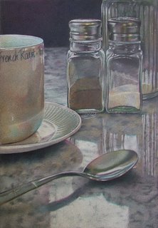
“Diner Reflections”, juried into the annual exhibition of the CPSA

“Half a Peck” juried into the 29th Annual of Salmagundi Club Non-Members Exhibition.
Technorati tags:
art , coloured pencils , colored pencils
Major problems with Blogger
Hopefully 'normal service' will resume soon.
Technorati tags: Blogger , blog software
Monday, May 15, 2006
"Impressionism has been neutered and lobotomized"
"He who must not be bored while I sketch" had found the AA Gill review in the Sunday Times for me since I wrote last about this 'mini-series'. Mr Gill, who trained as an artist at Central St Martins College of Art and the Slade School and who has been an art critic as well as reviewing TV, didn't leave us in any doubt what he thought starting out as he did with
".......nothing prepared me for the wraparound, jaw-dropping, pinch-yourself catastrophe it turned out to be"However, he went on to point out how notoriously difficult it is to dramatise art - and what fun can be had compiling a list of the top ten worst art movies! (Guess which ones he named by using the comments function and I'll let you know if you're correct!)
Notwithstanding that, he then criticised the series for
- being a safe option - in terms of how it told the story (flashbacks with voiceovers)
- the scripts - which were so unlike the way real people talk
- the way the artists appeared to have no real understanding of how art equipment is used and how paintings are made (this became increasingly irritating as they series proceeded - I found myself screeching at one of the 'artists' on TV at one point last night)
- the failure to address why art is important
"What we got was 'The Famous Five Go Sketching'. It was almost a Monty Python skit and way funnier than a French and Saunders Christmas Special.........the screaming solipsisms and chronic mistakes came in droves. But all that was as nothing compared to the utter lack of understanding of what art is or does or why it's important, why people are moved to make it and moved by it."
- missing a huge opportunity to rescue the impressionists from "being eternally embalmed in multicoloured candyfloss and thought of as airhead prototype hippies drawn thoughtlessly to the dappled light"
So, overall, that'll be a thumbsdown then?
Related posts: "Taking the Monet"; "The Impressionists - a review"
Technorati tags: art , AA Gill , impressionism
Sunday, May 14, 2006
Drawing Class 11th May
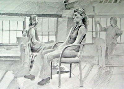
 This is the drawing I did on Thursday in my drawing class. I'm rather pleased with the rapidly sketched in stance of the artist at the easel - she wasn't posing and she certainly wasn't standing still! My friend sitting on the drawing donkey tells me I didn't get his hair right!
I'm also very pleased with the face - which is tiny in reality.
Practical hints and tips for doing drawings like this one:
- clean up the paper to get rid of any superfluous graphite which may have crept into the highlight areas otherwise you will have the most awful time trying to get a reasonable image from a photo. I forgot to do this and after the first photos had to stop, clean it up and rephotograph it!
- use Blue-Tak to pick out tiny highlights and adjustments to them (as I did on the girl's face) . You can shape it to the size of the highlight. Rolling it over the area also softens an area of graphite.
- if you're facing the light coming through the windows, treat it as a plein air experience and get the value pattern down quickly as it's going to change as you draw.
[Updated 17th May: to replace crop of head with a better scan and to test the image upload function]
Technorati tags: art , drawing , drawing people , pencil
Saturday, May 13, 2006
National Gardens Scheme
This scheme's website has a garden finder and also provides details of all the gardens which can be visited. It has a particularly effective database which allows searching by specific dates or ranges of dates and counties. The entry for each garden provides details of what plants can be seen, details of how to get there, what facilities exist and what restrictions there are. See an example for a garden in Kent which is only open one day each year - which is tomorrow in the case of this garden. The NGS days are not likely to be the best days to draw and paint a garden - but it enables people to see what's on offer and which are open for more than one day. Each entry also indicates which are open to private visits by prior arrangement which enables you to find out which might be open to the idea of you painting there - but maybe on another day.
Another site which is new to me and I've not yet explored fully but seems OK from the two or three links I've checked for gradens I know is Gardens Guide. The advantage of this is it takes a global perspective and provide details of gardens in a number of different countries. For example, this is the link to the website map for the Eastern States of the USA.
Technorati tags: gardens
Sketching in the Nosegay Garden, Kew

 Kew Gardens has changed a lot in just a week. The lilacs are now in full bloom, with a very heavy perfume lingering around the lilac beds. The azaleas are also about two thirds out with most of the blossoms in prime condition.
However I chose to do my sketching in Nosegay garden at the rear of Kew Palace where the colour is a little less 'full on' - apart from the laburnum pergola! I was limited for views by where I could sit. My "blogger's bottom" (see Walk and Sketch Blogs) got a lot of exercise yesterday - but also had a bit of a challenge as I sketched sitting on the stone steps due to the lack of seating in the Nosegay Garden.
There were any number of views that I could have done yesterday if I'd had a folding seat with me. I was asked to speak to people from the Gardens yesterday after I commented to the exhibition people about the poor signposting of "Artists's Kew". One of the comments I made was that I thought the gardens could be a lot friendlier to artists and maybe encourage more regular painting of the gardens through the provision of easels and folding seats to hire and maybe arrange or encourage plein air events / sketchcrawls for artists and an annual exhibition of paintings done within or of the Gardens. We'll see if anything happens!
This sketch of the mulberry tree in the Nosegay Garden is coloured pencil on a double page spread of my Moleskine sketchbook. Chromium oxide green was added when I got home - and I must make sure that gets included in my sketching pencil case in future!
 The Nosegay Garden is part of the Queen's Garden. The Kew Gardens website says
 The plants in the Queen's Garden are those exclusively grown before the seventeenth century. The plants grown were considered primarily for their medicinal qualities, with their culinary and ornamental qualities as secondary and tertiary considerations. Research into the plants was mostly taken from the seventeenth century herbals, from authors such as John Gerard, John Tradescant and John Parkinson.and
The labelling system in the Queen's Garden is differentSome of the 'virtue or quotation's were very amusing! And some of the plants were very unusual - such as the Great White Sea Daffodil, the juice of which apparently can have a mortal impact!
to that of the rest of the gardens. The following information is included:
• contemporary botanical name and family;
• common name in the seventeenth century;
• virtue or quotation from a herbal; and
• author's name and date of publication.
I'm anticipating going back and to Kew a lot over the course of the year so I'm creating a Kew section in the column on the right for relevant posts and links.
Technorati tags: art , drawing , coloured pencils , Kew Gardens , moleskine , pencil , plein air , sketching , sketchbook
"Artists' Kew" 9-16 and 29 May
"Artists' Kew" is described as being
an exhibition of original contemporary artworks which celebrate the Royal Botanic Gardens and its surroundings in Kew. The works express the whole Kew experience from the botanical treasures of the Royal Botanic Gardens to the charms of the riverside and the architectural heritage of the local area including Kew Green, Kew Village and Kew Bridge.It is an excellent exhibition of the work of artists of various persuasions. An on-line preview of the artwork being exhibited can be found at the Kew website- with an index to the artists found here. (There are six pages of artists - click on the image to see other work being exhibited by the artist)
- I think I liked Jane Corsellis's paintings the best of all - but them I am a fan of Jane Corsellis! She manages to mix a sense of the huge scale of Kew with the more personal experience of individuals while all the time displaying her glorious sense of colour. Interestingly she was one of three artists (John Ward and Toby Ward were the other two) who displayed their small studies done as preliminaries for their larger works - although this is only apparent on the website in the case of John Ward. I really enjoy seeing how people develop their paintings and it's always a treat for me when I can see such studies
- Michael Whittlesea demonstrates his usual fine draughtsmanship in his small oil paintings
- Nick Botting's views of the gardens are very representative of Kew for me. These are the gardens which people come to walk in and sit and read or sleep or have picnics
- the images of Peter Brown's wonderful panorama oil paintings of Kew simply don't do them justice - even at the larger image size.
- Kurt Jackson is showing watercolour paintings of the river and the view I sketched last week - but with a higher tide - which have wonderful titles and little annotations such as "Richard Attenborough walked by..."
- Carl Laubin and Steve Whitehead are both showing paintings involving the very grand architecture of both the glass houses and plants
- Lucy Smith and Ann Farrer both used watercolour to the same thing on a smaller scale and from a more botanical aspect
- and finally I liked James Hart Dyke's small oil painting the best of several views of Syon House
However I have a major criticism - the signposting within the Gardens is simply appalling. This is an exhibition which has been promoted on the Kew Gardens website and in the Friends Magazine and yet it's not in the seasonal leaflet about 'what's on' at Kew to say where it is located; there's no 'signposting' from the gates into Kew, the people on the Friends' Desk weren't sure where it was or whether it was open and the main route to it from the Victoria Gate is hampered by two major construction sites - with no signposting. I began to wonder whether anybody at Kew wanted people to see the pictures! In addition, the website makes clear - but nothing else does - that the exhibition is not open on every day between its opening and closing date. This makes for a very odd state of affairs for any exhibition and will doubtless lead to a number of people visiting Kew and not being able to see the exhibition!
For those wanting to see it, it's at the Kew Gardens gallery at Cambridge Cottage near the Main Gate. The website gives all the dates it's open - and that's not a lot - a minimum of 9-16 May and 29 May (Bank Holiday Monday) only due to the fact that Cambridge Cottages is used as a wedding venue! See this page for more details.
Entry is free, all the pieces are for sale and funds raised "will support plans to increase public access to Kew's unrivalled collections of botanical art" - and sales were looking quite good for some.
Previous posts: Artists Kew - but ignore the opening times which taken from early publicity and which are wrong!
Technorati tags: art , drawing , exhibition , painting
Friday, May 12, 2006
Ping-o-matic not responding.........again!
I know that Blogger automatically pings weblogs.com - but this isn't the syndication service which everybody uses to get blog updates. I use the Ping-o-matic service (which I understand is the default pinging service for Wordpress) after every post to reach a number of different feedreaders (or do I mean feedburners - I'm never quite sure of the difference!). Unfortunately, Ping-o-matic is poorly! [this is when I want one of those deeply ironic raised eyebrow smiley icons]. For the past few days it's only been working intermittently and when it is working it has become very slow. And at the moment, it's impossible to get into the website and impossible to ping - and no explanation. I confirmed on Technorati that others are having the same problem - I do hope it gets fixed soon. Speculation is rife that they are being swamped by pings from the ever increasing numbers of blogs and just can't cope any more. It also seems like Technorati might be having a few problems of its own as well. Bottom line - my new posts are certainly taking quite a bit longer to turn up on Bloglines.
While searching for explanations I also found this post on the "Quick Online Tips" blog which highlights a number of alternative one-click pinging services.
How do you syndicate your posts?
Are you noticing any problems?
Do you have any new pinging services to recommend?
Technorati tags: blog software , ping , ping-o-matic , technorati
My electric eraser
Until time comes to replace the first eraser. Then the virtues and vices of various different models start to emerge.
 I won't bore you with the ones which I am less happy and rather will introduce you to my dirt cheap super light battery powered Jakar eraser pen.
The huge advantage of this one for me is its plastic body which means that the only real weight in the pen are the two batteries. This makes it very easy to use. I found that after using it for a bit it really does start to seem like a pen - or rather like a fat pencil which erases rather than making a mark. Used slowly, it removes all trace of graphite and coloured pencil very cleanly. Used quickly and lightly - sort of dabbing action - it can lighten without removing all colour. Replacing erasers and batteries is easy peasy compared to some (pull the eraser out and then use the other end before discarding and replacing). The whole set-up is also amazingly cheap. Jakar is associated with Caran d'Ache and at the Artist and Illustrators Fair last year I bought a load of them (one in every pencil case with spares to lose / file away and forget where you've put them etc etc).
Technical details: Jakar battery powered eraser pen - requires 2 x 1.5V AAA batteries. Artifolk has supplies of the eraser pen for £1.99 and also has supplies of the replacement erasers for 50p.
Technorati tags: art , drawing , eraser , pencil
Thursday, May 11, 2006
Bluebell beginnings - an update

Sometimes it doesn't take long to know which bit you want to tweak next!
The image I uploaded two days ago was a lot darker than the effect I was trying for. I also wanted to get more sketchiness into the detail of the grass and bluebell leaves and more textural marks on the bark of the silver birches. Plus I wanted to redefine the path leading out of the wooded glade in the top right quadrant.
So I've been having some fun drawing with my electric eraser. With a bit of practice and a light hand it doesn't take much to use this as yet another drawing tool - cutting out the highlights and the edges which you want to be seen. The electric eraser takes off the top layer of colour off without smearing the artist quality coloured pencils and reveals what's underneath. Sometimes I then refill the erasure marks with another colour - and sometimes I don't. When I want a very clean sharp line I replace the eraser 'stub' and start to erase with a precise edge.
Comments and constructive criticism welcome.
Previous posts: Bluebell beginnings; Sketching bluebells.
Technorati tags: art , coloured pencils , colored pencils , drawing , landscape painting , painting
Wednesday, May 10, 2006
Walk and Sketch Blogs
- One Mile From Home (Julie Oakley in Hertfordshire who started all this!)
- 5 K Radius (Alison in Canberra, Australia)
- A Mile in My Shoes (Pedalpower in mid-west USA)
Curious that - is it only women who want to exercise and then sketch? I know Martin (Frieluftmaler) walks regularly around his home town in Germany to sketch - but I think he does it to sketch rather than to reduce the 'blogger's bum' which was the term Julie used which caught our attention!
I'm enjoying them all - everybody has a different approach - but I'm particularly enjoying seeing more of Canberra in "5k Radius" as my sister and her family live there.
PS Julie - I have a major commitment this week and have an excuse-me note - plus as you already know I'm a fairweather sketcher and the plein air is wet!
Previous post: Drawing the UK countryside
Technorati tags: art , drawing , moleskine , pencil , plein air , sketching , sketchbook
Tuesday, May 09, 2006
Bluebell beginnings
 Coloured Pencil on Arches Hot Press paper; 8" x 12"
This painting started from the sketch of bluebells which were beginning to bloom at Emmetts Garden in Kent 10 days ago. I've used the original sketch, my memories of the feel of the day and colours and reference photographs I took to develop this. Earlier stages are posted below

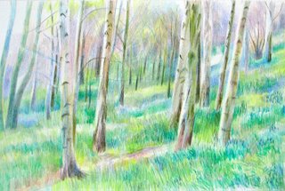 I think this is very nearly finished. So, I'm going to do what I normally do when nearing completion of a work.
- I put it where I can see it without looking at it while I ponder whether anything else needs sorting - and I'll leave it there for a few days, probably without doing anything to it.
- If I'm still not sure I'll then turn it to the wall and leave it like that for a couple of weeks or so andf then turn it back and have another good look.
Comments and constructive criticism welcome.
Technorati tags: art , coloured pencils , colored pencils , landscape painting , painting
Monday, May 08, 2006
Taking the Monet?
We're still watching "The Impressionists" on the BBC but I'm finding the emotional intensity rather wearing - it continues in the "very dramatic" TV mini-series vein as indicated in my review last week. My dearly beloved informed me, as we watched last night's episode, that he'd read an AA Gill review which suggested he was less than impressed. This morning I've been looking for that review and others on the Internet this morning and have a few links for your perusal which are worth reading:
- "Take the Monet" Andrew Billen 'New Statesman' Monday 6th May (Alternatively, you can also listen to this one after downloading it). There's a certain amount of heavy irony in this piece!
- Caitlin Moran in the "Timesonline" on 29th April had rather less to say with the following being her entire review (coming right at the bottom after her very long review of "Lost")
Finally The Impressionists — a lush BBC three-parter not on Mike Yarwood, Rory Bremner and Janet Brown, but Manet, Monet, Renoir and Bazille. Essentially this does for the Impressionists what Mamma Mia! did for Abba — a plot is constructed by stringing together the painters’ greatest canvases into some kind of narrative, aided by dialogue that appears to have been applied to the paper with a 6in masonry brush. Still, it all looks beautiful, and Renoir’s a bit of a dish, so just watch it with a bottle of absinthe and the sound turned down.
- this one (Patricia Nichol, Timesonline 30 April 2006) will probably only really satisfy Richard Armitage fans - being long on Richard Armitage (who plays young Monet) and short on the "lushly orchestrated and illustrated narrative" with the programme being characterised as "chocolate-boxy, but, in its post-Antiques Roadshow slot, will probably teach far more people something about art history than a BBC4 documentary would".
This programme is presenting the Impressionist movement to the masses - boiled down, the "headlines only and headlights on" version. Maybe in the hope that if they like the stories and the very quick glimpses of the paintings, they might go off to the galleries and actually take a good long look at the paintings - and then come back and be ready for the South Bank Show version - because we're still waiting for the BBC to show any sort of inclination to do a serious programme on the Impressionists which actually focuses on the painting rather than the "Drama" with a capital D.
PS In last night's episode, the focus was on Degas - who couldn't see what he was doing (his wonderful pastels of women bathing were shown for about 5 seconds - but they then lingered longer on the ones of women in a brothel). Monet painted "Impression: Sunrise" in 30 minutes, the face of wife Camille just after she died and held an exhibition with the other "Impressionists" before resubmitting to the salon and getting hung high up where nobody could see his painting. He also met the future Mrs M who moved her husband and family in with him. And Julian Glover as Monet in old age was permanently lit in naples yellow light.
Technorati tags: art , Degas , Monet , painting
Sunday, May 07, 2006
"Illustration Friday" has a new website
If you're interested try clicking on any of these links and you'll find out more!
And well done Penelope! I particularly like:
- the fact that it is now really easy to browse the different illustrated responses to each week's theme - by medium and category of illustration.
- the resource links for illustration - looks like some good content in there.
Technorati tags: illustration , illustrated blogs
Study of my salad box
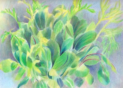
This is a study - not a painting - of my salad box (one of those cut and come again ones). It's been drawn from life in coloured pencil and is 9" x 12" on Arches HP.
It's been hanging around for about a week waiting for its background to be completed!
(PS Did anybody notice it rained a lot in London yesterday? Hence I didn't go for a walk! I think I'm going to have to 'fess up to being a 'fair weather walker' only in the 'exercise and sketch' department! And Julie's sketch from her walk yesterday had raindrops on it so I don't think she was faring much better re. weather! I have to tell you Sunday morning is not looking a whole lot better....... )
Technorati tags: art , coloured pencils , colored pencils , drawing
Visitor mapping - Clustr and MapStats
Maybe I should explain. My first degree is in Geography and I've always loved traveling and seeing new countries so I really relate to being able to see where you all are.
We're now up to 6,281 people since 18 March - which I calculate means that in 50 days there has been an average of around 125 visitors per day. (Although I think some of those are me creating posts and editing the template as I don't think it's got an 'ignore host' gizmo yet!)
Seeing all those little red dots every day reminds me all the time that what I'm writing is being read by people all over the world - which helps with thinking about what to write, how to write and what links to include. Mind you - I'm presupposing that people like having access to more information about places in other countries in the same way that I do!
On Friday evening, I decided to have an update/maintenance session and came across MapStats from BlogFlux - which provides a good range of statistics and charts around visitors to the blog (as other stats software also does) but also has this rather neat little box which lists the locations of the last 10 visitors to the site. I've been completely riveted by it since introducing it! It's just under the Clustr map.
In relation to privacy - absolutely no information is being derived from your computer by this blog that isn't also being obtained on a regular basis by other sites using similar software to track their visitors - which in reality means most sites. However, the stats data I get is totally anonymous in that I'm never provided with any personal data whatsoever about any of my visitors - although it does tell me about your computers (and what a lot of Firefox devotees there are out there!), where you are (IP location - which generates the maps), where you came from (where you were on the internet before arriving at the blog), what keywords you used in a search engine and which posts you visited. Again - can I emphasise this is data which is typically obtained by statistical software on most sites you visit every day with a view to improving the visitor experience.
I certainly won't be supplying anybody with the statistical information provided to me by the tracking software. However I personally find it very useful for tweaking the site to reflect technology being used, people's interests (eg key words searched) and the popularity of different posts (more of this and less of that!).
So - what do you think - do you like the information about visitors on my site? Do you think it's too intrusive or about right? Let me know.
Technorati tags: blog software
