 |
| The seven semi final paintings - and one print |
Last Wednesday, the semi finals of Landscape Artist of the Year 2025 was broadcast. I then watched it again the next day and started to write this review.
I feel that this series has truly lost the plot. (comment on FB)
The judges seem to delight in making life difficult for the artists, cackling at the thought of their plans going awry as the tide came in. It feels almost sadistic to me: does making the heat as difficult as possible for the artists make good telly? (comment on FB)
I've watched the program over many years too and to doze off and come to as they announce final three is a first for me. (comment on FB)
Location and Weather
None of them are thrilled with the Challenge (Judge)
They were all out of their comfort zone and certainly out of their depth. (Observation on FB)
What a ridiculous subject for the semi final. Especially given what the commission is. I haven’t got a problem with the concept of urban as opposed to organic/countryside landscape, but this is more akin to a still life. (Observation on FB)
Dealing with tidal changes in a natural landscape is already a challenge, but in this environment it’s setting them up for a challenge that needs more than 4 hours.
They will never get the best out of artists in this way.It was not fun to watch. (I did have to go back to watch the bits I slept through and didn’t feel it was really worth it in the end) (Observation on FB)

|
|
Those pods - at the bottom of the pic - and sitting very low down on a
slipway well below the jetty which hides the bottom part of HMS Warrior |
Below is the very tight view of HMS Warrior in Portsmouth Historic Dockyard.
If you look at it on Google maps, the artists had a very narrow field of view: restricted by a massive boat house on their right, and the Mary Rose museum on their left. They had no choice but to paint either the long pier with HMS Warrior hidden behind it or the more industrial-looking pier on the right. I thought Ben made the best of a terrible situation - I think I'd have walked off set!. (comment on FB)
Problems with the location of the Artists Pods were as follows:
- the artists were lower than the ship and saw even less of the ship at the beginning of the semi finals. However, behind the jetty, it rose up on the tide as the heat progressed.

|
|
The pods on the concrete slipway inbetween the jetty out to HMS Warrior
and and enormous hanger associated with Portsmouth Historic Dockyard |
Considering the judges sneer so much about boats in paintings it was an odd choice of location (tweet)
It's a pile of ship Stephen Mangan
The location offered very few alternatives to that ship. The only thing that was natural was the sky. It was crying out for the artists to desert their pods to go in search of a more interesting subject matter (FB Comment)
the only land they could see was limited on both sides meaning they had no choice of view. And the view they did have, as the judges kept pointing out gleefully, *was* going to change as the tide came in. Stretching the artists in the semi-final is fine, but this was just unkind. (FB Comment)
- It did not rain, however the location was very windy and looked rather cold too for a July day.
- I think those who were dressed in proper plein air kit for not very nice days probably fared better than others.
LAOTY Semi Final Locations
All that the semi final location choices do is
- (typically) provide big structures - which won't be present in the commission locations
- provoke difficulty
- generate disappointing paintings
- guarantee that a talented artist(s) will mess up - and not make the final
Maybe so, but I thought the pressure of being up against the winners of the other heats would have accomplished that. It also depends on what your definition of "well" is.
- 2015 - Potters Fields Park in central London - painting Tower Bridge, the Tower of London and the City of London
- 2016 - Margate Harbour - painting views of the harbour
- 2017 - Castle Farm in Kent (the exception which proves the rule - given what happened the next year) - painting enormous fields of lavender
- 2018 - Felixstowe Docks - a container port with very big cranes and ships and stacks of containers - complete with an ocean going container ship turning up halfway through. (The eventual winner of the series knew it was coming as given a vague idea of where the semi finals were she'd had the foresight to look up both tide tables and arrivals and departures!)
- 2019 - Oil Rigs in the Cromarty Firth - extremely peculiar vertical structures sat in the middle of the Firth?
- 2020 - change of timing of broadcast (the year of two PAOTYs)
- 2021 - the Queen Elizabeth Olympic Park at Stratford in East London (filmed under Covid constraints in 2020 and broadcast changed to Jan-March slot in 2021) - looking south down the River Lee - towards the Olympic Stadium and the ArcelorMittal Orbit in the distance.
- 2022 - Forth Bridge - a VERY meccano set over the Firth of Forth
- 2023 - Thames Barrier- next to the River Thames!
- 2024 - Bucklers Hard - in Hampshire
- 2025 - Portsmouth Historic Dockyard - with a view of the 19th century warship HMS Warrior
TIPS For LAOTY Semi Finalists (and Pod artists)
- Expect a big structure at some point - polish your perspective chops
- A panoramic format might be a very useful option for your support
- Take suitable tools for drawing/painting structures e.g.
- take a ruler (for measuring)
- large pieces of stiff card (for very fast delivery of sharp edges)
- flexi curve or french curve for bends
- Binoculars - because sometimes the structure is a VERY long way away!
- Make sure you know how to paint effective water quickly and easily
The Artists in the Semi Final
- all the Heat Winners plus the chosen wildcard from the Wildcard Winners in each heat. The Wildcard Winner who got a place in a pod and who was selected from the six Heat Wildcard was Rose Dufton from Heat 3 at the Bristol Suspension Bridge
I have immense respect for all the artists and what they managed to achieve. (FB comment - in the context of the awful location)
The view given was horrendous. That anything was produced was short of a miracle, but I don't think any of them were great. If the prize is to paint a countryside, then all the heats should reflect that premise. The lack of vision to get artists that could paint a painting worthy of the prize by giving them such an inane view is bonkers.
 |
| Left to right: Sarah Stoker, Molly Lemon, Ben McGregor, Clare Rose |
 |
| Left to right: Clare Rose's painting; Kieran Guckian, Susan Isaacs and Rose Dufton. |
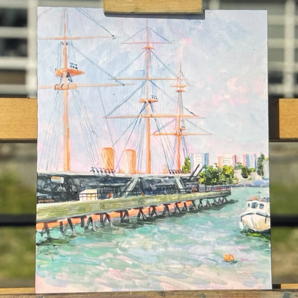
HEAT 1: Ben McGregor
 |
| "Not HMS Warrior" by Ben McGregor - the only artist to "go rogue"! |
I don’t think Ben is the best draughtsman of them but there was something about his colours and mark making that I liked and I think he will win. (FB Comment)
Ben’s work (and his mark making in particular) owes a lot to Van Gogh. As such I can see him having a super time in the south of France and making some paintings that would make the most of the atmosphere and light in that part of the world. (FB Comment)
HEAT 2: Clare Rose
 |
| HMS Warrior and Portsmouth Historic Dockyard by Clare Rose - this was by far the biggest painting on the day |
Clare’s was a superb skyscape - they even reference it as such during the programme. FB comment
I can’t understand why Clare didn’t get to the final. I thought she would have been perfect for the South of France! I did like Ben’s painting though. FB comment
I liked Clares the best and think she ought to be in the final FB comment
I liked Clare’s best although it was probably too conventional for the judges but I liked her explanation of the construction of the painting and her sky. FB comment
HEAT 3: Kieran Guckian
 |
| HMS Warrior by Kieran Gulkian |
I'm always drawn to landscapes that have a sense of time and am happiest painting in the mountains. (KG)
My feeling was that I love his design sense and his painting but I think he'd struggle to unhitch his attachment to his palette of muted browns and greens which work fine in Ireland but bear no relationship to the south of France
Comments from viewersAs for the finalists a definite yes for Kieran - I’m on his wavelength in terms of composition and the muted tones (FB Comment)
Talking of atmosphere and light, Kieran’s work is very monotonal and his palette very unsaturated. That “greyed out” effect works well on Irish mountains, passably in the English summer sun when tackling a ridiculous view of a suspension bridge, but I think he could go one of two ways faced with the saturated colours and light of the south of France. While I don’t see a Brogan Bertie-breakdown happening if he were to be picked, it would still be an uncomfortable watch… unless he finds himself totally inspired by the place and light and colour and adds another string to his artistic bow. (FB Comment)
HEAT 4: Susan Isaac
 |
| HMS Warrior and dock by Susan Isaac |
I paint mostly in oils in a loose figurative style which occasionally dissolves into the abstract elements of my compositions, combining strong drawing skills with bold use of colour and application of texture. My subjects are mainly towns and seascapes. (website)Some commented....
I like the way that Susan handles cityscapes but I wasn’t impressed yesterday, her picture seemed to have come from her imagination. (FB Comment)
Susan’s work is beyond my ken - I just don’t get it but I’m probably too stuck in my “realistic” ways. (FB Comment)
I didn’t mind Kieran’s but not a fan of Susan’s style at all, and I don’t understand how such heavy black mark-making will work in the south of France. Hey ho. (FB Comment)
HEAT 5: Sarah Stoker
 |
| HMS Warrior and a lot of cement dock by Susan Stoker |
I won Young Designer of the Year in 1989 and the following year I was awarded a grant from The Prince’s Trust to help set up a pottery studio.The mark-making effect she can achieve with alcaohol based inks was less obvious in this painting - when compared to her submission and her heat painting.
HEAT 6: Molly Lemon
 |
| HMS Warrior (woodcut engraving) by Molly Lemon |
I adored Molly’s print, I’m in love with her work and with her a little bit after watching her YouTube videos but they were never going to choose a small print. (FB Comment)
Wildcard Winner: Rose Dufton
 |
| HMS Warrior by Rose Dufton |
The work I create is born from emotional experiences, often captured en plein air, where I paint outdoors, immersed in the landscape. Each piece I create weaves together the memories and the spirit of a place, resulting in dreamlike compositions that echo with sentiment and depth. (website)To be honest, I thought there were stronger wildcard winners.
Themes, Learning Points and Tips
The Audience is drifting off to sleep
Various Facebook comments were made to the effect the semi final was very boring.I’ve watched this programme with delight since it began. Last night I also fell asleep and woke after it finished, so had no idea who went through. I normally would have been devastated but last night couldn’t have cared lessTIP: Stop giving them silly subject matter which they all struggle with. Inspire them to do their best rather than disrespecting the artists and making us watch them struggle.
Problems with Semi Finals
- ANOTHER LOCATION WHICH DOES NOT RELATE TO THE COMMISSION
- SAME OLD BALONEY: we're still hearing a lot of verbiage but mostly it lacks hard-edged content. Also quite a lot of it that is left in the programme is amazingly inconsistent with the choices at the end.
- NO NEW ARTISTS: the introduction of the artist is more minimal because we've already met them in the neats
- NO WILDCARD SECTION: it has no wildcard section to break up looking at people in pods painting - however it does have the reveal as to which wildcard got through - but there's never ever a proper explanation of why that person was chosen.
- NO WINNER: there's no winner, the programme ends on the shortlist of three artists selected for the final
Criteria for judging people suitable for the Commission
It's very feathery and reminds you a bit of the impressionistsI don't recall impressionist paintings ever looking "feathery"!
(Impressionists) painted contemporary landscapes and scenes of modern life, especially of bourgeois leisure and recreation. Interested in capturing transitory moments, the Impressionists paid attention to the fleeting effect of light, atmosphere and movement. They continued the break that the Realists began from the illusionist tradition by emphasizing the paint on the surface of the canvas, flattening the sense of perspective through a lack of tonal modeling, and using daring cropped perspectives which were influenced by Japanese prints. Confronting nature and modern city life directly, the Impressionists differed from their antecedents because they painted en plein air (in the open air) and used a palette of pure colors. Oxford Art Online
The Post-Impressionists rejected Impressionism's concern with the spontaneous and naturalistic rendering of light and color. Instead they favored an emphasis on more symbolic content, formal order and structure. Similar to the Impressionists, however, they stressed the artificiality of the picture. The Post-Impressionists also believed that color could be independent from form and composition as an emotional and aesthetic bearer of meaning. Oxford Art Online
So which set of artists is this series concerned with - the Impressionists or the Post Impressionists or both?
Might it not have been a good idea to articulate in a very much more considered way what aspect of Impressionist painting they were looking for?
I'm thinking here of specific criteria - as opposed to a Judge's gut feel!
As opposed to "she has a fresh light touch which reminds you of the impressionists"
Why are they not more focused on the South of France?
- the Mountains of the South of France re Cezanne I wonder from this vague statement whether they'll actually provide a view of Montagne Saint Victoire which Cezanne painted many times.
- Cezanne also painted a lot of trees.
 |
The Montagne Saint-Victoire (c.1887) by Paul Cezanne (1839-1906) oil on canvas Samuel Courtauld Trust: Courtauld Gift 1932 |
- the coast at Antibes - where Monet painted. Below is my sketch of the very famous painting by Monet which is in the Courtauld.
 |
| My sketch of Monet's painting of Antibes in the Courtauld Gallery |
- the countryside around Arles - where Van Gogh painted (see All about Van Gogh - my post about my archive of blog posts about Van Gogh - especially Van Gogh: Drawing media and techniques)
 |
| La Crau Seen from Montmajour Vincent van Gogh (1853 - 1890), Arles, July 1888 pencil, pen and reed pen and ink, on paper, 49 cm x 61 cm Credits: Van Gogh Museum, Amsterdam (Vincent van Gogh Foundation) |
Plein Air Artists - are they?
A lot of them are plein air artists so that they're used to things changing! Kathleen Soriano
I don't remember "being a plein air painter" being featured as an attribute that the Judges were looking for when selecting people:
- to appear in the pods
- to win the heat and appear in the semi-final.
The Programme Format, the location scouts and the Judges
- it's looking tired and boring - and
- now it even makes us go to sleep!!
- much more focus on the artists and the painting and
- much less attention paid to the Judges per se.
- PLUS lots more experienced and good plein air artists applying!
Judges must be making a lot of money and have control over the actual program making to be able to keep getting away with it. (FB Comment)
Why is it that when the judges say things like “it doesn’t look finished “ and “not sure that sky is going to work “ they then pick these ones for the final? The ones who were getting good comments all the way along were then just ignored. And I’m glad I wasn’t the only one to fall asleep! (FB Comment)
Most telling moment last night (as if we didn’t know already) was when Steven asked Tai why the judges don’t like traditional art. Tai’s reply, “Boooooooring!” was borderline offensive. (FB Comment)
Has everyone noticed that the standard of all the competing artists gets worse each year. All our better, more talented Plein air painters are not entering anymore as their talents are not appreciated by the terrible judges on this sham of a show. This years quality was the lowest yet and the judges ‘ArtSpeak’ comments even more ridiculous than ever. They are killing what should be a wonderful, inspiring programme for aspiring artists and a real opportunity for promoting the talent we have in this country. I give up. (FB Comment)
Decision Time - The Finalists
I actually had hope for this series as I have agreed with some of the chosen heat winners but the semi final took a nose dive. FB comment
It is a painting competition so surely the best should get through. It's not about how the artist is going to develop and how excited the judges are for their future. The producers seem to forget about the viewer these days and it's all about the judges. FB comment
 |
| Announcing the finalists - and Ben McGregor is the first to be announced |
- Ben McGregor
- Kieran Guckian
- Susan Isaacs
- I'm happy with the choice of Ben McGregor - he's got the appreciation of colour and light which will really work in the South of France.
- His quirky style of mark-making night also keep them happy on Kate's incessant and boring "we need to find a completely new landscape artist". (No - you just need to find a really good landscape artist!!!)
- I also liked the fact he positioned his easel and support so he couldn't see the great big masts!
- This is a man who is going to choose what interests him - not what he's plonked in front of!
- I do like a man with an independent perspective who knows his own mind!
- I suspected that Kieran Guckian might get through to the final - as he's a very accomplished painter. HOWEVER:
- his palette of muted colours that he likes using is VERY limited (as in sombre and muted) - and he demonstrated an even MORE limited palette in these semi-finals.
- It's absolutely spot on for Ireland - but the light is completely different in the south of France - and needs a completely different colour palette.
- I am very much NOT a fan of Susan Isaac's "John Bratby" type painting.
- It's so very heavy on the use of black - which is very emphatically NOT a colour I ever associate with the south of France.
- I think Kate is backing her which, for me, is seriously ominous.
- First because she struggled but produced a good and large painting with a good sky - although not as good as her best as seen by the submission and heat painting.
- Two because she's a better painter than at least one of the finalists.
- Three - because I thought she was bound to win and would produce an absolute wowser of a painting of the South of France.
Next Week - The Final at Stonehenge
Yet another very odd structure - Stonehenge - for the final.
Reference
Series 10: The Episodes
- Review: Episode 1 of Landscape Artist of the Year Series 10 (2025) - Hampton Court
- Review: Episode 2 of Landscape Artist of the Year Series 10 (2025) - Snowdon, Wales
- Review: Episode 3 of Landscape Artist of the Year Series 10 (2025) - Clifton Suspension Bridge
- Review: Episode 4 of Landscape Artist of the Year (Series 10) - St Pancras Basin
- Review: Episode 5 Landscape Artist of the Year 2025 - Dinorwic Slate Quarry
- Review: Episode 6 of Landscape Artist of the Year (Series 10) - Bristol Harbourside
- see my blog post about Call for Entries - Landscape Artist of the Year 2026 (Series 11). The deadline for submission is NOON on Friday 2nd May 2025 - and entries are ONLY accepted online.
- lists all reviews I've published for series episodes broadcast between 2018 and 2024
- together with the topics / themes /TIPS I identified in each episode.
No comments:
Post a Comment
COMMENTS HAVE BEEN CLOSED AGAIN because of too much spam.
My blog posts are always posted to my Making A Mark Facebook Page and you can comment there if you wish.
Note: only a member of this blog may post a comment.